In this article:
- What Are Variable Fonts?
- Pros of Using Variable Fonts
- Cons of Using Variable Fonts
- 5 Tips for Designing With Variable Fonts
- When to Choose Between a Variable Font and a Static Font
- The Future of Typography Is Variable
Typography is at the heart of great design, shaping how users engage with and interpret content. However, digital environments are growing more dynamic, so you must use the latest tools in crafting typography to keep up.
One innovation taking over in typographic design is variable fonts. This typography trend allows you to work with a whole font family seamlessly. The creative possibilities with variable fonts are endless, enhancing user experiences across the internet.
What Are Variable Fonts?
Variable fonts are an advancement in typography that offers designers more flexibility and control. They differ from static fonts because they consolidate multiple styles within a single file, whereas regular fonts require a separate file for each style and weight.
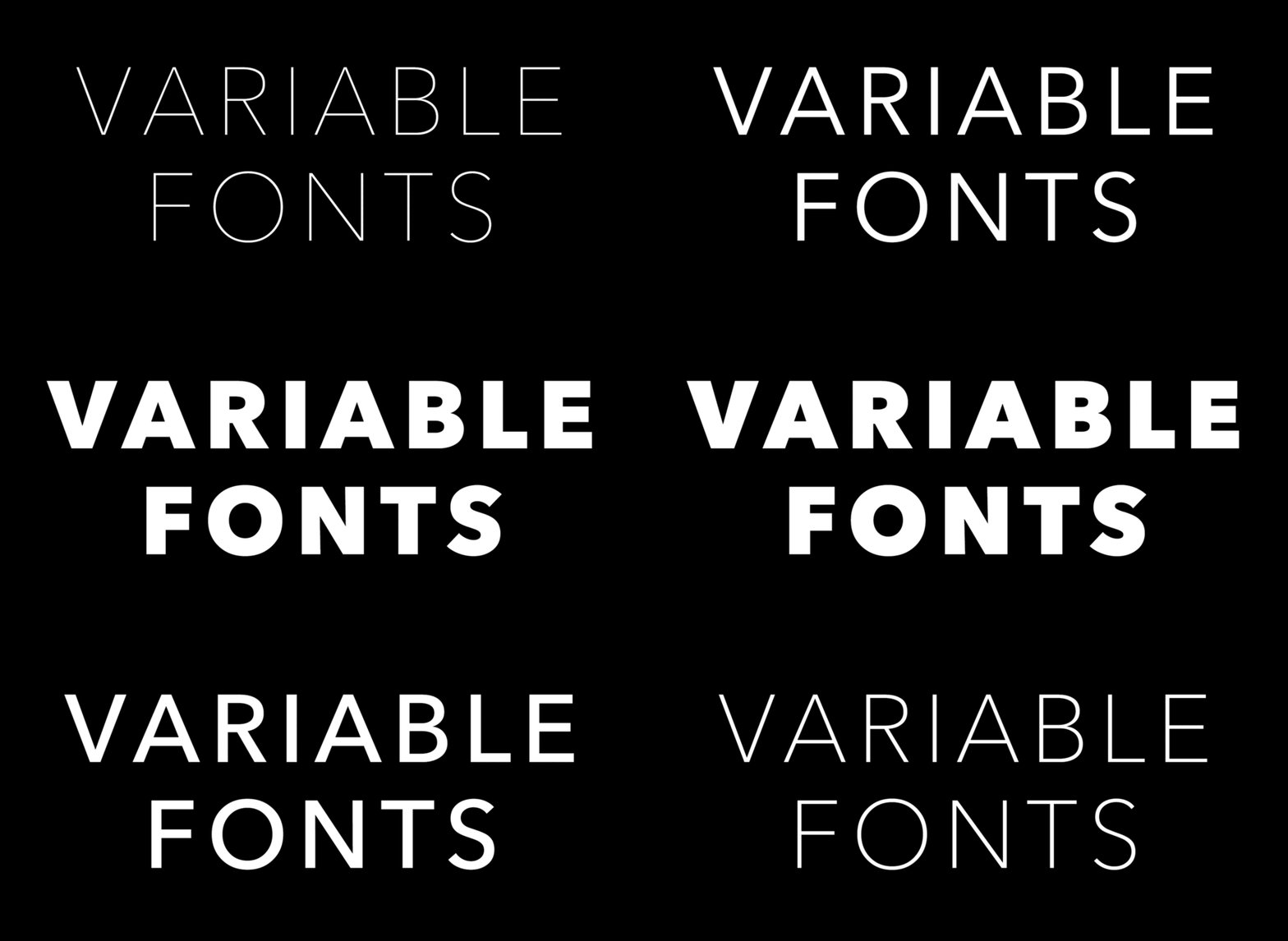
This innovation allows seamless transitions across various typographic attributes, all adjustable along continuous axes.
Variable fonts incorporate the following characteristics:
- Weight: Adjusts the thickness of characters, ranging from 1 to 1000 or thin to extra bold.
- Width: Modifies the font-stretch, often falling around the 75% to 125% mark.
- Optical size: Optimizes character design for different display sizes, enhancing readability across contexts.
- Custom axes: Allows type designers to define unique variations, such as slant or serif length.
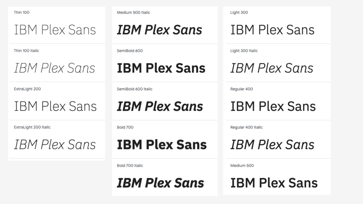
For example, the IBM Plex Sans enables transitions between weights, facilitating dynamic typographic animations.

Get 300+ Fonts for FREE
Enter your email to download our 100% free "Font Lover's Bundle". For commercial & personal use. No royalties. No fees. No attribution. 100% free to use anywhere.
The adoption of variable fonts is growing, with support from major browsers like Safari, Chrome, Edge and Firefox. The more compatible these fonts are, the more freedom there is to create responsive typography.
Pros of Using Variable Fonts
Using variable fonts has brought numerous benefits to my work in typography and graphic design. Below is how it has improved my work and how users interact with it.
Flexibility
Variable fonts provide infinite design variations within a single file. You can adjust axes on the go and create responsive designs that adapt easily to different devices and screen sizes. This makes variable fonts especially valuable for branding when maintaining consistency across platforms is critical.
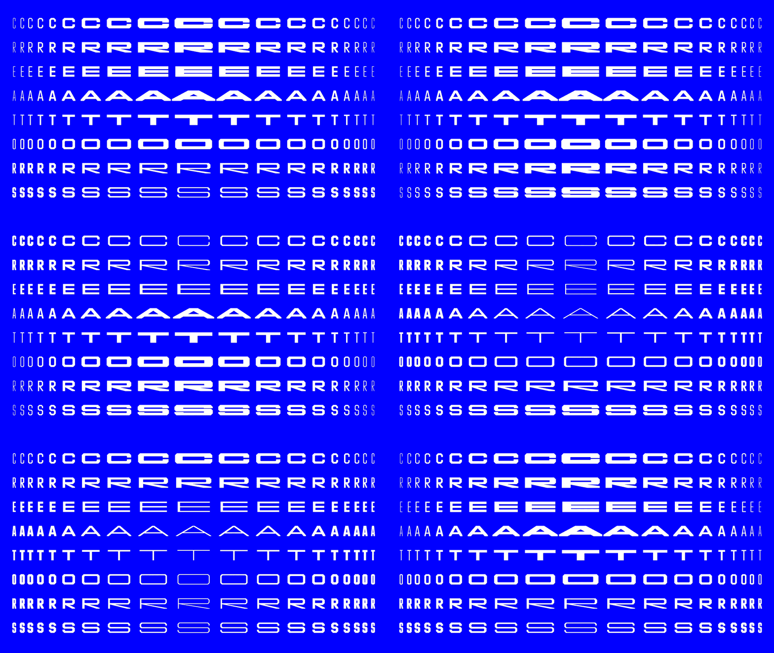
I remember working on a branding project for a client with a large digital presence. The biggest challenge was keeping everything the same — from mobile apps to print materials — without ballooning file sizes.
Using a variable font made all the difference. I could tweak weights and sizes in real time to fit each medium perfectly, saving me hours of back-and-forth with multiple fonts.
Accessibility
Variable fonts allow you to ensure text is legible for many users, even those with visual impairments. For example, optical size adjustments can improve readability on small screens, while wider widths can aid users with dyslexia.
Increasing accessibility for website users can be a business opportunity for brands. Companies that invest in customer experience are shown to achieve greater profitability than those that don’t. Accessibility is a vital piece of this customer experience that businesses can’t ignore.
Efficiency
Combining multiple font styles into one file reduces the need for numerous font files. This consolidation simplifies your workflow and improves website performance by reducing file sizes. Faster load times equal better user experiences and can increase conversion rates by 2.5 times when improving site speed.
Cons of Using Variable Fonts
Variable fonts can come with challenges that you must consider before implementing them into a design project.
Some Compatibility Issues
Although support for variable fonts has increased, not all platforms fully support them. According to Can I Use, most browsers support variable fonts. However, users on older browsers may encounter fonts that are different than intended. For instance, Safari on iOS 3.2 to 10.3 does not support it, leaving 0.08% of global users out of the same experience.
A lack of universal support means you will need to implement fallback fonts to ensure a consistent user experience. Managing these fallbacks can complicate your development process and require extra testing.
Learning Curve
Variable fonts introduce a new dimension to typography, which can be overwhelming if you only use static fonts. Knowing how to manipulate various axes requires time and experimentation.
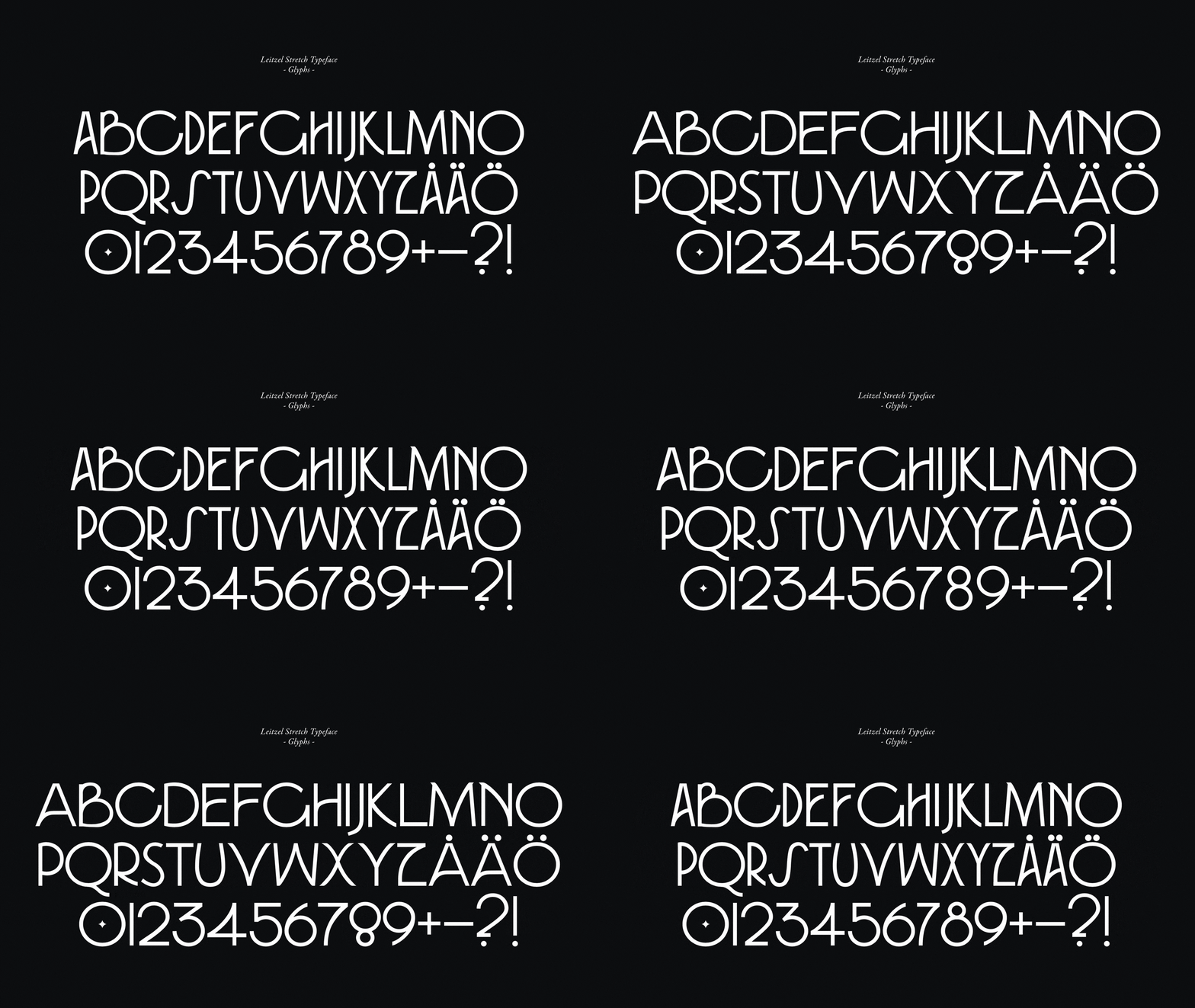
I found the number of options exciting when I started working with variable fonts. However, it took several projects and a fair amount of trial and error before I felt comfortable using their full potential. Investing time in learning to use variable fonts is essential but can be a hurdle for tight project timelines.
Performance Considerations
While variable fonts can reduce the number of font files needed, you may have issued the file size of a single variable font. These can be larger than an individual’s static font — potentially impacting the page load times — especially on mobile devices with slower internet connections.
According to HTTP Archive, the median font size is approximately 20 kilobytes, increasing the page weight. Incorporating a larger variable font without optimizations can negatively affect site performance. Techniques like subsetting can mitigate this issue but require additional effort.
Complexity in Implementation
Incorporating variable fonts onto websites requires a good grasp of cascading style sheets (CSS) and font-feature properties. If you are still getting familiar with these, the process can be intimidating. Static fonts make it easier to apply with simple CSS rules. However, variable fonts often require more detailed code to manipulate axes effectively.
5 Tips for Designing With Variable Fonts
The following practical tips help you maximize the use of variable fonts while avoiding common pitfalls.
1. Start Small
Given the numerous possibilities with variable fonts, starting small allows you to experiment without committing to a full-scale design overhaul. Instead of redesigning an entire website, try using a variable font in a specific context, such as a headline or a responsive text element.

For example, I focused on adjusting the weight axis for headlines on a microsite when I first experimented with them. This allowed me to see how subtle weight changes impacted the visual hierarchy and user experience without redesigning everything.
Starting small also helps you find potential issues, such as browser compatibility or performance impacts. Debugging and optimizing variable font usage in a limited capacity is much easier than across a sprawling project.
2. Optimize for Small Text
Designing small text can be tricky when trying to maintain readability and clarity. Variable fonts allow you to fine-tune text for these situations. They ensure that even the tiniest type is legible across different devices and screen resolutions.
One key advantage of variable fonts is adjusting the weight and spacing. For small text, increasing tracking or kerning can improve readability by reducing visual clutter.
Slightly boldening the font can also make the text stand out without compromising its overall appearance. Additionally, expanding the font width or opting for an optical size variation can make a big difference.
3. Adapt for Contrasts and Dark Mode
Variable fonts are incredibly useful when designing for environments with varying contrast levels, such as light and dark modes. In dark mode, text readability can change to excessive thinness or insufficient contrast between the text and background. Variable fonts allow for adjustments to ensure they remain legible.
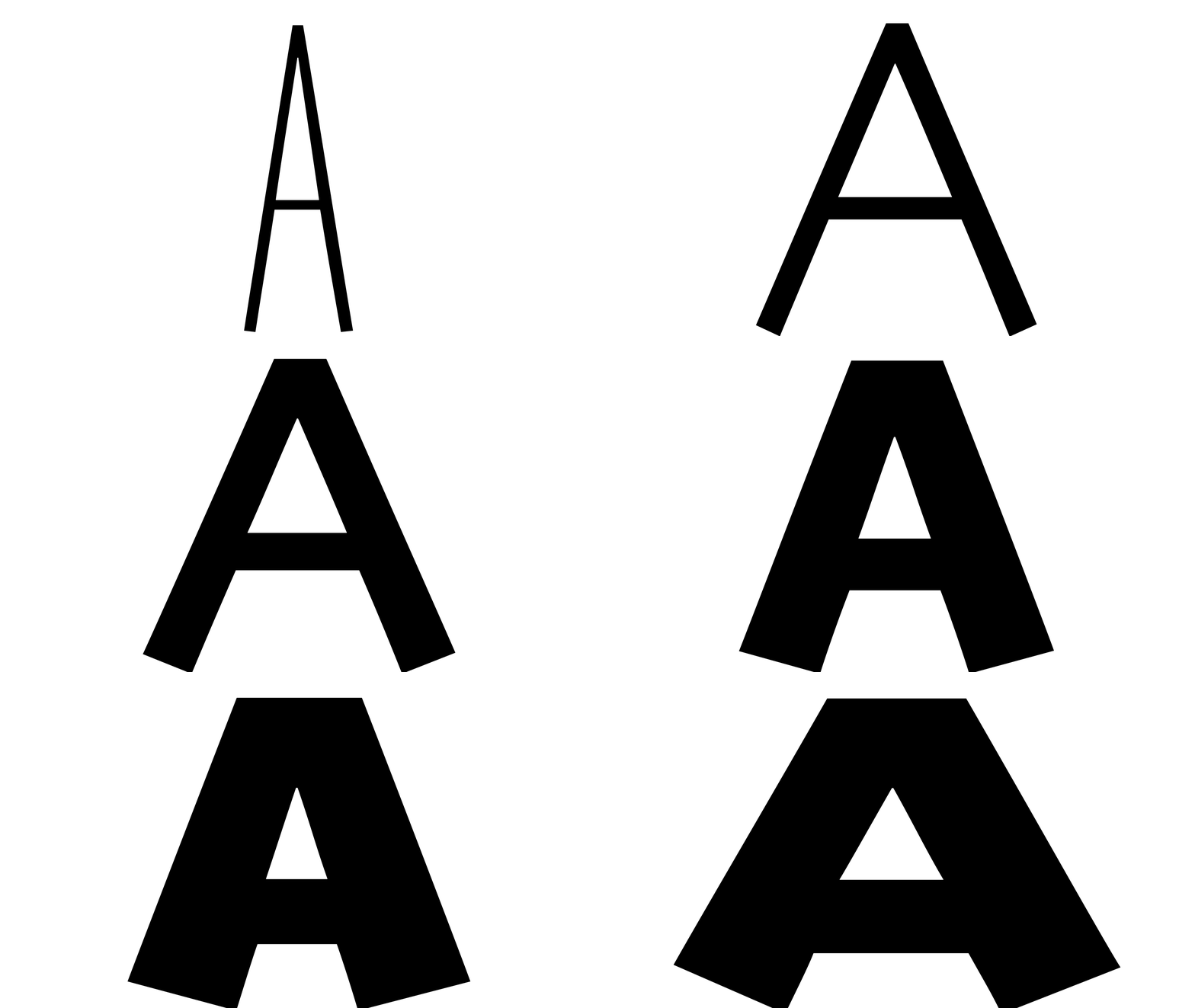
For instance, you can increase the font weight slightly in dark mode to compensate for the visual effect of light text on a dark background. This tactic will make the text appear thinner than on a white background. Similarly, tweaking the width or spacing can further enhance clarity and prevent eye strain for users.
Whether for light or dark mode, you can create a design that adapts to any contrast level. This attention to detail enhances usability and reinforces an inclusive design approach.
4. Prioritize Responsive Typography
With today’s users on multiple devices, responsive typography is essential for creating a seamless experience. Variable fonts are excellent in this area — they allow text to adapt fluidly to different screen sizes and orientations.
For smaller screens, narrow the width axis to conserve space while maintaining legibility. On larger devices, you can expand the width and increase the weight for a bolder look.
To get started, you must focus on defining a dynamic approach to typography that evolves with the screen size. Pair variable fonts with CSS to refine their attributes at different breakpoints. Taking this step will make your designs more functional and user-friendly.
5. Test and Debug
This step is critical when working with variable fonts, as they can introduce some challenges on a website. Ensuring your typography looks and functions — as intended across different devices and browsers — is key to delivering a good user experience. Even small adjustments can create unforeseen issues, so proper testing is necessary.
First, test your variable fonts on different devices and closely examine how they render on desktops, tablets and smartphones. Most major browsers support variable fonts, but it is always good to double-check their compatibility.
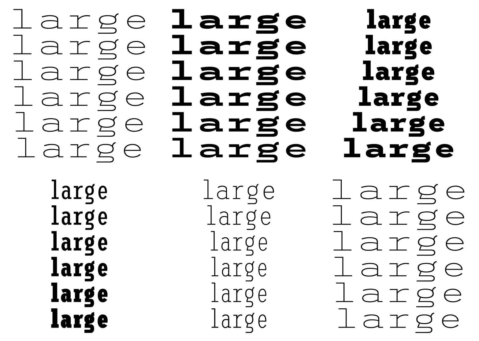
For instance, you might notice inconsistencies in how a variable font looks in Safari compared to Chrome. By diving into the CSS and tweaking the font-variation-settings property, you can create more consistent results.
It is important to assume that not all environments will behave the same. Iterative testing is a discipline you must implement each time to maintain usability.
When to Choose Between a Variable Font and a Static Font
Static fonts still hold value in certain scenarios where a project may prioritize simplicity and stability. Variable fonts are ideal for projects that demand adaptability.
If you are designing for responsive web experiences, branding systems or various applications, variable fonts are your best bet. They are also a strong choice for projects requiring customizable axes for refining adjustments to improve legibility.
On the other hand, static fonts shine in simpler projects where variability is less important. For instance, traditional fonts are a better choice for print materials, logos, and designs with a fixed layout. They are also preferable when older browsers or specific design tools do not fully support variable fonts.
Additionally, they are excellent for projects with only one to two styles. Static fonts decrease intricacy and avoid additional coding or testing.
To help you decide between variable fonts or static fonts, ask yourself these key questions:
- Will the design benefit from dynamic adjustments?
- Is browser or platform compatibility a concern for the target audience?
- Does the project need multiple styles, or will a single style suffice?
Ultimately, the right choice depends on the project and your design objectives.
The Future of Typography Is Variable
Variable fonts are the next evolution in typography, offering you more creative control. While they come with a learning curve and technical considerations, the benefits they offer make them a valuable tool for any design professional.
Now is the time to experiment with the fluidity of this typographic innovation. The future of typography is here — are you ready to design with it?

