In this article:
- The Most Authentic Distressed Fonts of 2026
- What Makes a Font Truly "Distressed"?
- Where Can You Use Distressed Fonts?
- Where to Avoid Distressed Fonts
- How to Pick the Perfect Distressed Font
- Pairing Distressed Fonts
- DIY: Creating Your Own Custom Distressed Effects
- The Psychology Behind Distressed Typography
- Conclusion: The Enduring Appeal of Distressed Fonts
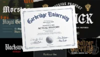
Distressed fonts capture that perfect balance of intentional imperfection – letterforms that appear weathered, worn, scratched, or eroded by time. They bring an instant sense of authenticity, nostalgia, and tactile reality to designs that might otherwise feel too polished or sterile.
In this comprehensive guide, I’ll be diving deep into the best distressed fonts to try in 2026. Here we go!
The Most Authentic Distressed Fonts of 2026
Let’s face it – not all distressed fonts are created equal. Some feel artificial and forced, while others capture that perfect balance of weathered authenticity. I’ve compiled a list of my absolute favorite distressed fonts that strike the perfect balance of legibility and character:
Rallen Distressed
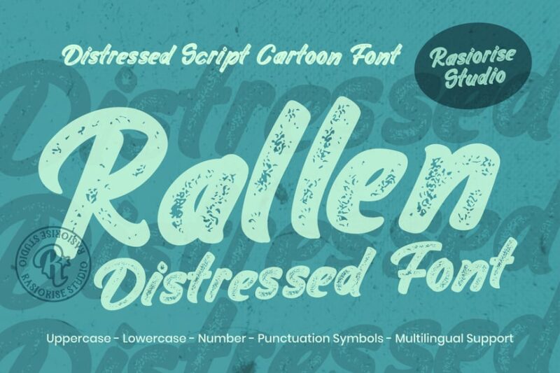
Rallen Distressed is a cursive script font that combines elegance with a weathered look. Its distressed texture adds character, making it perfect for vintage-inspired designs or projects requiring a handcrafted feel like signs or posters
Imprintica
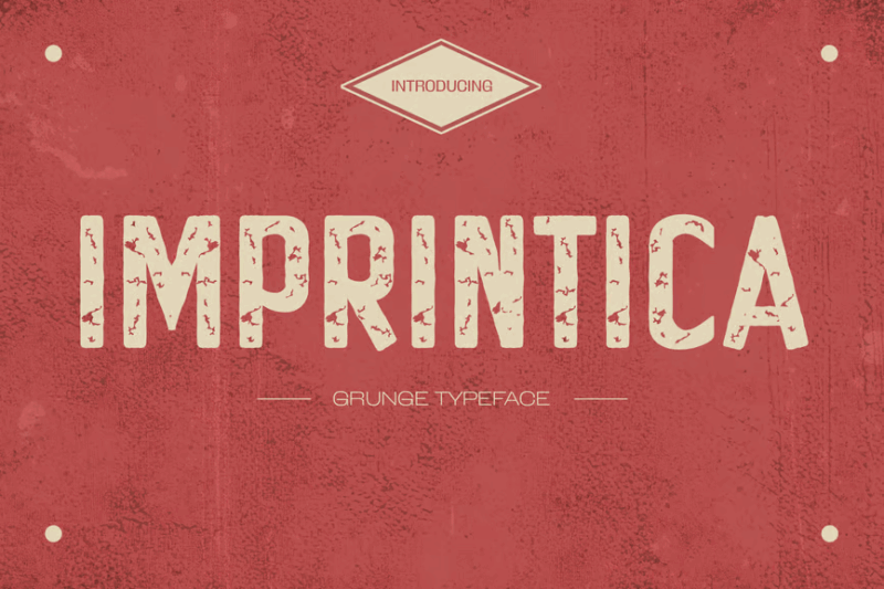
Imprintica is a distressed vintage sans-serif font that evokes a sense of nostalgia. Its worn appearance gives designs an authentic, aged look, ideal for retro-themed projects or branding that requires a touch of history.
Chaotic Sans
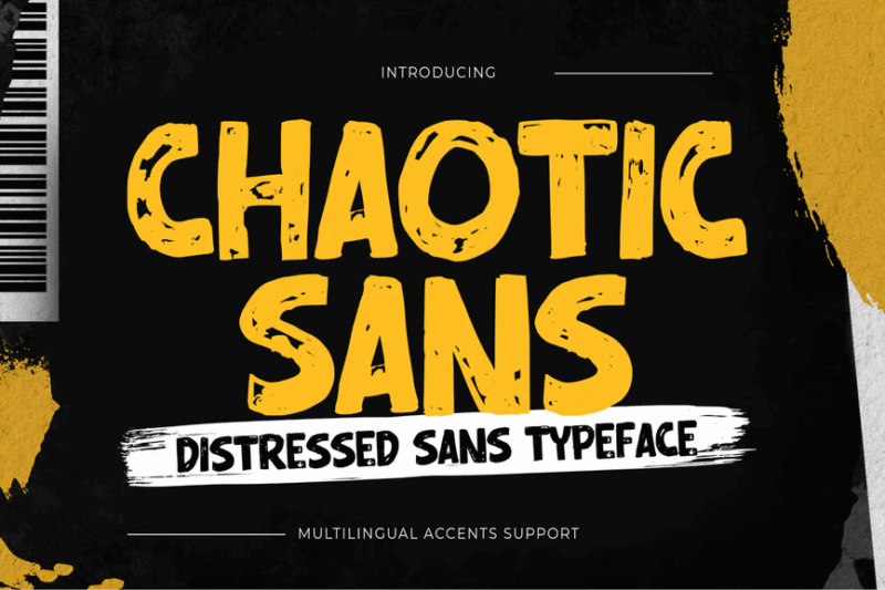
Chaotic Sans is a distressed display sans-serif font that combines modernity with a rough edge. Its irregular texture adds visual interest, making it suitable for bold headlines or designs that need to convey an edgy, contemporary feel.
Mud Track
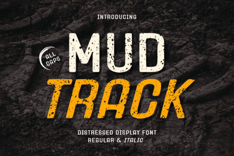
Mud Track is a distressed display sans-serif font with a gritty, textured appearance. Its rugged character makes it perfect for designs related to outdoor activities, adventure themes, outdoor racing or any project requiring a raw, unpolished aesthetic.

Get 300+ Fonts for FREE
Enter your email to download our 100% free "Font Lover's Bundle". For commercial & personal use. No royalties. No fees. No attribution. 100% free to use anywhere.
Bargers Distressed
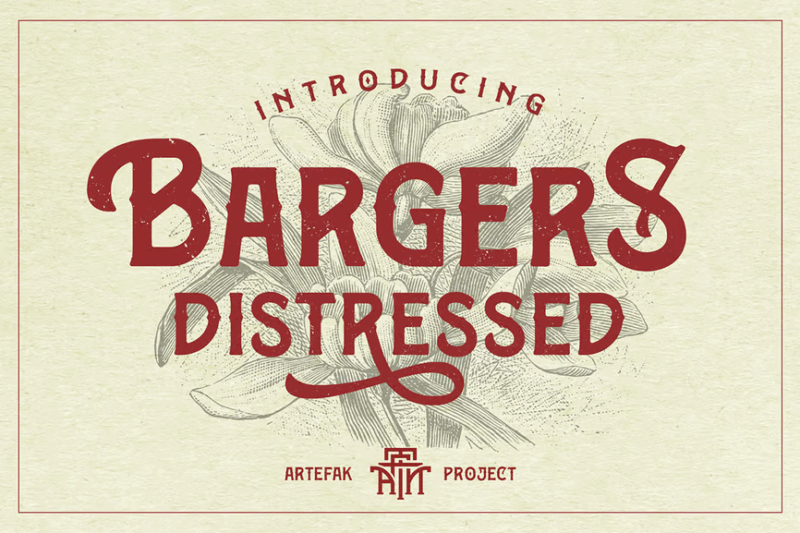
Bargers Distressed is a vintage-inspired serif font with an old-school charm. Its weathered look adds authenticity to designs, making it ideal for retro branding, packaging, or any project that aims to evoke a sense of nostalgia.
Mystic Forest
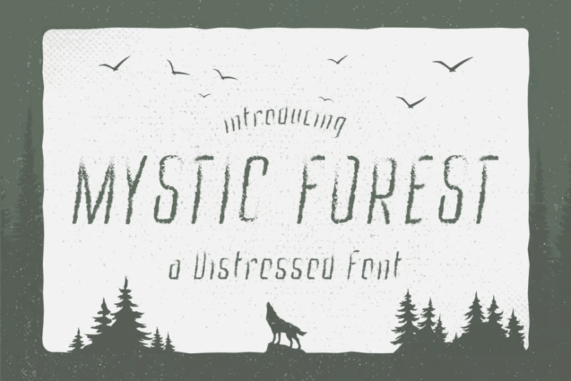
Mystic Forest is a distressed decorative font that combines a book-like quality with display elements. Its unique character makes it suitable for fantasy-themed designs, book covers, or projects that require a mystical, enchanted feel.
Distro Esseid
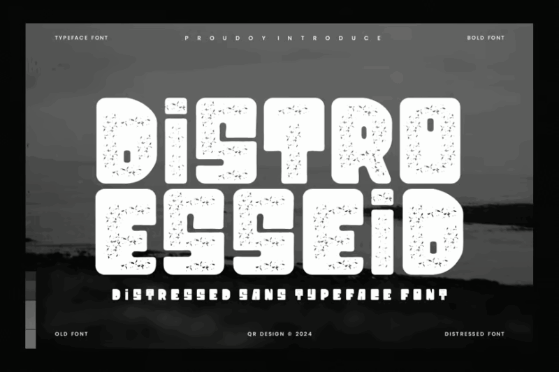
Distro Esseid is a distressed decorative typeface that embodies an old, worn-out aesthetic. Its heavily textured appearance makes it perfect for grunge-style designs, vintage posters, or any project that needs a raw, aged look.
Western Grit
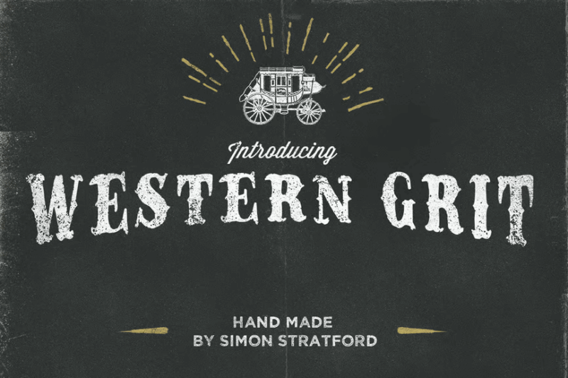
Western Grit is a distressed serif font that captures the essence of the old West. Its rough texture and bold character make it ideal for cowboy-themed designs, rustic branding, or any project that aims to evoke a frontier spirit.
CA Rough Rider
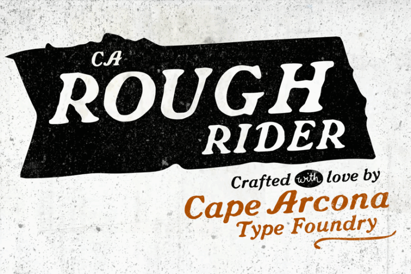
CA Rough Rider is an antiqued decorative font with a rugged, all-purpose appeal. Its weathered look adds character to designs, making it suitable for vintage-inspired logos, packaging, or any project requiring an authentic, aged aesthetic.
Pathways
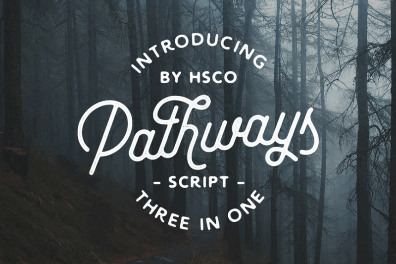
Pathways is a versatile font family featuring four styles and bonus elements. Its vintage-inspired cursive design makes it perfect for creating elegant, nostalgic designs. The variety of styles offers flexibility for different design needs.
Rubery
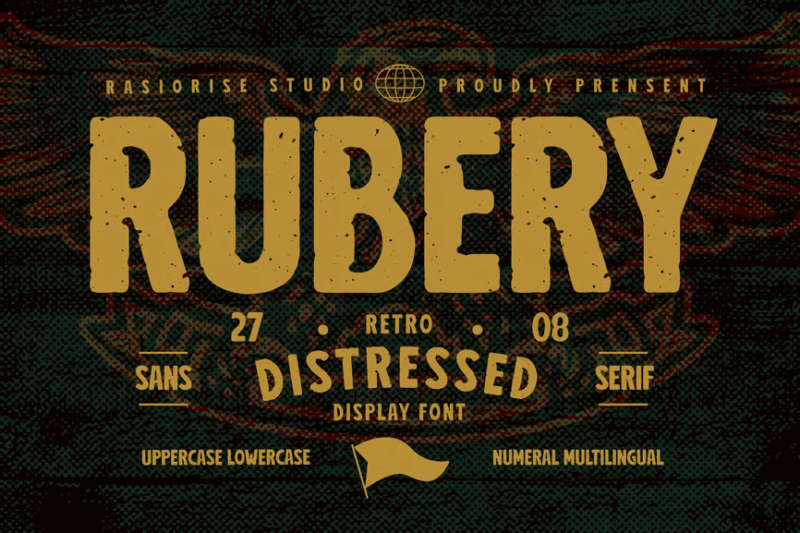
Rubery is a distressed sans-serif font with a grunge aesthetic while remaining similar to Impact. Its weathered appearance adds texture and character to designs, making it ideal for urban-themed projects, edgy branding, or any design that requires a raw, worn look.
Jason Caps
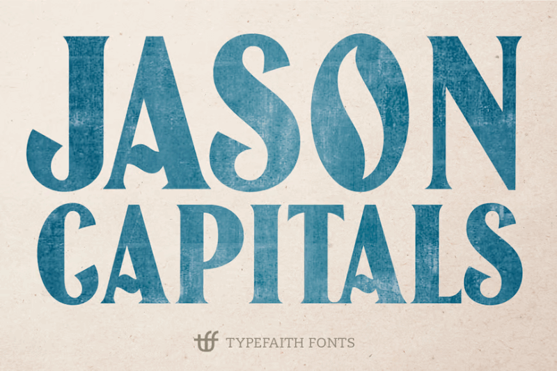
Jason Caps is a vintage-inspired decorative font with a strong typographic presence. Its bold character and retro feel make it suitable for headlines, logos, or any design that needs to make a powerful, nostalgic statement.
Hogsmeade font
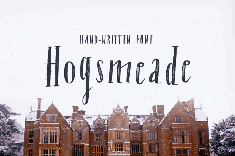
Hogsmeade is a handwritten serif font with a Halloween-inspired aesthetic. Its whimsical, slightly spooky character makes it perfect for magical or fantasy-themed designs, especially those related to autumn or Halloween events.
Hoverage Typeface
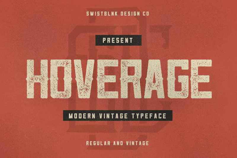
Hoverage is a decorative sans-serif typeface with a vintage letterpress feel. Its textured appearance adds depth to designs, making it ideal for retro-inspired branding, posters, or any project that requires a classic, printed look. Hoverage would work well in college-inspired font designs.
Stencil font Mind the Gap
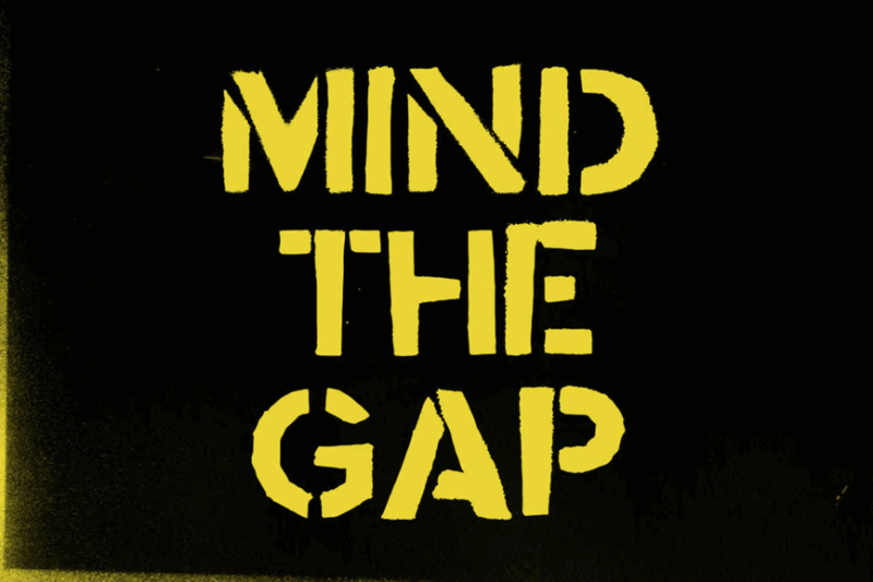
Mind the Gap is a stencil-style sans-serif font with an urban, industrial appeal. Its bold, cut-out design makes it perfect for signage, street-art inspired graphics, or any project that needs to convey a strong, urban aesthetic.
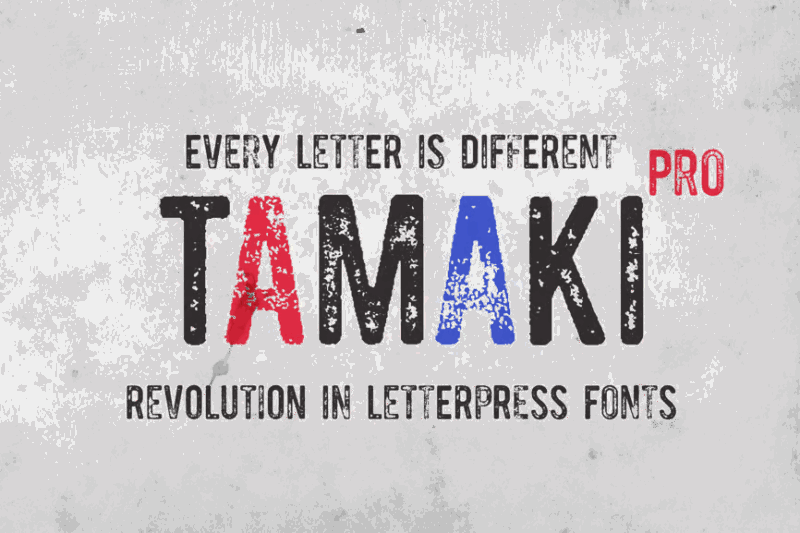
Tamaki
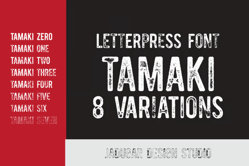
Tamaki is a vintage-inspired font combining sans-serif and handwritten styles. Its letterpress-like texture adds an authentic, aged look to designs, making it suitable for retro branding, packaging, or projects requiring a nostalgic touch.
Tactico Pro
![]()
Tactico Pro is a bold, vintage-inspired sans-serif font designed for logos and display purposes. Its strong character and slightly distressed look make it ideal for impactful branding, headlines, or designs that need to convey strength and authenticity.
Galeno Vintage
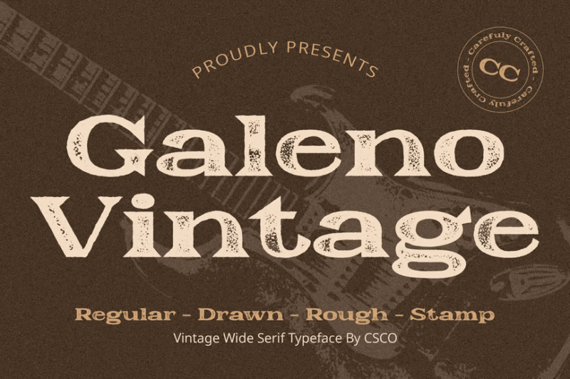
Galeno Vintage is a serif font with a vintage stamp-like appearance. Its weathered texture and classic design make it perfect for creating an authentic, aged look in logos, packaging, or any project that aims to evoke a sense of nostalgia.
BlockPress Grotesque
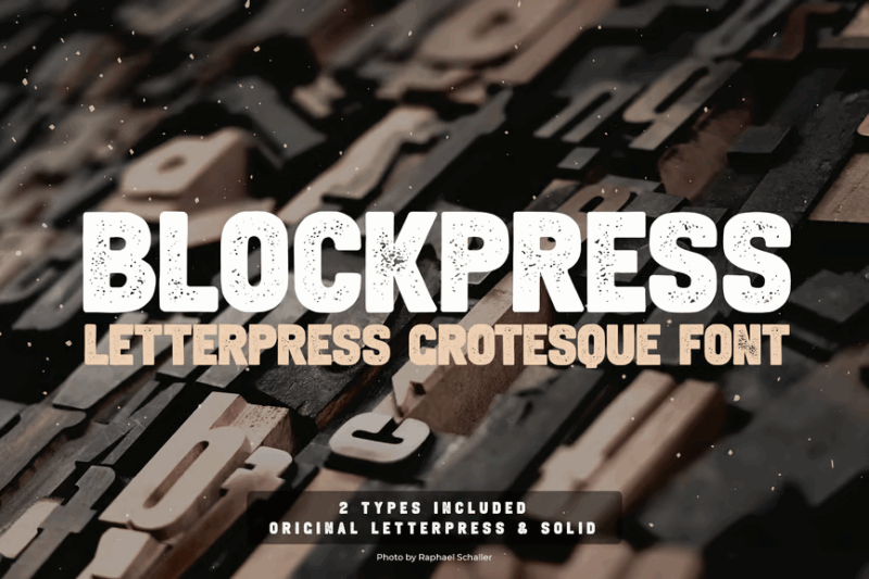
BlockPress Grotesque is a bold and distinctive sans-serif font with a decorative twist. It combines a strong geometric structure with unique print-inspired elements, making it ideal for eye-catching headlines and branding projects. The uppercase characters are particularly striking, offering a modern and edgy feel that would suit designs aiming for a contemporary urban aesthetic.
Gamilia Vintage
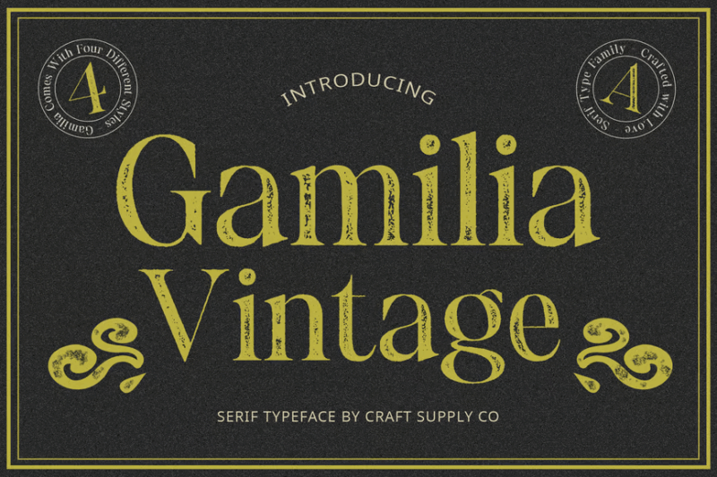
Gamilia Vintage is a serif font with a distressed, stamp-like aesthetic. Its worn appearance adds character to designs, making it ideal for vintage-inspired branding, retro packaging, or any project that requires an authentic, aged look.
Neckyn Vintage
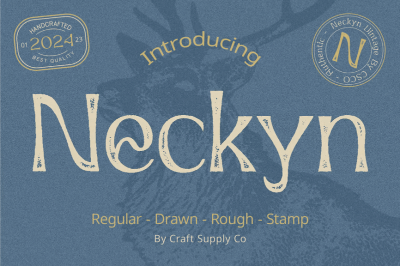
Neckyn Vintage is a decorative font with a vintage stamp-inspired art deco design. Its textured, worn appearance makes it perfect for creating authentic-looking retro designs, logos, or any project that aims to capture a nostalgic, timeworn feel.
Caplosy Vintage
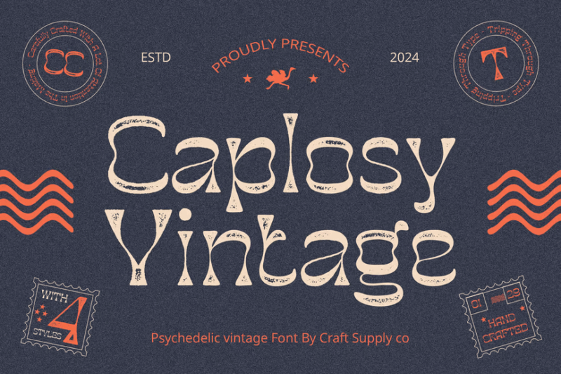
Caplosy Vintage is a decorative wavy font with a vintage stamp aesthetic. Its distressed texture and classic design make it ideal for creating aged-looking logos, packaging, or any design that requires an authentic, vintage touch.
Blnc Family Typeface
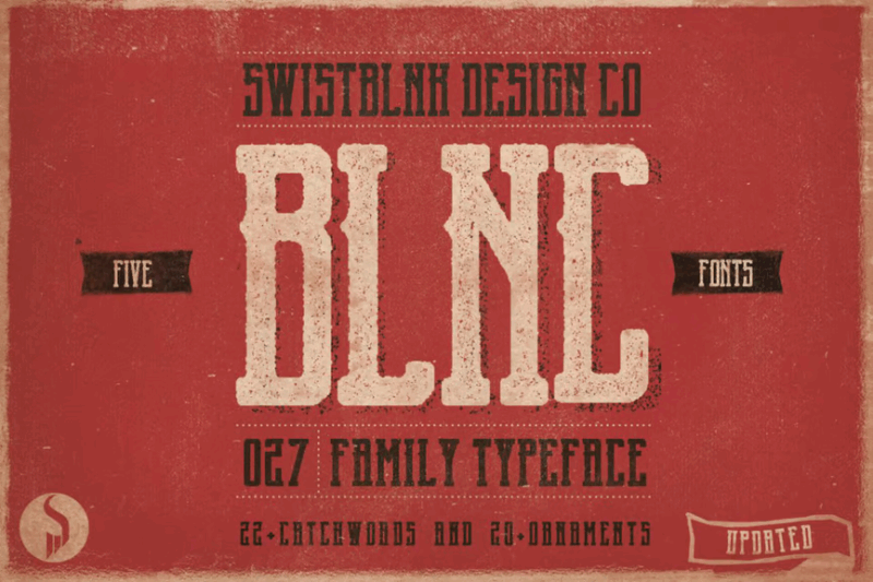
Blnc Family is a versatile typeface family including serif, decorative, and symbol styles. Its grunge-inspired texture and display-oriented design make it suitable for creating impactful headlines, posters, or any project requiring a bold, textured look.
Xaman Force
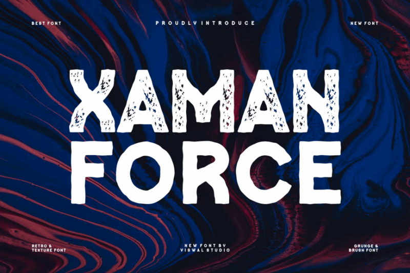
Xaman Force is a decorative brush font with a grungy, vintage aesthetic. Its rough texture and retro feel make it perfect for creating bold, eye-catching designs, especially for projects related to music, urban culture, or vintage-inspired themes.
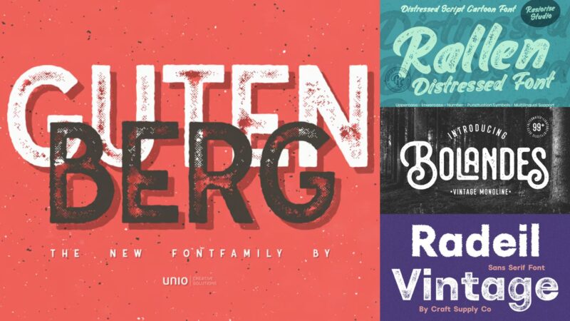
Gutenberg
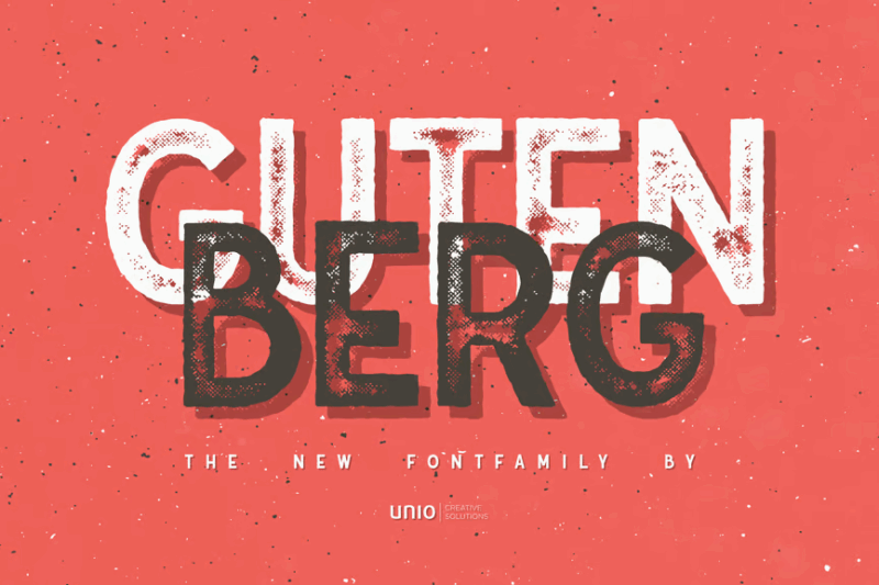
Gutenberg is a sans-serif font family inspired by traditional press printing. Its clean lines combined with a subtle texture make it versatile for both modern and vintage-inspired designs, suitable for editorial layouts, branding, or any project requiring a classic typographic feel.
Godger Vintage
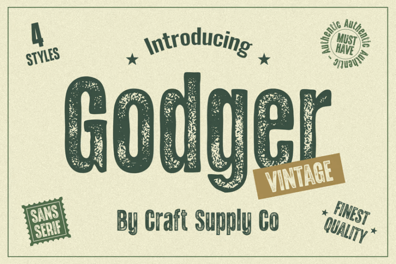
Godger Vintage is a sans-serif font with a vintage stamp-like appearance. Its weathered texture adds an authentic, aged look to designs, making it ideal for creating retro-inspired logos, packaging, or any project that aims to evoke a nostalgic feel.
The Northwest
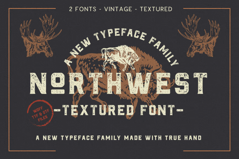
The Northwest is a comprehensive vintage-inspired type family including sans-serif, script, decorative, and serif styles. Its textured appearance and versatile range make it perfect for creating cohesive, authentic-looking designs for branding, packaging, or any project with a rustic, artisanal theme.
Disctactor
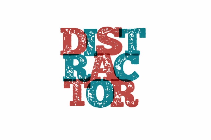
Disctactor is a serif font with a distressed, vintage aesthetic. Its worn appearance adds character to designs, making it suitable for creating aged-looking text in posters, branding, or any project that requires an authentic, timeworn feel.
Bolandes
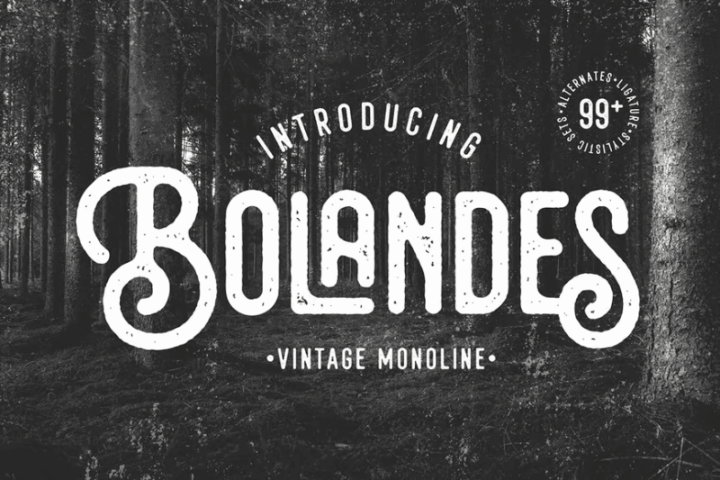
Bolandes is a vintage-inspired monoline sans-serif earthy font with a distressed texture. Its clean lines combined with a worn appearance make it versatile for creating both modern and retro-styled designs, perfect for logos, packaging, or any project requiring a balance of simplicity and vintage charm.
The Farmer Font
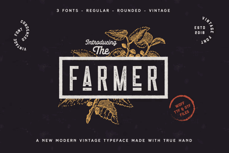
The Farmer Font is a condensed typeface family including sans-serif, serif, script, and decorative styles. Its textured appearance and versatile range make it ideal for creating cohesive, rustic designs for farm-to-table branding, artisanal products, or any project with a rural, handcrafted theme.
Ameda Vintage
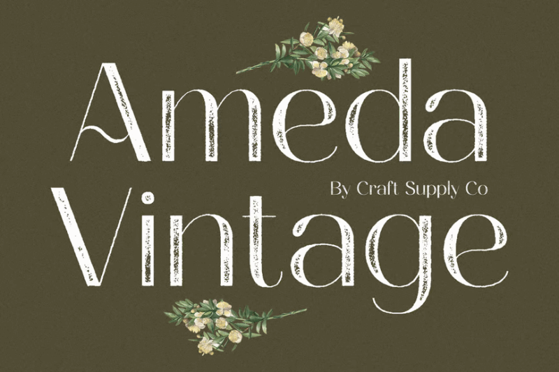
Ameda Vintage is a sans-serif font with a stamp-like, distressed appearance. Its worn texture adds an authentic, aged look to designs, making it perfect for creating vintage-inspired logos, packaging, or any project that aims to evoke a sense of nostalgia and craftsmanship.
Imprimo Letterpress Font
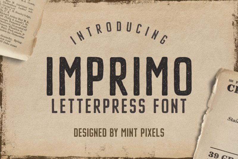
Imprimo is a sans-serif font designed to mimic the look of letterpress printing. Its subtle texture and impactful design make it ideal for creating eye-catching headlines, posters, or any project that requires a bold, classic typographic feel with a touch of vintage charm.
Yorksign
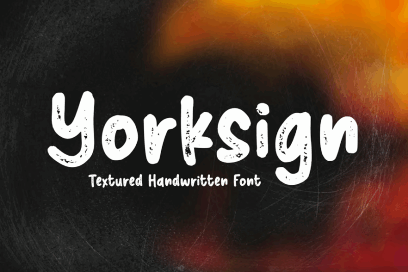
Yorksign is a textured script font with a handwritten aesthetic. Its rough texture adds an authentic, handcrafted feel to designs, making it perfect for creating signage-inspired graphics, artisanal branding, or any project that requires a personal, rustic touch.
Radeil Vintage
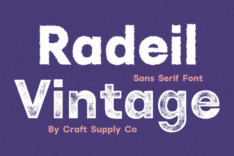
Radeil Vintage is a sans-serif font with a stamp-like, distressed appearance. Its worn texture adds an authentic, aged look to designs, making it ideal for creating vintage-inspired logos, packaging, or any project that aims to evoke a sense of nostalgia and timelessness.
Major Birch
![]()
Major Birch is a vintage-inspired serif font designed for logos and display purposes. Its classic character and subtle texture make it perfect for creating elegant, timeless designs, especially for branding projects that aim to convey a sense of heritage and quality.
Ouders
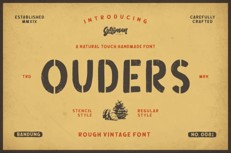
Ouders is a vintage stencil typeface with a distressed appearance. Its bold, cut-out design combined with a worn texture makes it ideal for creating impactful display graphics, especially for projects with an industrial, urban, or retro theme.
Rocking Rochoes
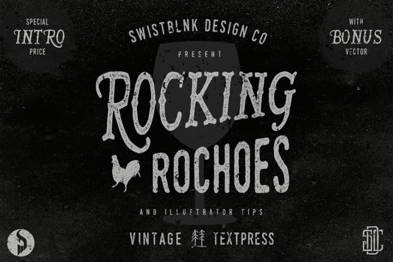
Rocking Rochoes is a decorative serif font with a handmade, vintage-inspired aesthetic. Its unique lettering style makes it perfect for creating eye-catching headlines, logos, or any design that requires a bold, retro-rock feel with a touch of nostalgia.
Boyers Vintage
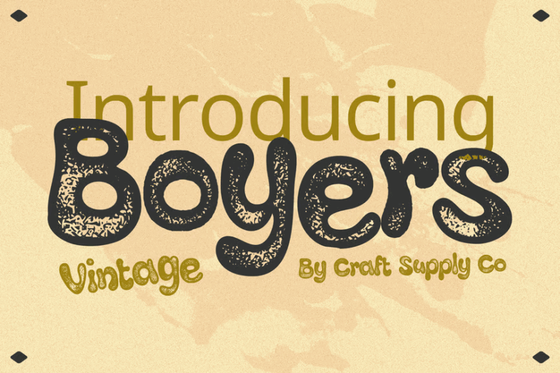
Boyers Vintage is a decorative font with a stamp-like, distressed appearance. Its worn texture adds an authentic, aged look to designs, making it ideal for creating vintage-inspired logos, packaging, or any project that aims to evoke a sense of history and craftsmanship.
Imagine Serif Font Vol.2
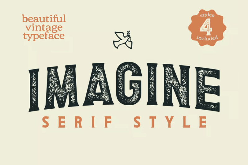
Imagine Serif Font Vol.2 is a bold, classic serif typeface. Its strong character and clean lines make it versatile for creating impactful headlines, elegant branding, or any design that requires a timeless, sophisticated typographic feel.
Destone
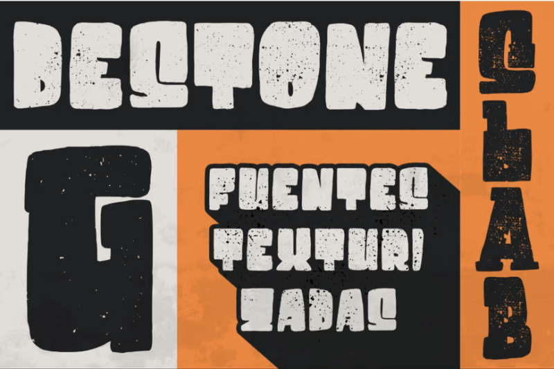
Destone is a bold, distressed sans-serif display font. Its rough texture and strong character make it perfect for creating eye-catching headlines, posters, or any design that needs to convey a powerful, gritty aesthetic with a touch of vintage charm.
Timber Press
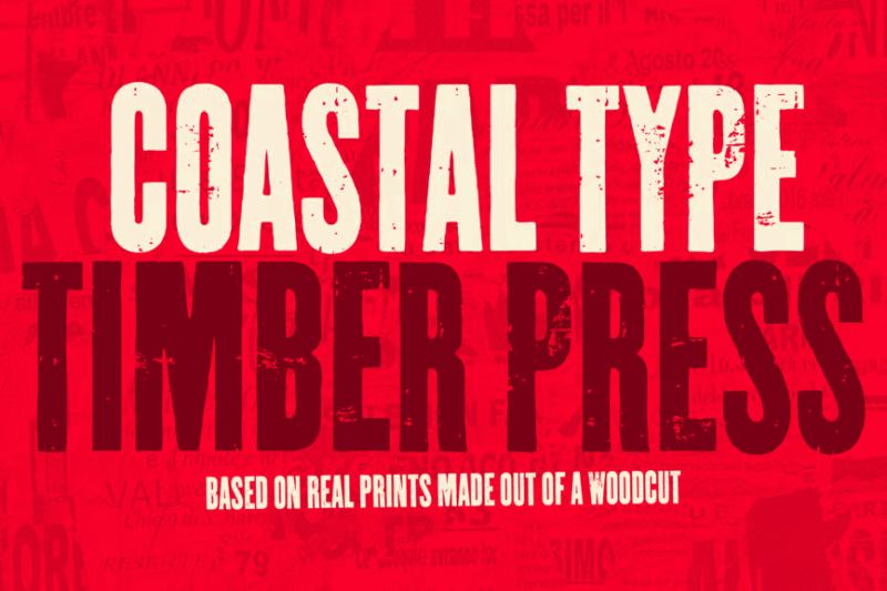
Timber Press is a rustic, rough sans-serif font. Its textured appearance adds an authentic, handcrafted feel to designs, making it ideal for creating nature-inspired graphics, outdoor-themed branding, or any project that requires a raw, organic aesthetic.
Riborn
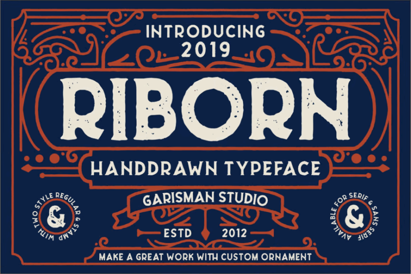
Riborn is a retro-inspired rough serif font. Its distressed texture and vintage character make it perfect for creating designs with a nostalgic feel, especially for projects related to classic Americana, vintage advertising, or any theme that requires an authentic, aged look.
Sunbeam
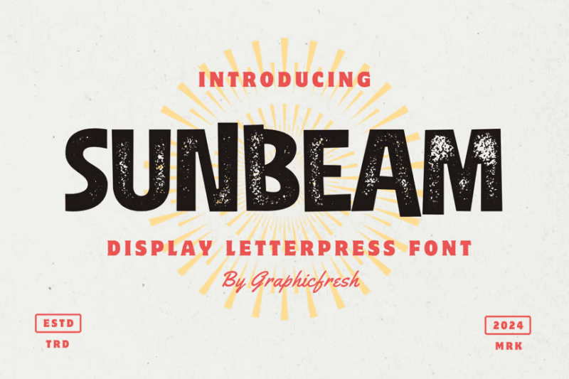
Sunbeam is a sans-serif display font designed to mimic letterpress printing with a sort of 50s midcentury vibe. Its texturized appearance adds depth and character to designs, making it ideal for creating eye-catching headlines, vintage-inspired posters, or any project that requires a bold, classic typographic feel with an authentic, printed look.
Forest Trophy
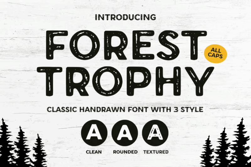
Forest Trophy is a classic textured sans-serif font with a vintage aesthetic. Its worn appearance adds an authentic, aged look to designs, making it perfect for creating outdoor-themed graphics, rustic branding, or any project that aims to evoke a sense of adventure and timelessness.
TypedeerMono
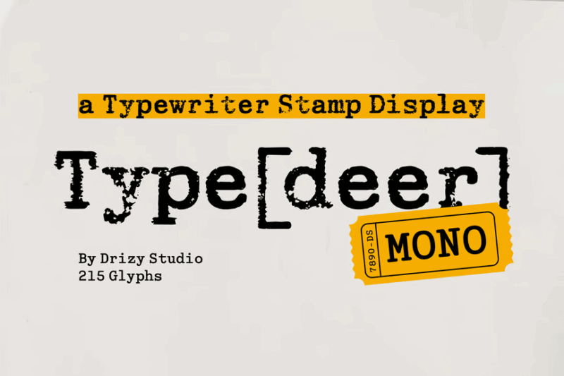
TypedeerMono is a typewriter-style font designed to mimic typewriter text with a stamp-like quality. Its distressed texture and monospaced design make it ideal for creating vintage-inspired designs, especially for projects related to writing, journalism, or any theme that requires an authentic, old-school typewritten look.
Rolebrush
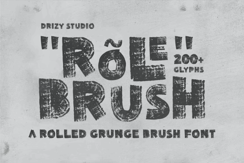
Rolebrush is a rolled grunge brush script font. Its rough, textured appearance adds an authentic, handmade feel to designs, making it perfect for creating bold, expressive graphics, especially for projects related to street art, urban culture, or any theme that requires a raw, energetic aesthetic. You could also use one of these spray-paint fonts.
Cowboy Outlaw
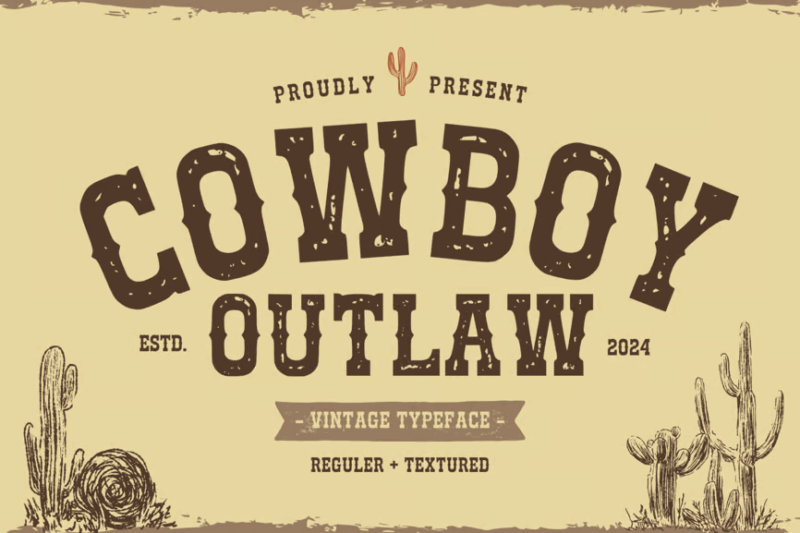
Cowboy Outlaw is a western-inspired serif font with a textured appearance. Its rugged character and vintage feel make it ideal for creating designs with a Wild West theme, especially for projects related to country music, rodeos, or any theme that requires an authentic, frontier-style aesthetic.
Gadion Vintage
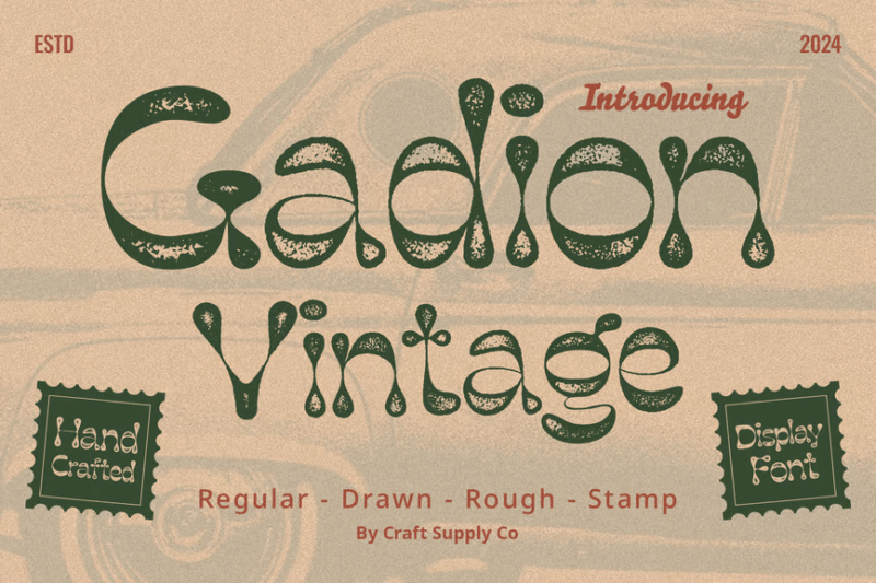
Gadion Vintage is a decorative font with a stamp-like, distressed appearance. Its worn texture adds an authentic, aged look to designs, making it perfect for creating vintage-inspired logos, packaging, or any project that aims to evoke a sense of nostalgia and craftsmanship.
Matrole
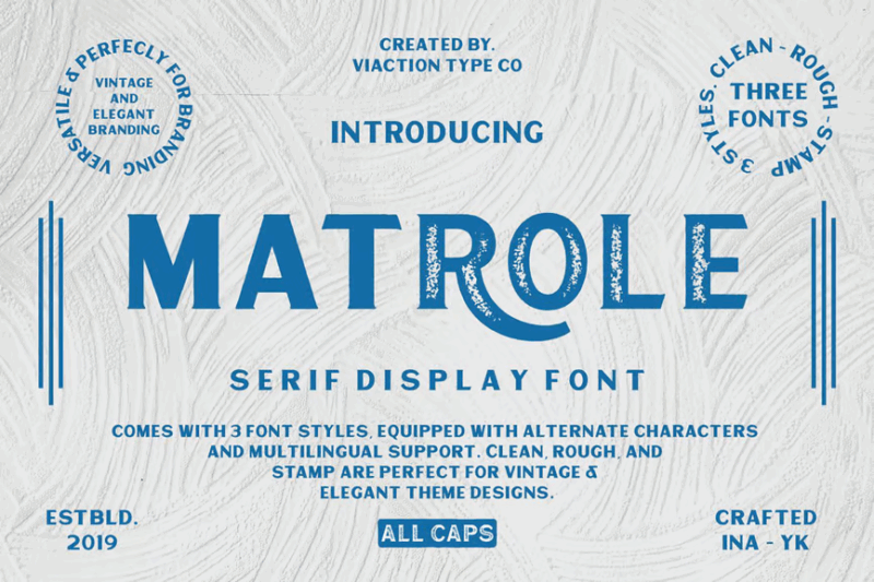
Matrole is a vintage-inspired serif font with a decorative flair. Its classic character and subtle texture make it ideal for creating elegant, timeless designs, especially for branding projects or badge designs that aim to convey a sense of heritage and quality.
Tamaki-Pro
Tamaki-Pro is a vintage-inspired font combining script and decorative styles with a distressed appearance. Its worn texture and versatile design make it perfect for creating authentic-looking retro designs, especially for projects that require a balance of elegance and aged charm.
Rushen
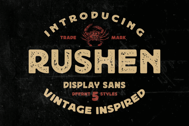
Rushen is a vintage-inspired sans-serif font with a grunge aesthetic. Its weathered appearance adds texture and character to designs, making it ideal for creating retro-styled graphics, urban-themed projects, or any design that requires a raw, worn look with a touch of nostalgia.
What Makes a Font Truly “Distressed”?
Distressed fonts get their unique character from several key characteristics that work together to create that weathered, time-worn appearance:
Irregular Edges
The hallmark of any great distressed font is its irregular, eroded edges. Unlike clean digital typography, distressed fonts feature roughened contours that mimic the effects of natural wear and tear. Think of letterforms that have been weathered by sand, wind, time, or physical handling.
Natural Texture
High-quality distressed fonts incorporate textures that feel natural rather than manufactured. The best distressed typefaces feature grit, scratches, and imperfections that mimic real-world surfaces like aged wood, rusted metal, cracked paint, or worn stone.
Inconsistent Ink Distribution
Many distressed fonts simulate the imperfect application of ink – spots where ink might have pooled or faded as if printed on an old letterpress. This variable ink density creates “gaps” or lighter patches within letterforms that add to their vintage appeal.
Authentic Damage Patterns
The most convincing distressed fonts feature damage patterns that make logical sense. Edges that would naturally receive more wear in the real world show more distressing. The erosion follows the natural physics of how objects actually age and deteriorate.
These elements working together is what makes a distressed font feel authentic rather than simply “dirty.” The best distressed typefaces tell a story through their imperfections, giving designs an instant sense of history and lived experience.
Where Can You Use Distressed Fonts?
Now that we understand what makes distressed fonts tick, where can we actually use them in designs? Their weathered aesthetic makes them particularly well-suited for:
Branding
Distressed fonts are fantastic for brands wanting to convey authenticity, heritage, craftsmanship, or a touch of rebellion. Think craft breweries, coffee roasters, barbershops, tattoo studios, vintage clothing stores, motorcycle shops, and artisanal food products.
Any brand seeking to communicate a handmade, time-tested quality or counter-culture edge can benefit from the right distressed font in their visual identity. The worn imperfections signal that a brand has stories to tell.
Packaging
On packaging, distressed fonts signal products with authentic ingredients, traditional methods, or artisanal production. They’re particularly effective for products marketed as small-batch, handcrafted, or premium.
The tactile quality of distressed typography creates a sensory expectation before customers even interact with the product itself – suggesting craftsmanship and attention to detail.
Apparel and Merchandise
Distressed fonts shine on t-shirts, hats, posters, and other merchandise where they can convey vintage appeal, rock-and-roll attitude, or outdoor adventure vibes. They make designs feel lived-in and authentic.
For band merchandise, sports teams with rich histories, or lifestyle brands connected to outdoor activities, distressed fonts create an instant sense of belonging and identity.
Environmental Design
For restaurant signage, wall graphics, or environmental branding, distressed fonts help spaces feel established and authentic rather than newly fabricated. They add character to interiors looking to convey history or a specific ambiance.
Digital Design
While primarily associated with physical applications, distressed fonts can also work beautifully in digital environments seeking to break away from the clean, minimal aesthetics that dominate many interfaces. They add unexpected texture that stands out in an increasingly homogenized digital landscape.
Where to Avoid Distressed Fonts
While fantastic for many applications, there are certain contexts where distressed fonts make poor choices. Namely in situations requiring:
Ultimate Legibility
For body copy, especially at small sizes, heavily distressed fonts can significantly impair readability. The very textures and irregularities that make them visually interesting can tire eyes during extended reading.
In these cases, save the distressed fonts for headlines or display text, and pair with clean, legible fonts for longer passages.
Clinical Precision
For medical, pharmaceutical, financial, or legal contexts, distressed fonts may send unintended signals about precision and professionalism. These fields typically benefit from clean, precise typography that reflects accuracy and attention to detail.
Modern Tech
Brands positioning themselves as cutting-edge technology leaders often clash with the inherently vintage aesthetic of distressed typography. The weathered look may unintentionally suggest outdated technology rather than innovation.
Luxury Elegance
High-end luxury brands typically avoid heavily distressed fonts in favor of crisp, refined typography that communicates precision and sophistication. The roughness of distressed fonts often contradicts the polished elegance of luxury positioning.
So while lively and characterful for scores of uses, thoughtfully evaluate context when deciding if a distressed font makes sense. Their inherent roughness may undermine messaging in contexts requiring immaculate precision or contemporary elegance.
How to Pick the Perfect Distressed Font
To choose an excellent distressed font that matches your needs, first consider:
Level of Distressing
Distressed fonts exist on a spectrum from lightly textured to heavily eroded. Consider how much weathering is appropriate for your project. Subtle distressing might be perfect for a premium whiskey label, while heavy erosion works for a hardcore band’s poster.
Look at each character in the font. Does the distressing maintain legibility at your intended size? Can you still recognize each letterform clearly despite the weathering?
Distressing Style
Different distressed fonts simulate different types of wear. Some mimic peeling paint, others resemble rust, woodgrain, or chalk. Choose a distressing pattern that makes sense for your brand story and medium.
A font distressed to look like cracked concrete makes perfect sense for a skateboard company but might feel disconnected for a seaside restaurant (where a weathered driftwood texture would be more appropriate).
Historical Context
Many distressed fonts are based on historical lettering styles – from Western woodtype to industrial stencils to mid-century signpainting. Consider whether the historical period suggested by the font’s structure (separate from its distressing) aligns with your brand story.
Versatility
Will you need to use this font across multiple applications? Some distressed fonts look amazing as large headlines but become illegible at smaller sizes. Consider fonts with multiple weights or distressing levels for maximum versatility.
Ideally, look for distressed font families that include both clean and weathered versions of the same typeface. This allows for consistent branding while adapting to different contexts.
Pairing Distressed Fonts
Effectively pairing distressed fonts with complementary typefaces is crucial for creating balanced designs:
Clean Sans-Serifs
The most common and effective pairing for distressed display fonts is a clean, simple sans-serif for body text. The contrast between weathered headlines and crisp supporting text creates perfect balance – the distressed font adds character while the sans-serif ensures readability.
Consider neutral workhorses like Helvetica Neue, Open Sans, or Montserrat as perfect complements to more expressive distressed fonts.
Vintage-Inspired Serifs
For designs fully embracing a heritage aesthetic, consider pairing distressed display fonts with vintage-inspired serifs. Typefaces like Clarendon, Century Schoolbook, or Georgia provide historical continuity while maintaining readability.
Handwritten Scripts
For brands going all-in on authentic, handmade appeal, a simple handwritten script can complement distressed block lettering. This combination feels personal and artisanal – perfect for products emphasizing craftsmanship.
Just ensure the script is relatively simple and doesn’t compete with the texture of your distressed font.
Contrast is Key
Whatever you pair with your distressed font, ensure there’s sufficient contrast in weight, style, and texture. If your headline font is heavily distressed, your supporting typography should be clean and clear to create visual hierarchy and ensure information remains accessible.
DIY: Creating Your Own Custom Distressed Effects
Sometimes, you need a distressed look that’s completely unique to your project. Here are some approaches to creating custom distressed effects:
Analog Methods
For truly authentic distressing, consider analog techniques. Print your text on paper, then physically distress it through photocopying, folding, wetting, sanding, or other tactile processes before scanning it back in.
These real-world imperfections capture nuances that digital filters often miss.
Texture Overlays
In graphic software, try overlaying real texture photographs onto your typography. Images of concrete, wood grain, peeling paint, or rusted metal can be mapped to text using blend modes like Multiply, Screen, or Overlay.
Experiment with opacity settings to find the perfect balance between texture and legibility.
Digital Brushes
Many design programs offer brush libraries specifically created for distressing. These allow you to selectively erode parts of your letters with natural-looking patterns that mimic real-world wear.
Layer Blending
Try creating multiple versions of your text – one clean, one heavily distressed – and blend between them using layer masks. This gives you precise control over exactly how much distressing appears in different parts of each character.
The key to convincing DIY distressing is randomness and irregularity. Avoid perfectly repeating patterns or too-uniform erosion, as these immediately signal digital manipulation rather than authentic wear.
The Psychology Behind Distressed Typography
There’s fascinating psychology behind why distressed fonts resonate so strongly with viewers:
Perceived Authenticity
In an age of digital perfection, imperfections signal human involvement and authenticity. Distressed fonts tap into our desire for things that feel real, handmade, and genuine. They suggest history and experience rather than mass production.
Emotional Connection
Weathered typography creates immediate emotional resonance. The visible “age” of distressed fonts triggers nostalgic connections and suggests stories waiting to be told. Brands can leverage this emotional shorthand to create instant connections with audiences.
Counter-Cultural Signaling
The roughness of distressed fonts has long been associated with rebellion, independence, and alternative subcultures – from punk rock to skateboarding to craft movements. For brands wanting to position themselves outside mainstream commercial culture, distressed fonts signal those counter-cultural values.
Craftsmanship Cues
The imperfections in distressed fonts mirror the natural variations found in handcrafted goods. This creates a subconscious association with artisanal quality and attention to detail – suggesting care and individual attention rather than mass production.
Understanding these psychological triggers helps designers deploy distressed fonts strategically, using their inherent emotional qualities to support specific brand positioning and messaging.
Conclusion: The Enduring Appeal of Distressed Fonts
As we’ve explored, distressed fonts offer designers a powerful tool for injecting authenticity, character, and emotional resonance into their work. In a world increasingly dominated by digital perfection, these intentionally imperfect typefaces provide a welcome counterbalance – reminding viewers of the beauty in weathering, aging, and the marks left by time.
The best distressed fonts aren’t simply “dirty” – they tell stories through their patterns of wear, suggesting histories and experiences that clean typography simply cannot convey. Whether you’re designing for a craft brewery, a motorcycle brand, or a rustic restaurant, the right distressed font can immediately communicate values of authenticity, heritage, and craftsmanship.
As with any powerful design tool, the key lies in thoughtful application. Consider context, ensure legibility, create meaningful contrast, and choose distressing patterns that support your brand narrative.
When used with intention and care, distressed typography will continue to be one of the most effective ways to create designs that don’t just communicate information, but resonate emotionally and feel authentically human.
What are your favorite distressed fonts? Have you created custom distressed effects for any recent projects? Let me know in the comments!