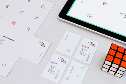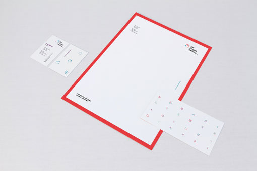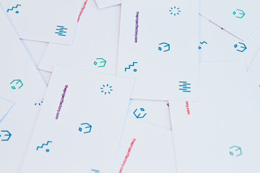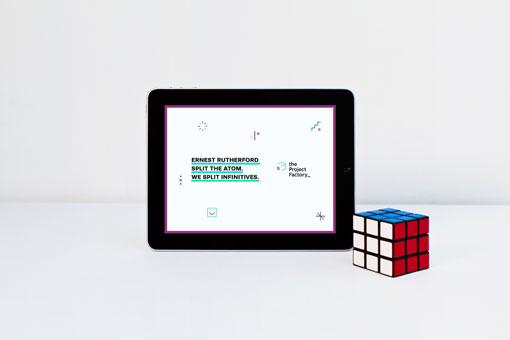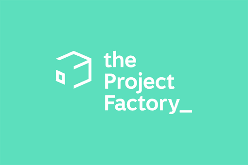
Berlin-based studio Dittmar developed this colorful identity for The Project Factory, a digital production company:
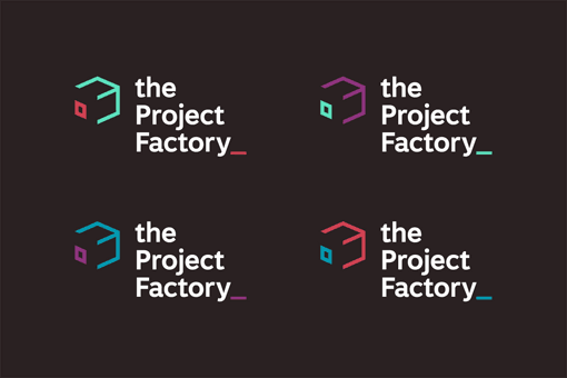
The new brand is inspired by a rubix cube, introduced to reflect the communication and connections that the company has to offer, as well as alluding to a basic iteration of anything digital; the pixel.
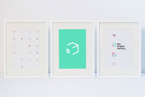
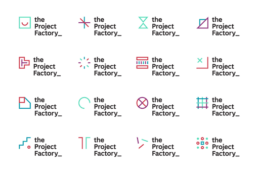
Included in the brand upgrade was an asset suite comprising of 24 symbols. The symbols act as a metaphor for the cogs of the factory turning, and are utilised across the collateral in a variety of ways to give a point of difference.
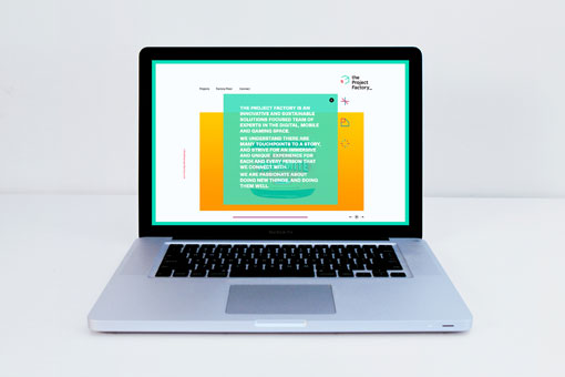
A kinetic nature was brought into the fold, giving flexibility to applications across an online and digital context.

Get 300+ Fonts for FREE
Enter your email to download our 100% free "Font Lover's Bundle". For commercial & personal use. No royalties. No fees. No attribution. 100% free to use anywhere.