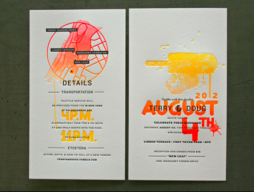
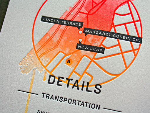
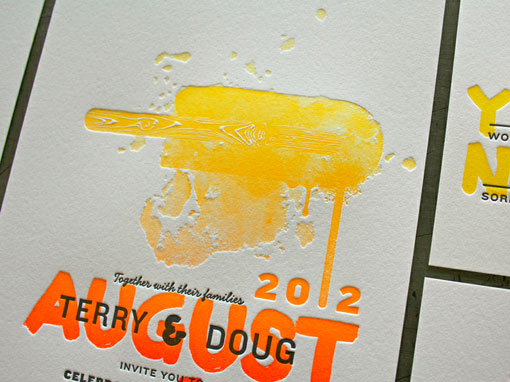
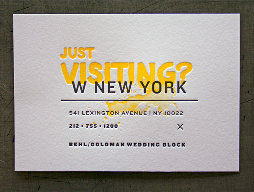
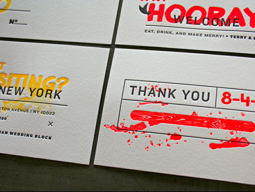
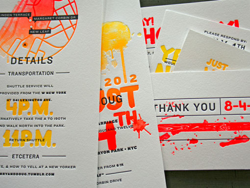
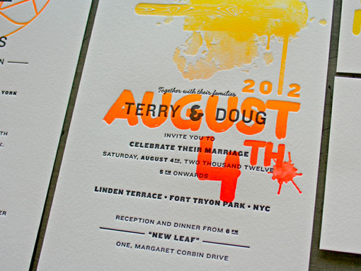
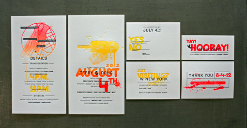
I’d have to agree with the folks at Studio on Fire that Douglas Behl’s wedding invitations “ooze summer.” The split fountain printing—which means two colors were used on the same roller to create a gradient effect (see a video here)— works especially well in this design. And I love all the layering of graphics and type. Awesome work.

Get 300+ Fonts for FREE
Enter your email to download our 100% free "Font Lover's Bundle". For commercial & personal use. No royalties. No fees. No attribution. 100% free to use anywhere.
via Beast Pieces
