While we look at our monitors more often than not as digital creatives, it’s important for us to stop, put on pants occasionally, sniff the flowers, try on some fresh new kicks, drink copious amounts of coffee, and get the best pickles we’ve ever tasted. And in our hood, it’s fairly easy to do. Let’s take a tour and find some inspiration to share.
Revolver
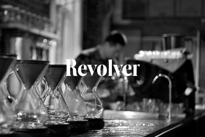
Our first stop is Revolver. Coffee is very important to us, an obsession really, and Revolver is the kind of never-have-seats place that takes the beans seriously. It’s the kind of place that plays records, has a small selection of pastries, and then coffee. The attention to detail extends the experience from the small shop to the artfully cool black and white website which prides itself on a detailed listing of brewing equipment, naturally. But for fuel and a bit of inspiration, this is a good stop morning or afternoon. Of course, there’s another upstart coffee shop across the street from us, Timbertrain, is equally hip, and in a Star Trek quote on the website kind of way.
Old Faithful Shop
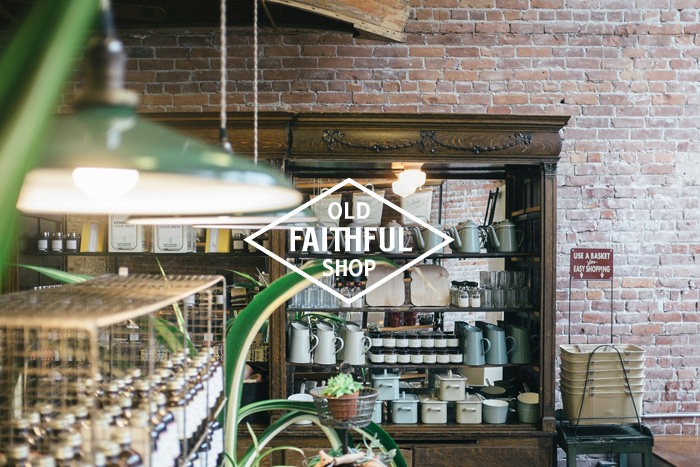
Old Faithful Shop is just down our staircase. Let’s be very clear, this is a dangerous place to have so close. Let’s just say Christmas shopping made Visa very, very, happy this year. Like our office and Revolver, brick is a dominant theme—Old Faithful Shop features a complex mix of artfully collected items from around the world for the home and kitchen harkening back to a slower, simpler time. At times you’re not even sure why you might need some of these products, except you just have to have them.
When you come into Old Faithful Shop you’ll find a considered selection of quality goods for everyday living,” founder Walter Manning told Booooooom. “Our store is housed in a 100 year old building and we tried to stay as true to that as possible and interpret the character of the space as it might of appeared when it was first built.We like to imagine our store as in existence in Gastown over a 100 years ago after the completion of the railway. Old Faithful Shop is a store for the senses. Our products are meant to be touched and examined, great music is always playing and the place smells amazing (a combination of balsam fir incense and a selection of rare perfumes.)
The website does a really good job of recreating that style and selection online and creating a finely tuned narrative. And then there are things you can’t get enough of, like the life-changing pickles they carry, McClure’s from Brooklyn—turning any afternoon trip downstairs into an inspired walkabout in branding, packaging, and cool stuff.

Get 300+ Fonts for FREE
Enter your email to download our 100% free "Font Lover's Bundle". For commercial & personal use. No royalties. No fees. No attribution. 100% free to use anywhere.
Meat & Bread
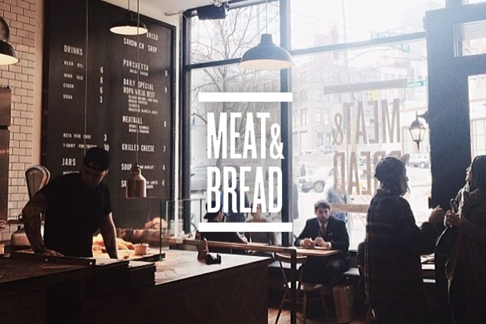
Thankfully we also have insane pork sandwiches nearby. Meat & Bread is just that. A deceptively simple and well-branded sandwich shop that gives guests a selection of permanent and rotating primarily meat based sandwiches (including the infamous Porchetta featured on Diners Drive ins and Dives) along with a daily salad and soup. It’s ridiculously simple, but the line starts around 11:50 every day. The website is just as simple, featuring only what is needed. Nothing more, nothing less than a great display of their branding, shop, and food.
Rowan Sky
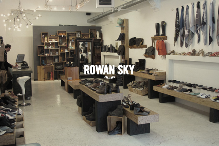
In the other direction down the stairs is the always-tempting Rowan Sky. Do you know how hard it is to work above a store that specializes in a hand-picked selection of great shoes? We imagine it’s much like a heroin addict living above the dealer, convenient as hell, but frustratingly expensive. The shop carries the Pound & Grain standard issue Onitsuka Tigers worn like a uniform, by both Graham and our partner Sandy Fleischer. What the website and the store do is just keep everything very simple. “It’s the shoes, stupid” to modify the powerful political adage of the 1990’s coined by Clinton Campaign Manager James Carville.
Brassica & Co.
And finally you could imagine our surprise last week when a shopfront that had been empty for many months suddenly had a coming soon sign on it. Brassica & Co. goes beyond the general store and the hipster coffee aesthetic and is making everything out of everyone’s favourite superfood, kale.
Our initial reaction was, “you’ve got to be kidding. You’ve gone too far this time, Gastown!” The shades of green branding, hipster rainbows of effortless cool, and impeccably designed, it’s not easy being green, products were, sadly, just figments of our agency’s imagination. But it seemed about right in Gastown, just not on April 1st.
The branding, website, kale bouquets we send to a few influencers and fictional products just seemed too rich a target. So you can read how this played out on Vancouver’s weekly, The Georgia Straight. Of course, now the people actually want it for real, or at the very least a pop-up shop. Kickstarter shop anyone?
