In this article:
- 24 Perfect Alternatives to the Impact Font
- Things to Consider When Choosing an Impact Alternative
- Why Use Impact’s Alternatives?
- How to Use Impact-Like Fonts Effectively?
- Impact—A Brief History
- What Really Made Impact Famous?
- Frequently Asked Questions
- Summing it up
The Impact font – bold, attention-grabbing, and synonymous with internet memes. But what if you’re looking for something similar, yet fresh?
For designers and marketers seeking fonts like Impact, you’ve come to the right place. We’ll explore Impact’s history and what made it famous, and introduce you to a variety of alternatives that pack a similar punch.
From premium to free options, we’ll cover fonts that can make just as strong an impression as Impact. Ready to discover typefaces that can elevate your headlines, branding, and attention-grabbing projects? Let’s dive in.
24 Perfect Alternatives to the Impact Font
There are literally a large number of alternatives to Impact but I have prepared a list of premium as well as free fonts which can replace Impact. Enjoy!
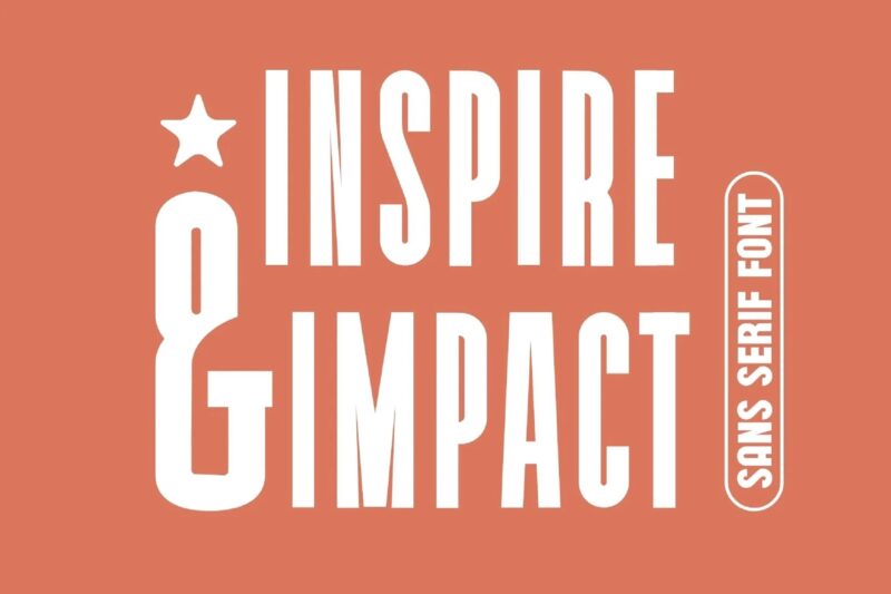
Inspire Impact
Inspire Impact is a modern sans-serif font that combines minimalism with bold design. Its clean lines and striking appearance make it ideal for logos, branding, and high-impact visuals. The font includes standard glyphs and international accents, ensuring versatility across various design projects.
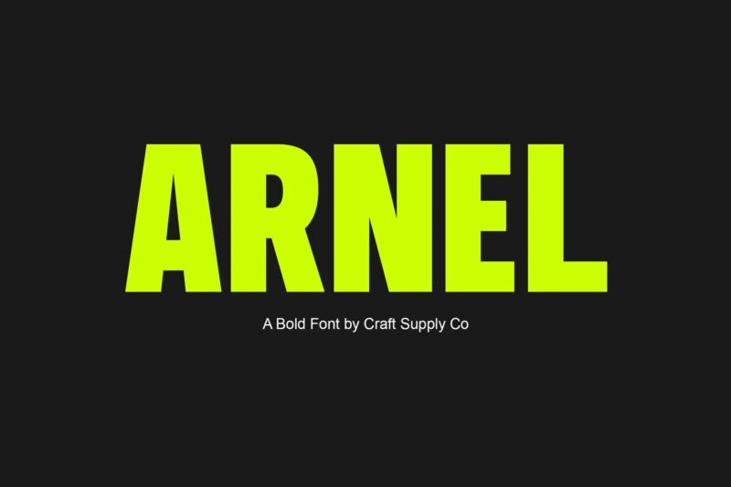
Arnel – Bold Sans Serif

Get 300+ Fonts for FREE
Enter your email to download our 100% free "Font Lover's Bundle". For commercial & personal use. No royalties. No fees. No attribution. 100% free to use anywhere.
Arnel is a bold sans-serif font that exudes masculinity and strength. Designed as a captivating display typeface, it demands attention with its robust characters. Arnel’s commanding presence makes it an excellent choice for headlines, branding, and impactful visual communication across various media, from advertising to marketing materials.
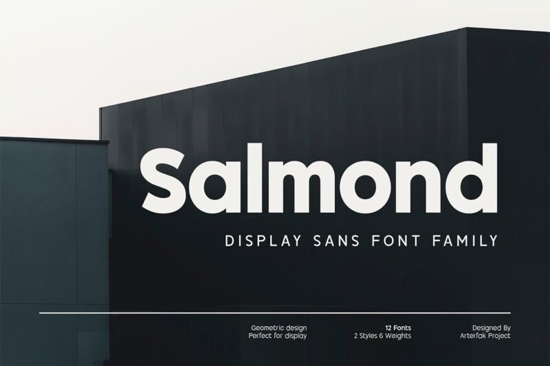
Salmond
Salmond is a geometric sans-serif font that offers a perfect blend of modern design and minimalist charm. With six weights ranging from Light to Bold and matching oblique styles, it provides excellent versatility for various design needs, particularly in display typography, branding, and editorial work.
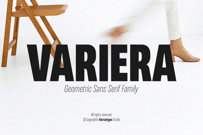
Variera
Variera is a semi-condensed sans-serif typeface that combines geometric forms with a unique personality. It features nine weights with matching italics, making it highly versatile for display purposes. The font’s balance of emotion and usability allows designers to create captivating and distinctive designs across various applications.
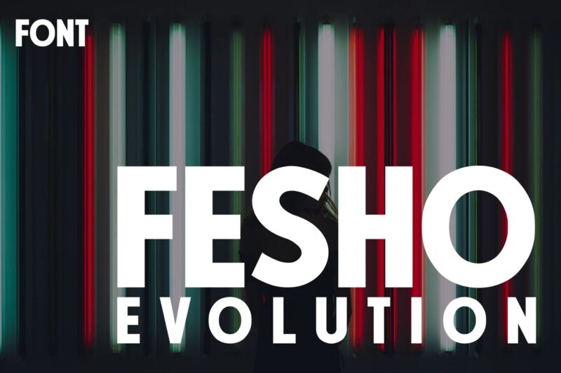
Fesho Evolution
Fesho Evolution is a bold and impactful font designed to make a statement. Its sturdy letterforms and powerful presence make it perfect for posters, billboards, and other large-format designs where visibility and impact are crucial. Available in both OTF and TTF formats, it’s a versatile choice for designers seeking to create eye-catching visuals.
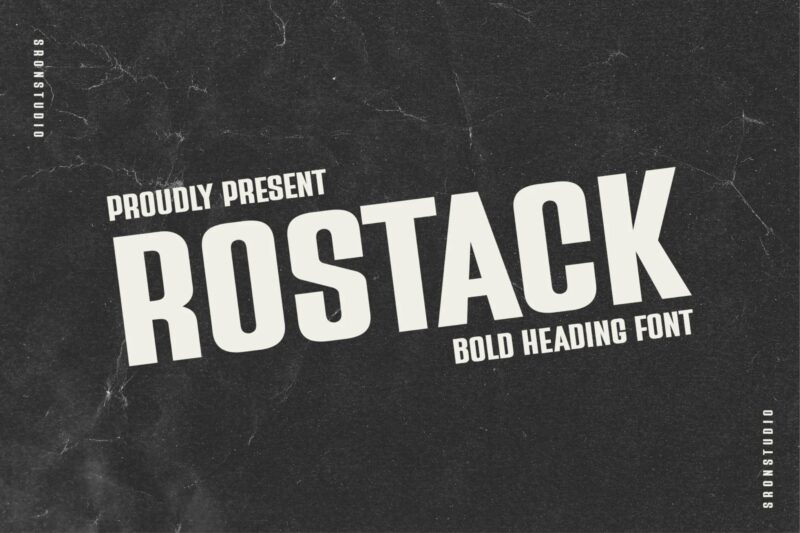
Rostack – Bold Heading Font
Rostack is a bold, condensed font that commands attention with its strong strokes and compact letterforms. Ideal for headlines, titles, and designs requiring a bold, condensed style, it offers a modern and sophisticated look. The font supports multiple file formats and includes features like multilingual support and PUA encoding for enhanced usability.
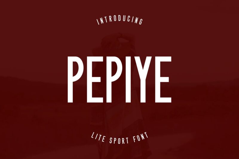
PEPIYE Font
PEPIYE Font, also known as Sports Aura Font, is a sleek and functional typeface designed specifically for sports-themed content. Its unique curves and lines capture the dynamic essence of sporting events, making it perfect for athletics-centric materials. The font’s ability to pair well with bold primary fonts enhances its versatility in creating impactful sports-related designs.
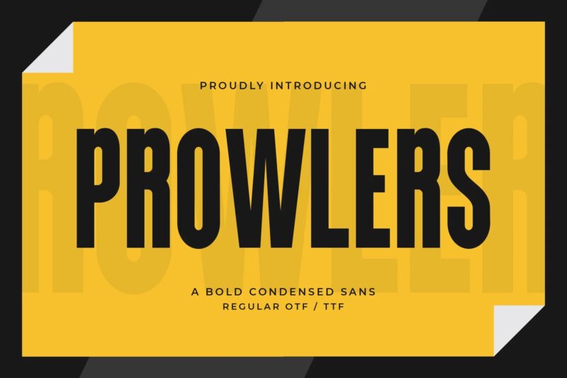
Prowlers – A Bold Condensed Sans
Prowlers is a bold condensed sans-serif font that exudes strength and impact. Its commanding and compact letterforms make it ideal for attention-grabbing headlines, striking logos, and modern posters. The font’s versatility shines in urban graphics, edgy branding, and impactful signage, offering designers a powerful tool to create captivating visual designs.
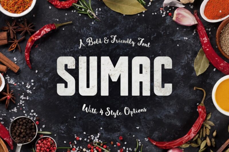
Sumac Typeface
Sumac is a bold and friendly typeface designed for maximum impact in titles, book covers, and posters. With its four distinct styles and support for uppercase multilingual letters, numbers, and punctuation, Sumac offers designers a versatile tool for creating eye-catching headlines and impactful visual designs across various mediums.
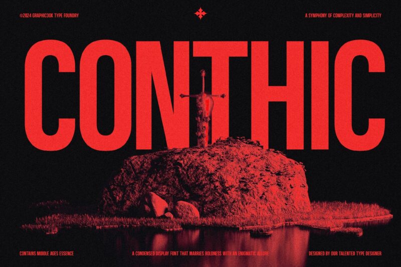
Conthic
Conthic is a striking Gothic Condensed typeface that combines a powerful presence with a touch of grunge style. Its condensed form and bold character make it perfect for creating impactful designs in various contexts, from headlines and logotypes to movie posters and album covers. The font’s versatility and eye-catching nature ensure it stands out in any design project.
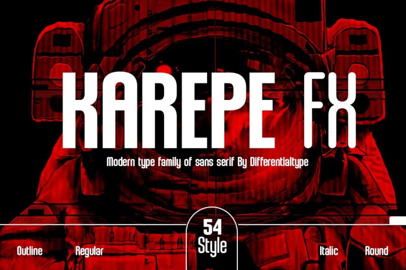
Karepe FX
Karepe FX is a powerful sans-serif font family that offers impressive versatility with its 54 styles, including regular, rounded, and outline options. Its bold weight and clean lines make it ideal for creating high-impact designs across various mediums. With features like PUA encoding and multilingual support, Karepe FX provides designers with a comprehensive toolset for crafting striking visuals.
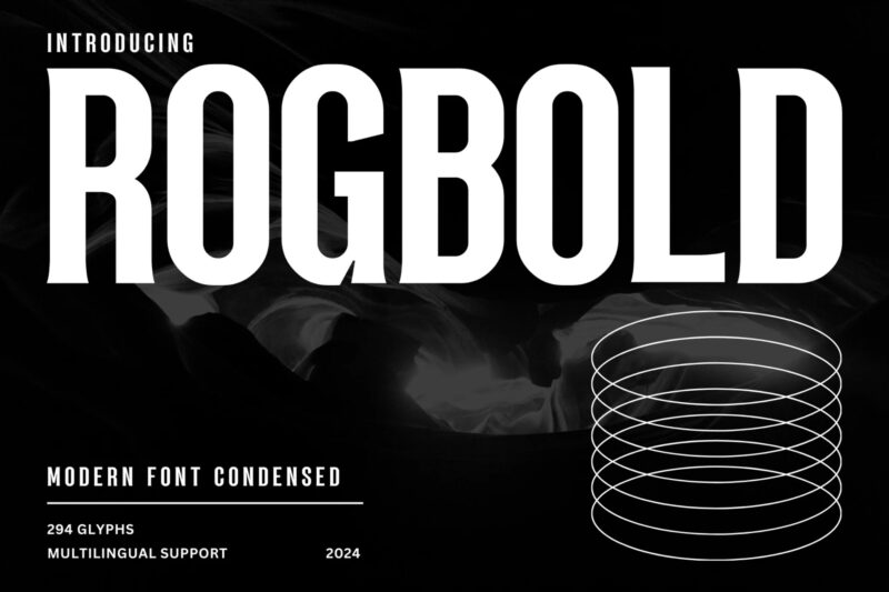
Rogbold – Tall Font
Rogbold is a modern condensed font that combines sleekness with versatility. Its clean lines and compact design make it perfect for creating bold statements in various design projects. Whether used for headlines, posters, or branding materials, Rogbold commands attention with its contemporary aesthetic and efficient form.
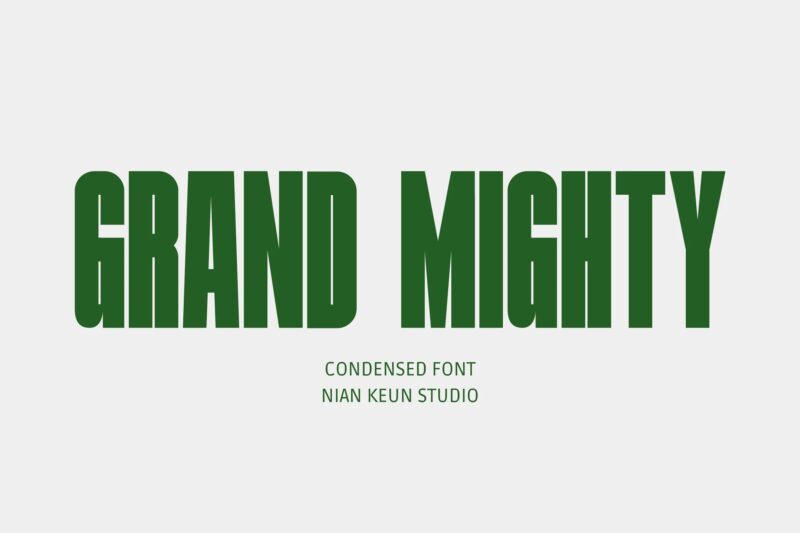
Grand Mighty – Condensed Font
Grand Mighty is a display font that masterfully blends clean, modern elements with a condensed design. Its sharp angles and smooth lines create a visually appealing balance, making it suitable for various design needs. This font excels in projects requiring a bold and clean look, such as logo design, promotional materials, and impactful headlines.
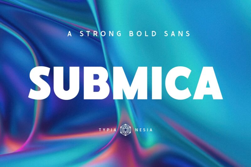
Submica – Strong Bold Sans
Submica is a strong, bold sans-serif typeface that embodies confidence and modernity. Its versatile design makes it suitable for various applications, from corporate branding and marketing materials to website design and fashion branding. With features like ligatures, Submica offers designers a sophisticated tool for creating impactful typography across different media.
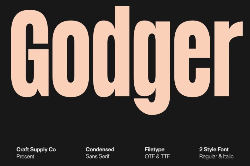
Godger – Condensed Sans Serif
Godger is a bold, condensed sans-serif font that redefines strength in typography. Its masculine and commanding presence makes it ideal for titles and branding that require a powerful touch. With regular and italic styles, plus support for multiple languages, Godger offers versatility for designers seeking to make a strong visual statement in their projects.
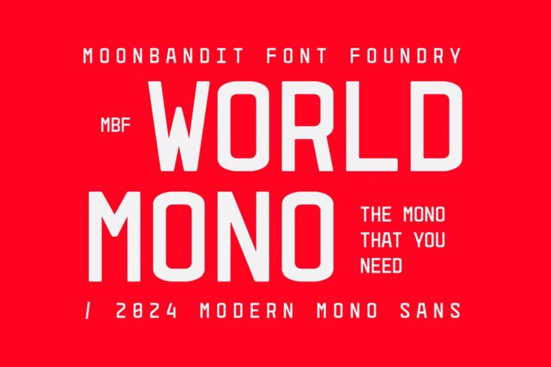
MBF World Mono
MBF World Mono is a powerful monospace font designed for bold and impactful projects. Its modern aesthetic and clean lines make it perfect for creating stunning posters, captivating displays, and cutting-edge designs. Available in OTF, TTF, and WOFF formats, this font provides designers with a versatile tool for high-impact visual communication.
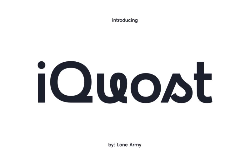
Iquost
Iquost is a unique font that blends modern sans-serif elements with playful script features. Its clean lines and soft curves create a perfect balance between professionalism and whimsy. This versatile typeface is suitable for various design needs, allowing designers to deliver messages with both style and impact across different mediums.
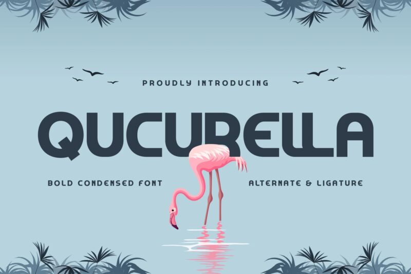
Qucurella – Bold Condensed Font
Qucurella is a bold condensed font that commands attention with its strong and compact letterforms. It strikes a perfect balance between boldness and readability, making it ideal for eye-catching headlines, powerful logos, and modern posters. With support for multiple languages and file formats, Qucurella offers designers a versatile tool for creating impactful designs across various projects.
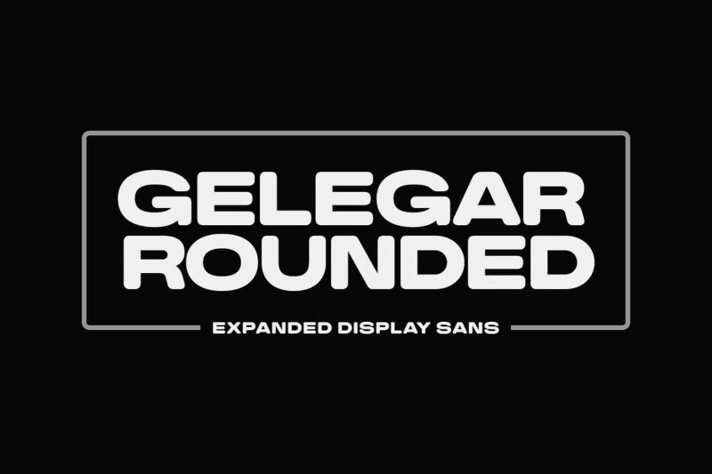
Gelegar Rounded
Gelegar Rounded is part of the Gelegar font family, featuring an ultra-wide display sans serif design. This rounded version offers a softer take on the bold, expansive style of Gelegar. Ideal for creating commanding visual and emotional impact, it’s perfect for posters, social media posts, headlines, and large-format prints that demand attention and amplify messages.
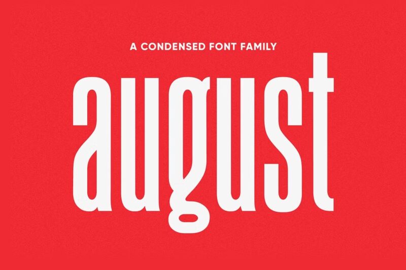
August Typeface
August is a powerful and beautiful condensed sans serif display typeface that plays with extremes. It combines charming curves with satisfying patterns, offering a fresh take on traditional condensed fonts. With four styles including bold, bold italic, thin, and thin italic, August is designed for high-impact typography while maintaining style and legibility, making it perfect for posters, headlines, and bold branding projects.
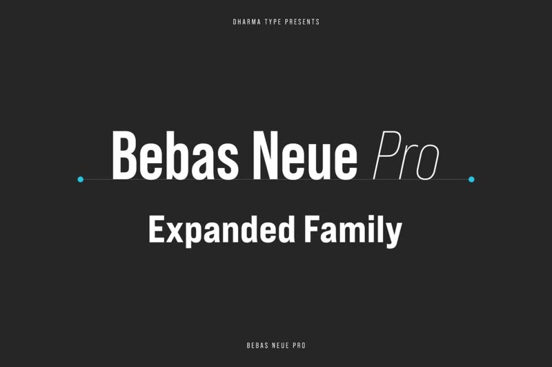
Bebas Neue Pro – Exp Family
Bebas Neue Pro Expanded is part of the versatile Bebas Neue Pro family. This expanded width version offers a bold, attention-grabbing presence while maintaining the clean, modern aesthetic of the original. With multiple weights and matching italics, it provides designers with a comprehensive toolset for creating impactful typography across various design applications, from branding to editorial layouts.
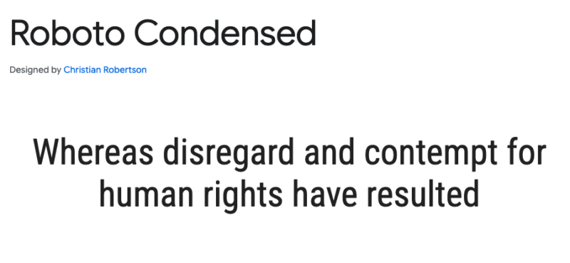
Roboto Condensed
Roboto Condensed is a space-efficient variant of the popular Roboto family. It maintains the mechanical skeleton and largely geometric forms of its parent font while offering a more compact design. This condensed version preserves the natural width of letters, resulting in a comfortable reading rhythm. As of August 2023, it’s available as a variable font, offering even more flexibility in design applications.
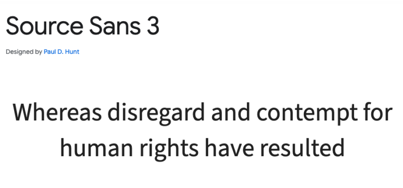
Source Sans 3
Source Sans 3 is Adobe’s first open-source typeface family, designed with user interfaces in mind. This sans-serif font offers a clean, modern look that’s highly legible in various contexts. Its versatility makes it suitable for both digital and print applications, providing designers with a reliable and adaptable typeface for diverse projects.
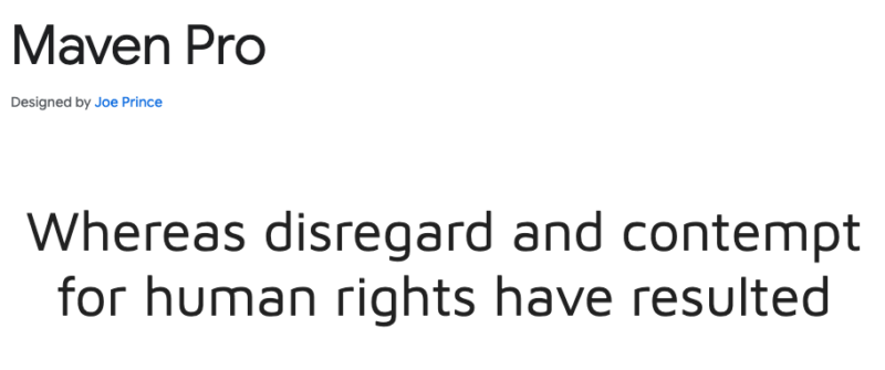
Maven Pro
Maven Pro is a unique sans-serif typeface featuring distinctive curvature and flowing rhythm. Its modern design makes it highly legible and versatile across various design mediums. Updated in January 2019 with a variable font “Weight” axis, Maven Pro offers designers flexibility in creating impactful typography for web and print projects alike.
Things to Consider When Choosing an Impact Alternative
Although I have shared a long list of Impact alternatives, I suggest considering the following elements when choosing an Impact alternative.
Weight & Thickness: Make sure the font has the bold look you need.
Character Set: Check for necessary symbols and uppercase/lowercase letters.
Language Support: Ensure the font supports all required languages.
Licensing: Verify that the font is legally usable for your project, whether personal or commercial.
Why Use Impact’s Alternatives?
As much as I love the familiarity of Impact, it’s not always the right choice. I can think of multiple reasons and here are some of them.
Overuse: Impact is so strongly associated with memes that it’s hard to take it seriously in formal contexts. When people see Impact, they often think “meme.” If you’re going for that look, try our Impact font meme generator.
Limited Versatility: While great for headlines, Impact’s compressed spacing and thick strokes make it difficult to read at smaller sizes or for people with vision difficulties.
Lack of Style Variations: Impact doesn’t offer much in the way of bold or italic options, which limits its flexibility for designers.
Performance: Some alternatives offer better optimization for web and print, providing more clarity and adaptability across various media.
How to Use Impact-Like Fonts Effectively?
Pair with Complementary Fonts: Combine Impact-like fonts with contrasting typefaces for body text or subheadings. This creates a balanced, visually appealing design. For instance, use a bold, eye-catching font for headlines and a cleaner font for the rest of the text.
Adjust Font Size for Different Mediums: Customize your font sizes based on where the text will appear. Use larger sizes for headlines and smaller sizes for supporting text to ensure readability and impact across websites, print materials, or social media.
Maintain Readability: Avoid overcrowding your text. Ensure there’s enough spacing and contrast between the text and background. This makes your content clear and easy to read, no matter the format.
Impact—A Brief History
Impact is a sans-serif typeface created by Geoffrey Lee in 1965 and released by Stephenson Blake. This bold and compressed font became globally popular when it was included with Microsoft Windows in 1998.
Designed to make strong visual impressions, Impact features thick strokes and narrow letter spacing, making it ideal for headlines rather than body text. It gained even more popularity in the 2010s when it became a staple in internet memes and was used by the “Call of Duty” franchise until 2023.
What Really Made Impact Famous?
Impact rose to fame on social media and was adopted by iconic franchises like Call of Duty. But why did it become so well-known? Here’s why we love it:
- Bold Appearance: Its thick strokes and tight letter spacing make it stand out and grab attention.
- Memorable Design: Its blocky, distinctive look has made it iconic, especially in memes.
- High Readability: Designed for headlines, its high x-height and clear structure make it easy to read from afar.
- Easy Access: Since 1998, it’s been widely available on Microsoft Windows and the web, contributing to its widespread use.
Frequently Asked Questions
Why is Impact so popular in memes?
Impact is a bold font with a memorable design, and it is easily accessible—thanks to Microsoft. Second, the font gives a playful and loud aesthetic that is appealing to members. Now, Impact is so highly associated with memes that any image with this font in it is first considered as a meme.
Is Impact free to use?
Yes, Impact is free to use. You can use this font for personal or commercial use without any cost.
Can I use Impact-like fonts for commercial projects?
Yes, there are both free and paid impact-like fonts which you use for commercial projects.
How do I install new fonts on my computer?
Here is how you can install new fonts on your computer.
For PC Users:
- Go to the “Start” button in the menu and choose “Control Panel.”
- Click on “Appearance and Themes.”
- In the left sidebar, click on “Fonts.”
- In the Fonts window, go to the “File” menu and select “Install New Font.”
- Find the folder where your new fonts are stored and select it.
For Mac Users:
- Open Finder and go to the folder where your new fonts are stored.
- Double-click the font file (it should have a
.ttf,.otf, or similar extension). - In the preview window that opens, click the Install Font button at the bottom right.
- The font will automatically be installed and should appear in the Font Book app.
- You can also open the Font Book app directly, click the + button at the top left, and browse to the folder where your fonts are stored to manually add them.
Are there web-safe alternatives to Impact?
Yes, there are multiple web-safe alternatives to Impact. Some of them include Monserrat and Ariel Black.
What’s the difference between Impact and Arial Black?
The Arial type family is quite plain and lacks the distinctive personality found in other display fonts like Impact. While Arial Black is bold, it does not have the same strong Impact as Impact. Impact stands out not just because of its thickness but also due to its proportions, spacing, and overall character.
Summing it up
And there you have it—25+ fonts like Impact that are ready to make a bold statement! Impact has undeniably left its mark on memes and marketing, but exploring these alternatives can add a fresh twist to your designs. Whether you’re working on a headline, branding, or any project that needs to grab attention, these fonts offer a range of styles and impacts.
Don’t be afraid to experiment and find the font that perfectly fits your project’s vibe. Each one has its unique flair and can bring a different energy to your work. Share your experiences or favorite fonts in the comments—I’d love to hear how you’re using these alternatives! And remember, choosing the right font isn’t just about looking good—it’s about making your message stand out.

