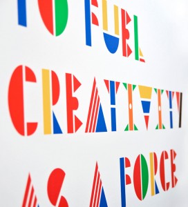
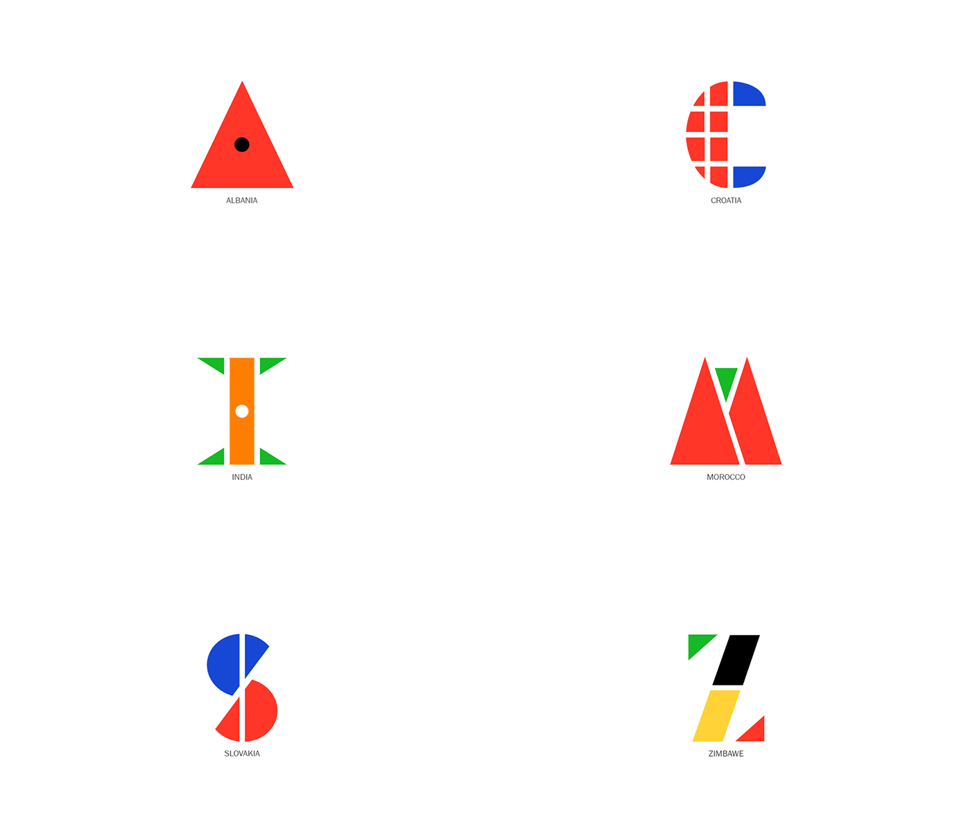
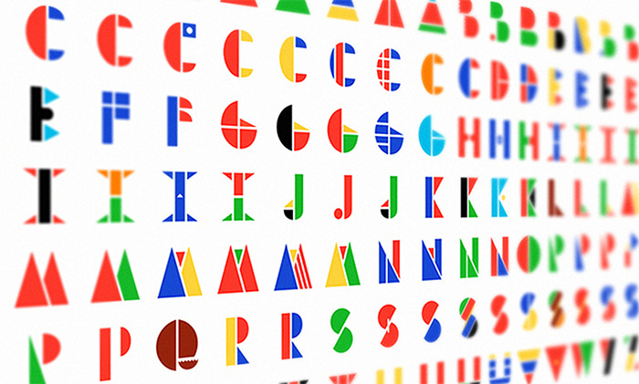
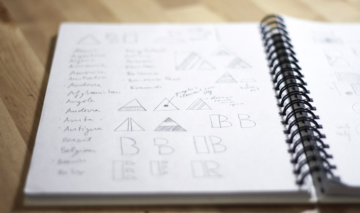
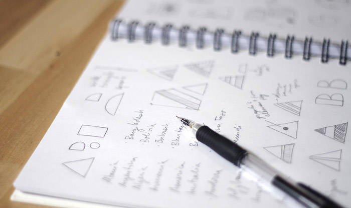
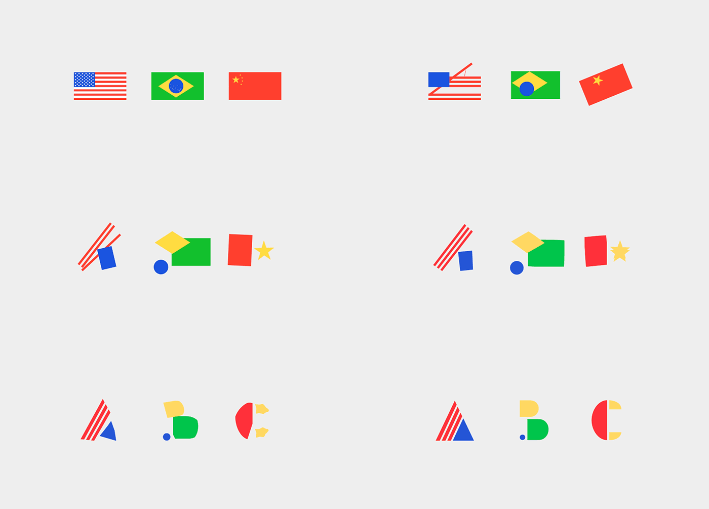
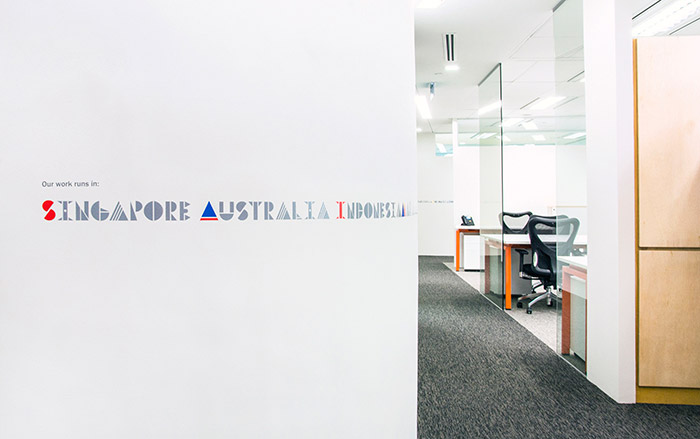
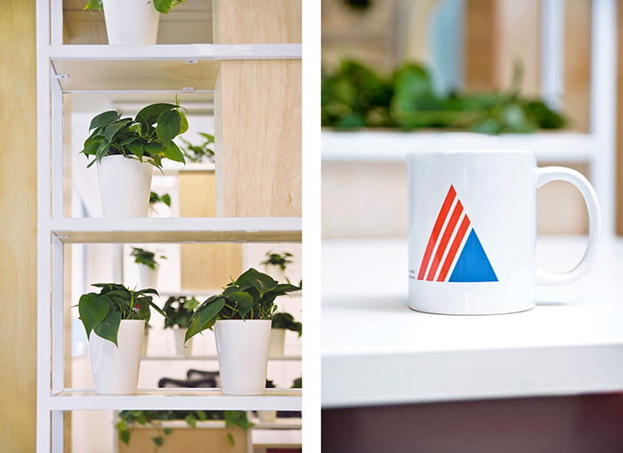
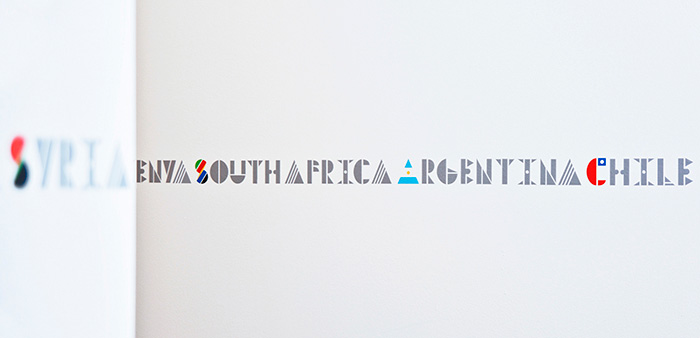
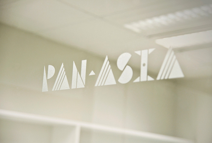
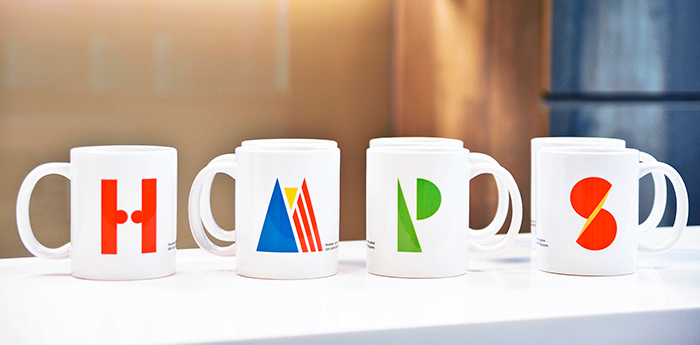
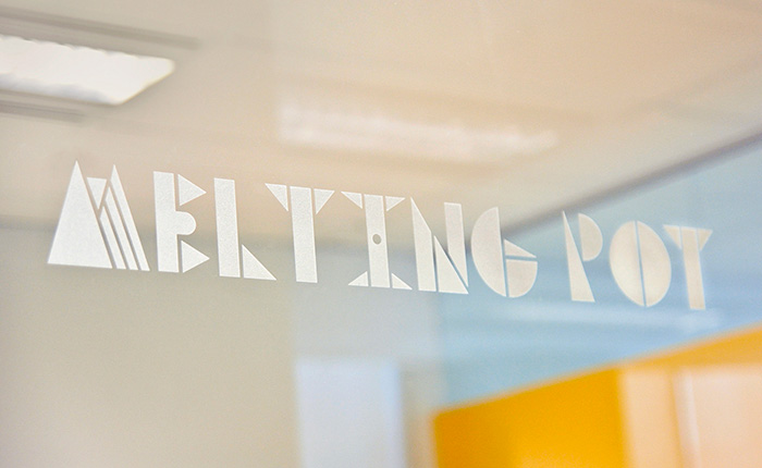
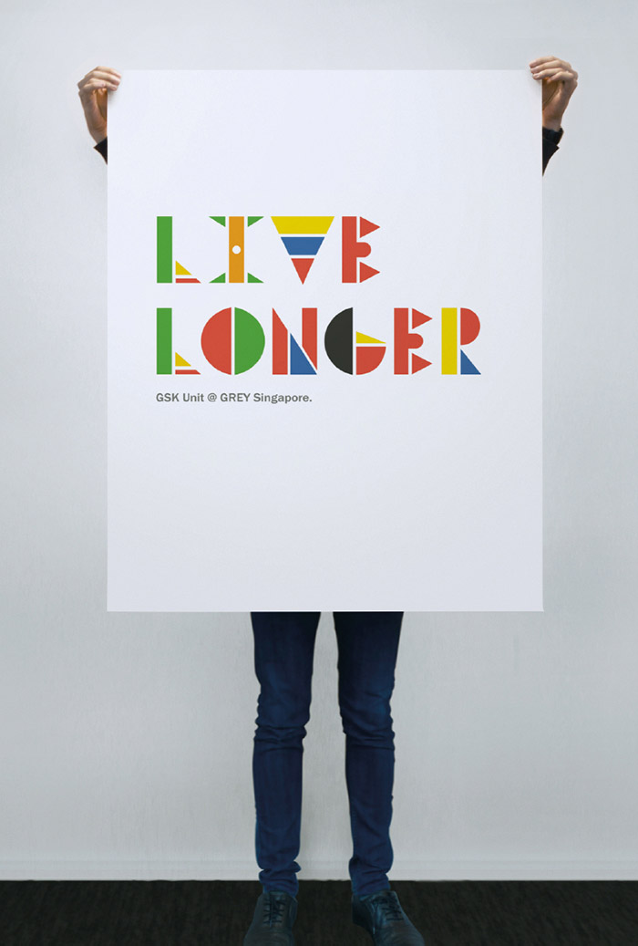
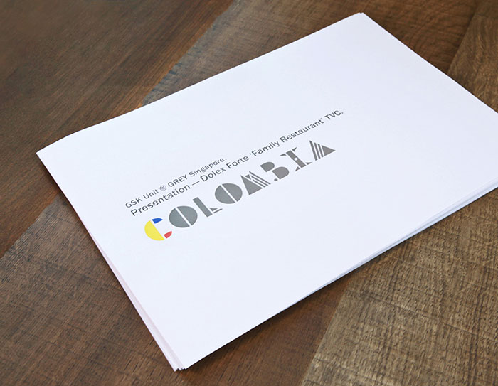
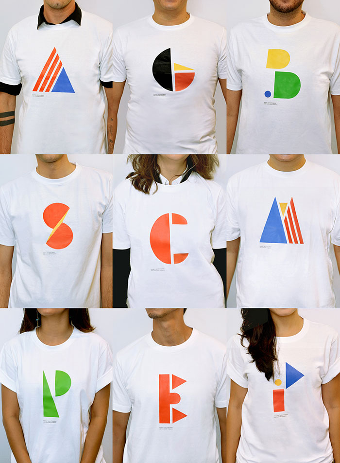
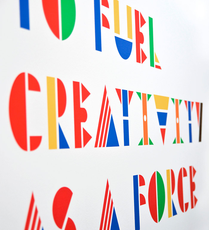
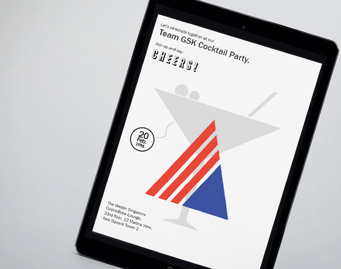
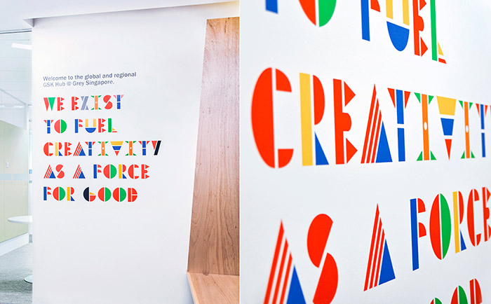
The team at Grey Advertising‘s Singapore office designed a fascinating modular Multinational Typeface, using colors and composition representative of the flags of all 106 countries in which the company does business.
I love the duality of feelings that this series evokes — while the diversity of color and variation in form celebrate each country’s individuality, the modular structure joins the letters together in one global, united system. Each character/country is unique, yet everything fits in place together.
Much has been written and said about the needs of our global economy. In fact: heated debates have and are still taking place about the dichotomy of global vs. local.
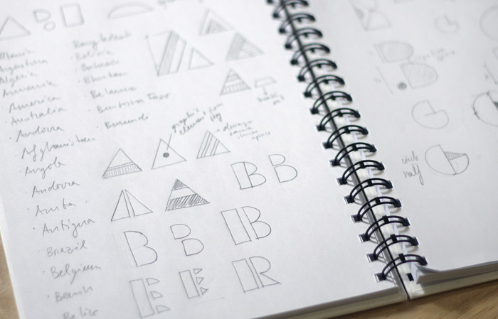
Here’s our take on it all: when you set up a new hub to work with the rest of the world, it kind of makes sense to install a multinational team to do so. Not just a local setup running a global account, but a team that has got a clue about the world out there. We did just that. And we invented a design tool to brand this team, and to communicate our mindset and vision – the world’s first multinational typeface.

Get 300+ Fonts for FREE
Enter your email to download our 100% free "Font Lover's Bundle". For commercial & personal use. No royalties. No fees. No attribution. 100% free to use anywhere.
Creative Credits
Designer/Typographer: Luis Fabra
Photography: Theia pixelworx

