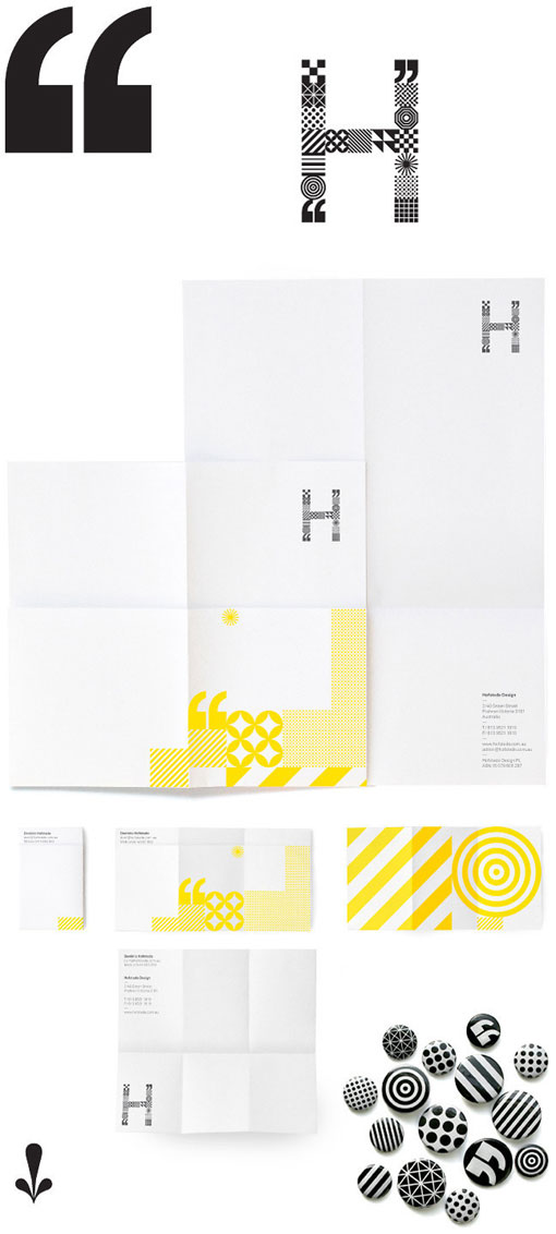
Australian studio Hofstede Design has a pretty amazing portfolio, so it’s no surprise that their own identity is equally outstanding. The system, which seems to present endless possibilities, is “defined by an adaptable typographic language and expression derived from a symbol constructed from seventeen unique ‘pixels.’”