In this article:
- Leveraging Design-Focused Website Creation Tools
- Extensive Design Resources for Professional Websites
- Mobile-First and Adaptive Design Principles
- Collaboration and Real-Time Editing
- Automation in Web Design
- Conclusion
With web design evolving at such a fast pace, 2025 is sure to see some very exciting new developments. Now professional designers are really testing the limits of what is possible to create a functional, attractive, and user-friendly site.
And the method they have to do it is so incredibly efficient.
It is the innovative techniques and the platforms that make for a professional-grade website. This does not only help to improve the quality of the design but also helps to serve the website for the need of the user and client.
As the new requirements take shape, designers rely on design-focused website creation tools and extensive design resources for professional websites. They have given control to designers, automated menial work and help them to be creative. Failing to embrace these innovations can result in lengthier production, inconsistent designs, and a disgruntled customer.
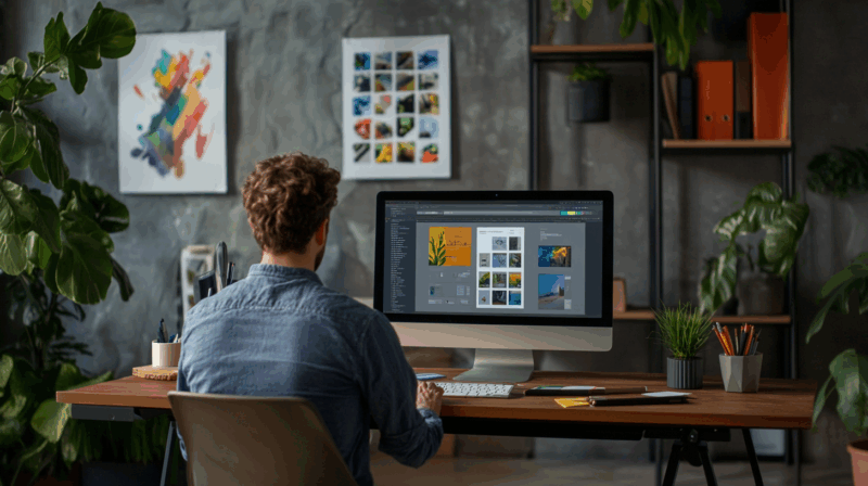
Leveraging Design-Focused Website Creation Tools
Tools To Build Websites With Design In Mind Offering a lightweight solution to creativity without as much manual coding. Such tools are essential as they ensure designers do not compromise on functionality during the design process. Designers can play around with layouts, type, and responsiveness without even breaking their code.
A place like Elementor makes it easy; drag and drop; done. Using Dragoman feels intuitive and saves up a lot of time as it lets the designers get started directly on developing a visual language. Tools like this break down these hurdles — especially as timeframes draw tighter, by integrating modules, grids, or adaptive elements. Without design-specific tools, practitioners would not be able to meet the requirements of contemporary web development.
If you ignore design-specific tools, you risk limited and outdated workflows. Designers may not be able to make perfect-designed images. Furthermore, absence of advanced tools can affect responsiveness, which would frustrate the users. This means fewer customer interactions and a missed opportunity for clients.

Get 300+ Fonts for FREE
Enter your email to download our 100% free "Font Lover's Bundle". For commercial & personal use. No royalties. No fees. No attribution. 100% free to use anywhere.
More technically, because of grids solutions within these platforms, designers create dynamic layouts. This allows us to get them in line on various screen sizes Tools provide real-time modification, designers apply changes and test their visual propositions in real-time. Building these features translates to bringing next-gen websites that make clients happy.
Extensive Design Resources for Professional Websites
Due to growing expectations, professional designers in 2025 have easy access to extensive design resources for professional websites. With libraries of templates, design assets, and content modules, it becomes ridiculously easy to customize. These assets add ability for designers to enhance website quality without building from the ground every single time. With their unique industry, theme and visual style, they offer immense creative opportunities.
Why is this necessary? Flexibility among design considering the complexity of varying user preferences Having a large repository of assets allows a designer to quickly cater to an entire industry such as e-commerce, education, or health services. Diversity and versatility are useful in establishing a brand identity for each client without breaking any industry standard. Design teams tend to use these resources to ensure consistency, visual appeal as well as functional utility across their projects, otherwise, they might feel at the loss of these things.
Without such resources available to them, the process is lengthy and painfully convoluted. The designers would spend a lot of time making rudimentary building blocks instead of final branding elements. But you might end up sacrificing quality for such inefficacy. When sites are poorly designed, it turns potential users away, hence decreased conversions, meaning the clients lose their revenue.
But even a solid asset library could be anything from interactive pieces created beforehand – think of accordions and tabs and animations. Bring these seamlessly into any site by designers. Websites can still be user-friendly when they use these resources as a base, then customize the colour schemes, typography and/or layout to fit the need of the brand.
Mobile-First and Adaptive Design Principles
Mobile browsing has become more popular, which means that web designers need to focus on mobile first and adaptive design principles. This philosophy guarantees fast-loading websites that run smoothly and look beautiful on mobile. Customers see the same fluidity across the touchpoints of their audience and so this is a non-negotiable practice for clients.
Why is this significant? Most users around the world browse on mobile first, according to digital trends. Mobile-first design is a strategy for smaller screens but that scales pretty effortlessly to larger ones. Any responsive quirk is dealt with directly in the design phase. Websites that have not applied these tactics can yield poor user experience. As a result, they will lag and load incorrectly, or completely lose the attention of the user.
Ignoring mobile first designs means sites become useless at one of their biggest traffic sources. When the visitors leave due to lousy navigation, tight layouts, and sluggish page speeds. Clients face drastic fall off in visitor retention and impacts overall business goals.
Going by the book, adaptive design is about optimizing using breakpoints specific to devices. Scalable fonts and fluid grid layouts are implemented by designers. This guarantees that it works the same way if someone comes by on a 5-inch phone or on a 32-inch monitor. These designs won’t be exemplary without more advanced CSS techniques like media queries.
Collaboration and Real-Time Editing
In 2025, collaboration is an essential part of developing professional websites. It is learned that teams work together and across UI/UX, content, development, and testing domains. Tools that enable simultaneous editing eliminate the need for emails, allowing decisions to be made in a timely manner. When designers work in lockstep, they can compile harmonious layouts that match whatever long term branding aspirations they have for their product.
Why prioritize it? In nearly every web design project, you have multiple stakeholders providing input. It brings the risk of creating designs that can have different interpretations, resulting in the need to redo the work. Most Collaboration tools focus on transparency and feedback so that you can get everything aligned. Quicker approval cycles: Instant updates are a helpful tool to designers and clients.
When we do not have technologies for collaboration, projects require a longer time to get completed. When teams do not have aligned vision, it leads to inconsistent website sections — like differing color schemes or wrong typography used from the established style guide. However, revision loops get delayed, and clients lose their patience which makes them find the designer looks unprofessional.
The technical model focuses on shared dashboards through advanced platforms. Furthermore, these dashboards can be updated by multiple members of the team on-the-go. One designer could be changing the page animations, whilst another is editing the typography. Real-time visual feedback encourages an increase in collaboration, which increases the effectiveness of the workflow and creates refined results.
Automation in Web Design
Automation has changed the way designers save time and maintain design integrity! By generating your website automatically, it frees you from performing the same repetitive, low-value task that eats up productive time while ensuring faultless results. In-built features such as AI-driven optimization provide layout and color palette suggestions, or even visual hierarchy adjustments. Automation means designers can spend more time creating great experiences.
Why is this critical? This includes things such as responsive scaling, prewarmed animations, or cross-browser compatibility checks which are all handled by Automation. It increases productivity and assures quality outputs in a shorter time. For clients this translates to shorter launch times without sacrificing general design quality by simply automating more of the backend processes.
Failing to implement automation in 2025 means that designers are swamped with mass manual work. Instead of brainstorming creative ideas, there is a lot lost time on debugging codes where layout breaks, etc. Designers could also miss out on optimization opportunities inadvertently, which may also affect site performance or mobile responsiveness, if they are working without AI assistance.
Technically, automation tools introduce dynamic content substitution. As an example, designers utilize auto-generated SEO meta details appropriate for each specific client business. Designers discover whether to place CTAs or media files with integrated AI analysis tools. All of these things increase user engagement, satisfaction, and the reliability of the site.
Conclusion
Website creation in 2025 is nothing like it was a decade before — designers get the layers of functionality and design aesthetics right without anyone having to settle for the lesser option anymore, catering to both evolving client and user needs. The tools that enable the creation of websites, focused on the Design are at the core of this unprecedented success, simplifying complex processes, and offering unmatched creative flexibility. With these tools, designers can create beautiful, high-performing websites and never be restricted by technical means.
Then there are the vast libraries of design resources for professional-grade websites, with design resources, templates, assets and modules. It gives designers the means to be able to achieve quality and consistency, whilst being adaptable to the various project requirements of individual clients. Collectively, these tools and resources not only speed up the man hours but also give a fresh dimension to the process of design, making websites not just good-looking but also interacting digital solutions.
In the near future, the focus is going to be moved from building website to designing engaging meaningful online experiences which aim to touch users while also meeting the client goals. By embracing the aforementioned strategies and tools, designers are not only keeping pace with the expectations of 2025 but are also paving the way for the future of web design; a future where innovations not only captivate audiences but forge lasting connections in the digital landscape.