In this article:
- The Role of Culture in Typography
- Cultural Typography in Action
- Cultural Colors and Motifs in Typographic Choices
- 4 Best Practices for Choosing Culturally-Inspired Typography
- Make Thoughtful Typography Choices for All Cultures and Background
What is it about certain fonts that draw the eye to text? Typography is just as much a visual language as the messaging itself. Each line and bend tells a story about history, heritage and customs, making it a dynamic tool for conveying a cultural narrative, building relationships and evoking profound emotions.
These cultural influences significantly impact typography selections, from intricate East Asian scripts to sweeping Davengari curves and simple Roman fonts. As a designer, you can comprehend how fonts enhance the aesthetics of written language and make it more accessible and purposeful for diverse audiences. As such, it is crucial to understand the role of culture in typography choices and the best practices for implementation.
The Role of Culture in Typography
You may not realize it initially, but culture greatly dictates your view of typography and encourages explicit design decisions. Specific choices generate various emotional reactions based on linguistic and cultural experiences. This is especially important when developing international branding and marketing projects.
A 2023 Monotype study found English-speaking countries favored distinctive typeface characteristics, while places like France, Portugal and Spain preferred typefaces with classic serifs. The study also showed that traditional brushstrokes promoted trustworthiness in Japanese designs, while gothic, low-contrast, humanistic types conveyed innovation.
Another example is Scandinavian typography, which is characterized by concision and clarity. These fonts and typefaces are usually minimalistic, easy to read and reflect an orderly, practical culture. You often find them in editorial landscapes, where modernity, sophistication and simplicity align with balanced layouts, clean lines and neutral tones.
Other key points to consider when integrating culturally influenced typography into creative pursuits include the following:
- How it carries historical context, reflecting different periods or societal movements, such as intricate Renaissance serifs versus modern san-serif typefaces
- Unique styles and scripts of different regions, such as Japanese kanji or Arabic calligraphy
- Cultural perceptions, such as weightier fonts suggesting control and strength in one culture while appearing threatening or overpowering in another
- Ways fonts raise awareness of social or political messages associated with specific ideologies and movements
- Branding with fonts that reflect cultural identity
Cultural Typography in Action
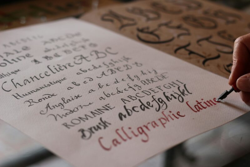
Source: https://unsplash.com/photos/a-group-of-people-sitting-at-a-counter-in-a-restaurant-CNiSyJG-sXQ
Spanish is among the fastest-growing cultures in the United States, with 1.9 million new Spanish speakers living in the country since 2018. It should be unsurprising that numerous Spanish restaurants have opened nationwide to share authentic cuisines with the diverse population.

Get 300+ Fonts for FREE
Enter your email to download our 100% free "Font Lover's Bundle". For commercial & personal use. No royalties. No fees. No attribution. 100% free to use anywhere.
If you look at the signage or logo of a Spanish-themed eatery, you might notice how the culture is depicted in the typography. For example, The Taco Stand in Miami’s Wynwood Arts District, shown above, uses several culturally distinctive fonts, from the menu to Spanish sayings on the walls. Mexican taco stands like this one usually use lively typography with bold, hand-drawn letters, rounded corners and uneven lines, producing a familiar, homemade aesthetic.
German beer logos also typically utilize typography reflective of ritual, heritage and artisanship. These letterings are usually heavy, classic serifs and sans-serifs, integrating gothic scripts and bold lettering to highlight Germany’s centuries-old brewing tradition. You might lean toward richer, darker hues or gold to demonstrate premium craftsmanship and quality when working on similar logos.
Social movements are also particular in the typography they choose. After all, the fonts and typefaces you use for websites and print materials should communicate the overall message while instilling an enthusiastic desire to act.
The Black Lives Matter movement is a prime example. The community often utilizes bold sans-serif fonts like Gotham and Helvetica — emblematic of strength and unity — for slogans and posters. As another example, the Fight Against Climate Change movement might use Avenir and Proxima Nova — two contemporary fonts that underscore the importance of progressive environmental action.
Cultural Colors and Motifs in Typographic Choices
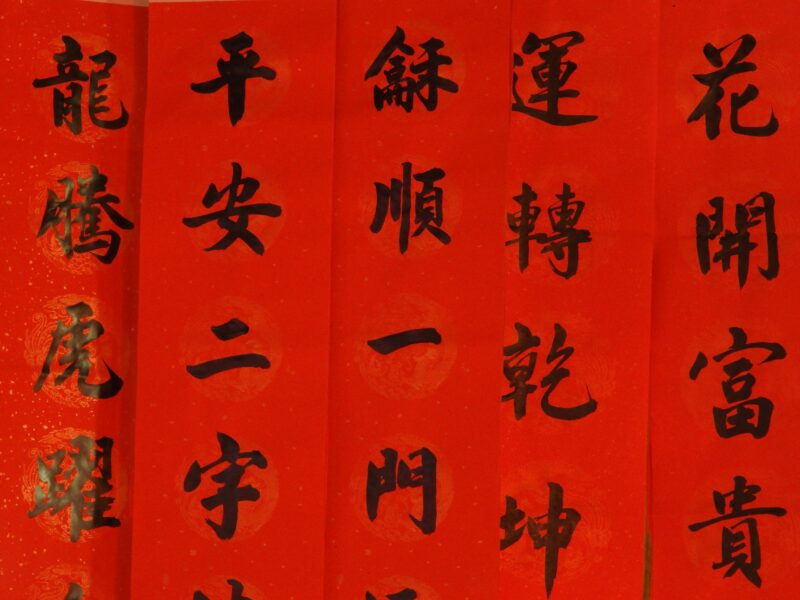
Source: https://unsplash.com/photos/a-row-of-red-banners-with-asian-writing-on-them-Awu9oN1vrkY
Color is equally as crucial as a font when it comes to culturally impacted typography. Some cultures hold specific colors in high regard, often representing different sentiments, values or beliefs.
You should choose typographic colors based on the audience you’re trying to appeal to. For instance, red represents luck, happiness, celebration and prosperity in Chinese culture.
Meanwhile, Indian typography leans into bright colors like orange, yellow, green and blue. Incorporating colors into typography gives your designs another layer of cultural significance, identity and resonance.
Motifs are another approach to connecting with your audience on a cultural level. Use specific patterns as a background to text, fill in lettering or integrate them into the messaging. For instance, you could use geometric patterns in Islamic-reflected typefaces or include Indigenous symbols in related projects.
Another example would be replacing individual letters in Scandinavian text with ancient Nordic runes. Certain runes may also carry different meanings or historical contexts audiences can culturally appreciate.
4 Best Practices for Choosing Culturally-Inspired Typography
If you’re going to incorporate culture in your typography choices, you’ll want to follow a set of best practices. Not only will these rules help you create a seamless design, but they’ll help you avoid offending your audience with overlooked mistakes.
1. Research Your Target Audience
Always research your target audience to choose the most relevant and appropriate typeface. This includes historical nuances and attributes, symbolism, colors, aesthetics, and more, which each culture prefers. With a comprehensive background, you’ll develop a practical design that appeals to the masses and communicates your message more meaningfully.
The best way to start your research is by looking up ancient texts, culturally identifiable colors and symbols. You might also study the lettering on storefronts, logos and print materials, recognizing the type of fonts used and their backgrounds. Are there any common characteristics, such as rounded letters, heavy brushstrokes or geometric shapes?
2. Pair Complementary Fonts
Pairing two or more fonts can enhance cultural representation in typography, making the text more visually attractive and reflective of the intended audience. Complementary fonts should account for weight, style and size and be legible for everyone to read.
Contrast counts, so utilize larger and bolder fonts with regular or lighter-lined ones. Combining unique or whimsical lettering with something neutral is another potential approach. There are several ways to do this, including:
- Sans and sans-serif fonts: A classic serif font with a clean, modern sans-serif font that harmonizes old and new designs, such as Garamond and Helvetica
- Script and modern fonts: A decorative font with a contemporary typeface for an elegant appearance, such as Exquitte and Black Matteo — ideal for luxury lifestyle cultures and branding
- Attention-grabbing fonts and simple sans-serif: A combination of bold and understated text such as Abril Fatface and Muli font, which may be an interesting combination for a menu at a French restaurant
Experimenting with different typefaces is the best way to uncover the best pairing. This will be much easier once you’ve conducted research and have a better idea of what your audience expects.
3. Consider Color and Symbolism

Source: https://unsplash.com/photos/graffiti-on-wall-during-daytime-xtd0mg5bd-c
Color and symbols are critical to typographic communication. As you know, some colors hold significant value across different cultures and conjure various emotions. For instance, you wouldn’t want to use vibrant, celebratory colors for moments of solemnity or employ an ineffective typeface that reaches the wrong audience.
Graffiti is an excellent example of tying color and symbolism into cultural typography. These typefaces are usually bold, bright and expressive, energizing and grabbing the attention of particular urban populations.
Brands like Nike, MTV and Adidas have all used graffiti typefaces to attract urban youth and other subcultural affiliations. Nike has integrated these fonts in advertising to convey its edgy, athletic branding, while Converse has collaborated with popular graffiti artists for limited-edition shoe designs.

Source: https://adage.com/creativity/work/shanghai-unstoppable/44192
If you’re interested in using the hottest graffiti fonts for this subculture, there are plenty to choose from in 2025. Bombsky has bold and chunky lettering ideal for urban streetwear, while Streetlight is more reminiscent of urban tagging and street art — a nod to city life.
4. Seek Culturally-Informed Feedback
Cultural sensitivity is one of the most critical practices for allowing culture to impact typography choices. You’ll want to get it right since you may be creating designs for audiences outside of your own cultural identity. This means you must be as respectful as possible.
In addition to thoroughly researching cultures, seek input from experts from specific regions about their preferences. It is best to know beforehand whether your conceptions may offend particular demographics. You’ll also be able to determine which of your typography designs has the potential to resonate best with your target audience.
Inclusivity is equally essential to cultural sensitivity and strengthens brand identity. For instance, regardless of the culturally-inspired font you choose, always make sure it’s easy to read — this includes those with visual impairments. Also, when designing websites, users should be allowed to adjust font sizes, styles and tones in plain text if the lettering is difficult to decipher.
Make Thoughtful Typography Choices for All Cultures and Background
Ultimately, the best typography choices encourage connection, deepen emotions and promote cultural diversity. Using fonts, typefaces and colors to touch on a particular culture can deliver a more meaningful and resonant message to your audience and connect shared cultural backgrounds. Be thoughtful in your selection, and watch your designs touch people far and wide.