In this article:
- Understanding Typography Basics
- Why Typography Matters in Branding
- Aligning Typography with Brand Identity
- Practical Tips for Choosing Typography
- Testing Your Typography Choices
- Future Trends in Typography
- Conclusion
Typography does more than make words look pretty—it shapes how people see your brand. The right typography can make your message stand out, while the wrong choice might send the wrong signal entirely.
With trends constantly shifting, it’s not just about following what’s popular. It’s about finding a style that supports your brand’s personality and connects with your audience.
In this post, we’ll guide you through choosing typography trends that truly work for your brand in 2024.
Understanding Typography Basics
How your brand communicates visually starts with typography. It’s not just about words—it’s about how those words feel and what they communicate before someone even reads them. Whether you’re designing a website, a logo, or a social media post, understanding typography fundamentals ensures your message is clear, professional, and emotionally aligned with your audience. Let’s break it down.
What is Typography?
Typography is the art and science of arranging text. It involves selecting the right styles, spacing, and layouts to make content readable while conveying a specific tone or mood. In design, typography is as much about function as it is about aesthetics. It dictates how your audience navigates your content and sets a visual tone that speaks to your brand.
Think about it: a bold, clean typeface can scream confidence, while a delicate, script style can feel elegant or refined. Typography supports your brand personality just like color and imagery do, but it’s unique because it plays a direct role in how your message is read and understood. At its core, typography is about creating a visual connection between words and emotions.
Key Typography Terms
If you’re new to typography, the jargon can feel overwhelming. But these five basic terms are crucial to understanding the subtle (and not-so-subtle) choices that go into great design:

Get 300+ Fonts for FREE
Enter your email to download our 100% free "Font Lover's Bundle". For commercial & personal use. No royalties. No fees. No attribution. 100% free to use anywhere.
Typeface vs. Font
- Typeface: The design of the letters. Think of it as the “family” of styles (e.g., Arial or Times New Roman).
- Font: A specific version of a typeface. For example, Arial Bold or Arial Italic is a font from the Arial typeface family.
Kerning
Kerning refers to the space between individual letters. Good kerning creates even spacing, ensuring text feels balanced and polished.
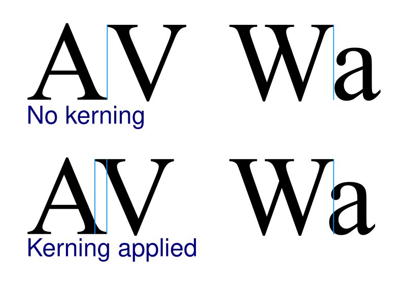
No one likes awkward gaps, right? For example, “WA” and “VA” often need adjustments because their shapes naturally create uneven spacing.
Leading
Leading (pronounced “ledding”) is the vertical spacing between lines of text. It influences readability, especially in blocks of copy.
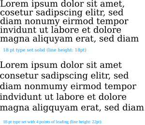
Too tight, and it feels cramped. Too loose, and it looks disjointed. Think of it like breathing room—your text needs just the right amount to feel comfortable.
Hierarchy
Typography hierarchy establishes the order of importance in your text by varying size, weight, or color. Your eyes should naturally know what to read first, second, and so on.
For instance:
- Headlines: Big and bold to grab attention.
- Subheadings: Slightly smaller, guiding readers through the content.
- Body text: Clean and consistent, prioritizing readability.
Without hierarchy, your design can feel chaotic, leaving readers unsure where to start.
Mastering these basics is key to spotting typography trends and deciding which ones work for your brand. Each decision—whether it’s typeface choice or kerning adjustments—affects how your audience perceives what you have to say. And when done right, typography doesn’t just look good—it speaks volumes.
Why Typography Matters in Branding
Typography is more than just selecting a font—it’s a critical piece of your brand’s identity. The way text looks can shape how people perceive your company, even before they read a single word. It acts as a silent ambassador, setting the tone and reinforcing what your brand stands for. From first impressions to emotional impact, typography plays a key role in connecting with your audience.
First Impressions and Readability
You know the saying, “You never get a second chance to make a first impression”? Typography is one of the first things your audience notices when they see your brand. Whether it’s a bold headline or the fine print on packaging, the typeface you choose affects how they feel about your message—often before they’ve read it.
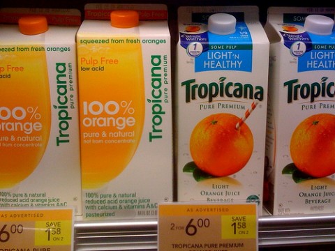
Readable typography has an instant effect. If your text is hard to read, too cluttered, or poorly spaced, you risk losing your audience within seconds. On the flip side, clean and well-structured typography makes your brand feel polished and approachable. Consider these factors when evaluating readability:
- Font size: Is it big enough to skim quickly but small enough to look professional?
- Spacing: Proper kerning and leading ensure the words don’t blend together or feel overwhelming.
- Contrast: Dark text on a light background or vice versa helps the type pop while reducing eye strain.
When done right, typography provides clarity and draws attention to what matters most. Think of it as a guide that helps readers easily navigate your message. And when they don’t have to work hard to understand, they’re more likely to stick around.
Emotional Response and Brand Messaging
Did you know the style of your typography can evoke emotions just as much as colors or images? Typefaces aren’t just letters on a page—they carry personalities that influence how your brand feels to people.
Sleek sans-serifs may feel modern and bold, while a serif font can exude tradition and trustworthiness. A playful script font might feel friendly or creative, but it won’t work if your goal is to communicate reliability. It’s all about matching the mood to your message.
Here’s a breakdown of how different styles create emotional responses:
- Serif fonts: Emphasize tradition, authority, and professionalism. Commonly used by financial institutions and law firms.
- Sans-serif fonts: Clean, modern, and minimal. Brands that want to feel innovative or fresh often go this route.
- Script fonts: Elegant and intricate, they’re often used for luxury brands or events like weddings.
- Display fonts: Bold and unique, these grab attention but should be used sparingly to avoid overpowering the design.
Typography also reinforces your messaging. If you’re marketing a cutting-edge tech product but use a dated typeface, you’re sending mixed signals. Consistency between typefaces and tone builds trust. Imagine seeing a handwritten font on a medical clinic’s website—it would feel out of place, right? The typeface should feel like an extension of your brand voice.
The goal is to make sure the audience feels what you want them to feel before they even process the words. Think about it: typography doesn’t just transmit information; it sets expectations. Whether you want to be seen as approachable, trustworthy, or innovative, your typography choice should help tell that story. It’s like choosing the right outfit for a first date—it sets the tone before you speak.
Aligning Typography with Brand Identity
Your typography speaks volumes about your brand, often before a single word is read. The right choice ensures your message feels authentic and resonates with your audience. To find the perfect fit, it’s crucial to align your typography with your brand’s personality and the people you’re trying to reach. Let’s break it down.
Understanding Your Brand Personality
Every brand has a personality—it’s the human traits people associate with your business. This personality dictates how you communicate visually, and typography plays a huge role in shaping that perception. The wrong typeface can feel like showing up to a formal dinner in a tracksuit. The right one? It’s a perfect match to your vibe.
Here’s a quick look at common brand personalities and how they relate to typography:
- Traditional and Trustworthy: Serif fonts like Times New Roman or Georgia work well. These typefaces convey stability and reliability, making them ideal for banks, law firms, and universities.
- Modern and Minimal: Sans-serif fonts such as Helvetica, Futura, or Open Sans are sleek and uncluttered. They’re a favorite for tech companies, startups, and innovative brands.
- Fun and Playful: Rounded or hand-drawn fonts like Comic Neue or Pacifico add warmth and approachability. Perfect for brands targeting younger audiences or those in creative industries.
- Luxury and Sophistication: Script or high-contrast serif fonts like Bodoni or Baskerville exude elegance and exclusivity. Think high-end fashion or boutique services.
- Bold and Adventurous: Eye-catching display fonts, such as Impact or Bebas Neue, demand attention. These work well for brands wanting to stand out with a sense of daring or edge.
Ask yourself: “What emotions do I want people to feel when they see my brand?” Then choose a typeface that reinforces those emotions. Remember, consistency is key—your typography should always reflect your values and personality across all platforms.
Audience Considerations
Your audience should always be at the center of your design decisions, and typography is no exception. Fonts that feel right to you might miss the mark completely for your target customers. It’s all about understanding who they are and what appeals to them.
Here’s why knowing your audience matters:
- Age Group: Younger audiences tend to connect with trendy, playful fonts, while older groups might prefer traditional or easy-to-read typefaces.
- Industry Expectations: Professional audiences, like B2B clients, expect clean and conservative typography. In contrast, lifestyle or fashion audiences may embrace creative and bold styles.
- Cultural Sensitivities: Some typefaces can carry cultural connotations. For example, script fonts might feel elegant in one market but outdated in another.
Think of it like tailoring a speech—you wouldn’t use the same tone or language with a 16-year-old as you would with a corporate CEO. Your typography choice needs to match what your audience finds relatable and trustworthy.
Here are a few questions to help guide you:
- What types of fonts do your competitors use, and how can you stand out?
- Are you solving a problem or providing inspiration with your messaging?
- How much time will your audience spend engaging with your content? Quick interactions may require bold, simple fonts, while longer reads favor those optimized for readability.
When your typography reflects not just your brand but also your audience’s preferences, you create an instant connection. It’s like speaking their language without misspeaking, ensuring they feel understood and valued.
By balancing your brand identity with audience expectations, you’ll make typography decisions that reinforce trust and authenticity every time.
Practical Tips for Choosing Typography
Typography is one of the most important aspects of design—it sets the tone and directs attention. But with so many fonts and styles available, how do you choose the right one? Whether you’re working on a website, ad campaign, or product packaging, these practical tips will help you make smart typography choices that strengthen your message and boost readability.
Creating a Typography Hierarchy
Typography hierarchy makes text easier to follow by signaling what’s most important. Without it, your content can feel disorganized, making readers lose interest fast. Let’s simplify how you can set this up effectively.
- Start with Your Headline
Headlines should be the most eye-catching part of your design. Use a larger font size and bold weight to grab attention. Your headline is the first thing people see, so make it stand out.Example: Compare a bold and oversized title to the body text—it naturally draws your eye first. - Add Subheadings for Structure
Subheadings act like road signs, guiding readers through your content. Use medium font sizes and distinguish them with slightly different weights or colors. This breaks up large text blocks and helps skimmers get the gist quickly. - Make Body Text Readable
The body text needs to be clear and easy to scan. Stick to a standard size (usually 14–16px for digital content) with good spacing between lines. Avoid fancy or overly decorative fonts for body copy—they can tire the eyes. - Use Contrast to Enhance Flow
Pair different font sizes, weights, and styles to signal importance. For example:- A bold title for the headline.
- A light italic font for a secondary note.
- Simple, readable styling for paragraphs.
Think of typography hierarchy as a visual guide. It tells readers what to focus on first and leads them through the content in a logical way.
Combining Fonts Effectively
Mixing fonts can bring personality to your design, but doing it wrong can create chaos. The challenge is finding combinations that complement each other without becoming distracting. Here’s how to do it well.
- Stick to 2–3 Fonts
Using too many fonts makes the design feel cluttered. A good rule: one font for headings, another for body text, and an optional accent font.Example: Pair a decorative serif font for headlines with a clean sans-serif font for paragraphs. This creates variety but keeps things balanced. - Choose Fonts with Contrast
Contrast helps fonts stand out from one another without clashing. Pairing a thick, bold typeface with a thin, elegant one often works well. Similarly, mix serif and sans-serif fonts to add visual interest.Example: Georgia (serif) for headings and Open Sans (sans-serif) for body text offer a classic, professional feel. - Match the Mood
Fonts send signals about tone. If your heading font feels playful but your body font is too serious, the message becomes inconsistent. Think about what emotions you want the typography to evoke and choose fonts that align. - Test Readability at Different Sizes
Before committing, test how the fonts look at various sizes. Some fonts lose their charm at smaller sizes or become unreadable. Others may feel too overpowering when scaled up for headlines. - Use Tools to Preview Pairings
Websites like Google Fonts and Fontpair can help you test combinations without guesswork. They offer pre-made pairings that save time and give you inspiration.
Remember, the goal of combining fonts isn’t just to look cool—it’s to enhance clarity and reinforce your brand’s voice. A good combination feels natural, not forced, and subtly supports the design rather than overshadowing it.
By setting up a clear hierarchy and thoughtfully combining fonts, you can elevate your typography game and build designs that truly connect with your audience.
Testing Your Typography Choices
Choosing the right typography is only part of the process; testing those choices is where the real impact is measured. What looks great during design might perform poorly when put in front of your audience. Testing ensures your typography works in real-world situations, aligning with your brand’s message and audience expectations.
A/B Testing with Typography
Typography choices can influence engagement, readability, and conversions. A/B testing allows you to compare two typography options in a controlled way to see which one performs better. Think of it like trying on two outfits before a big event—what fits the occasion best?
Here’s how to run an effective A/B test:
- Define Your Goal
Are you testing for readability? Click-through rates? Brand recall? Decide what success looks like to measure effectively. - Choose One Variable to Test
Avoid testing multiple changes at once. For example, compare two different typefaces or font sizes, not both. This keeps your results clear and actionable. - Create Two Versions
Design two versions of your content—Version A and Version B. Keep all other elements (images, colors, layout) identical, so typography is the only difference. - Split Your Audience
Randomly divide your audience into two groups. Show each group a different version to eliminate bias or environmental factors. - Analyze the Results
Use metrics like engagement rates, click-throughs, or time spent on page to determine which typography choice performs better. Did one version keep readers’ attention longer? Did it lead to more conversions?
Pro Tip: A/B testing isn’t just for websites. You can test typography on email campaigns, social media graphics, and even print materials. The key is to use data to guide decisions rather than relying solely on aesthetics.
Gathering Feedback from Stakeholders
Typography doesn’t exist in a vacuum. It affects and is affected by the people who interact with it. That’s why gathering feedback from your team, stakeholders, and even end-users is so important. Collaboration ensures your typography aligns with both brand goals and audience needs.
Why does feedback matter? Your designers might focus on aesthetics, while marketers prioritize readability or emotional impact. Getting input early avoids last-minute conflicts and saves time.
Here’s how to gather and organize feedback effectively:
- Get Team Input
Share typography options with your team in the early stages. Use questions like:- Does this align with our brand personality?
- Is it easy to read across different platforms?
- Does it feel modern or outdated?
Encourage open discussion to uncover potential issues.
- Involve Key Stakeholders
Present your choices to decision-makers. Show them how each option supports brand messaging and aligns with overall strategy. For example, explain why a bold sans-serif conveys innovation or why a serif font builds trust. - Gather User Feedback
Test your typography choices directly with a small group of your target audience. Use surveys, focus groups, or online testing tools to collect their opinions. They’ll often notice details your team might overlook. - Consolidate Feedback
Organize comments into categories like readability, emotional tone, and brand alignment. Identify common patterns to make informed adjustments. - Prioritize What Matters Most
Not all feedback will align, and that’s okay. Focus on comments that directly impact your goals. If readability issues are flagged, for instance, address those first.
Taking the time to involve others not only improves your final typography but also builds consensus and confidence in the design decisions. It’s like building a bridge between what your brand wants to say and what your audience expects to hear.
By testing and refining your typography choices, you ensure that they go beyond looking good—they’ll function effectively and resonate with the people that matter most.
Future Trends in Typography
Typography continues to evolve, shaped by design tools, cultural shifts, and consumer preferences. New trends are emerging that redefine how brands communicate visually. Keeping an eye on these changes will help your brand stand out while staying relevant. Let’s look at what’s coming next.
AI-Generated Typography
Artificial Intelligence is reshaping typography design. Designers can now use AI tools to create typefaces tailored to specific brand identities. Imagine a font that adapts to your logo, website layout, or user behavior automatically—it’s not as far off as it sounds.
What does this mean for branding?
- Personalization: Brands could develop unique fonts that align with their exact needs, making their designs unmistakably their own.
- Efficiency: AI speeds up the design process by automating repetitive tasks like kerning or weight adjustments.
For businesses, AI-driven custom typefaces may convey innovation or exclusivity. It’s a chance to create something truly unique without the time or cost of traditional custom font development.
Animated Typography
Movement in typography is becoming a popular design choice for digital platforms. Think of letters that morph, shift, or bounce as users scroll. These elements can grab attention and keep viewers hooked longer.
Why does this matter?
- Increased Engagement: Animated type catches the eye in ways static text can’t, making it perfect for social media or ads.
- Storytelling: Motion can reflect tone or illustrate ideas, adding depth to branding.
This trend, however, needs balance. Overused animation can feel gimmicky or distracting. For brands that value innovation and creativity, it’s a trend worth exploring—but always keep functionality in mind.
Sustainability-Inspired Design
As consumers demand more eco-conscious practices, typography is taking a minimalist, sustainable turn. This trend focuses on pared-down, no-frills designs that feel modern but timeless.
Emerging qualities of this trend:
- Eco Fonts: Fonts like Ryman Eco use less ink by leaving tiny gaps in their strokes, ideal for print materials.
- Simplicity over Complexity: Fonts are leaning more toward clean and readable styles, avoiding overly decorative details.
For environmentally conscious brands, adopting these designs sends a clear message of commitment to sustainability. Subtle choices like this can resonate deeply with eco-aware audiences.
Inclusive Typography
Inclusive design is becoming a key focus, and typography is no exception. Designers are experimenting with accessible typefaces that cater to visually impaired or neurodiverse users. Fonts like Atkinson Hyperlegible and Open Dyslexic are paving the way.
Here’s how brands can benefit:
- Broader Reach: Accessibility improves user experience for a diverse audience, building trust and loyalty.
- Brand Values: Inclusive designs show your company cares about everyone, reflecting empathy and awareness.
As inclusivity shifts into the mainstream, investing in accessible typography could set your brand apart while meeting evolving standards.
Retro Meets Modern
Nostalgia continues to shape design, and retro-inspired typography isn’t going anywhere. But there’s a twist: designers are adding fresh, modern elements. Think vintage typefaces blended with futuristic line work or bright, unexpected color palettes.
What’s driving this trend?
- Emotional Connection: Nostalgic styles evoke familiarity, making your brand feel approachable.
- Originality: Combining old and new allows brands to stand out without feeling outdated.
It’s a trend that works especially well for lifestyle, fashion, or independent brands wanting to exude creativity and individuality.
Responsive Typography for AR/VR
Augmented Reality (AR) and Virtual Reality (VR) are changing how text is displayed and read. Typography that adapts seamlessly within immersive environments is becoming a design necessity—for example, curved text for headsets or dynamic scaling based on user interaction.
How this affects branding:
- Immersion: Well-designed AR/VR typography keeps users immersed without compromising readability.
- Innovation: Brands looking to lead in tech and gaming spaces will need to dive into this emerging area.
As AR/VR experiences grow, brands that explore responsive typography will position themselves as innovators, ready for the next wave of consumer interaction.
These future typography trends underline one important thing: fonts are no longer just static design elements. Whether your brand embraces custom AI-generated typefaces, animated styles, or sustainability-driven fonts, the goal is the same—to communicate in a way that feels fresh, relevant, and memorable.
Conclusion
Choosing the right typography trend for your brand is more than a design decision—it’s a way of connecting. Fonts don’t just display words; they tell a story, set a tone, and evoke feelings. When chosen with care, typography speaks directly to your audience, reinforcing what your brand stands for.
By understanding both your brand’s personality and your audience’s expectations, you can make choices that feel authentic. Modern typography trends—like minimalist styles, bold statements, and dynamic variable fonts—offer endless possibilities. However, it’s not just about what’s trendy. It’s about what aligns with your values and messaging.
When picking fonts, ask yourself: “What impression will this give?” A sleek sans-serif might showcase innovation, while a serif font suggests reliability. Pairing this creative thought with practical testing ensures you’re not only choosing typography that looks good but one that performs well.
Typography is the silent ambassador of your brand. The right choices create an emotional bridge, building trust, clarity, and recognition at first glance. Stay thoughtful and intentional, and your typography will work as hard as any other part of your branding.

