
In this article:
- Why Businesses Are Shifting Toward Digital Catalogs: 6 Core Benefits
- How To Create A Digital Catalog That Attracts & Converts Shoppers: 8 Easy Steps
- 3 Digital Catalogs Examples Every Brand Can Learn From
- Conclusion
Scrolling is the new window shopping. If your catalog looks like homework, people are gone before the second swipe. And no, stiff PDFs stacked with product shots won’t bail you out here. Nobody is downloading those. If you are serious about grabbing attention, you need to learn how to create a digital catalog.
This guide is all about making that happen. You will see exactly how to create digital catalogs with different types of designs that pull their weight and examples that prove catalogs can be way more than “pretty PDFs.”
Why Businesses Are Shifting Toward Digital Catalogs: 6 Core Benefits
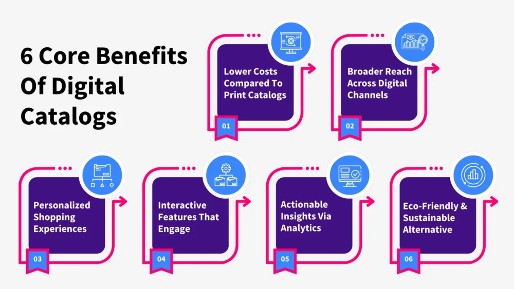
Print catalogs had their time. But today, they don’t match how people actually shop anymore. That is why businesses are leaning hard into digital catalogs. Here’s what makes the switch so worth it.
1. Lower Costs Compared To Print Catalogs
Printing, shipping, and mailing stacks of catalogs costs a fortune. And every time you change a price or add a product, that is another round of printing. With digital, you build it once and update it whenever you want. That is it. The savings add up fast, especially if you launch new lines or seasonal drops often.
2. Broader Reach Across Digital Channels
A print catalog lives and dies in one place: a mailbox or a stack on a counter. A digital one is everywhere at once – your site, Instagram bio, email blasts, even a QR code on your packaging.
Instead of being limited to a physical stack, you are making your catalog accessible across every touchpoint your customers already use. In fact, 84% of people have bought something after seeing it in a digital catalog. Now imagine that influence multiplied across every digital channel you already use.

Get 300+ Fonts for FREE
Enter your email to download our 100% free "Font Lover's Bundle". For commercial & personal use. No royalties. No fees. No attribution. 100% free to use anywhere.
3. Personalized Shopping Experiences
Everyone flipping through the same 80 pages is old school. With digital, you can actually show people the products they are interested in – swap out collections, recommend based on browsing history, adjust for location. That extra relevance keeps people engaged way longer than any campaign ever could.
4. Interactive Features That Drive Engagement
Static product shots only go so far. Digital catalogs let people:
- Zoom in
- Watch videos
- Tap to see details
- Add items straight to the cart
It feels more like browsing an app than flipping through a booklet. The more interactive you make it, the easier it is for customers to stay interested and buy.
5. Actionable Insights Through Analytics
Here’s a feature print will never give you: data. With digital, you see it all. Which products get clicks. Where people drop off. How long they spend flipping. That intel tells you which products deserve the spotlight and which ones need a rethink.
6. Eco-Friendly & Sustainable Alternative
Dumping thousands of paper catalogs into circulation isn’t doing the planet any favors. An online catalog saves trees and drops your shipping footprint to zero. And customers notice that too. In fact, many support brands that take sustainability seriously. Going digital is an easy, visible way to cut your footprint without sacrificing how you sell.
How To Create A Digital Catalog That Attracts & Converts Shoppers: 8 Easy Steps
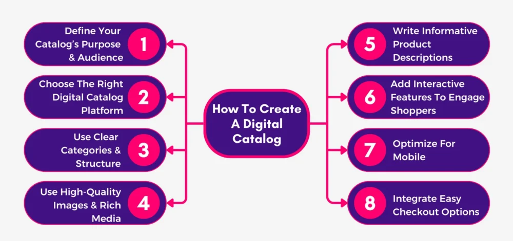
Follow these 8 steps, and you will have a catalog that doesn’t just look good but actually turns views into conversions.
Step 1: Define Your Catalog’s Purpose & Audience
A digital catalog isn’t just a bunch of pages with products. It needs a job. Maybe it is meant to launch a new collection, or maybe it is designed to give loyal customers an easy way to shop the latest drop. Without figuring that out, you create a catalog that looks nice but is more decoration than a sales tool.
Sort out two things before you touch design:
- What the catalog is supposed to do. Sell, showcase, or pitch – it can’t do all three at once.
- Who is going through it? Busy wholesale buyers need fast specs and prices. Shoppers at home want beautiful images and a quick “add to cart.”
Do this now: Write a short one-liner that says, “This catalog exists to [goal] for [audience].” Keep it visible while building. It keeps you from going off track.
Step 2: Choose The Right Digital Catalog Platform
The digital catalog software you pick can make or break your catalog. Pick the wrong one and you are staring at designs that look outdated, or worse – something that crashes on mobile. And nothing kills conversions faster than that.
When you are shopping for a digital catalog maker, check for:
- Speed of edits. If updating a product takes more than a couple of clicks, skip it.
- Interactive features. Hotspots, video, “add to cart” buttons – these are expected.
- Sharing options. A good catalog should embed easily on your site, in your emails, and even as a QR code in-store.
- Mobile-first design. Most people will open it on their phone. If it lags or feels clumsy, they are gone.
- Data tracking. You should know which pages get views and which products earn clicks. Without this, there is no way to improve future catalogs.
- Data protection. The best platforms come with built-in security to prevent data breaches. If your catalog tool doesn’t protect data, it is not worth using.
Do this now: Before you commit, upload a handful of your products into the digital catalog publishing platform or even use a free catalog template they provide. Open it on your phone. If it annoys you, it will annoy your customers.
Step 3: Organize Products With Clear Categories & Structure
Good design collapses if the catalog is messy. People need to scan and find what they want without effort. Make them fight with endless scrolling or buried menus, and they will bounce.
Here’s how to keep it clean:
- Group products the way customers shop, not the way your warehouse sorts SKUs. (Example: “Living Room Essentials” instead of “SKU 200–499.”)
- Keep categories shallow – two levels max. Nobody is clicking through 5 layers to reach a product.
- Put in-demand or high-profit products up front. Shoppers want assurance that they are choosing what others love.
- Make navigation obvious with tabs, menus, or filters. Saves time, increases conversions.
- Keep titles, descriptions, and specs consistent. Nothing kills trust like sloppy, mismatched info.
Do this now: Start with one of the free catalog design templates the platform offers and give your draft to someone who knows nothing about your brand. Ask them to find one product. If they hesitate, you need to fix the structure.
This gets even more critical when your audience is seniors. Many of them have health challenges that make confusing layouts frustrating. Clutter or disorganized information can actually slow down their decisions or cause mistakes.
Now, if you want to see how it should be done, you need to take a look at this comparison of the best medical alert systems for the elderly. Everything is crystal clear. Each system is broken down into easy-to-read tables with features, pros and cons, and pricing. A senior can glance at the page and immediately see which options might work best for them.
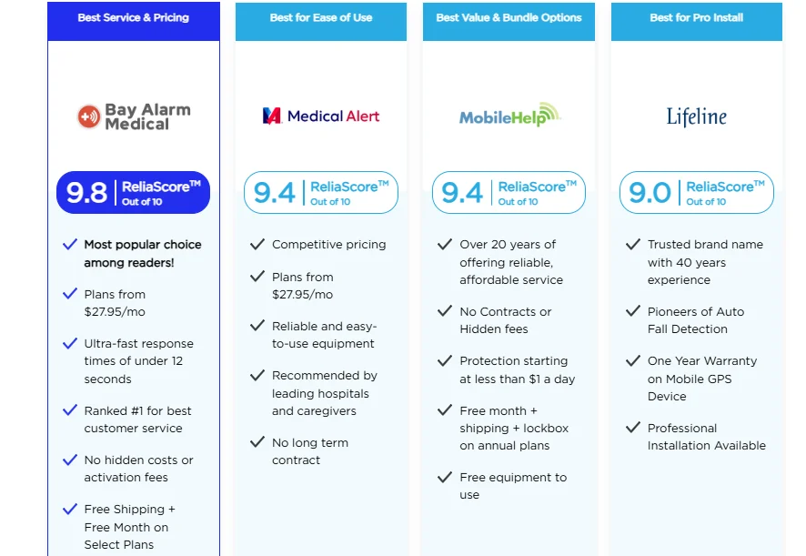
For your catalog, the takeaway is simple: think about your buyer’s perspective. Organize information so it is effortless to scan. If a user can compare products quickly and understand the differences at a glance, they will move from browsing to deciding without frustration.
Step 4: Use High-Quality Images & Rich Media
A catalog lives or dies on visuals. Grainy photos, weird lighting, or random sizes instantly signal “skip.” Shoppers don’t just want to see your product — they want to feel like they are handling it. That only happens if your media is sharp and intentional.
What to lock in:
- Consistent photography style. Same background, same lighting, same framing. Chaos makes it unprofessional.
- Mix of product-only and lifestyle shots. A clean shot shows detail. A lifestyle shot shows context. Both matter.
- Short demo clips. A 10-second demo can answer more questions than three pages.
- 360° or multi-angle views. Let people spin or swipe to see different views. That “control” keeps them browsing longer.
- Resized images. Images that lag \= lost shoppers. Always prioritize mobile-first experience and compress without killing sharpness.
Do this now: Before uploading, run your images through a simple checklist: is it crisp, consistent, fast-loading, and true to the product? If one box is unchecked, fix it or cut it.
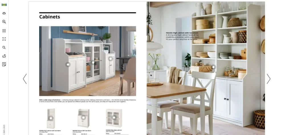
There are some niches where even if you use high-quality images, it is still not enough. You have to show the entire setting to set the direction for the customer. Let’s take the example of outdoor living brands. People shopping for these products need the full scene: the layout, the flow of space, how materials hold up outdoors, and whether the setup works structurally.
That is why we really like this piece on building an outdoor kitchen. What they did really well was combine visuals with practical direction. Instead of just adding glossy shots of cabinets, they show the full outdoor kitchen setting. They walk you through layouts, spacing between appliances, material durability, weight limits for decks, and even ventilation needs.

With these kinds of images, buyers can literally see how the setup comes together and imagine it in their own backyard. And that is when the media stops being eye candy and starts being a sales driver.
Step 5: Write Compelling & Informative Product Descriptions
A product photo grabs interest, but the description closes the deal. Weak copy makes even the best photo look unfinished. Your text has to give just enough detail to remove hesitation, without feeling like a wall of words.
Here’s how to write smarter:
- Lead with the “why.” Open with the main benefit, not a generic label.
- Keep it skimmable. Two to three short lines plus quick-hit bullets work better than chunky paragraphs.
- Stick to facts that matter. “Breathable fabric that stays cool in summer” beats “premium material” every time.
- Match tone to the audience. Selling luxury → Refined language. Selling to teens → Keep it casual.
- Consistency across products. Every item should follow the same structure so the catalog looks organized.
Do this now: Take one of your product descriptions and cut it in half. If it still communicates clearly, you are on the right track.
Now, product descriptions aren’t a big deal just for fashion brands or consumer gadgets. In fact, they matter even more in industries where buyers are making expensive, high-stakes decisions. These customers want details that tell them exactly what they are getting and how it impacts their ROI.
Take a commercial real estate firm as an example. When they build a digital catalog of available properties, throwaway lines like “spacious office space” won’t get anyone to pick up the phone. Buyers want to see square footage, zoning details, build-out options, compliance notes, and even projected tax savings. That clarity moves the deal forward.
And here’s where you can set your catalog apart: don’t just stop at the property specs – add resources that help your buyers make smarter financial decisions. For example, if you are showing a portfolio of properties, you could link to this resource on real estate cost segregation to let buyers accelerate depreciation and unlock major tax savings.
Now see the difference: instead of just giving someone a property listing, you are also giving them a way to save money on it. That is the kind of value-add that keeps you ahead of competitors who are only listing square footage and photos.
Step 6: Add Interactive Features To Engage Shoppers
Static catalogs feel outdated. Shoppers now expect to tap or swipe through like they would on Instagram or an online store app. Adding interactive elements keeps people actively engaged instead of passively scrolling.
What to build in:
- Tap-to-view hotspots. Let shoppers tap an image to get details or buy instantly.
- In-catalog checkout. Fewer steps \= higher conversions. Don’t send them away to buy.
- Smart navigation. Filters, search bars, and quick-swipe sections so shoppers don’t waste time hunting.
- Embedded video or GIFs. A product in motion draws more attention than static text.
- Zoom and flip features. People want to check textures or fine print before buying.
Do this now: Test one or two interactive elements on a new release before rolling them across the entire catalog. Watch what shoppers actually use and expand from there.
While interactive features are important for any business, they become critical when you are selling products where people’s lives depend on them. In these cases, clarity is essential. Your audience needs to understand functionality instantly, because hesitation or confusion can have real consequences.
To understand it better, let’s say you are selling a product like this emergency mass notification app. Here, you can’t just show screenshots or list features. Users need to see exactly how it works in real scenarios, and interactive elements are the best way to go about it.
So, what you can do is let users click on an alert icon or menu in your app screenshot to see what happens in real life. You can also add scenario-based demos where buyers can select different emergencies and see how the app reacts in each case.
To take it further, you can include simulated multi-user interactions, where buyers can see how alerts propagate across a network of devices or team members in real time.
Step 7: Optimize For Mobile & Cross-Device Compatibility
Most shoppers will open your catalog on their phone while multitasking – maybe on the couch, maybe in line at Starbucks. If it is slow or hard to tap through, you have already lost them.
And sure, mobile optimization is table stakes these days, no matter the industry. But some live and die by it. Beauty, aesthetics, wellness — these are spaces where the look and feel of your catalog have to be perfect.
It is not just about shrinking images or making buttons slightly bigger. Mobile optimization here means making sure the catalog still feels premium and cohesive. If the imagery or overall experience doesn’t carry over, your audience won’t trust you, and they certainly won’t convert.
Take The Dermatology and Laser Group, for example. Their site isn’t a catalog, but it is a masterclass in this principle. Open it on mobile and everything connects. Images maintain their clarity, and text is easy to scan. Moving between services or booking a consultation feels completely natural.
The brand’s elegance and trustworthiness come through just as strongly as on a laptop. That is what makes it so effective – they rethought the experience for mobile without losing any of the aesthetic appeal or authority.
Here are the key takeaways of this example so you can also keep your audience hooked:
- Design for thumbs, not cursors. Big tappable buttons, no tiny links.
- Cut the bloat. Heavy images that take forever to load \= instant exit. Compress smartly.
- Readable modern fonts. With 25% of US adults experiencing some visual impairment, your text needs to be easy to read on any device. If you squint to read it on a phone, shoppers won’t even try.
- Test on real devices. Don’t just preview in your platform’s editor. Open it on iPhone, Android, tablet, desktop. Break it yourself before customers do.
- Cross-device continuity. If someone starts browsing on their phone and switches to a laptop, the catalog should pick up where they left off.
Do this now: Before launch, open the digital product catalog on multiple devices. Try to complete a purchase from each. If something feels slow or awkward, fix it before shoppers ever see it.
Step 8: Integrate Easy Checkout Options
Shoppers shouldn’t need a GPS to buy from your catalog. The second you push them to an external site, or make them fill 5 fields, half of them bounce.
Make checkout brain-dead simple:
- In-catalog checkout. Let buyers add to the cart and pay without jumping to an external page.
- Offer wallet payments. Apple Pay, Google Pay, PayPal – whatever makes it faster.
- One-step flow. More screens \= more drop-offs. Keep checkout short and direct.
- Auto-fill friendly. Mobile wallets and browsers store info for a reason. Make sure your online product catalog plays nice with them.
- Instant confirmation. End with a clean order summary and reassurance that payment went through.
Do this now: Perform a test run yourself. If you sigh halfway through, it is already too complicated.
Pro-Tip: Building a smooth and secure checkout is harder than it looks. You are dealing with payments, compliance, user experience, and integrations that tie into your inventory and CRM. If you don’t have the right team, you risk checkout glitches that kill conversions.
To overcome this, consider hiring a software outsourcing firm that brings in vetted developers and UX experts specializing in eCommerce flows. Instead of trial and error, you get people who know how to implement mobile-first checkout and integrate wallets, all while tightening up security from day one.
3 Digital Catalogs Examples Every Brand Can Learn From
If you want to see what a digital catalog can really do, check out these 3 brands that are actually pulling people in.
1. Nike’s 2025 Product Guides
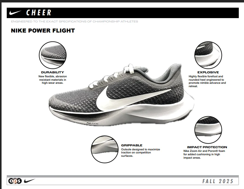
Nike knows how to tell a story, and their catalogs prove it. Open one up, and you feel like you are flipping through a magazine that happens to be shoppable.
Here’s What They Are Doing Right:
- Big lifestyle shots – athletes mid-action, gear styled in context.
- Flipbook format where every product image is clickable. No looking for product codes.
- Seasonal launch calendars are built right in, so you know what is dropping and when.
- Direct integration with SNKRS – hype meets catalog.
Why This Works So Well:
- Inspiration first, purchase second. They hook you with visuals and then remove all the friction to buy.
- The built-in calendar keeps people coming back instead of treating the catalog as a one-off read.
What You Can Copy Right Now:
- Open your catalog with 2–3 full-bleed lifestyle spreads. Don’t jump straight into product grids.
- Use platforms like ZoomCatalog or any other free online catalog maker to make products instantly clickable.
- Add a simple “launch calendar” section. Even if you don’t drop sneakers, you can tease seasonal arrivals or limited runs.
2. IKEA’s 2025 Catalogs
IKEA doesn’t just sell you a chair. They sell you the dream of an entire room where that chair makes sense. That is why their digital brochures are so addictive.
Here’s What They Are Doing Right:
- Full-room layouts that let you picture how everything works in your own space.
- Multiple formats: interactive brochures, downloadable PDF catalog, and planning tools.
- Localized catalogs, so customers in different markets see what is actually available to them.
- Links into their planners and shopping lists – this makes it ridiculously easy to go from browsing to buying.
Why This Works So Well:
- Instead of leaving you to figure it out, IKEA lays it all out clearly.
- The different formats mean everyone is covered — casual browsers, serious planners, and bulk buyers.
What You Can Copy Right Now:
- Create “room stories” in your catalog, like “Starter Home Office” or “Cozy Living Room for Four.”
- Always publish both an interactive and a downloadable version. Some people want to click, others want to save.
- Bundle products. Add a one-click option to add the whole set, or at least a pre-filled shopping list.
3. Festool’s 2025 Interactive Catalog
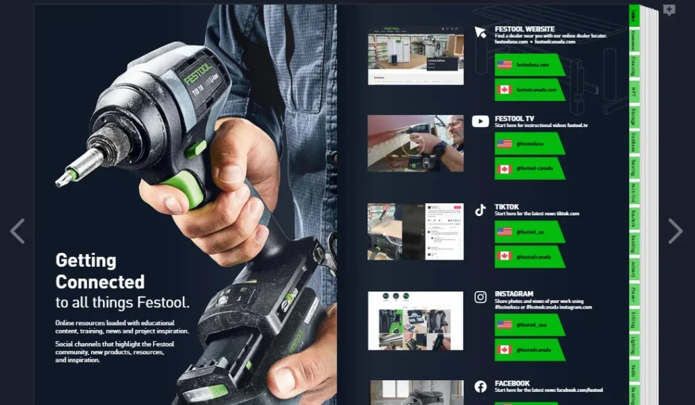
This one is for the B2B crowd. Festool’s interactive catalog is a working sales and support tool. If you sell technical products, this is the standard to beat.
Here’s What They Are Doing Right:
- Full spec sheets are built right into the catalog.
- Search and compare tools so you can line up products side by side.
- Embedded videos showing how products actually work.
- Options to download just the pages you need or add notes directly in the catalog.
- Links to training, warranty, and service, which make it a complete ecosystem.
Why This Works So Well:
- B2B buyers don’t have time to waste on maybes — they need fast, accurate specs.
- Adding notes and comparison tools makes the catalog part of the buyer’s workflow.
- Integration with training and service builds trust and long-term retention.
What You Can Copy Right Now:
- Add searchable spec tables when you publish your own catalog online.
- Embed short “how-to” clips for products that aren’t self-explanatory.
- Give users a way to export or save selected products into a quote or order form.
Conclusion
Knowing how to create a digital catalog is really about building a shopping experience people don’t want to click away from. Anything else is wasted space. So if you are putting the time in, go all the way. Design it for how people scroll, not how you think they should. Keep every detail tight because those small things pile up into one big thing – sales.
We are DesignWorkLife, a team of designers and creative souls who can fuel your progress. From in-depth how-tos and trend-savvy insights to curated freebies and font generators, we give designers the tools to elevate every project.
Explore, learn, and level up with us at DesignWorkLife – where design meets life, and every catalog you build starts with creativity that counts.
Author Bio:
Burkhard Berger is the founder of Novum™. He helps innovative B2B companies implement modern SEO strategies to scale their organic traffic to 1,000,000+ visitors per month. Curious about what your true traffic potential is?
- Author picture: Here
- Gravatar: vip@novumhq.com