In this article:
- What Is Vertical Rhythm?
- How Consistency Enhances Typographical Design
- How Can You Master Vertical Rhythm in Typographical Design?
- Try Vertical Rhythm and Track the Results
Why do some fonts stand out while others fade into obscurity? Consistency in typographical design creates the visual connectedness that drives user engagement. A highly readable and scalable headline or logo is the most desirable. How can you ensure yours follows a logical pattern and taps into the power of vertical rhythm?
What Is Vertical Rhythm?
Vertical rhythm is a design technique that considers text placement as the user scrolls down a page. Whether a website is readable or not often depends on how skilled the designer is at creating a legible and pleasing look.
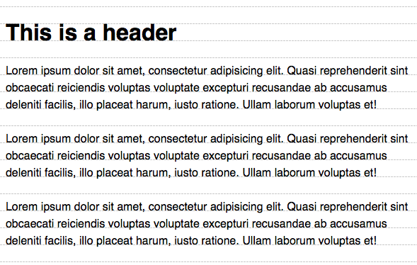
Using systems such as an eight-point grid ensures designs repeat patterns so they are predictable for readers. Whether using an eight-point or another configuration, coming up with a baseline grid for your designs is crucial to equal spacing.
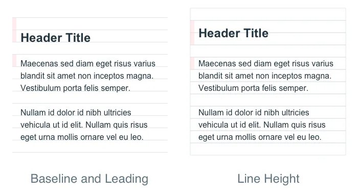
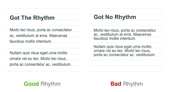
Excellent vertical rhythm has strong contrast, a spacing hierarchy and equal placement down the page. If you placed a sheet with lines behind the text, it would sit perfectly on the lines without crossing over any of them.
The baseline grid alone is not enough to create vertical rhythm. It is a start. Having an eye for detail and an understanding of basic design principles is crucial to typographical design that works.
Why Does Vertical Rhythm Matter?
Although typography might seem like a minor part of the overall user experience (UX), it is one of the first impressions users have of your website. Eighty-seven percent of people who have a positive experience will buy again. Focusing on the small details impacts the UX and builds brand loyalty.
How Consistency Enhances Typographical Design
Consistency is an element many cannot quite put a finger on. If asked why they enjoy reading a page, they may not be able to express the reasons. However, vertical design likely plays a significant role in this experience.

Get 300+ Fonts for FREE
Enter your email to download our 100% free "Font Lover's Bundle". For commercial & personal use. No royalties. No fees. No attribution. 100% free to use anywhere.
Establishing trust with site visitors is achieved through a professional, cohesive appearance, which reassures users about your site’s credibility. Using the same fonts and spacing across site pages helps create a recognizable brand style that draws users in from the moment they land on your site.
Additionally, blocks of text that add authority to the site also enhance readability, making it easier for visitors to absorb information. The use of repetitive elements like these is more familiar to readers, allowing them to connect more naturally with your brand.
Vertical typography and linear web design go hand and hand to create a clear path for site visitors to follow. When users know what to expect, they feel more engaged and inclined to stay on your site longer.
How Can You Master Vertical Rhythm in Typographical Design?
Finding the perfect vertical rhythm improves the overall aesthetics and makes readability intuitive. While experience helps with typographical design, a few tips help with better spacing and consistency.
1. Be Choosy With the Font
If you start with something too complex, it may be difficult to read on smaller screens and at different sizes. Stick to a serif or sans serif font whenever possible, save for a logo or site heading. For H2s and body text, you will need something that is as readable at 12 points as 30 points.
Remaining in the same font family also ensures the height and width of the fonts are similar. It is much easier to make letter spacing consistent when they have a familiar structure. Use font pairs that have the same mood and style.
2. Use Design Tools for Your Baseline Grid
Do not just wing it when it comes to designing a strong baseline grid. Since you will follow it throughout the design process, you want something highly accurate.
Programs such as InDesign and CSS code can help with spacing to ensure accuracy. If designing a logo, you will even find ruler lines in programs such as Canva.
3. Determine the Best Line Height
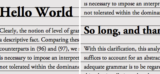
UX designers prefer to keep line height around 150% of the chosen font size. For an 18-pixel font, the height would be 27 px. Keeping the line height the same lets you snap the text to the bottom of each line and still have enough spacing so the taller letters do not run into the shorter ones, such as the difference between a lowercase “L” and “A.”
4. Create a Hierarchy for Padding and Margins
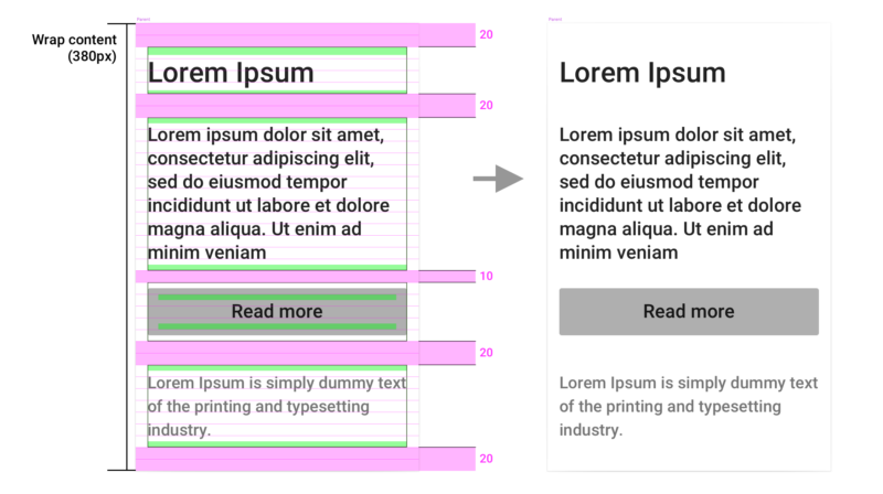
You would expect to see more space between a logo and the body text than between paragraphs in a text block. The margin around images and padding between elements should be consistent as well for good vertical flow.
The whitespace may be as crucial to creating visual harmony as the text. Start by aligning margins with the baseline grid. The spacing should match what is already in the grid pattern.
Try to use basic math for the best formula. For example, if you use multiples of four, you might have 12 pixels, 16 px and 20 px.
5. Design for Responsiveness
Nearly 94% of the world uses smartphones to access the internet at least some of the time. Most designers work on larger screens and can forget the importance of designing a fluid grid.
If vertical rhythm should be anything, it should be adaptable to different devices. You want page elements to appear with similar spacing across screen sizes but to scale.
Using the same rhythm across multiple devices drives home branding and keeps a similar perception no matter where the person accesses your site. Recognizable brand sites such as VRBO look the same on desktop and mobile.
Some of the ways to create consistency no matter how users access your site include tapping into the power of CSS media queries and using fluid grids that adjust as necessary in increments. Use relative units for better scaling options.
6. Pay Attention to Contrast
The best typographical design considers spacing as well as the overall look. Contrast with other elements on the page can guide the user in the direction you wish them to go.
For example, if you are drawing them in, offering facts and encouraging them to click on a call-to-action button, you might have a larger space for the headline, closer spaces for smaller font text and learn more info, then a medium space for the button.
Venture Labs is one example of a site using different sizes and weights alongside scrolling features to create a rhythm as the user moves down the page. Improving contrast can create a more positive experience for users, reducing bounce rates.
7. Edit for Clutter
A cluttered page is distracting and difficult to read. An excellent vertical rhythm pulls text apart. If something wraps too closely around an image, more padding may be necessary to set it apart.
Take a step back from the design after setting your gridlines and make sure it looks good from a distance and up close. You will have to use your designer’s eye and best judgment to decide if things work well together. You can follow all the rules, but without a bit of discernment, the idea can still fall flat.
8. Seek Accessible Fonts
Fonts are not created equal. Unless you are making it from scratch, you will need to seek one that has enough kerning between letters for them to remain readable to those with accessibility challenges.
Can someone with low vision still read the text on a small screen, or is it so close together that the words run into one another? Consider various accessibility issues and start with a typeface that considers conditions such as dyslexia.
Some fonts frequently recommended as accessible include:
- Tahoma
- Georgia
- Lucida Sans
- Helvetica
- Verdana
- Arial
- Palatino
- Century Gothic
- Times New Roman
- Garamond
- Calibri
- Sofia Pro
9. Choose Cap Height or X-Height
One issue beginning designers often make is failing to choose a cap or X-height to align the design to. Because uppercase letters in some fonts expand above lowercase ones, it is crucial to pick one or the other.
When using cap height, you will align the grid to the top of the uppercase letters. With X-height, you will align to the top of lowercase letters.
Another option is to align to the bottom of all letters, but you will still need to pay attention to spacing based on cap and X-heights. Whatever method you select, follow it throughout your site. For example, never shift from X-height to cap height.
10. Double-Check Links
Many designers try to set off inline links by making them bold or slightly larger. While it does grab user attention, it can be distracting and mess up your vertical spacing. Instead, try to stick with a standard format for all text on your page.
Try Vertical Rhythm and Track the Results
Tweak a webpage you would like to see have more engagement and conversions. Once you are finished aligning typography vertically and fixing spacing issues, run some split tests to see which version performs the best.
You will likely find people stay on the page longer and interact with buttons and other animated features more frequently. You may even notice you are getting a lot of repeat visitors and lower bounce rates. Vertical rhythm is just one thing you can change to improve the UX of your site, but it has a powerful impact.

