In this article:
- Not All Interfaces Are Created Equal
- Size and Position Send a Message
- Color Isn’t Just for Looks
- Typography Shapes Understanding
- Icons and Visual Cues Work Wonders
- Less Clutter, More Clarity
- Adapting to Different Devices
- Wrapping Up: Design With Intention
In the world of online learning, content is king—but design is the crown. A great course with poor visuals? That’s like serving gourmet food on a paper plate. Learners notice. They click away. They get distracted. Design shapes experience, and visual hierarchy is one of the biggest game-changers.
Not All Interfaces Are Created Equal
You’ve probably scrolled through a few platforms and noticed how some just feel easier to use. That’s not luck. That’s visual structure doing its job. It guides the eye. It tells the brain where to go first. And it helps users move through information without getting lost.
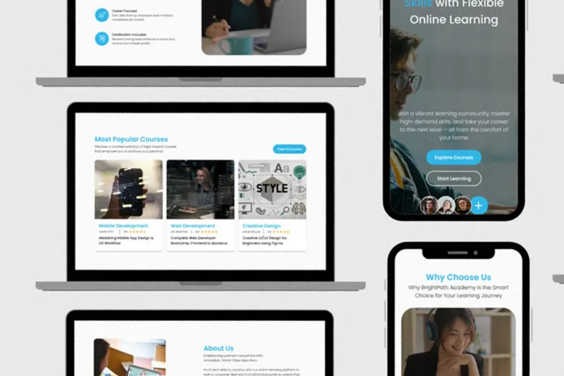
You’ll see this in many learning management system examples. Some use bold titles, clean sections, and lots of white space. Others cram everything together with no clear focus. Guess which one keeps students around longer?
Size and Position Send a Message
In design, bigger isn’t just louder—it’s more important. That’s how our brains work. We look at the largest element first. If your course title is tiny and buried at the bottom, people will miss it. But place it front and center? Now it sets the tone.
Same goes for buttons and calls to action. If the “Next” button is lost in a sea of links, users won’t know where to click. That creates friction. And friction leads to frustration. Visual hierarchy solves this by organizing size and position in a smart way.
Color Isn’t Just for Looks
Colors are not just about aesthetics; they bring a whole new vibe to a site. They guide attention. They create mood. They also help with recall. Red can signal urgency. Blue builds trust. Yellow grabs attention fast. When used right, color supports learning. When overused, it causes chaos.
Stick with a limited palette. Use bold colors for key elements. Keep the background calm so the content stands out. A clean interface with smart color choices can boost focus and reduce mental strain.
Get 300+ Fonts for FREE
Enter your email to download our 100% free "Font Lover's Bundle". For commercial & personal use. No royalties. No fees. No attribution. 100% free to use anywhere.
Typography Shapes Understanding
Fonts might seem like a small detail, but they’re actually huge for user experience. Clear text keeps learners reading. Confusing fonts or crowded lines can slow them down or push them away.
Use headers to break up long pages. Choose one or two easy-to-read fonts. Avoid tiny text. Space things out. Good typography helps learners move through material smoothly. It turns reading into something effortless.
Icons and Visual Cues Work Wonders
Words aren’t always enough. That’s where icons come in. They add context. They signal what’s interactive. They also make information easier to scan. You don’t need a design degree to spot a download icon or a play button. These visuals are universal.
Use icons for navigation, alerts, or actions. Keep them consistent. A well-placed symbol can guide someone faster than a sentence ever could. And when users don’t need to stop and think? They stay engaged.
Less Clutter, More Clarity
Cramming too much into one screen is a big mistake. It overwhelms the eye. It makes users bounce. A strong visual hierarchy creates breathing room. It highlights what truly counts.
Group related items. Break content into chunks. Add some space between sections. White space isn’t empty—it’s powerful. It lets learners focus without getting drained. The cleaner the layout, the stronger the message.
Adapting to Different Devices
Learners don’t just sit at a desk anymore. They learn on phones, tablets, and laptops. That means your interface has to adjust. Visual hierarchy helps maintain flow no matter the screen size.
Make sure headings scale well. Test buttons for touchscreens. Keep navigation simple. Responsive design keeps users from getting lost. And when they can learn anytime, anywhere? That’s a huge win for engagement.
Wrapping Up: Design With Intention
Visual hierarchy isn’t a fancy term for designers to toss around. It’s a real tool. One that helps learners absorb, retain, and enjoy what they’re doing. From spacing to color to font choices—every little tweak counts.
If you’re building an interface or evaluating one, start by asking what jumps out first. What draws the eye? What gets ignored? Take notes from solid learning management system examples. The ones that feel natural, organized, and smooth. That’s not by accident—it’s smart design doing its job.
