In this article:
- The Most Beautiful Indian Fonts of 2026
- What Makes Indian Typography So Distinctive?
- Where To Use Indian Fonts Effectively
- Where To Avoid Indian Fonts
- How To Choose The Perfect Indian Font
- Perfect Pairings for Indian Fonts
- Common Questions About Indian Fonts
- Conclusion: The Timeless Beauty of Indian Typography
Indian typography tells stories through shapes—curves that dance, lines that flow with centuries of cultural meaning. The scripts of India aren’t just alphabets; they’re visual poetry reflecting the diverse heritage of a nation with 22 official languages.
From the geometric precision of Devanagari to the rounded elegance of Malayalam, each script carries distinct personality. What makes Indian fonts so powerful in design is how they instantly evoke a sense of place—bringing with them the colors, textures, and rhythms of the subcontinent.
These typefaces bridge worlds, connecting ancient calligraphic traditions with modern design needs. Whether used in branding, editorial work, or digital interfaces, Indian typography offers designers an extraordinary palette of visual expression rooted in one of humanity’s richest typographic heritages.
In this post, I’ll be exploring the most captivating Indian fonts of 2026, diving into:
- What makes Indian typography unique and recognizable
- The best Indian-inspired fonts for different applications
- How to effectively incorporate Indian fonts into your designs
- Perfect font pairings for authentic South Asian aesthetics
- Answers to common questions about Indian typography
Important Note: Some fonts in this collection may be inspired by Indian aesthetics rather than being authentic representations of specific Indian scripts. We’ve made efforts to distinguish between authentic scripts and stylized interpretations. When working on projects requiring cultural authenticity, please research the specific regional scripts appropriate for your content. Thank you to our Indian friends for being patient with us as we learn more about your beautiful culture.
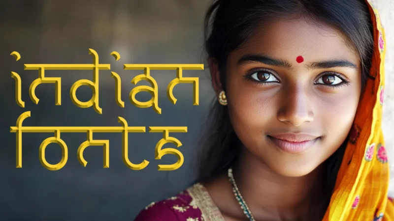
The Most Beautiful Indian Fonts of 2026
I’ve carefully curated this collection of stunning Indian and Indian-inspired fonts that can elevate your design projects with the rich visual language of South Asia. Here are my top picks:
Night Hindi
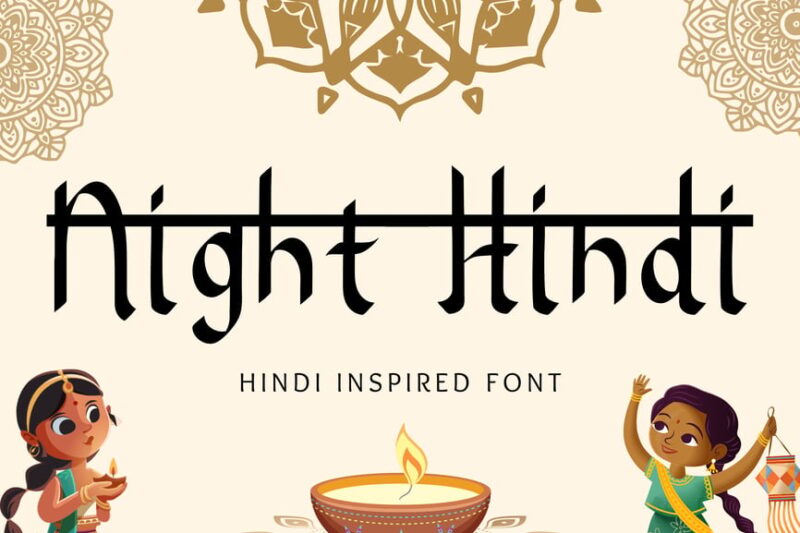
Night Hindi is a decorative display font that combines Hindi script with cultural elements. This font is perfect for creating eye-catching headlines or titles with a distinct Indian flair, ideal for projects that require a bold and authentic cultural representation.

Get 300+ Fonts for FREE
Enter your email to download our 100% free "Font Lover's Bundle". For commercial & personal use. No royalties. No fees. No attribution. 100% free to use anywhere.
Qawatone
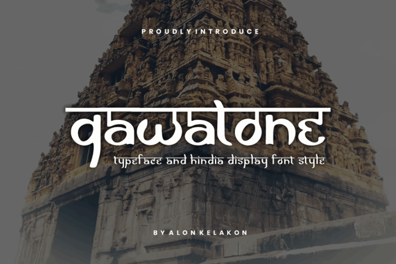
Qawatone is a free Hindi display font with decorative elements. Its unique typeface design makes it suitable for creating striking visuals in projects that require a blend of traditional Hindi script and modern aesthetics.
Kantata Aksara
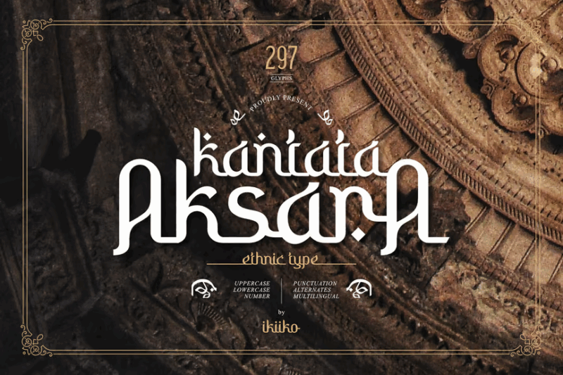
Kantata Aksara is an ethnic display font that celebrates cultural diversity. This decorative typeface is perfect for designers looking to add an authentic, indigenous touch to their projects, especially when creating logos or branding materials with a strong cultural identity.
Indikhala
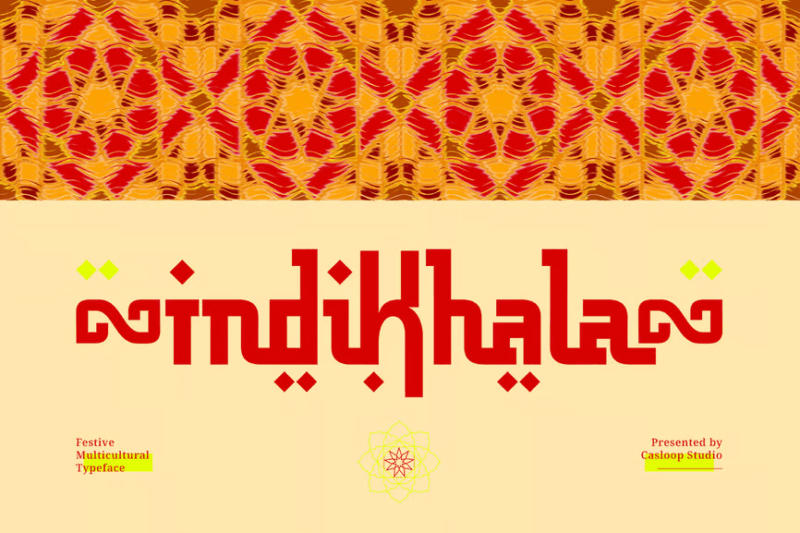
Indikhala is an Arabic typeface designed specifically for Eid and Ramadan-themed projects. This decorative font captures the essence of Islamic celebrations, making it ideal for creating festive designs, greeting cards, or promotional materials during these special occasions.
Krishna
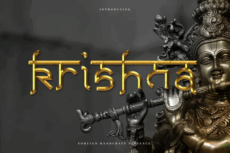
Krishna is an authentic Indian typeface that combines sans-serif elements with decorative features. This versatile font is perfect for creating logos and branding materials that require a modern Indian aesthetic, striking a balance between readability and cultural authenticity.
Hindi Raj
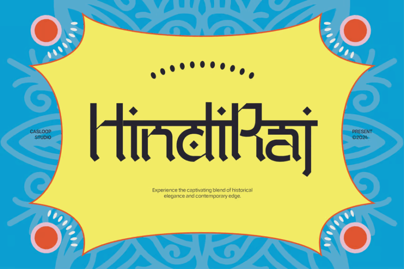
Hindi Raj is a traditional Devanagari font with a festive Indian flair. This sans-serif typeface offers a neat and clean appearance while maintaining its cultural roots, making it suitable for a wide range of design projects that require a touch of Indian heritage.
Mahatie
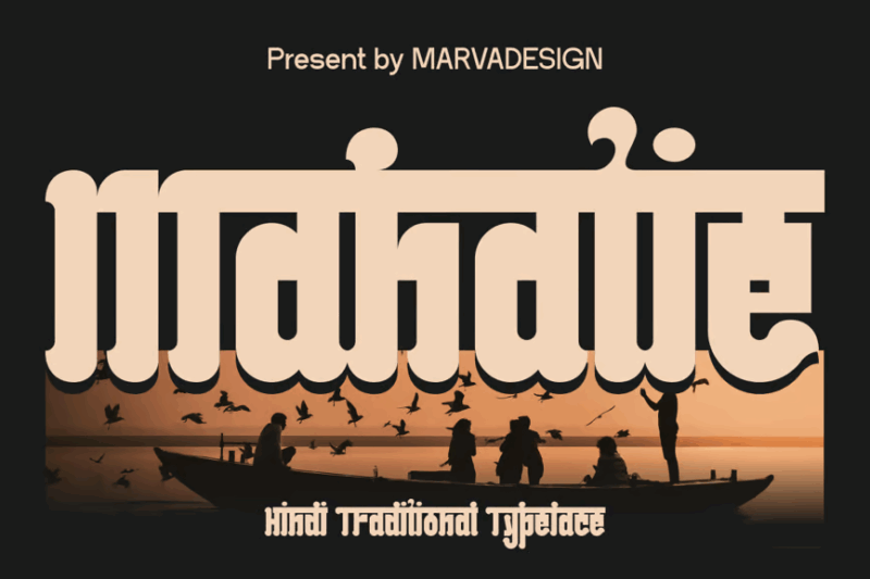
Mahatie is a traditional Hindi font with a modern twist. Its condensed design and decorative elements make it an excellent choice for creating contemporary designs that still honor traditional Hindi typography, perfect for branding or editorial projects.
Qasira
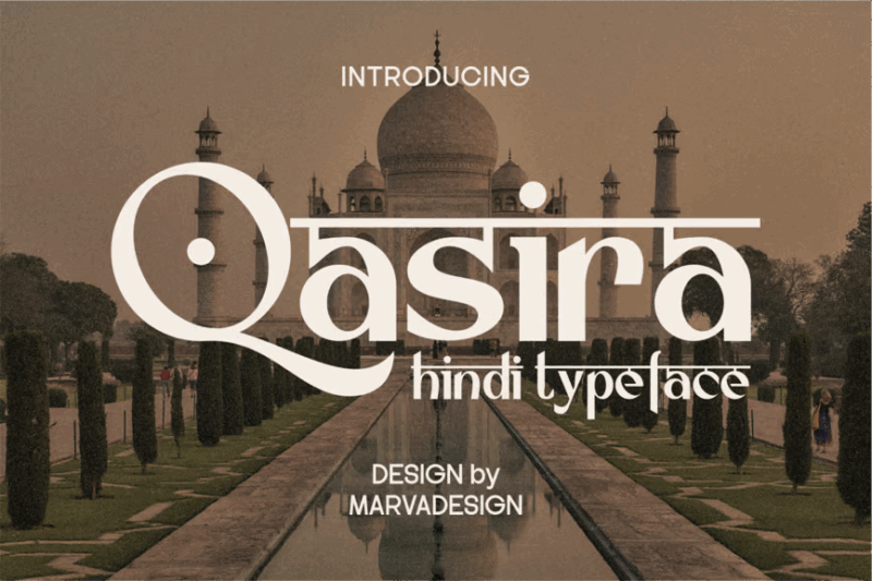
Qasira is a modern Hindi font with a clean sans-serif design. This typeface offers excellent readability while maintaining a contemporary look, making it ideal for digital interfaces, branding, and any project that requires a fresh take on Hindi typography.
Nistha
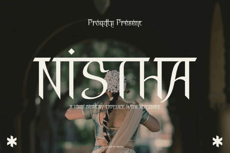
Nistha is a Hindi display font with a cinematic quality. Its bold and decorative design makes it perfect for movie posters, titles, and other projects that require a dramatic and eye-catching Hindi typeface with a touch of Bollywood glamour.
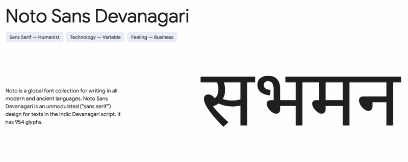
Noto Sans Devanagari
Noto Sans Devanagari is a clean and versatile sans-serif font designed by Google. It offers excellent legibility across various sizes and supports a wide range of Devanagari characters, making it ideal for both digital and print applications requiring a modern and professional Hindi typeface.
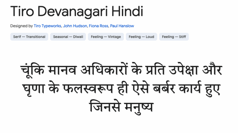
Tiro Devanagari Hindi
Tiro Devanagari Hindi is a sophisticated typeface available on Google Fonts. It features elegant letterforms and balanced proportions, making it suitable for long-form text in print and digital media, as well as for creating refined headlines in Hindi.
Ananda Yetauti Devanagari
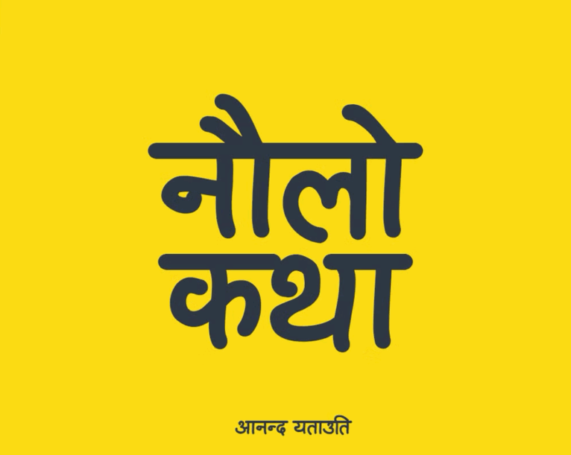
Ananda Yetauti Devanagari is a script font that brings a handwritten charm to Devanagari typography. Its flowing lines and organic feel make it perfect for creating personal, friendly designs in Hindi, ideal for invitations, greeting cards, or casual branding projects.
Ananda Fanko Devanagari Handwriting
Ananda Fanko is a handwritten Devanagari font that captures the essence of natural Hindi penmanship. Its authentic look and feel make it ideal for projects that require a personal touch, such as handwritten notes, informal branding, or designs aimed at creating a warm, approachable atmosphere.
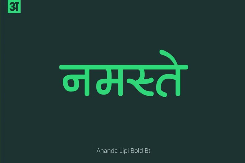
Ananda Lipi Devanagari
Ananda Lipi Devanagari is a beautifully crafted font that combines traditional Devanagari letterforms with modern design sensibilities. Its balanced and elegant appearance makes it suitable for a wide range of applications, from book typography to branding projects that require a sophisticated Hindi typeface.
Samarkan Normal
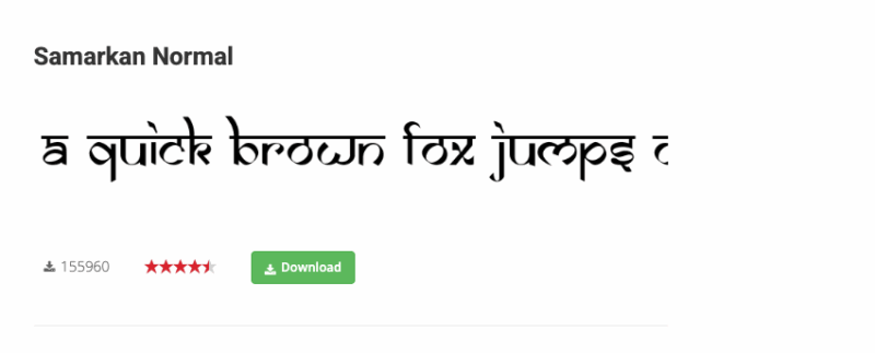
Samarkan Normal is a decorative Devanagari font with a distinctive, ornate style. Its elaborate letterforms and intricate details make it suitable for titles, headings, and special design projects that require a touch of elegance and cultural flair. This font would be particularly appealing for designs related to Indian themes or when aiming to create a visually striking impact.
What Makes Indian Typography So Distinctive?
Indian typography has several unique characteristics that give it such a recognizable aesthetic:
Complex Character Systems
Unlike Latin alphabets, many Indian scripts are abugidas, where consonants carry an inherent vowel that can be changed with diacritical marks. This creates a fascinating structural complexity and visual rhythm in the text. Characters often connect with one another through a horizontal line called a “shirorekha” in scripts like Devanagari, giving the text a flowing, connected appearance.
Curved, Flowing Forms
Many Indian scripts feature graceful, rounded forms with elaborate curves. These curved strokes create a sense of movement and fluidity across the text. Even in modernized versions, this organic quality is often preserved, giving Indian fonts their distinctive flowing appearance.
Vertical and Horizontal Balance
Traditional Indian scripts masterfully balance vertical strokes with horizontal elements. This creates a visual harmony and rhythm that’s immediately recognizable. The careful equilibrium between these elements is what gives many Indian fonts their distinctive structural integrity.
Rich Ornamental Details
Decorative elements are often incorporated into Indian typography, especially for display purposes. These can include flourishes, swashes, and other embellishments that add layers of visual interest without compromising readability. This ornamental tradition reflects India’s rich decorative arts heritage.
Where To Use Indian Fonts Effectively
Now that we understand what makes Indian typography special, where can we use these fonts most effectively? Here are some perfect applications:
Cultural Celebrations & Events
Indian fonts shine in designs for cultural events, festivals, and celebrations. They bring instant authenticity to wedding invitations, Diwali greetings, Holi festival materials, or any South Asian cultural gathering. The ornate details and flowing forms perfectly complement the festive nature of these occasions.
Restaurant & Food Branding
For South Asian restaurants, food packaging, or culinary brands, Indian typography creates an immediate cultural connection. The right font can transport customers to the streets of Mumbai or the spice markets of Delhi before they even taste the food, creating a complete sensory experience.
Travel & Tourism
Travel companies, tour operators, or hospitality businesses focusing on South Asian destinations can use Indian fonts to evoke the essence of the region. These typefaces instantly communicate the exotic beauty and cultural richness awaiting travelers.
Fashion & Textiles
Indian-inspired clothing lines, textile designs, and accessories pair beautifully with authentic Indian typography. The flowing forms of the scripts often echo the draping qualities of traditional Indian garments like saris, creating a harmonious visual language.
Wellness & Spirituality
Yoga studios, meditation centers, Ayurvedic products, and spiritual retreats can use Indian fonts to connect with the subcontinent’s ancient traditions of wellness and mindfulness. The balanced, harmonious forms of the scripts visually reinforce messages of balance and harmony.
Where To Avoid Indian Fonts
While versatile, there are some contexts where Indian fonts may not be the best choice:
Extended Body Text
Many decorative Indian fonts are designed for headlines or short phrases rather than long passages. For extended body text, especially in English or non-Indian languages, consider pairing an Indian display font with a more readable serif or sans-serif for content.
Minimalist Designs
The ornate nature of many Indian fonts can clash with extremely minimalist aesthetics. If your overall design approach is very spare and clean, consider using more simplified Indian-inspired fonts or using them very sparingly as accent elements.
Inappropriate Cultural Contexts
Avoid using Indian fonts merely for their “exotic” appeal when there’s no relevant cultural connection to the content. This can come across as cultural appropriation rather than appreciation. Always ensure there’s a meaningful reason for your typographic choices.
How To Choose The Perfect Indian Font
Selecting the right Indian font requires consideration of several factors:
Authenticity vs. Stylization
Determine whether you need an authentic representation of an Indian script (for actual text in Hindi, Tamil, etc.) or simply an Indian-inspired aesthetic for Latin text. For the former, ensure you’re using properly designed fonts for the specific language. For the latter, stylized options can work well.
Regional Specificity
India is incredibly diverse, with distinct regional traditions. If your project relates to a specific region of India, research the appropriate script for that area. A Tamil-inspired font would be inappropriate for content relating to North India, for example.
Readability Needs
Consider the context in which your text will be read. Headlines and logos can use more decorative Indian fonts, while body text might need simpler versions or complementary non-Indian fonts for clarity.
Cultural Sensitivity
Be mindful of religious and cultural associations. Some scripts are strongly associated with religious texts or traditions. Research the cultural context of the font you’re considering to ensure appropriate usage.
Perfect Pairings for Indian Fonts
Creating harmony between Indian fonts and other typefaces can elevate your designs:
Clean Sans Serifs
The ornate nature of many Indian fonts pairs beautifully with clean, modern sans serifs. Try coupling an elaborate Indian display font with Helvetica Neue, Montserrat, or Open Sans for body text.
Classic Serifs
For a more traditional feel, pair Indian fonts with elegant serifs. Garamond, Baskerville, or Georgia can complement the flowing forms of Indian scripts while maintaining readability for longer text passages.
Contemporary Handwritten Fonts
For an organic, artistic feel, try pairing simplified Indian fonts with contemporary handwritten typefaces. This combination works especially well for wedding invitations or creative projects.
The key is finding balance – letting the Indian font be the star while supporting it with complementary typefaces that don’t compete for attention.
Common Questions About Indian Fonts
Let’s address some frequently asked questions about Indian typography:
What is the most popular Indian font?
For Devanagari script (used in Hindi, Sanskrit, and other languages), Nirmala UI and Mangal are widely used digital fonts. For stylized Indian-inspired Latin fonts, Samarkan remains one of the most recognized options, though professional designers often prefer more nuanced choices.
Are Indian fonts free to use?
Many Indian fonts are available through Google Fonts and other free platforms, but premium options with better character sets and refinements are available through professional font foundries. Always check licensing for commercial projects.
How can I type in Indian scripts?
Modern operating systems support Indian language input. You can enable Hindi, Tamil, Bengali, and other Indian language keyboards in your system settings. For occasional use, online tools like Google Input Tools allow typing in various Indian scripts.
What font is used in Bollywood movie posters?
Traditional Bollywood posters often used hand-painted lettering rather than digital fonts. Modern Bollywood typography varies widely, though stylized Devanagari and bold display fonts are common. There’s no single “Bollywood font,” but rather a diverse tradition of expressive typography.
How do I know if an Indian font is authentic?
Authentic Indian script fonts will have complete character sets for the specific language and will be named after the script or language (e.g., “Hindi,” “Devanagari,” “Tamil”). Stylized fonts meant only for decorative English text often have exotic-sounding names but limited character sets.
Conclusion: The Timeless Beauty of Indian Typography
Indian typography represents one of the world’s richest and most diverse typographic traditions. From the geometric precision of South Indian scripts to the flowing lines of Devanagari, these writing systems have evolved over thousands of years to become both functional communication tools and incredible works of art.
By incorporating Indian fonts thoughtfully into your designs, you can tap into this heritage and create work that resonates with the visual rhythm and cultural depth of South Asia. Whether you’re designing for an Indian audience or simply drawing inspiration from this typographic tradition, these fonts offer endless creative possibilities.
Which Indian font catches your eye the most? Are you using any of these in your current projects? Let me know in the comments!


