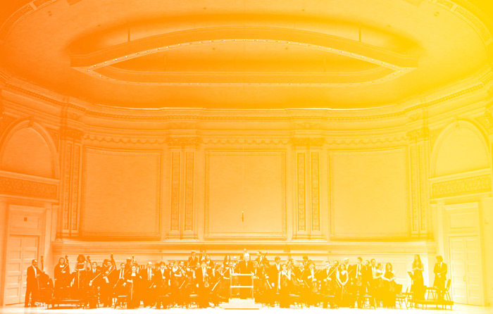
The orchestra, consisting of musicians from countries in the Middle East — of Egyptian, Iranian, Israeli, Jordanian, Lebanese, Palestinian, Syrian and Spanish background — served as an interesting and unique challenge in brand identity, UI/UX and strategy (it’s not every day that your client is an international orchestra). I interviewed Darrin to dive deeper into his work and dissect his process, execution and experience with the West-Eastern Divan Orchestra.
We knew we had to find a solution that would be able to represent them all as one.
GP: What was the most important objective in creating the brand identity for the orchestra?
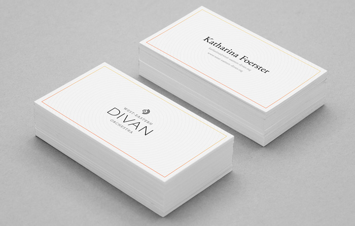
DH: Our goal was to honestly reflect the straightforward philosophy of the orchestra in a clear simple way. Divan is an international orchestra comprised of musicians from all over the Middle East, and this identity needed to represent all of them as a collective whole. To achieve this, we had to fully understand the history of the orchestra and its founders. The Simple.Honest.Work. team and I read all of the books we could find, watched documentaries, conducted interviews and for the first few months, had conversations to listen to what everyone else had to say.
You interviewed people from all over the world and studied the history of the middle east as part of your process. How does this come through in your design?
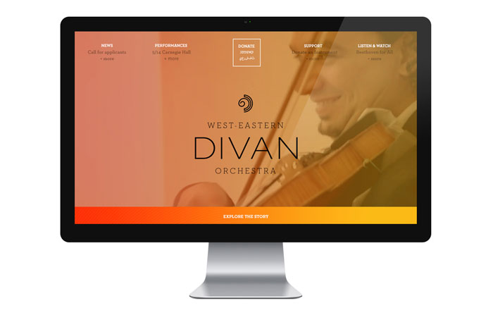
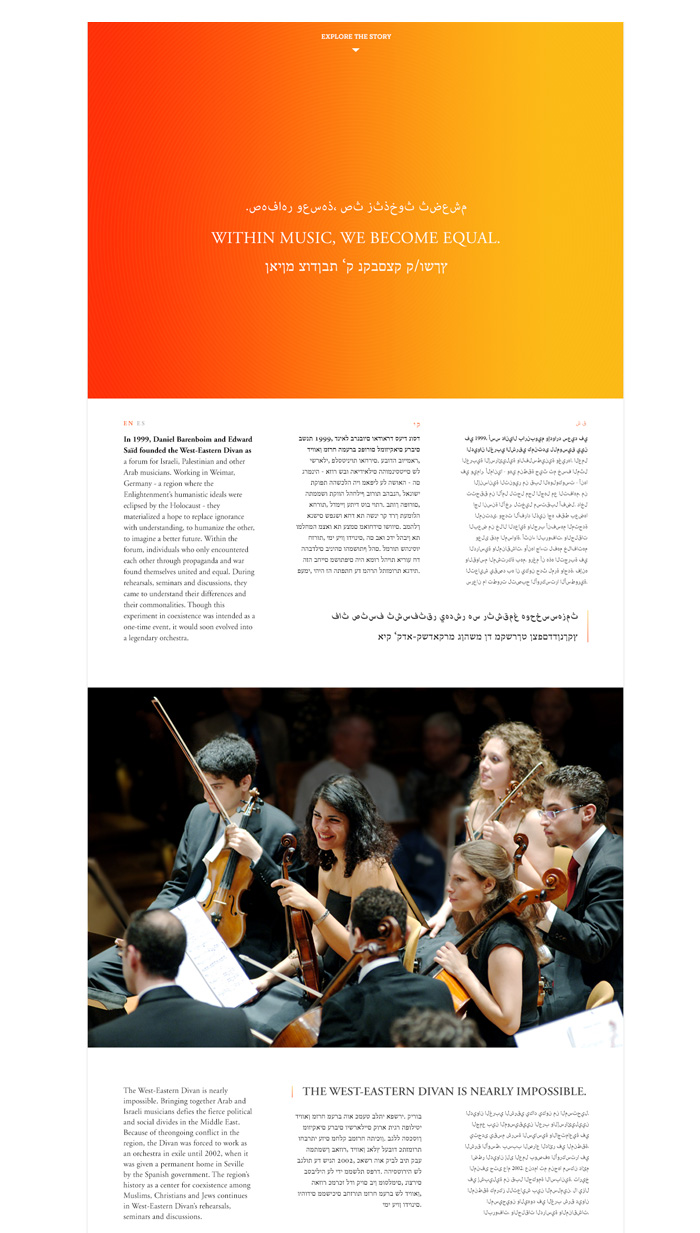
We tried our best to echo what we learned in all aspects of the identity. Everything had to be in sync, from the copywriting to the website and the logo mark itself. Every component is guided by a brand voice that could unite different cultures and aims to facilitate understanding.
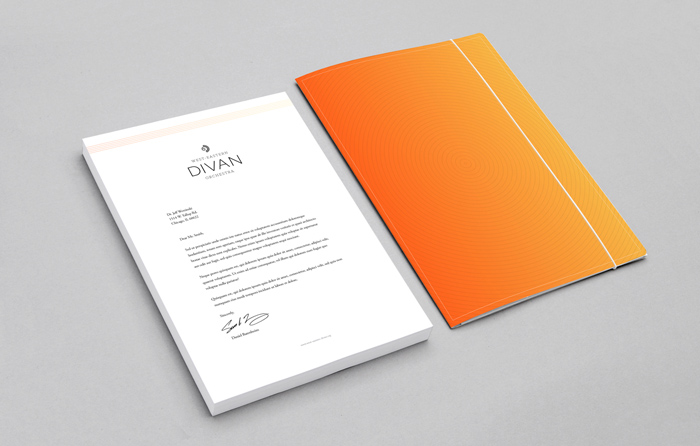
One clear example of the research’s influence can be seen in the choice of color. People from different religions and countries have disparate sensitivities with color. For example, blue is associated with the Jewish religion, and red and green are tied to the flags of many middle eastern countries. We knew we had to find a solution that would be able to represent them all as one. We chose warm energetic colors, which were inspired by instrumentation and natural colors from the sun. The orange-yellow gradient reflects the blending of the cultures.

Get 300+ Fonts for FREE
Enter your email to download our 100% free "Font Lover's Bundle". For commercial & personal use. No royalties. No fees. No attribution. 100% free to use anywhere.

I love the logo. Tell us a bit about the concept and process behind its creation.
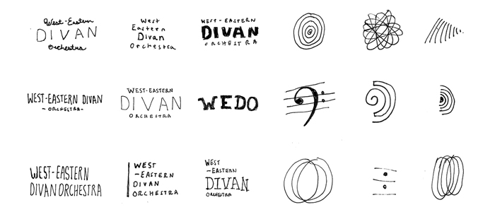
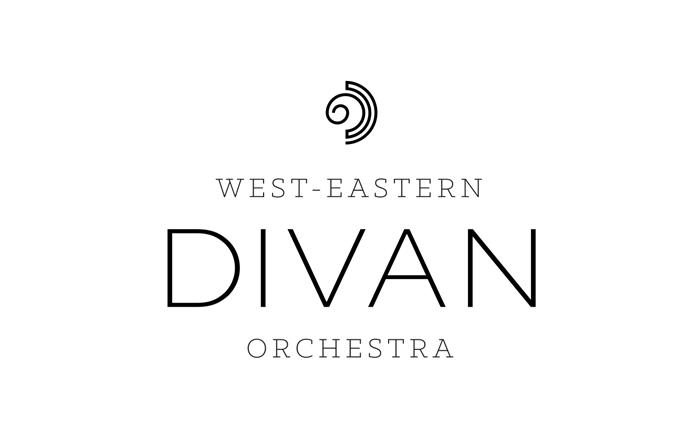
Designing for an orchestra, we knew the logo would be the most visible aspect of the organization. This meant that it not only had to say “this in an orchestra,” but also had to tell the orchestra’s story. The West-Eastern Divan’s new logo had to represent the journey to understanding, from an individual to a global perspective, from the west to the east. Labyrinths, the winding mazes, ancient amphitheaters, instrumentation and the human ear were points of inspiration.
Tell us what went into your type choices.
The West-Eastern Divan is very much a modern orchestra with a deep knowledge of what has come before. This was the guiding force in the type choice. The orchestra’s typography utilized a contemporary slab serif (Klinic Slab) and a classic serif (Garamond) in the body copy. In the logo a strong modern sans-serif (Sweet Sans) was chosen. One classical point of reference early on for the construction of the type lockup came from Beethoven sheet music found at Carnegie Hall during a visit with the orchestra.
How did this most differ from your other work? Any unique challenges?
The whole project was a unique challenge. In regards to music, I have worked with local bands in Chicago and Detroit for years, so making the jump to a world-renowned orchestra was an incredible shock to the system. In addition, the orchestra was founded by philosopher Edward Said and conductor Daniel Barenboim. These two men are two of the most prominent figures in contemporary culture and impassioned commentators on the Middle East. Not to mention the unbelievable musicians themselves. Our goal at Simple.Honest.Work. was to live up to the standards set by all of those involved.
What was the most fascinating thing you learned during the course of this project?
I feel very grateful to have met the people within the orchestra. It has forever altered my own outlook on life and viewpoint on other cultures. Before the project I had a very limited view of the Middle East, only knowing what I have heard on the news. Now, I have a greater understanding of the deeply rooted and complex cultural system.
My favorite part of being a designer is being able to jump into a new world such as this and come out of it a better person. I can only hope I will be able to work on more projects akin to this in the future.
Creative Credits
Senior Designer: Darrin Higgins
Creative Director: Simple Scott
Lead Developer: Michael McMillan
Project Manager: Elisabeth Hass

