In this article:
- The Typography of Team Pride: Jersey Fonts Decoded
- Top Jersey Fonts That Score Big in 2026
- What Makes a Great Jersey Font?
- The Evolution of Jersey Typography
- Expert Insights: Typography Designers Speak
- How to Choose the Perfect Jersey Font
- Beyond the Field: Jersey Fonts in Popular Culture
- Conclusion: More Than Just Letters
When numbers dance across fabric and typography tells a story of athletic passion, jersey fonts emerge as the unsung heroes of sports visual identity. They’re more than just letters and numbers—they’re the visual heartbeat of team spirit, transforming simple cloth into a canvas of collective identity.
The Typography of Team Pride: Jersey Fonts Decoded
Sports fans know the magic isn’t just in the game—it’s in how those iconic numbers and names become legendary. From the swooping curves of basketball jerseys to the bold declarations on football uniforms, jersey fonts are a critical part of athletic storytelling.
In this deep dive, we’ll explore the fascinating world of jersey typography, uncovering the secrets behind those unforgettable letterforms that have defined generations of athletic excellence.
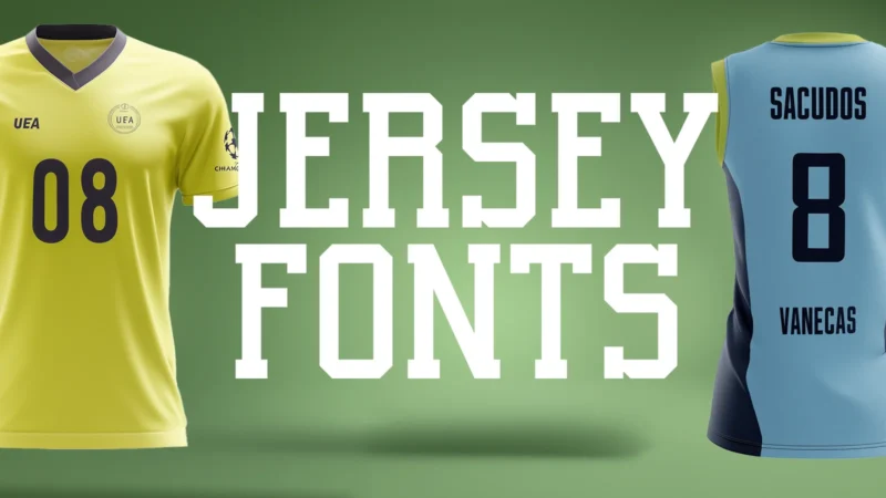
Top Jersey Fonts That Score Big in 2026
Beckon
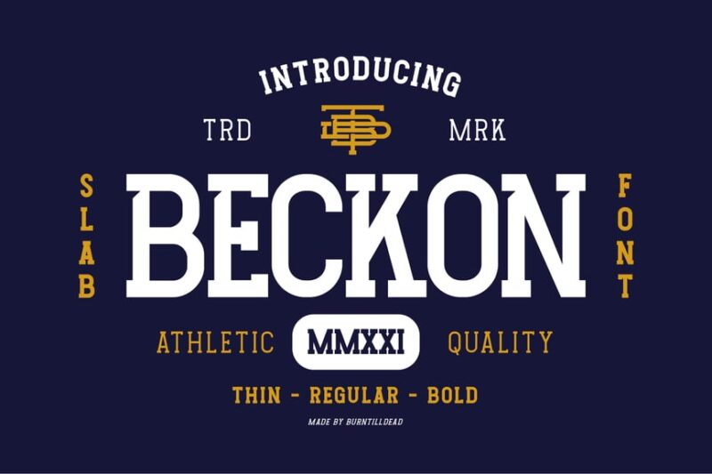
Beckon is a dynamic sans-serif font that captures the essence of sports and motion. Its clean lines and energetic forms make it ideal for athletic branding and designs that require a sense of movement and excitement.
Jerzen – All Star Sport Fonts
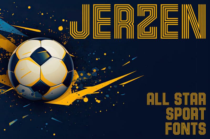
Jerzen is a versatile sans-serif font family designed specifically for sports applications. It features styles reminiscent of jersey numbers and soccer aesthetics, making it perfect for team branding and sports-related graphic design projects.
College Font Family
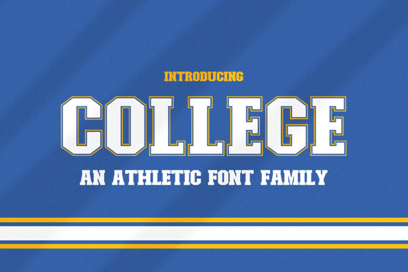
The College Font Family is a sans-serif collegiate typeface that embodies the spirit of varsity and academic environments. Its clean, bold character makes it suitable for educational materials, school branding, and designs that aim to convey a scholarly yet modern feel.
Origin Athletic
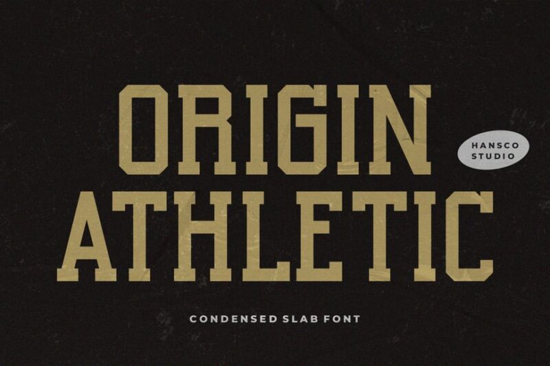
Origin Athletic is a serif font that combines the classic look of college athletics with the ruggedness of jersey typography. Its bold, structured design is perfect for sports team logos, athletic department branding, and vintage-inspired sports graphics.

Get 300+ Fonts for FREE
Enter your email to download our 100% free "Font Lover's Bundle". For commercial & personal use. No royalties. No fees. No attribution. 100% free to use anywhere.
Inter Soccer – Display Jersey Outline Sport
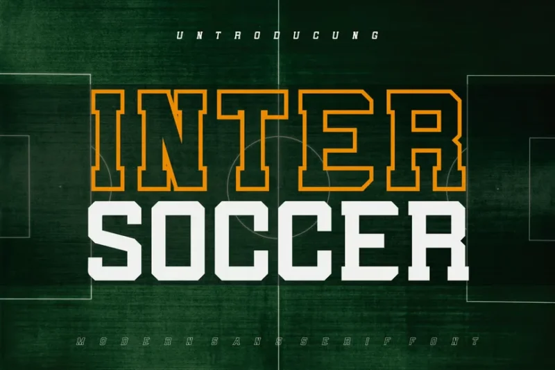
Inter Soccer is a distinctive serif display font designed to mimic the look of outlined jersey numbers. Its unique style makes it stand out in sports-related designs, particularly for soccer team branding and merchandise.
Groundout
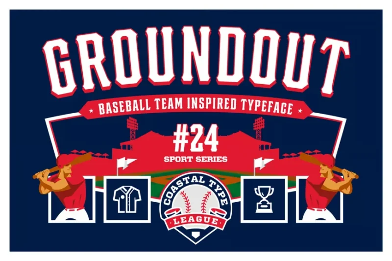
Groundout is a decorative serif font that captures the essence of baseball and San Francisco style. Its vintage-inspired design with modern touches makes it ideal for sports branding, particularly for baseball teams or retro-themed projects.
Jersey – Modern Display Sports Font
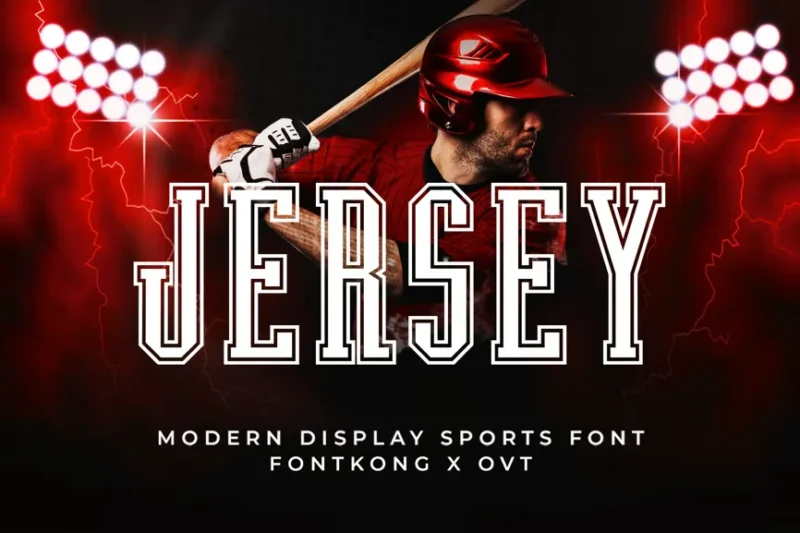
Jersey is a modern varsity font designed for sports applications. Its clean lines and athletic typography make it perfect for team uniforms, sports branding, and any design that requires a contemporary athletic aesthetic.
Disway – A Modern Stencil Sport Font
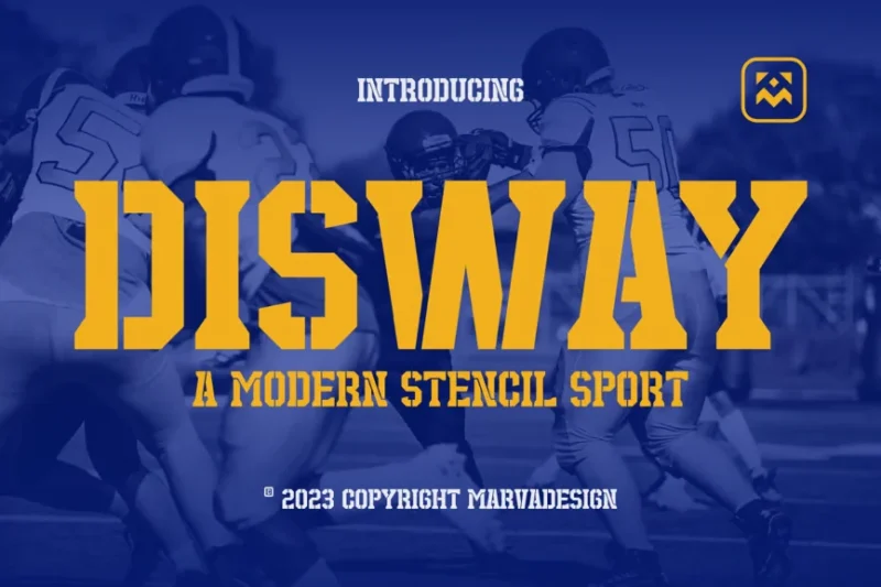
Disway is a modern stencil-style font with a sporty edge. Its unique design combines the ruggedness of stencil typography with the sleekness of contemporary sports aesthetics, making it ideal for athletic branding and edgy design projects.
Sporty Varsity – Stencil Font
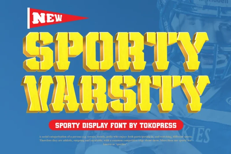
Sporty Varsity is a bold serif stencil font that blends athletic and military aesthetics. Its strong, structured design is perfect for sports team logos, varsity jackets, and designs that require a tough, authoritative look.
Djezzy Milano Vintage Serif Font
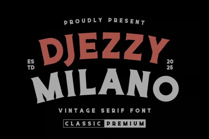
Djezzy Milano is a vintage-inspired serif font that combines sporty elements with an authentic, classic feel. Its elegant yet robust design makes it suitable for high-end sports branding, luxury goods, and designs that blend sophistication with athletic energy.
Trigger slab serif
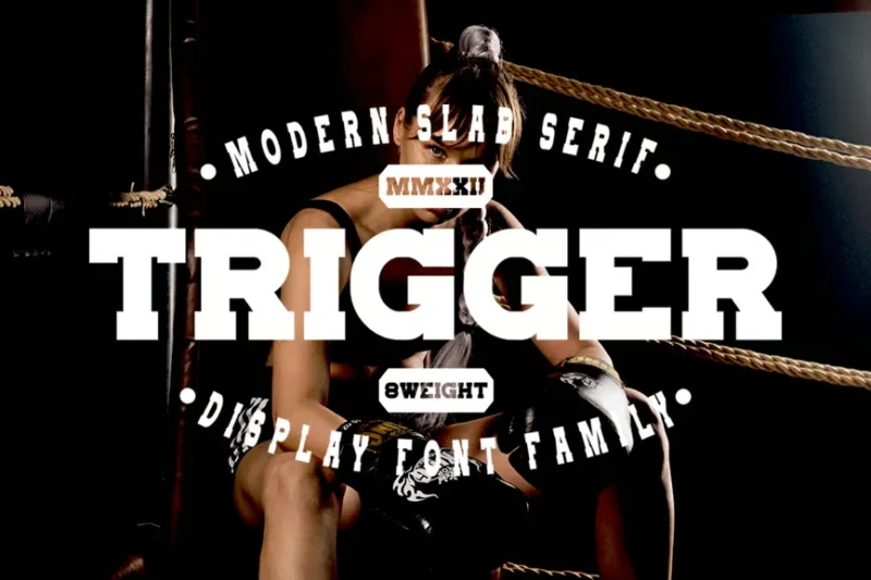
Trigger is a slab serif font that offers a bold, impactful presence. Its strong serifs and clean lines make it ideal for headlines, logos, and designs that require a confident, assertive typographic voice.
Univarsity – Sport Display Font
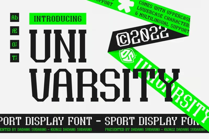
Univarsity is a serif display font designed specifically for sports-related applications. Its bold, athletic character makes it perfect for university sports teams, athletic department branding, and designs that aim to convey strength and team spirit.
Berlings – Handmade Crafted Serif
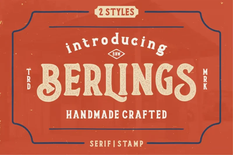
Berlings is a handcrafted serif font with a distressed flair, perfect for designs with a retro or motor-inspired theme. Its unique, hand-drawn quality adds character and authenticity to branding projects and vintage-style graphics.
Slathers – Ligature Slab Serif
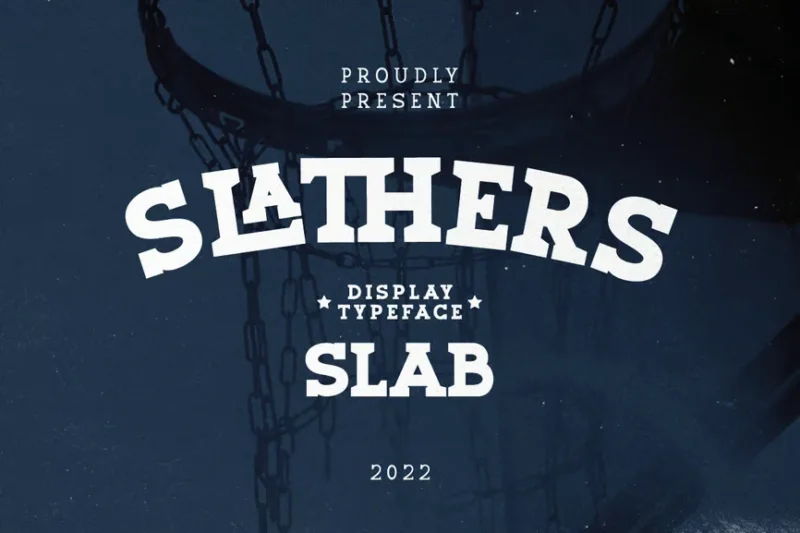
Slathers is a ligature baseball style font that combines classic elegance with modern design elements. Its distinctive ligatures and strong serifs make it ideal for creating sophisticated logos and headlines with a touch of uniqueness.
BALLOCS TEXTURED SPORT FONT
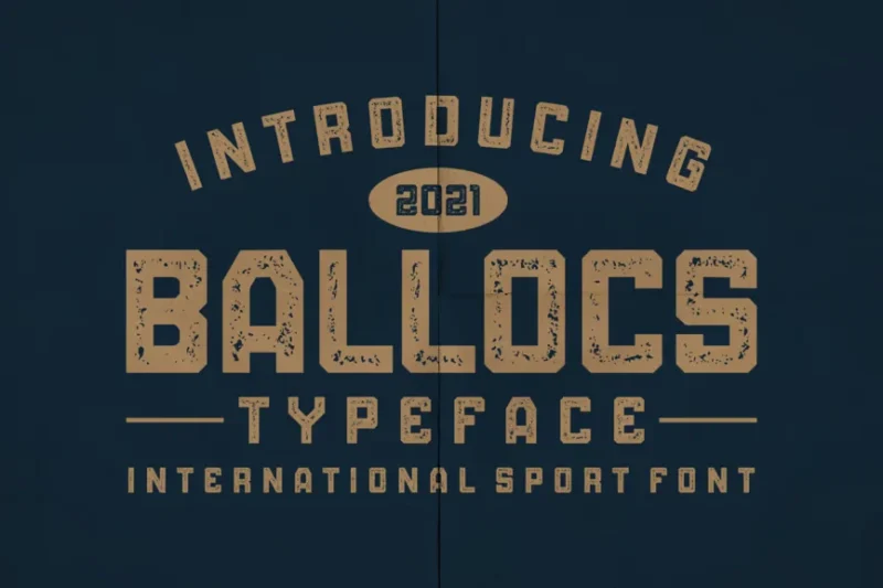
BALLOCS is a textured sans-serif font designed for sports-related projects. Its rough, gritty texture adds a sense of energy and intensity, making it perfect for athletic branding, team merchandise, and designs that require a bold, dynamic look.
Suportigo – Athletic Jersey Fonts
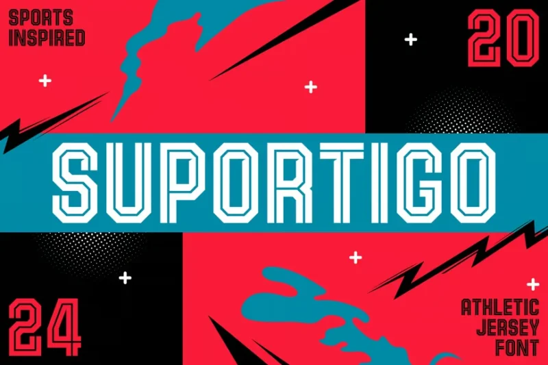
Suportigo is a sans-serif font family created specifically for athletic jerseys and soccer-related designs. Its clean, sporty aesthetic makes it ideal for team uniforms, sports branding, and any project that requires a professional athletic look.
TF-Russya
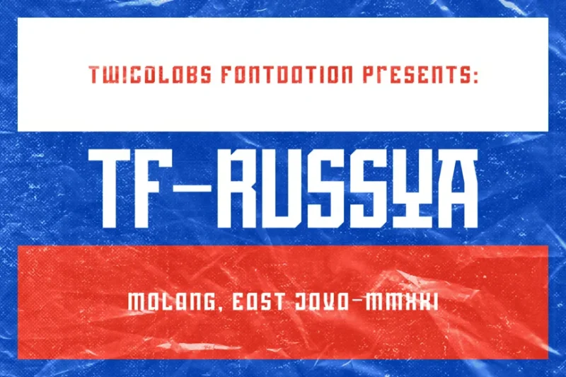
TF-Russya is a decorative sans-serif font with a unique blend of Russian-inspired design and esports aesthetics. Its bold, angular forms make it ideal for gaming logos, esports team branding, and designs that require a futuristic, competitive edge.
High Jersey – Modern Decorative Typeface Font
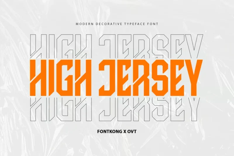
High Jersey is a modern, decorative sans-serif font designed for sports applications. Its unique design elements and contemporary style make it perfect for creating distinctive athletic branding, team uniforms, and sports-related graphic designs.
Undersky Font
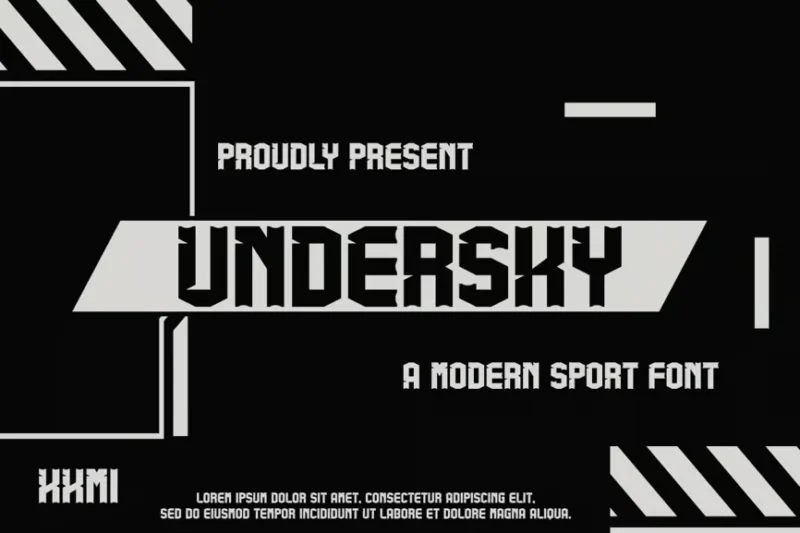
Undersky is a versatile sans-serif font that offers a clean, modern aesthetic. Its balanced design and clear letterforms make it suitable for a wide range of typographic applications, from branding to web design and editorial layouts.
Bogotier – Sport Game Enthusiast Fonts
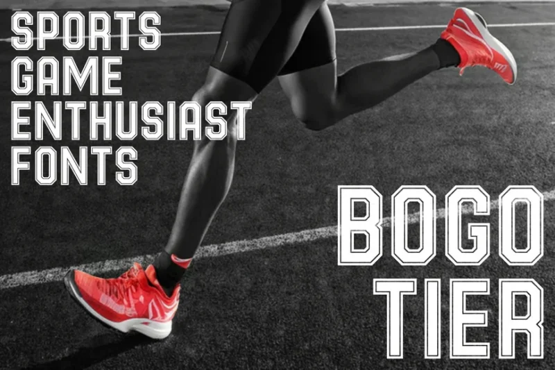
Bogotier is a sans-serif font family designed for sports and gaming enthusiasts. Its energetic character and athletic-inspired forms make it ideal for team jerseys, esports branding, and designs that cater to the world of competitive sports and gaming.
New Varsity – Baseball Varsity Font Family
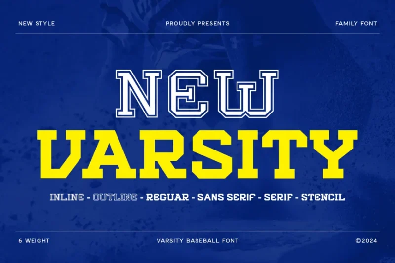
New Varsity is a font family that includes both sans-serif and serif styles, designed specifically for baseball and sports-related projects. Its versatile design captures the essence of varsity athletics, making it perfect for team branding and sports merchandise.
Montenegro – Decorative Slab Serif
Montenegro is a decorative slab serif font with a military and game-inspired aesthetic. Its bold, structured design with unique decorative elements makes it suitable for creating impactful headlines, logos, and designs that require a strong, authoritative presence.
Sportfield Varsity – Athletic Font
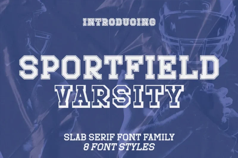
Sportfield Varsity is a serif font designed for athletic and varsity-themed projects. Its slab serifs and sporty character make it ideal for creating collegiate sports logos, team uniforms, and designs that embody the spirit of school athletics.
Outright slab serif
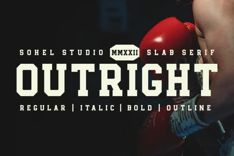
Outright is a bold slab serif font that commands attention with its strong, geometric forms. Its clean lines and pronounced serifs make it excellent for headlines, logos, and designs that require a confident, modern typographic voice.
Buccane – A Modern Sport Font
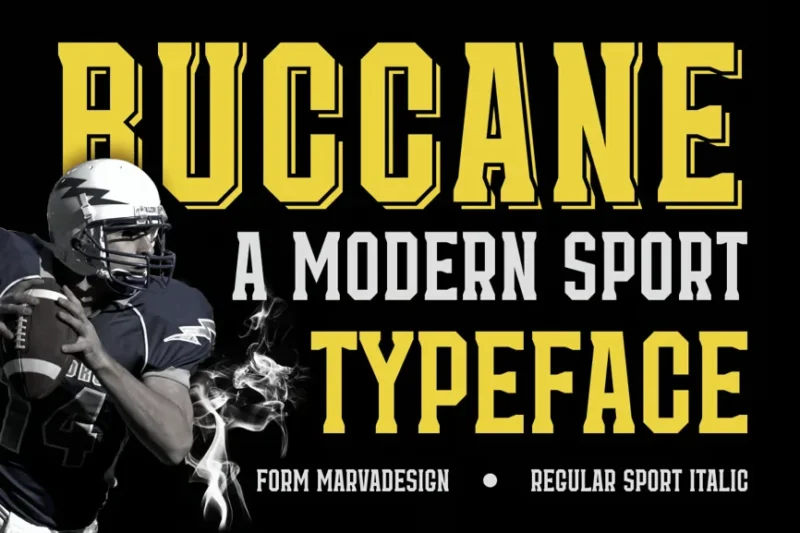
Buccane is a modern serif font designed with sports applications in mind. Its clean, athletic aesthetic combined with subtle serif details makes it versatile for various sports-related designs, from team branding to event promotions.
Nevis
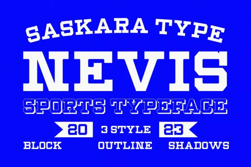
Nevis is a playful serif typeface that adds character and charm to designs. Its unique blend of classic serif elements with modern, whimsical touches makes it suitable for brands and projects that want to convey a friendly, approachable personality.
Each of these fonts does more than just identify a player—they capture the essence of athletic energy, team culture, and sporting heritage.
What Makes a Great Jersey Font?
Jersey fonts aren’t just about looking cool (though they absolutely do). They’re engineered with precision, readability, and pure athletic attitude in mind:
Legibility at Speed
First and foremost, a great jersey font must be readable whether you’re sitting in the nosebleed section or watching on a high-definition broadcast. Fonts need to pop from a distance, with clean lines and distinct letterforms that don’t blur when players are in motion.
Athletic Personality
Some fonts scream “power play” while others whisper “strategic finesse.” The right jersey font captures a team’s entire athletic personality in just a few characters.
Durability by Design
These fonts aren’t just printed—they’re essentially tattooed onto fabric. They need to withstand extreme conditions: sweat, stretching, washing, and the intense physical demands of professional sports.
The Evolution of Jersey Typography
Jersey fonts have come a long way from basic block letters. Let’s take a visual journey through sporting typography:
Vintage Era
In the early days, jersey fonts were simple, utilitarian. Think bold block letters that could be easily screen-printed or sewn onto jerseys.
Digital Revolution
With advanced printing technologies, designers began experimenting. Gradients, shadows, and more complex letterforms became possible.
Modern Customization
Today, jersey fonts are as unique as the teams themselves—custom designs that blend tradition with cutting-edge graphic design.
Expert Insights: Typography Designers Speak
We reached out to top sports design experts to get their take on jersey font magic:
Sarah Martinez, Sports Design Director, notes: “A jersey font is like a team’s visual DNA. It’s not just about looking good—it’s about capturing an entire athletic philosophy in a few characters.”
Mike Rodriguez, Uniform Design Consultant, adds: “The best jersey fonts tell a story. They’re not just identification—they’re a form of visual poetry that represents team spirit.”
How to Choose the Perfect Jersey Font
Selecting a jersey font isn’t just about aesthetics. Consider:
Team Identity
Does the font reflect your team’s personality? A hockey team might want something aggressive, while a tennis team might prefer something more elegant.
Readability Across Distances
Test fonts at multiple scales. What looks great up close should still be crystal clear from the bleachers.
Material Considerations
Some fonts work better on different jersey materials. Cotton behaves differently than moisture-wicking synthetics.
Beyond the Field: Jersey Fonts in Popular Culture
Jersey fonts have transcended sports. They’ve become design icons, inspiring streetwear, graphic design, and even tattoo artistry. What started as a practical necessity has become a full-blown design phenomenon.
Conclusion: More Than Just Letters
Jersey fonts are the unsung heroes of sports visual culture. They transform simple fabric into a storytelling medium, capturing team spirit, individual athleticism, and collective passion in every curve and line.
Next time you’re watching a game, take a moment to appreciate those letters and numbers. They’re not just identification—they’re a celebration of athletic creativity.