In this article:
- What Is Kinetic Typography?
- Kinetic Typography Pros and Cons
- Using Kinetic Typography Effectively
- Succeeding With Kinetic Typography
Designers seeking to impact viewers in today’s fast-paced world try to grab their attention and make them remember what they’ve seen. Kinetic typography can do that and has experienced a recent resurgence as design professionals cite it as a trend to watch. How could you apply it in future projects?
What Is Kinetic Typography?
Kinetic typography combines movement and text to express ideas. Most examples involve moving words or objects, but designers sometimes use angles, curves and other features to imply movement instead. They use motion to amplify textual messages, letting it evoke emotions and tell stories beyond what static text can.
Kinetic Typography Pros and Cons
Knowing about the advantages and possible disadvantages of kinetic typography can help you decide whether to use it and assess its appropriateness for future projects.
Highlight Information
Thinking back to my time in college, I fondly remember using different highlighter colors to make specific words or passages stand out from the surrounding text and increase my comprehension. Kinetic typography does the same by encouraging people to pay attention to particular aspects.
You can find plenty of strong examples in this lending service’s YouTube video. As the screenshot below shows, the advertisement features many examples of moving text that gradually forms words as people watch.
Source: https://www.youtube.com/watch?v=UVTnROl1IAo
Sometimes, the animations cause seamless transitions from one word to another, creating a smooth flow that holds viewers’ interest and encourages their curiosity. The designers also used kinetic typography to emphasize key information, such as available loan amounts and the fact that people can apply online.
Improve Brand Recognition
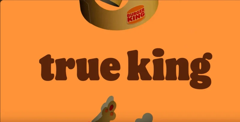
Kinetic typography also helps companies create word-animation combinations that spark recognition. Check out that concept in action in Burger King’s brand-refresh video.

Get 300+ Fonts for FREE
Enter your email to download our 100% free "Font Lover's Bundle". For commercial & personal use. No royalties. No fees. No attribution. 100% free to use anywhere.
It includes many animated words that reassure people that the chain still includes what they know and love, such as craveable, fresh food. However, later animations explain that the brand is doubling down on what makes it great.
The screenshot below includes Burger King’s iconic cardboard crowns, which eventually cascade onto the text. I still remember how those accessories made meals more fun during my rare childhood visits to my town’s branch. Including them effectively told people that even though some things change, many others stay the same.
Source: https://www.youtube.com/watch?v=xwH4oVnuIAs
Other parts of the video show the text changing size or zoom in on the letters’ shapes, which gently move. These design decisions were a great way to get people excited about Burger King’s new look and interest them in knowing more.
Add Context and Clarity
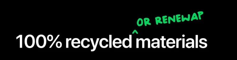
Brands also use kinetic typography to make newsworthy changes more relevant and applicable to target audiences. Apple took that approach in an advertisement announcing some of its environmental aims.
Source: https://www.youtube.com/watch?v=66XwG1CLHuU
It included many animated additions to on-screen text. In the above example, one features the word “renewable” that quickly flows into place. It clarified that Apple wants to use 100% recyclable or renewable materials.
A similar animation occurs later to underline specific words, such as to drive home the point that material improvements are part of the brand’s sustainability goals, but how the company makes its products matters, too. These aspects give useful details to accompany the headlines about this news, helping people understand it in context.
Accessibility Issues
Statistics indicate that nearly 94.8% of the biggest homepages do not adhere to accessibility guidelines. Kinetic typography could exacerbate barriers for people with disabilities using the internet.
You can prevent those issues by making the content compatible with screen readers, using contrasting colors to increase readability and keeping the movement at a moderate speed. Additionally, consider adding dialogue to accompany some of the words made to stand out with animation. That way, people enjoy the desired effects even if they cannot see the movement.
Mobile Device Preferences
Many people tweak the settings for social media sites and other online destinations to prevent videos from playing automatically, disliking the surprising sounds they otherwise hear when scrolling through content. Others do it to save mobile data, especially if their plans limit how much they can use per billing period.
Data from 2023 showed that more than 67% of people in the United States go to websites on their smartphones. That explains why many designers prioritize responsive design. However, it also means users’ device settings may prevent some from seeing kinetic typography in the intended format.
Page Loading Times
Pages with kinetic typography animations may load more slowly than those without them. Address that downside by optimizing them for the best performance and making essential parts of the content load first.
The main thing to remember is that kinetic typography has its advantages and disadvantages. Assessing them within your project’s scope and evaluating other factors — such as your budget and the client’s requirements — can help you decide whether to implement it and how to get the best results if you do.
Using Kinetic Typography Effectively
If you’ve decided to incorporate kinetic typography into a project, best practices can enhance the outcomes.
1. Use Motion to Tell a Story
Designers who excel at using kinetic typography understand that movement is essential to the results. Before considering how you’ll use it, identify how you’ll apply it to improve the content.
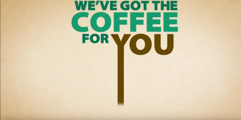
One example from a brief but impactful Starbucks advertisement includes features such as a moving sun and moon. A heart accompanies text that emphasizes how the coffee brand gets you through early mornings and late nights by satisfying cravings.
The screenshot below shows how the commercial ends, as the Y turns into coffee poured into a Starbucks cup. That’s a memorable way to cap things off because it helps viewers move from possibility into reality. Although people may initially daydream about steaming cups of caffeinated beverages, Starbucks makes it easy to act by ordering them.
Source: https://www.youtube.com/watch?v=YRLG1uLN7mY
Let this example remind you to add motion with a clear purpose that furthers the story. Otherwise, the movement could distract people and dilute the message.
2. Improve the Creative Process With Brainstorming Tools
Although kinetic typography works well for helping you make words or phrases more noticeable, it isn’t always easy to decide which ones to emphasize. Artificial intelligence products — specifically those that use generative AI — could spark your creativity by suggesting which themes best align with a client’s desired message.
One study found that 90% of commercial leaders anticipate using generative AI frequently. The platforms that use this technology are imperfect and often get information wrong. However, they work well for ideation by encouraging you to think about project goals differently.
Using these tools for brainstorming is especially helpful if you need to propose a fresh concept for a long-term client or an industry for which you’ve developed dozens of campaigns. Try bringing AI into your process to maximize your creativity rather than replace it.
3. Increase the Impact With Human Tendencies
People naturally assign meaning to things that don’t otherwise contain it. This explains a phenomenon called pareidolia, which causes humans to see objects or faces in clouds, on rocks and in other random places.
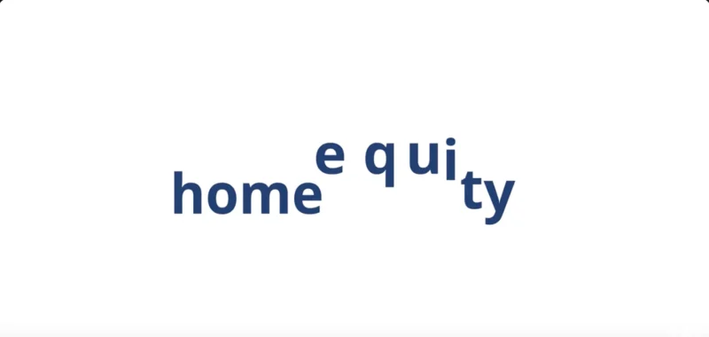
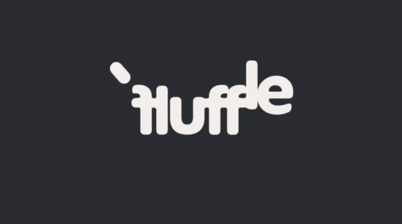
You can harness that tendency by making letters morph into familiar objects. In one example, the logo in a Fluffle commercial moved to form various dog breeds.
People who view the example below without the canine context may not immediately see the likeness. However, those details make viewing the Fs as two legs and the E as a head and tongue easier. The connection between the letters and dogs is even clearer if you know that movement in the animated version mimics a wagging tail.
Source: https://www.creativebloq.com/news/dog-breeds-animated-logo-for-fluffle
Consider how to shape people’s expectations with a few strong cues. Then, let their imaginations and brains do the rest.
4. Let Words Convey Movement
Although I’ve shown strong examples of kinetic typography that moves, project limitations may prevent you from taking that approach. Maybe you’re designing a print ad, or a client has stated they do not want a moving online ad because it might distract or overwhelm site visitors.
Fortunately, you can achieve similar effects by focusing on the letters’ angles and how the text fills the usable space. Dotto is a design studio that shows the possibility of creating static and animated kinetic typography. Check out the example below of a framed print.
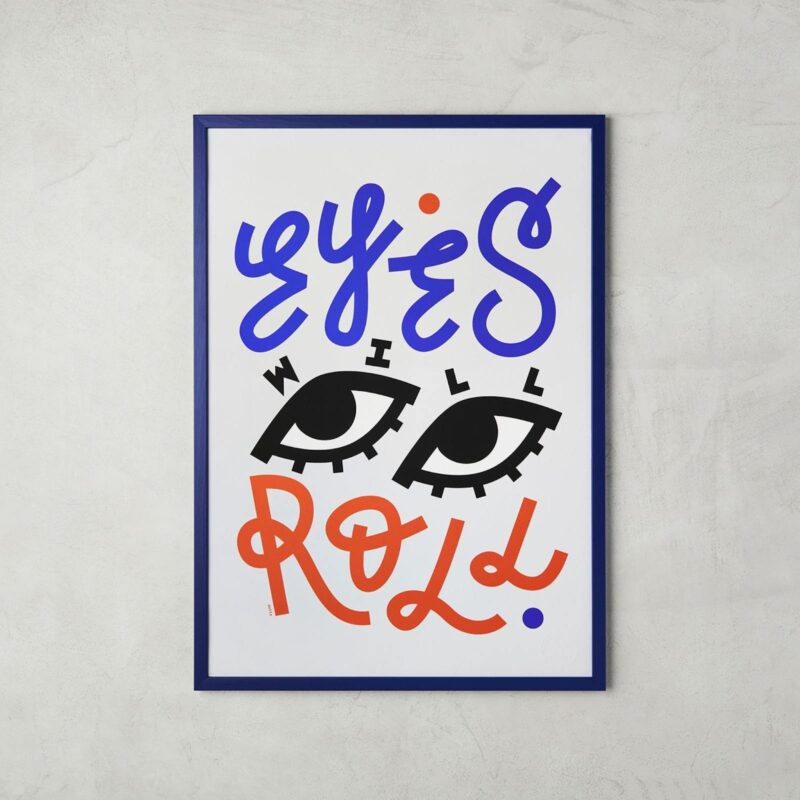
Source: https://www.creativeboom.com/inspiration/type-that-moves-you/
Its creators made a moving version with eyes that blink and roll as the words smoothly appear. However, the static rendition is just as captivating, thanks to several smart design decisions.
Putting the two Ls at different heights suggests upward movement, while positioning the word “will” to follow the eyes’ contours reminds me of kids playing on a hill. The eyes also capture attention by appearing to fixate on viewers, even when examining the piece from different angles.
Consider experimenting with kinetic typography in both static and animated formats. Becoming skilled at creating both versions will give you more flexibility as a designer and help you demonstrate your capabilities to clients with particular needs.
Succeeding With Kinetic Typography
This overview of kinetic typography will help you explore how to apply it in your work. In addition to being inspired by these real-life examples, consider how movement could enhance the messages’ meaning, making the media stick in the audience’s memory.