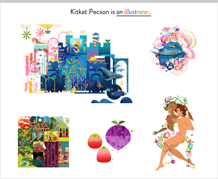
Illustrator/designer Kitkat Pecson just launched her new portfolio site a few days ago. If you’re looking to revamp your website—or build a new one as your graduation date looms—this one sets a great example.
The site is effective for a few simple reasons:
- The work is the star of the show—[reasonably] large images!
- Project descriptions are well-considered, and provide meaningful details (proper attributions for collaborators, too)
- Kitkat doesn’t turn her personality into a gimmick; it shines through in subtle ways.
- The site itself is functionally interesting but accessible (built by Oscar Bicada, designed by Kitkat)
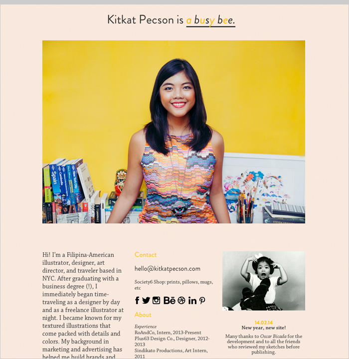
Kitkat’s bio section
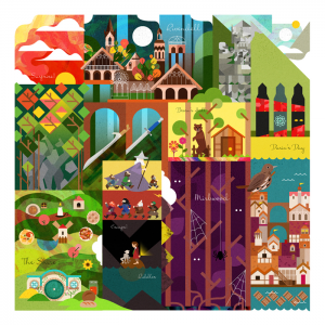
This badass lady creative studied business, of all things, and is now living and working in NYC. Kitkat’s work is refreshing in its cheerful maximalism. In a design world drenched in two-color illustrations, Kitkat uses a wide color palette and a range of textures:
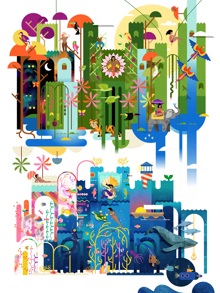
“Royals”, created for Bloom Arts Festival

A map for the Tolkein nerds…

…and one for the Game of Thrones fans.

Editorial illustration for Cebu Smile
Design systems really shine in nicely laid-out environments:

Plus63 Design Co.Mission
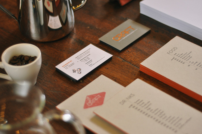
Craft Coffee Revolution (Designed at Plus63)
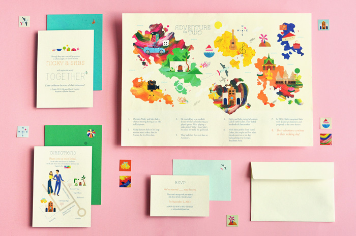
Adventured-themed wedding invitations
Alright, enough gushing—check out more of Kitkat Pecson’s work on her portfolio.

Get 300+ Fonts for FREE
Enter your email to download our 100% free "Font Lover's Bundle". For commercial & personal use. No royalties. No fees. No attribution. 100% free to use anywhere.

