You may be familiar with Leta Sobierajski from her personal brand identity system featured on DWL last year, but you’ll want to familiarize yourself with some of her incredible branding work below. She combines excellent layout, typography, illustration and color choices into some truly special work.
Quietman
Quietman, founded in 1995 by award-winning Creative Director Johnnie Semerad, is a creative production company for the advertising and entertainment industries. Quietman has worked on campaigns for Pepsi Max, FedEx, M&M’s and GE, as well as Disney, CBS’s Early Show, Jim Henson’s Muppets and Saturday Night Live.
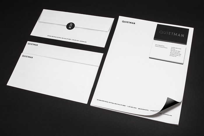
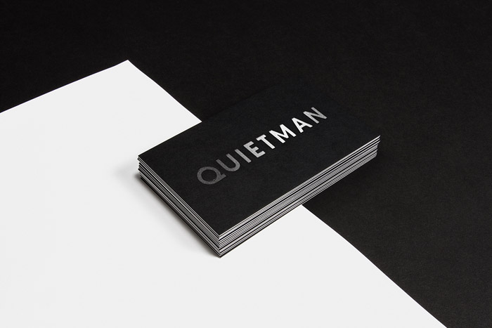
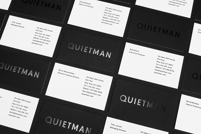
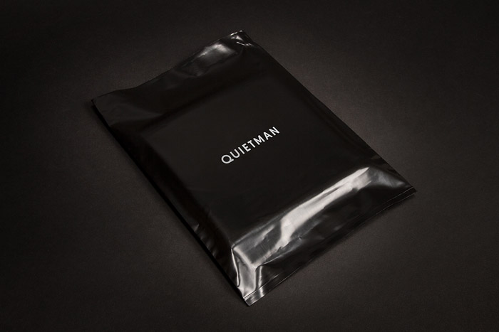
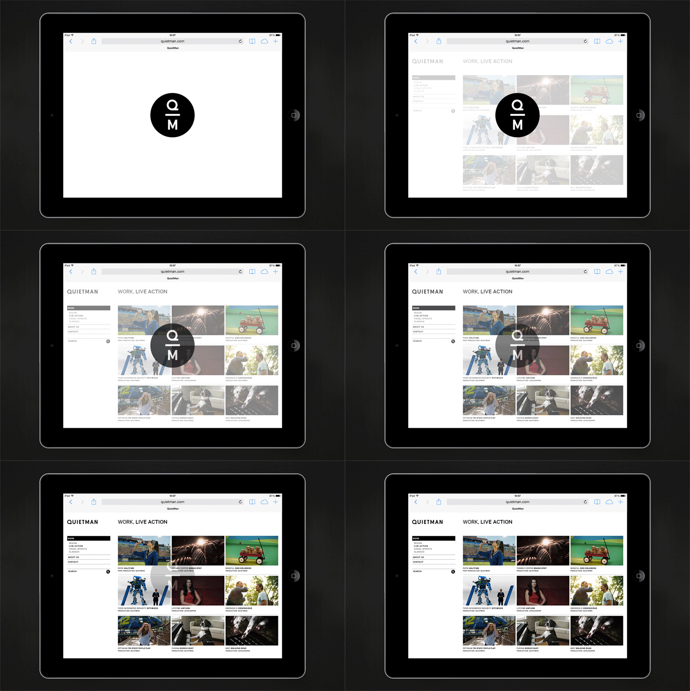
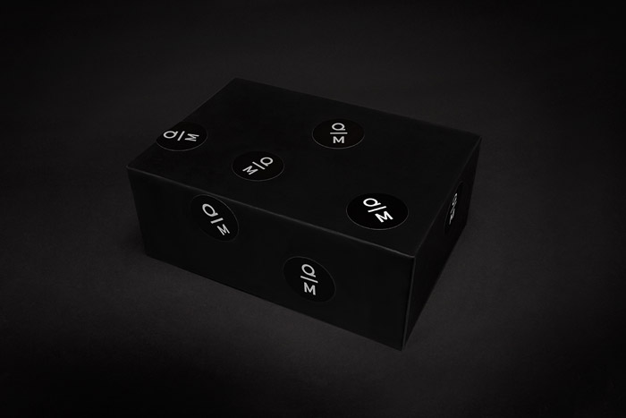
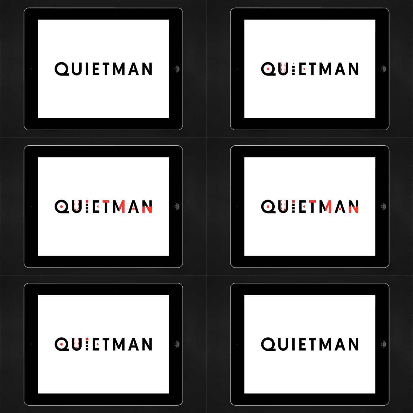
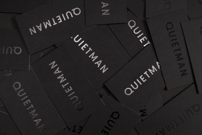
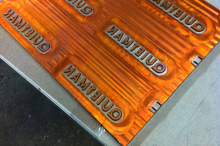
Quietman’s identity had remained more or less the same since they were founded in 1995, so I was approached to bring their visual identity up to date. A full makeover was needed to better interpret Quietman’s values and philosophy, involving a custom-designed wordmark and a stripped-down color palette. The stationery system and website are full of subtleties, including strong typography and easter egg surprises, such as an animated logo which alludes to Quietman’s strengths in the industry.

Get 300+ Fonts for FREE
Enter your email to download our 100% free "Font Lover's Bundle". For commercial & personal use. No royalties. No fees. No attribution. 100% free to use anywhere.
VinePair
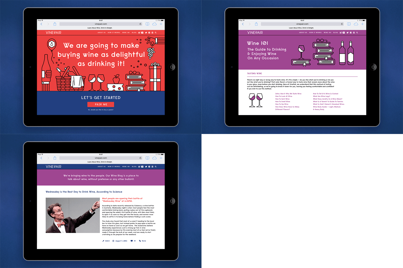
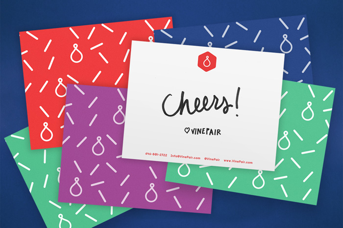
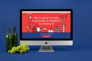
VinePair is a new way to understand and talk about wine. It removes the anxiety, pretension and insider language from one of the world’s oldest beverages. People drink wine to relax, celebrate and have a good time. Trying to understand and buy wine should not be stressful. And now it isn’t.
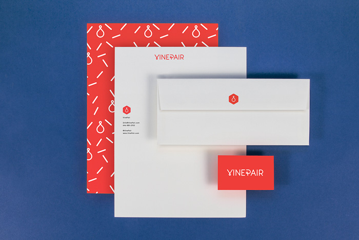
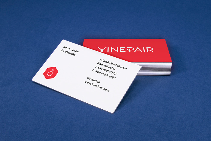
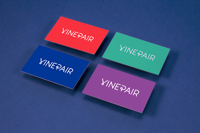
VinePair’s visual look and feel was built to reposition wine selection and wine drinking as a friendly, contemporary and fun activity, and to move it away from its stereotype as a prestigious, snobby and elitist hobby.
