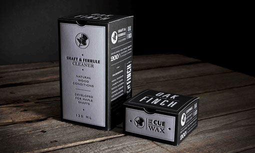
Unfortunately I can’t read a word of this site (and Google translate is failing me at the moment), but I couldn’t resist posting this gorgeous black and white letterpress packaging.


via Graphic Exchange

👋 Psst... Did you know you can get unlimited downloads of 59,000+ fonts and millions of other creative assets for just $16.95/mo? Learn more »
Get 300+ Fonts for FREE
Enter your email to download our 100% free "Font Lover's Bundle". For commercial & personal use. No royalties. No fees. No attribution. 100% free to use anywhere.
