In this article:
- The Basics of Visual Accessibility
- Key Principles of Designing Accessible Graphics
- Tips for Designing Visibly Accessible Graphics
- Designing for Impact Through Accessibility
In graphic design, it is common for designers to focus on creating visually stunning content. Yet, how often do they stop to ask whether everyone can see and understand what they are making? Producing visibly accessible designs is crucial in this digitally connected world.
Audiences have various needs that may keep them from processing the graphics made on the internet today. For instance, some may have color blindness, while others may struggle with low vision or cognitive challenges. So, how do you ensure your work speaks to everyone? It starts with taking a closer look at the principles of accessible design and applying them strategically.
The Basics of Visual Accessibility
In design, it can be easy to focus on the aesthetics of a graphic, but I have learned it is just as important to stop and consider how someone might struggle to see it. The truth is that 2.2 billion people worldwide live with a near or distance visual impairment. That is nearly a quarter of the global population who could struggle to interact with your designs if accessibility is on the back burner.
When I consider accessibility, I think of it as a way to design for everyone. Picture someone trying to read a small font on a dim screen or struggling to distinguish colors because of color blindness.
Accessibility impacts so many more people than most realize, and tackling these challenges makes your designs better for the world to see. That is what visual accessibility is all about — focusing on clarity and usability. By adopting its best practices, you follow guidelines like WCAG and create experiences that put people first.
Key Principles of Designing Accessible Graphics
Creating accessible graphics demands an approach that ensures everyone can engage with your designs. Here are the key principles you should remember when designing for accessibility purposes.
Make Thoughtful Color Choices
Color is the basis of a good design, but it has to do with more than looking good. Research shows that color can boost brand recognition by 80% and influence 85% of purchasing decisions. However, colors will have zero impact unless they are accessible to everyone.

Get 300+ Fonts for FREE
Enter your email to download our 100% free "Font Lover's Bundle". For commercial & personal use. No royalties. No fees. No attribution. 100% free to use anywhere.
In my previous work, I designed a promotional poster that relied heavily on red and green accents. It looked great on paper, but a colleague pointed out that people with red-green color blindness may be unable to differentiate the two.
To make the graphic more accessible, I had to rework it by adding textures and patterns to the color-coded elements. This change made the message clearer for the audience. Small adjustments like these are great for enhancing accessibility and improving the overall effectiveness of your design.
Prioritize High Contrast
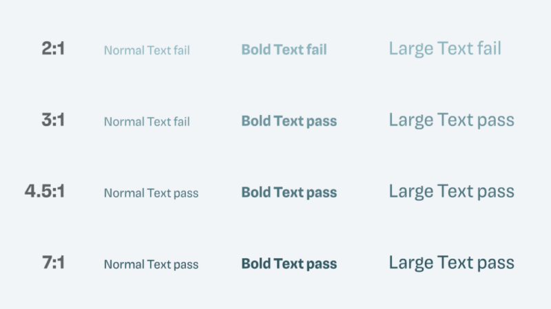
If you have ever squinted at faint text on a white background, you know how frustrating poor contrast can be for your audience. High contrast ensures your designs are easy to read, including people with low vision or those viewing your work on smaller screens.
For instance, imagine you are working on a project for a client whose audience includes older adults, and you use pastel text on a light background. When testing it, you would likely receive feedback that many users could not read the text. Switching to a darker text color and increasing the contrast makes the design more readable instantly.
To keep things accessible, aim for a contrast ratio of at least 4.5-to-1 for body text and 3-to-1 for larger headings.

Source: https://pimpmytype.com/color-contrast/
Use Readable Typography
I always keep in mind that if someone cannot read the text, the design loses its entire message. That is why typography is such a crucial part of accessible design. You can start by choosing simple, sans-serif fonts like Verdana or Arial, which are easier to read on screens.
Size matters too — body text should be at least 12 points or 16 pixels, with plenty of spacing between lines. Also, if you intend to use an ornate font for flair, keep it limited to headlines or nonessential elements. When you focus on readability, you ensure your message is easy to understand.
Clear Hierarchy
Have you ever looked at a design that felt cluttered and overwhelming? I know I have, and it is a quick way to lose your audience. A clear and logical layout makes your designs easier to review, especially for those with cognitive disabilities.
You can achieve this by using headings, subheadings and plenty of white space to break up content. Group related elements together and align everything consistently. Organization and structure in your designs help convey your message more clearly and create better user experiences.
Tips for Designing Visibly Accessible Graphics
Now that you understand the key principles of accessibility in graphic design, use these tips to put them into practice:
1. Use Simple, Clear Layouts
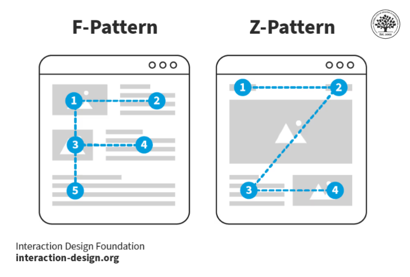
The easiest way to make your designs more accessible is by simplifying your layout. A clean design helps everyone comprehend your message without unnecessary distractions.

Source: https://www.interaction-design.org/literature/topics/visual-hierarchy
When designing, focus on grouping related elements and maintaining a logical flow of information. For instance, arrange content in a top-to-bottom or left-to-right order to guide the viewer’s eye naturally. Avoid clutter by incorporating ample white space to improve readability and give it a professional feel.
I have noticed that when I simplify layouts for accessibility, the designs work better for those with disabilities while engaging more deeply with a general audience. A clear layout makes your message easier to process and creates greater impact.
2. Test and Optimize Color Palettes
The right color palette is essential for creating accessible designs. Colors may make your designs visually appealing but are critical in conveying information. However, your color choices could exclude users with visual impairments without testing and optimization.
To ensure your designs are accessible, you should use tools that make testing easy. I like to use Color Contrast Visualizer, which helps me choose color combinations with the right contrast ratios for readability. It is an excellent way to ensure your text stands out against backgrounds and meets accessibility standards.
Once I have chosen a palette, I also rely on a color blind webpage filter to see how the design appears through the eyes of people with various types of color blindness. This tool allows you to simulate conditions like protanopia or deuteranopia, giving you great insight into whether your designs are truly inclusive.
3. Provide Text Alternatives

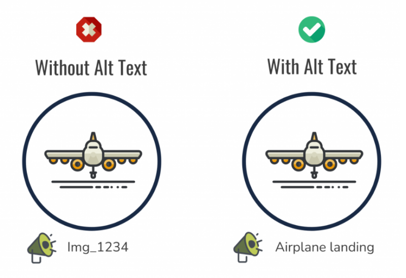
Source: https://accessibility.sdsu.edu/core-skills/alternative-text
Only some people experience visual content similarly, so providing text alternatives for key elements in your designs is vital. Adding text descriptions ensures people who rely on assistive technologies — like screen readers — can fully understand your visuals.
For example, suppose you are working with infographics. Be sure to include concise alt text that conveys the most important information. Instead of just saying, “An infographic,” describe what it represents.
For instance, you could put, “A pie chart showing 60% of respondents prefer online shopping.” This extra step goes a long way in ensuring your message is accessible to visually impaired users.
4. Make Text Readable
In accessible design, readable text is nonnegotiable. With 92% of people worldwide using mobile devices to browse the internet, ensuring your text is clear and legible across all screen sizes is even more important.
Small fonts or overly decorative typography may look stylish, but they can make your designs inaccessible to a large portion of your audience. Start by choosing sans-serif fonts to improve readability. These are easier to read, especially on digital screens.
Remember to test your designs on mobile devices to see how your text appears on smaller screens. What looks great on a desktop monitor could be difficult to read on a smartphone.
5. Offer Multiple Formats
Some users interact with content differently, so offering various formats ensures your message reaches the widest possible audience. Providing alternative ways to access the same information can make all the difference for people with visual, auditory or cognitive disabilities.
For instance, when a design includes an infographic, I typically provide a plain-text version or a detailed written summary that explains the data. I have found this especially helpful for those who use screen readers, as it allows them to access the same information in a format that works for them.
For multimedia content like videos or animation, include captions and transcripts. Captions benefit those with hearing impairments and users who prefer to consume content without sound.
Offering multiple formats also makes your designs more versatile. It shows your audience that you value inclusivity and ensures your message is clear to a broad range of users.
6. Limit Flashing and Animation
Flashing designs and excessive animation may be attention-grabbing, but they can also create serious accessibility barriers. For some users, flashing visuals can even trigger seizures if they have photosensitive epilepsy. Sometimes, subtle animations distract or overwhelm those with cognitive impairments or motion sensitivity.
That is why it is a good idea to avoid flashing content altogether or limiting it to fewer than three flashes per second. Simultaneously, animations should serve a purpose rather than add unnecessary flair when incorporated.
7. Use Labels for Graphs, Charts and Visuals
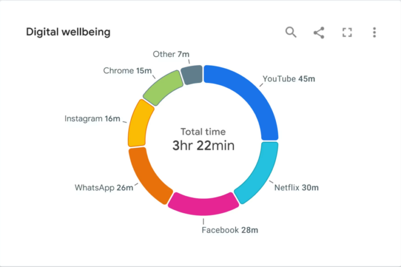
Visual representations are excellent tools for conveying information but can be confusing without proper labels. With labels, every user can understand the data you are presenting.
When creating graphs or charts, always include clear, descriptive labels for axes, data points and legends. For example, instead of labeling an axis as “Time,” specify it as “Time (in months)” to give users more context.
If you use color to differentiate sections of a pie chart or bar graph, pair it with symbols or text to ensure clarity for those with color blindness. Taking such measures eliminates guesswork and makes your message more impactful.

Source: https://www.smashingmagazine.com/2024/02/accessibility-standards-empower-better-chart-visual-design/
Designing for Impact Through Accessibility
Accessible design is a necessity if you aim to reach a wider audience. Prioritizing this aspect of graphic design ensures your work is usable for everyone. Additionally, it allows you to make a statement that all people deserve to feel seen, valued and included.
When you incorporate accessibility into your projects, you enhance the experience for all users. As you move forward, keep these principles and tips in mind to establish more meaningful connections with your audience.

