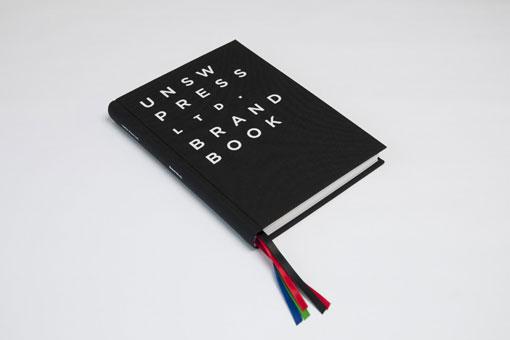
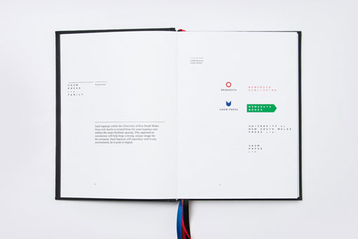
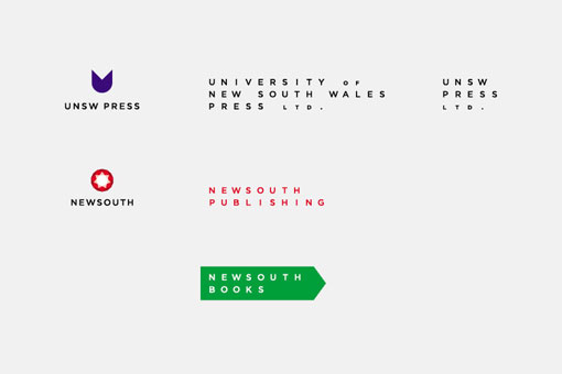
Mark Gowing Design was tasked with the challenge of developing an identity for the five divisions of the University of NSW Press Ltd., a non-profit publisher:
The overall identity was approached as a family of brands, yet each division still maintains its own personality. The look and feel of the five brands is sophisticated and understated. The trademarks and visual elements are intended to demonstrate the company’s commitment to quality publishing. The marks are simple and maintain a timeless crafted feel through strong links to traditional book typesetting, yet the marks maintain a progressive attitude that is ever present in the company’s products.


Get 300+ Fonts for FREE
Enter your email to download our 100% free "Font Lover's Bundle". For commercial & personal use. No royalties. No fees. No attribution. 100% free to use anywhere.
