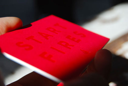
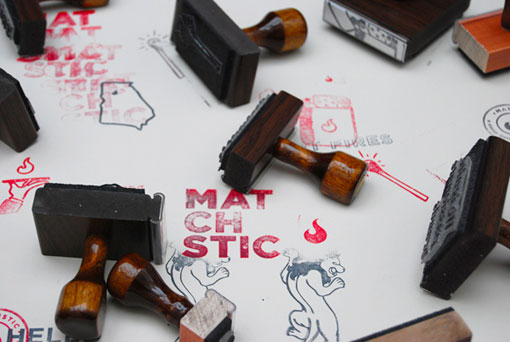
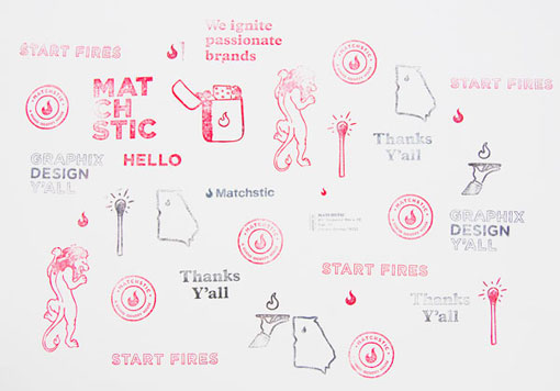
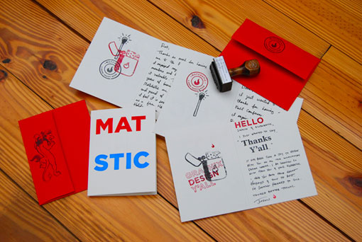
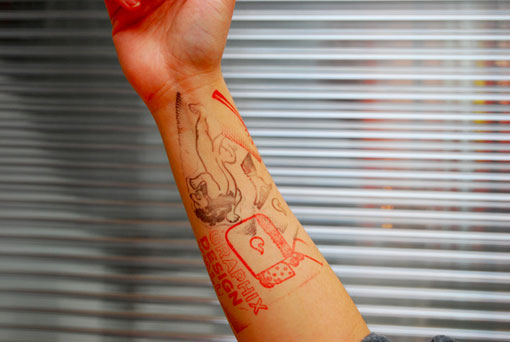
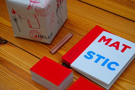
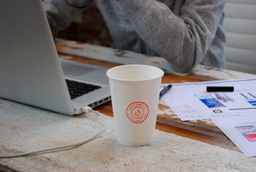
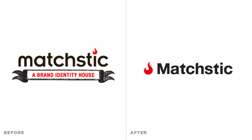
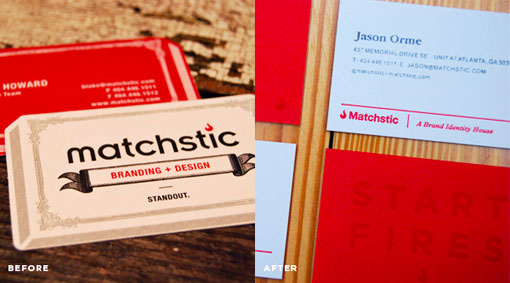
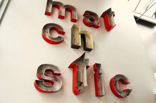
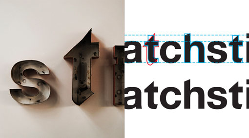
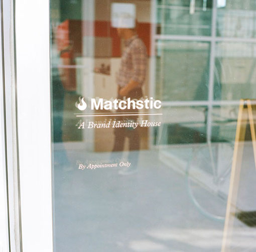
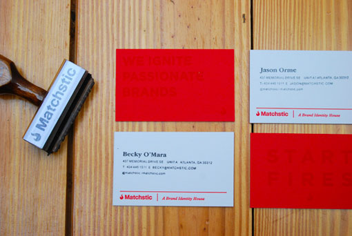
I’m consistently impressed with the work coming out of Atlanta-based Matchstic, so my eyes widened when I spotted the recent rebrand of their own studio. As designers, we all know how difficult it can be to create work for ourselves—I’ve been toiling away at our own rebrand for months and months—so it’s really interesting and inspiring to see what they accomplished. To get more insight into what went into the work, and to see a few more visual details, check out the original blog post right here.

Get 300+ Fonts for FREE
Enter your email to download our 100% free "Font Lover's Bundle". For commercial & personal use. No royalties. No fees. No attribution. 100% free to use anywhere.
