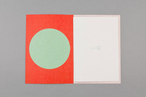
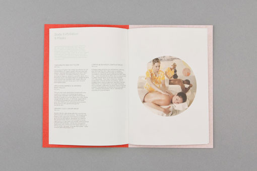
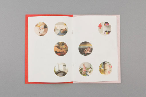
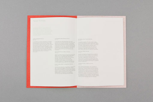
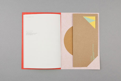
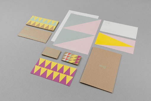
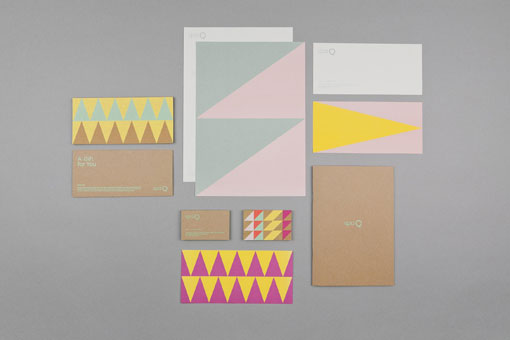
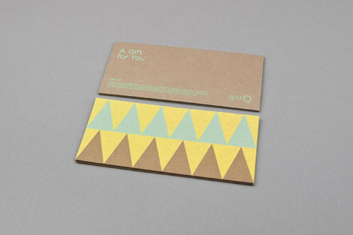
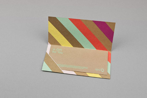
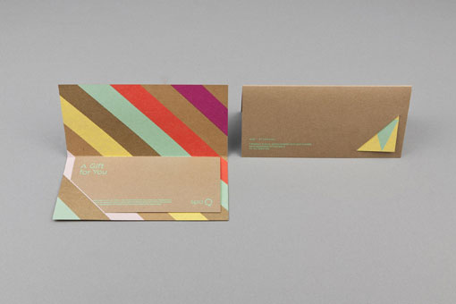
Awesome geometric identity work for Spa Q by Australian studio Maud:
QT Hotels approached us to design a brand for their first of several spas around Australia, with the stipulation that the identity of each should be inspired by the culture of its location, the first being on Australia’s iconic Gold Coast. We took inspiration from colourful beach huts and natural stocks to create a vibrant and approachable brand that avoids the expected. The Logo and information sit on a clean pattern free surface, always opposed by an individual and striking pattern. This juxtaposition is designed to suggest the idea of stress & relief.

Get 300+ Fonts for FREE
Enter your email to download our 100% free "Font Lover's Bundle". For commercial & personal use. No royalties. No fees. No attribution. 100% free to use anywhere.