In this article:
- The Most Enchanting Medieval Fonts
- What Makes a Font Truly "Medieval"?
- The Four Major Categories of Medieval Fonts
- Where to Use Medieval Fonts (And Where Not To)
- Pairing Medieval Fonts: Creating Harmony
- Creating Your Own Medieval-Inspired Letters
- Common Medieval Font Questions
- Conclusion: The Enduring Appeal of Medieval Typography
As designers, we’re constantly seeking fonts that transport viewers to different eras and evoke specific moods. And when it comes to creating that authentic medieval vibe—whether for a fantasy game, renaissance fair poster, or historical publication—choosing the right medieval font makes all the difference.
Medieval fonts capture the essence of hand-lettered manuscripts, Gothic cathedrals, and illuminated texts from the Middle Ages. With their ornate flourishes, blackletter styling, and time-worn character, these typefaces instantly communicate history, tradition, and mystique.
In this comprehensive guide, I’ll explore the best medieval fonts of 2026 and provide insights on:
- What truly makes a font feel “medieval”
- Key types of medieval fonts and their historical origins
- When (and when not) to use medieval fonts in your designs
- How to pair medieval fonts effectively
- Answers to common medieval font questions
Let’s journey back through the centuries and discover the most enchanting medieval fonts for your 2026 design toolkit!
The Most Enchanting Medieval Fonts
After extensive research and personal testing, here are my top picks for the most captivating medieval fonts currently available. These selections range from historically accurate recreations to modern interpretations that capture medieval essence while remaining functional for contemporary design work.
Silvermoon – Medieval Font
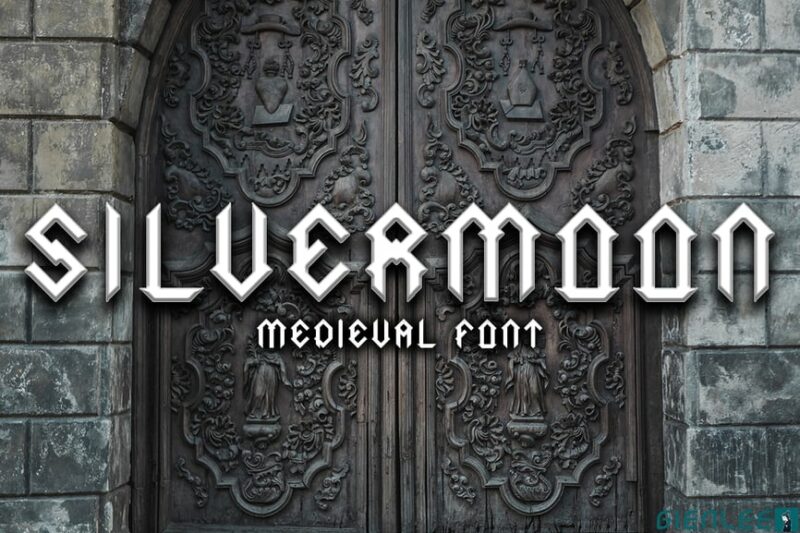
Silvermoon is a decorative medieval-inspired font that exudes a regal and fantastical atmosphere. Its intricate letterforms and ornate details make it perfect for designs related to kingdoms, fantasy realms, and historical themes.
Goldiwak – Classic Medieval Font
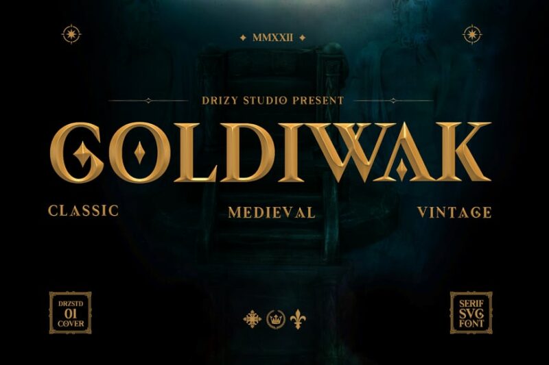
Goldiwak is a serif font that captures the essence of classic medieval typography. Its elegant and refined letterforms make it suitable for high-end branding, book covers, and designs that require a touch of historical sophistication.

Get 300+ Fonts for FREE
Enter your email to download our 100% free "Font Lover's Bundle". For commercial & personal use. No royalties. No fees. No attribution. 100% free to use anywhere.
THE QUIRONAX – Medieval Display Font
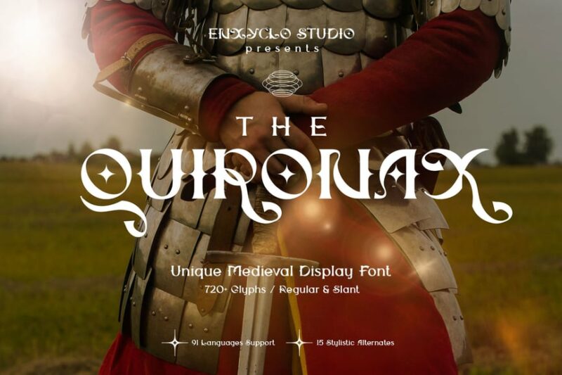
THE QUIRONAX is a modern take on medieval display fonts, combining traditional elements with contemporary design principles. Its elegant and bold characters make it ideal for headlines, logos, and designs that require a striking medieval-inspired presence.
Synthetic Stone – Medieval Crafted Font
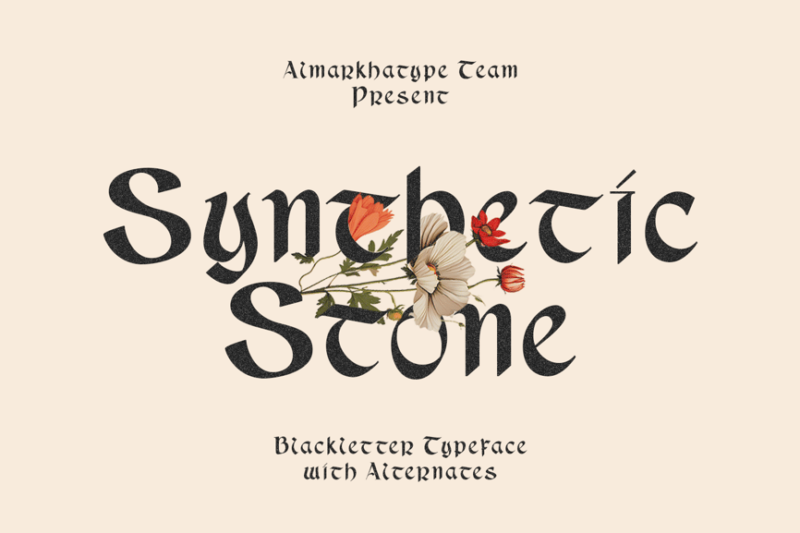
Synthetic Stone is a versatile medieval-inspired font family that includes serif, script, and handwritten styles. Its diverse range of letterforms, from elegant to rustic, makes it perfect for creating authentic-looking medieval documents, signage, and branding materials.
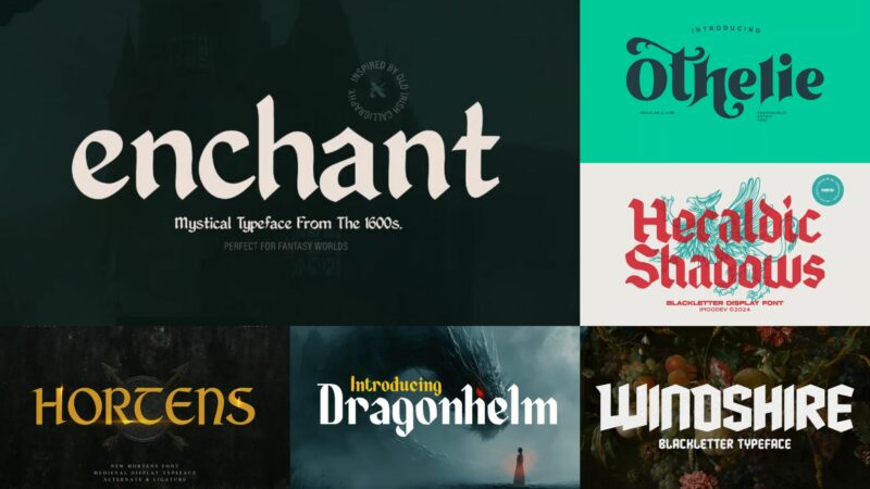
Dragonhelm – Medieval Typeface
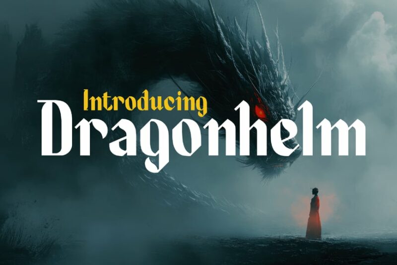
Dragonhelm is a bold and dramatic medieval typeface with strong gothic influences. Its powerful letterforms and sharp edges make it ideal for designs related to fantasy, gaming, and medieval-themed projects that require a strong visual impact.
Inkwell Scribe – Medieval Typeface
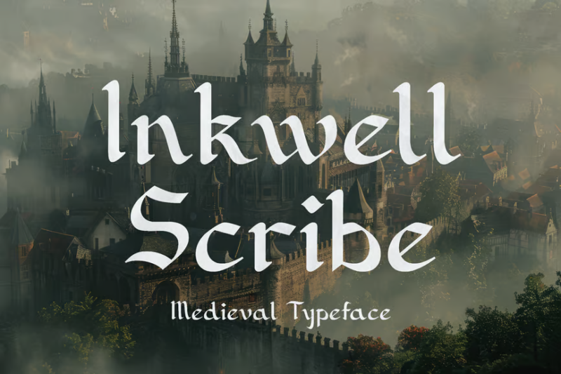
Inkwell Scribe is a serif typeface that captures the essence of medieval manuscript writing. Its delicate letterforms and subtle antique touches make it perfect for designs that require an authentic, hand-crafted feel, such as historical recreations or royal-style text invitations.
Dragonit – A Medieval Strong Display Font
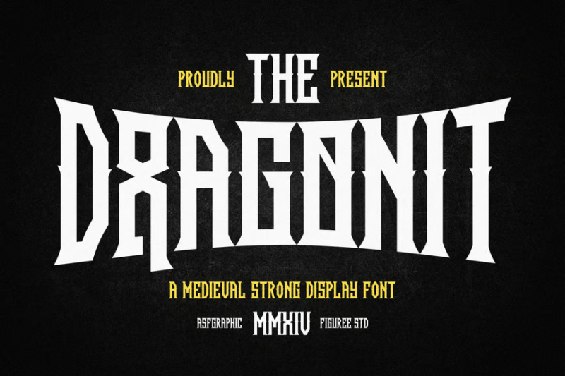
Dragonit is a powerful medieval display font with a touch of Victorian flair. Its strong, decorative letterforms make it ideal for creating eye-catching headlines, logos, and designs that require a bold, fantasy-inspired aesthetic.
Cikond – Medieval Display Font

Cikond is a serif display font that blends medieval influences with a Western-style flair. Its unique letterforms make it suitable for signage, posters, and branding projects that require a distinctive, historical-meets-frontier aesthetic.
Hortens – Medieval Display Typeface

Hortens is a grand and ornate medieval display typeface. Its elaborate letterforms and decorative elements make it perfect for creating luxurious, regal designs for high-end products, event invitations, or fantasy-themed projects.
Black Kinger – Blackletter & Medieval Font
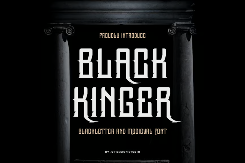
Black Kinger is a bold blackletter font that combines medieval and gothic styles with a modern, metallic edge. Its strong, angular letterforms make it ideal for creating impactful designs in the music industry, particularly for metal and rock genres.
Black Baron Typeface|Medieval Font
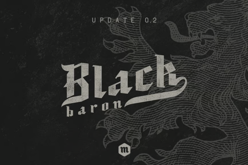
Black Baron is a decorative medieval font with a strong, authoritative presence. Its bold letterforms and sharp edges make it perfect for creating powerful headlines, logos, and designs that require a commanding medieval-inspired aesthetic.
NCL Jurgen Farbache – Medieval Rounded Blackletter
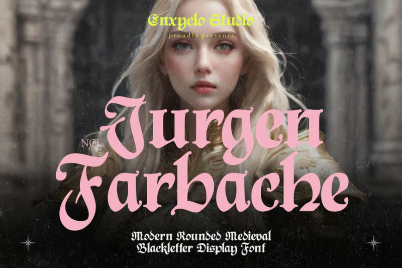
NCL Jurgen Farbache is a unique medieval blackletter font with rounded edges, offering a softer take on the traditional style. Its distinctive letterforms make it ideal for creating eye-catching titles, logos, and designs that blend historical charm with modern readability.
Basefigh – Medieval Rounded Blackletter Font
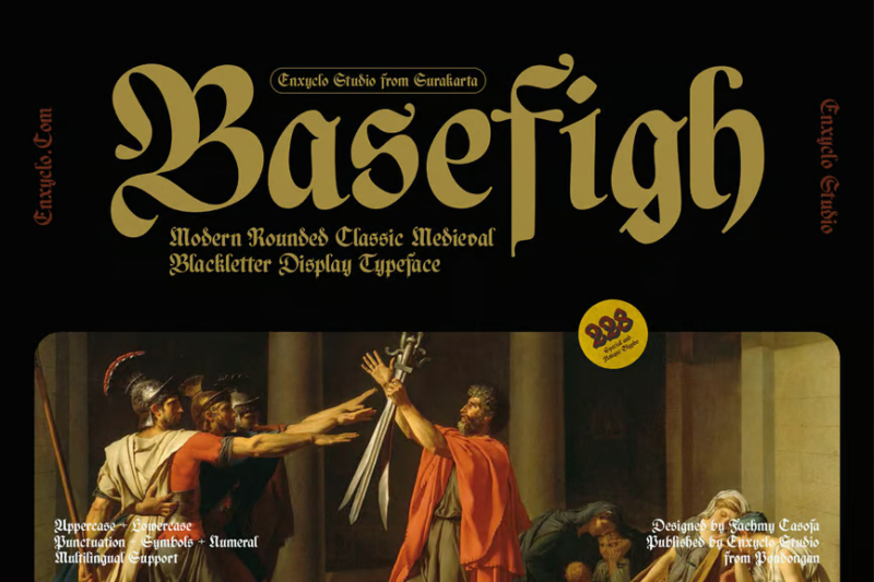
Basefigh is a medieval rounded blackletter font that combines classic calligraphic elements with a contemporary twist. Its smooth curves and balanced proportions make it suitable for a wide range of design projects, from branding to editorial layouts.
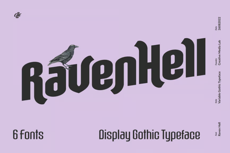
Raven Hell Round
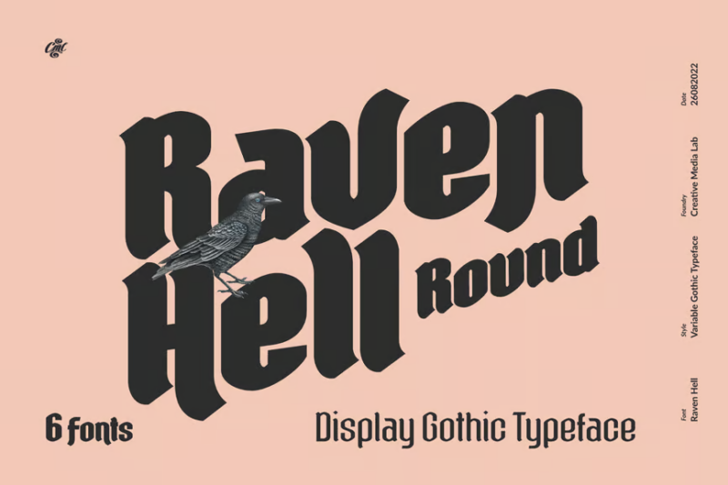
Raven Hell Round is a versatile font family that includes serif, sans-serif, and decorative styles with blackletter and medieval influences. Its diverse character set makes it suitable for creating cohesive designs across various mediums, from print to digital.
Iron Steel
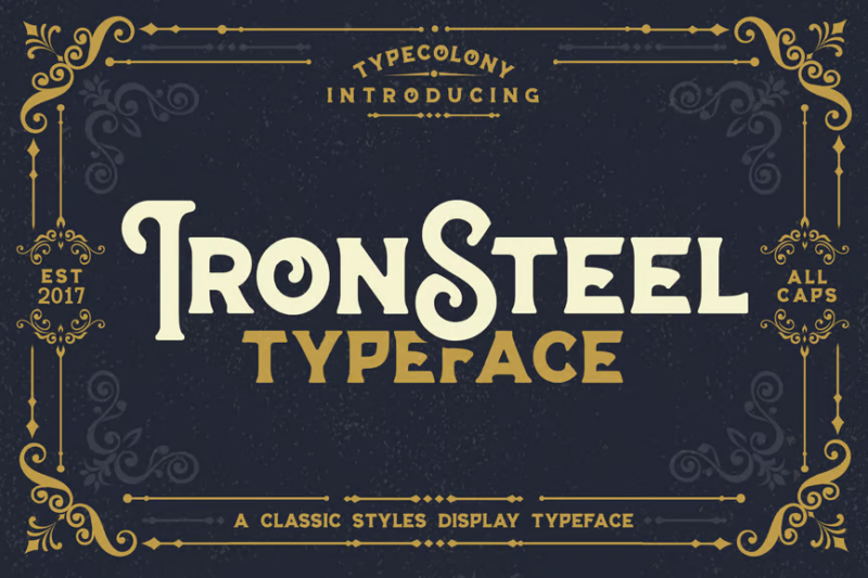
Iron Steel is a robust serif font with a vintage, industrial feel. While not strictly medieval, its strong letterforms and rugged texture make it suitable for designs that require a bold, timeless aesthetic, particularly for posters and branding projects.
Odd Times

Odd Times is a script and handwritten font that offers a unique, quirky take on lettering. While not medieval in style, its distinctive character makes it suitable for adding a personal, handcrafted touch to various design projects.
Enigmatic Waesbendiy – Modern Blackletter
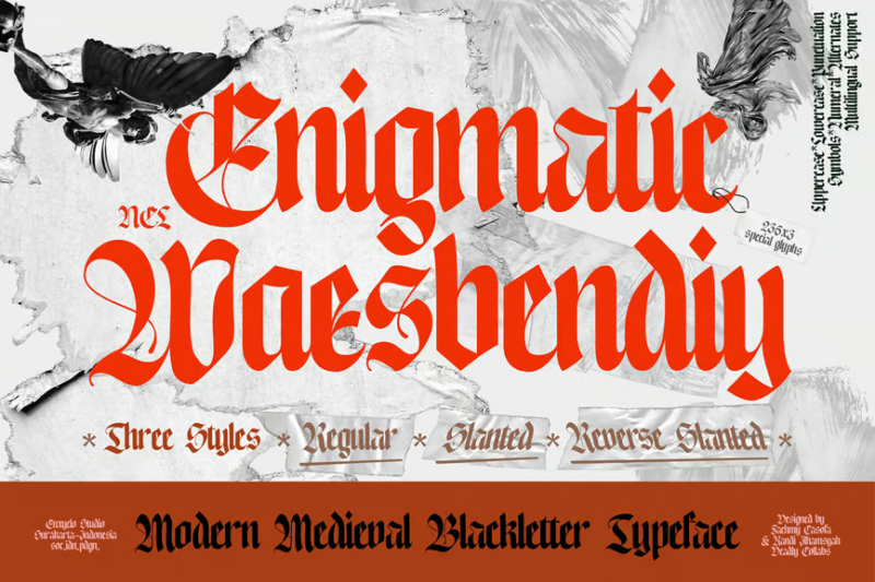
Enigmatic Waesbendiy is a modern blackletter font that blends medieval influences with contemporary design. Its sleek, stylized letterforms make it ideal for creating striking logos, headlines, and designs that require a fusion of historical and modern aesthetics.
Falcone – Gothic Font
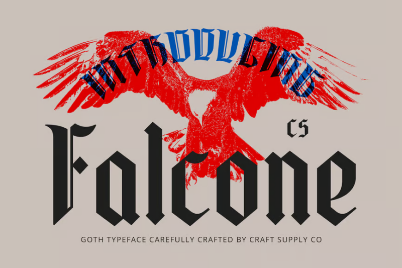
Falcone is an elegant gothic font that exudes timeless sophistication. Its refined letterforms and balanced proportions make it suitable for high-end branding, editorial designs, and projects that require a touch of gothic elegance.
Enchant – Mystical 1600s Typeface
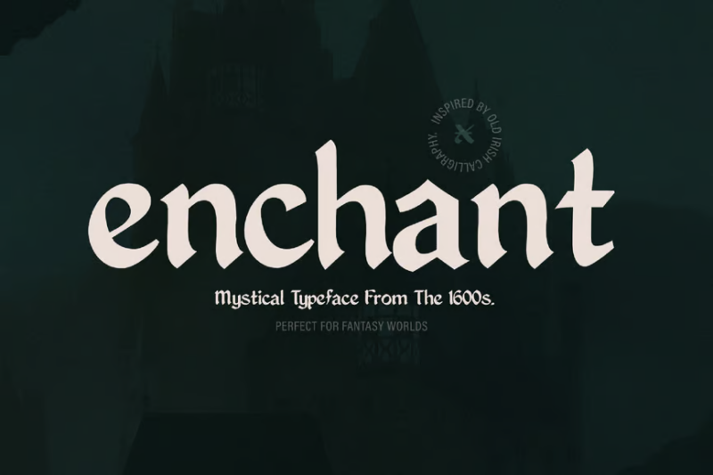
Enchant is a decorative typeface inspired by 17th-century mystical and gothic styles. Its intricate letterforms and ornate details make it perfect for creating magical, otherworldly designs for book covers, posters, and fantasy-themed projects.
Marcus – Blackletter Font
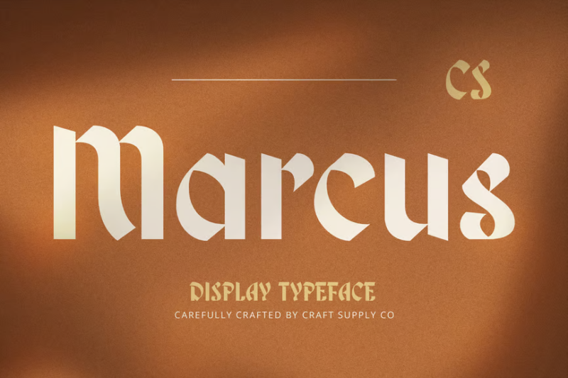
Marcus is a timeless blackletter font that combines traditional calligraphic elements with modern readability. Its well-balanced letterforms make it suitable for creating elegant logos, headlines, and designs that require a touch of historical authenticity.
Windshire – Blackletter Typeface
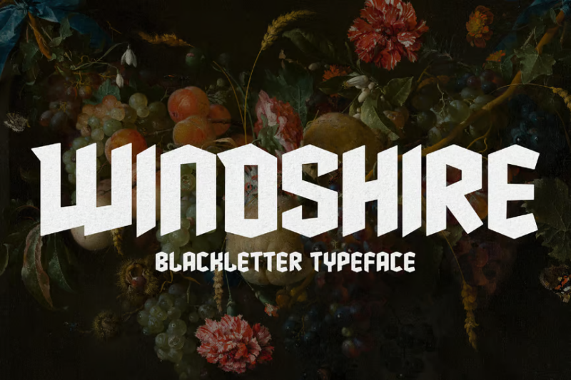
Windshire is a gothic blackletter typeface with a distinct Scottish flair. Its bold, ornate letterforms make it ideal for creating powerful headlines, logos, and designs related to Celtic or Scottish themes, as well as fantasy and historical projects.
Fenrir Gothic
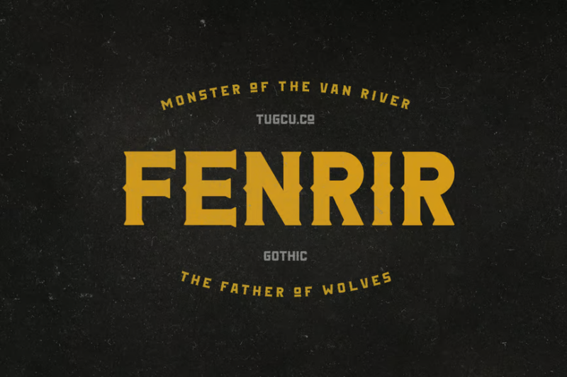
Fenrir Gothic is a serif font with strong gothic influences and a nod to norse or viking styles. Its distinctive letterforms make it suitable for creating eye-catching titles, logos, and designs that require a blend of historical and mythological elements.
Ambrosia – Blackletter Font
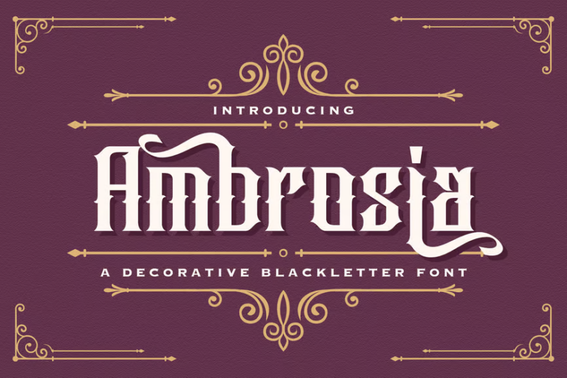
Ambrosia is a decorative blackletter font with strong gothic influences. Its intricate letterforms and balanced proportions make it ideal for creating elegant, sophisticated designs for luxury brands, event invitations, and high-end packaging.
Heraldic Shadows – Blackletter Display Font
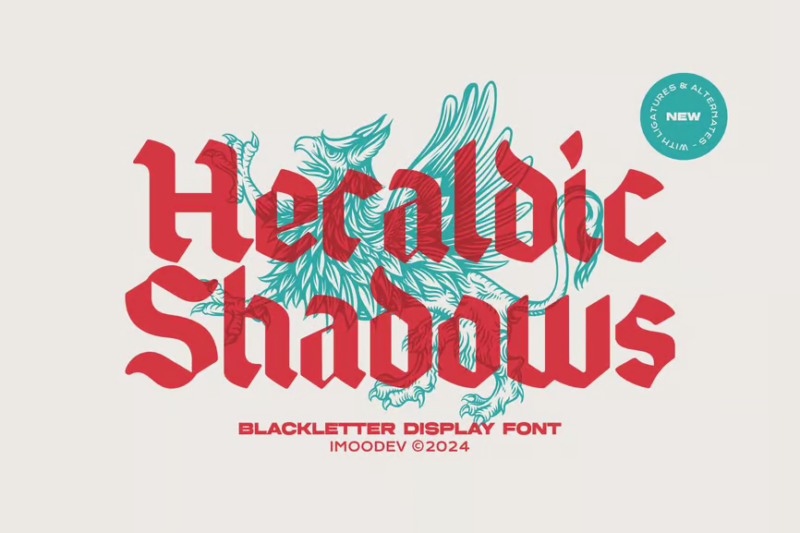
Heraldic Shadows is a stylish blackletter display font with a unique shadow effect. Its distinctive appearance makes it perfect for creating eye-catching headlines, logos, and designs that require a bold, medieval-inspired presence with a modern twist.
The Hero King Typeface
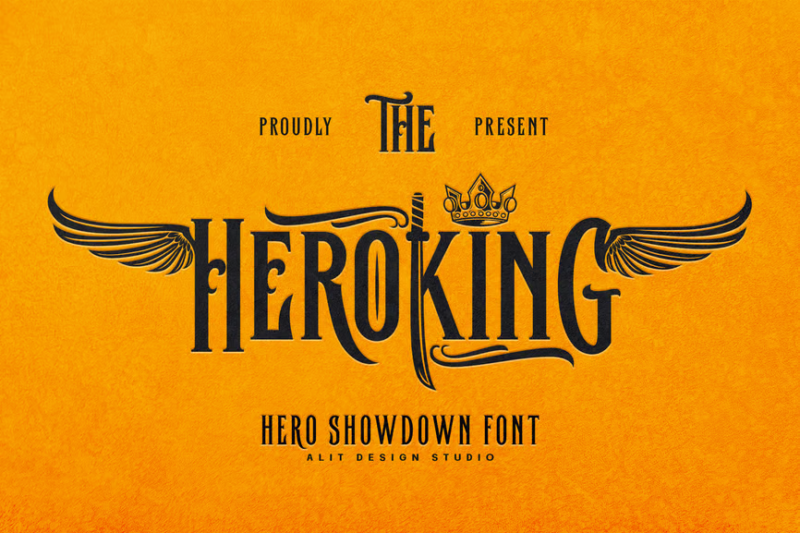
The Hero King is a serif typeface that combines knightly and sporty elements. Its bold, structured letterforms make it suitable for creating impactful designs for sports teams, gaming projects, and brands that want to convey strength and heroism.
Raven Hell Regular
Raven Hell Regular is a versatile font family that includes serif, sans-serif, and decorative styles with a touch of Halloween and minimalist aesthetics. Its diverse character set makes it suitable for creating cohesive designs across various projects and seasons.
Wicked Knight – Blackletter Font
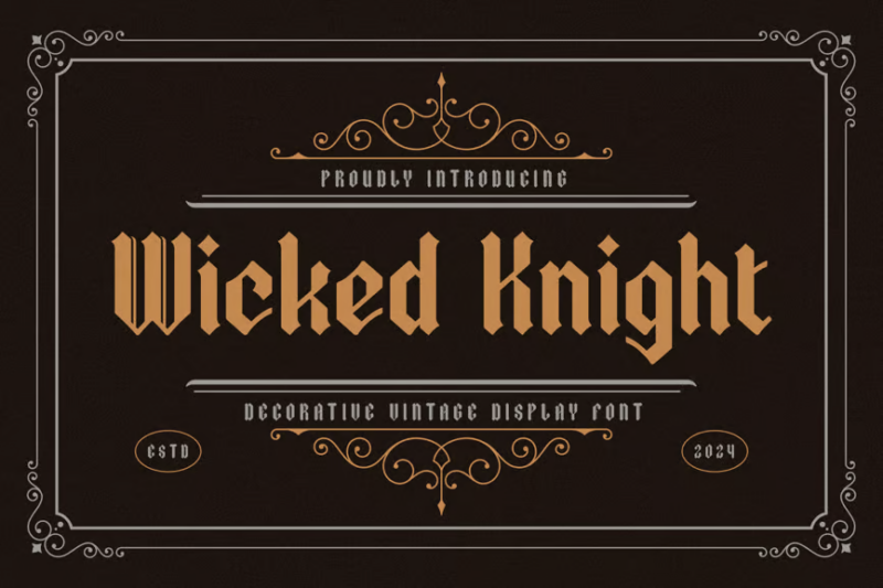
Wicked Knight is a bold blackletter font with a modern edge. Its strong, angular letterforms make it ideal for creating impactful logos, headlines, and designs that require a powerful, medieval-inspired presence with a contemporary twist.
Lordish Blackletter
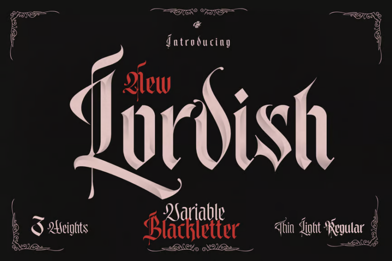
Lordish Blackletter is a decorative serif font that combines traditional blackletter elements with a tattoo-inspired aesthetic. Its unique letterforms make it perfect for creating distinctive designs for alternative fashion brands, music projects, and edgy visual identities.
The White Knight – Blackletter Font
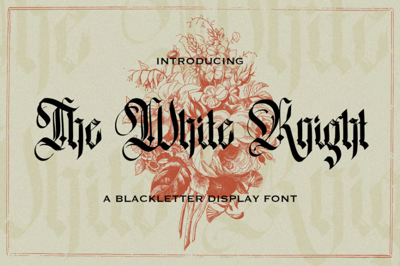
The White Knight is a decorative blackletter font with strong gothic influences. Its elegant and refined letterforms make it suitable for creating sophisticated designs for luxury brands, high-end products, and projects that require a touch of medieval nobility.
Distropiax – Modern Blackletter Font

Distropiax is a modern blackletter font with a distinctive tattoo-inspired aesthetic. Its bold, stylized letterforms make it ideal for creating edgy designs for alternative fashion brands, music projects, and urban-themed visual identities.
King Castle – Celtic Typeface
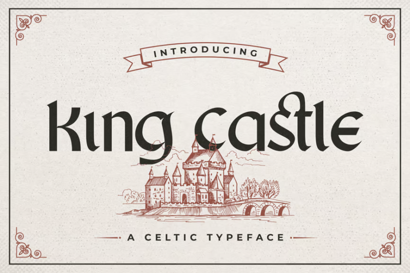
King Castle is a decorative Celtic typeface with Danish influences. Its intricate letterforms and ornate details make it perfect for creating authentic-looking designs related to Celtic culture, medieval themes, and fantasy projects.
Moleta – Modern Gothic Font
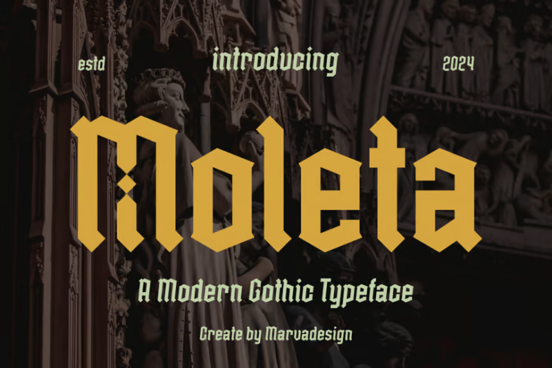
Moleta is a modern gothic font that combines traditional elements with contemporary design principles. Its decorative yet readable letterforms make it suitable for creating striking headlines, logos, and designs that require a gothic-inspired aesthetic with a fresh twist.
Othelie
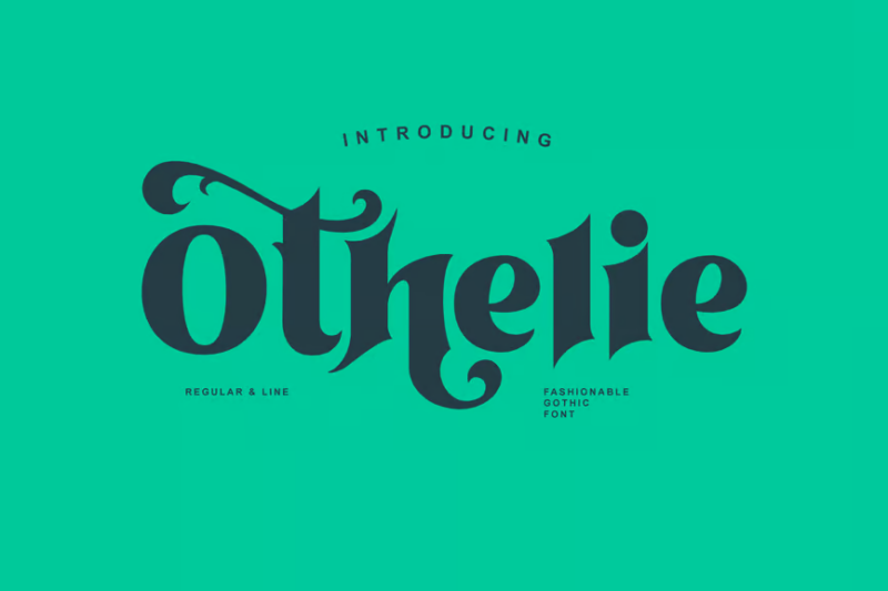
Othelie is a versatile font family that includes decorative, symbol, sans-serif, and serif styles with Halloween and Victorian influences. Its diverse character set and unique aesthetic make it perfect for creating cohesive designs across various seasonal and themed projects.
What Makes a Font Truly “Medieval”?
Have you ever wondered what specific characteristics make a font feel authentically medieval? Let’s break down the key elements that transport us back to the Middle Ages:
Blackletter Foundation
Most medieval fonts derive from blackletter (also called Gothic script), which dominated European writing from approximately 1150 to 1500. These scripts feature tall, narrow letters with dramatic thick and thin strokes. The densely packed letterforms create a distinctive texture on the page that immediately signals medieval origins.
The primary blackletter styles—Textura, Rotunda, Schwabacher, and Fraktur—each represent different periods and regions of medieval Europe. Most contemporary medieval fonts draw inspiration from one or more of these historical styles.
Formal Structure and Discipline
Medieval typography reflects the disciplined hand of trained scribes who followed strict rules of letter formation. Authentic medieval fonts maintain vertical consistency with careful attention to the rhythmic spacing between elements. This formal structure creates the sense of order and tradition associated with medieval writing.
Decorative Capitals
One of the most distinctive features of medieval manuscripts was the elaborately decorated initial letters that began important sections of text. These “illuminated capitals” often incorporated illustrations, gold leaf, and vibrant colors.
Many premium medieval fonts include alternate versions of capital letters with decorative elements that recall this illuminated manuscript tradition. These special characters add instant medieval authenticity to titles and important passages.
Ligatures and Special Characters
Medieval scripts frequently used ligatures—two or more letters joined as a single glyph—to create more efficient writing and aesthetic harmony. Quality medieval fonts include numerous ligatures and period-appropriate special characters like the long s (ſ), unique abbreviations, and decorative flourishes.
Worn, Aged Appearance
Some medieval-inspired fonts incorporate subtle texture or irregularities that suggest the imperfections of hand-written text or the wear of centuries. These details add character and authenticity, distinguishing truly great medieval fonts from basic imitations.
The Four Major Categories of Medieval Fonts
Medieval typography evolved significantly throughout the Middle Ages (roughly 500-1500 CE). Understanding the four main styles that developed during this period can help you choose the most appropriate medieval font for your specific design needs:
Uncial and Half-Uncial (4th-8th centuries)
Early medieval typography evolved from Roman lettering into rounder, more open forms called Uncial and Half-Uncial scripts. These early medieval scripts feature:
- Rounded letterforms
- Few ascenders and descenders
- Open, curved strokes
- Relatively wide proportions
Fonts in this style work well for Celtic, early Christian, or early medieval themes. They feel ancient yet remain relatively readable to modern eyes.
Carolingian Minuscule (8th-12th centuries)
Developed during Charlemagne’s reign to standardize writing across Europe, Carolingian minuscule represents a clear, ordered medieval script with:
- Clear, rounded lowercase letters
- Distinct ascenders and descenders
- Moderate contrast between thick and thin strokes
- More generous spacing than later medieval scripts
Fonts inspired by Carolingian minuscule offer excellent readability while maintaining medieval character, making them suitable for longer text passages in historical contexts.
Gothic/Blackletter (12th-15th centuries)
Gothic scripts (also called blackletter) represent what most people immediately recognize as “medieval” writing. These densely packed scripts feature:
- Tall, narrow letterforms
- Strong vertical emphasis
- Sharp, angular connections
- Dramatic thick/thin contrast
- Minimal space between letters
Gothic-inspired fonts create immediate medieval impact and work beautifully for titles, logos, and short display text.
Humanist/Early Renaissance (15th century)
As the Middle Ages transitioned to the Renaissance, a new style emerged that combined medieval traditions with renewed interest in classical Roman forms:
- Clearer, more open letterforms
- More rounded shapes
- Balanced proportions
- Refined pen strokes
Fonts in this late medieval/early Renaissance style offer an excellent compromise between authentic medieval flavor and contemporary readability.
Where to Use Medieval Fonts (And Where Not To)
Medieval fonts add instant historical character, but they’re not appropriate for every situation. Here’s guidance on the best applications for these distinctive typefaces:
Perfect Applications for Medieval Fonts
- Fantasy Gaming: RPGs, adventure games, and fantasy worlds often rely on medieval fonts to establish setting and atmosphere in logos, UI elements, and in-game text.
- Historical Projects: Museums, educational materials, and historical documentaries can use carefully selected medieval fonts to enhance period authenticity.
- Themed Entertainment: Renaissance fairs, medieval-themed restaurants, historical reenactments, and similar venues benefit from appropriate medieval typography in their branding and signage.
- Book Design: Fantasy novels, historical fiction, and scholarly works about medieval topics can incorporate medieval fonts for chapter headings, pull quotes, or decorative elements.
- Certificates and Formal Documents: Diplomas, awards, and commemorative documents often employ medieval-inspired typography to convey tradition, authority, and timelessness.
- Breweries and Distilleries: Craft beer, mead, and spirits producers frequently use medieval typography to suggest traditional craftsmanship and historical recipes.
When to Avoid Medieval Fonts
- Body Text: Most medieval fonts sacrifice readability for style, making them poor choices for extended reading. Save them for headlines and display purposes.
- Modern Brands: Unless you’re deliberately evoking history or tradition, medieval fonts will likely conflict with contemporary brand values like innovation, simplicity, and accessibility.
- Digital Interfaces: The complexity of medieval letterforms often renders poorly at small sizes and creates accessibility issues in web and app interfaces.
- Professional Communications: Business documents, presentations, and corporate materials generally require more neutral, professional typography.
- Contexts Requiring Cultural Sensitivity: Be mindful that some blackletter fonts carry associations with German nationalism due to their use in Nazi propaganda. Research your font choice carefully if working in politically sensitive contexts.
Pairing Medieval Fonts: Creating Harmony
Even the most beautiful medieval font needs thoughtful pairing to create effective designs. Here are strategies for combining medieval typography with other fonts:
The Classic Contrast Approach
Medieval fonts work beautifully when paired with clean, simple sans-serif counterparts. This creates a pleasing contrast between historical decorative elements and modern clarity.
Try pairing:
- Gothic blackletter fonts with geometric sans serifs like Futura or Proxima Nova
- Uncial scripts with humanist sans serifs like Gill Sans or Frutiger
The Period-Appropriate Pairing
For historically accurate designs, pair different medieval font styles that would have coexisted historically:
- Use Gothic display fonts for titles with a more readable Carolingian-inspired font for body text
- Combine elaborate illuminated capitals with simpler blackletter for remaining text
The Transitional Timeline Approach
Create subtle historical narrative by pairing medieval fonts with typefaces from adjacent historical periods:
- Late medieval/early Renaissance fonts work well with Renaissance serif typefaces
- Early medieval Uncial fonts pair nicely with Roman-inspired typefaces
The Functional Hierarchy Strategy
Design for both impact and usability by assigning specific roles to each font:
- Medieval fonts: Headlines, titles, pull quotes, and decorative elements
- Modern readable fonts: Body text, navigation, captions, and functional information
This approach maintains medieval character while ensuring your content remains accessible and readable.
Creating Your Own Medieval-Inspired Letters
Passionate about medieval typography but can’t find the perfect font? Consider trying your hand at creating medieval-inspired lettering:
Calligraphy Basics
Start by learning fundamental calligraphy skills with a broad-nib pen or marker. Medieval scripts were created with specific pen angles and stroke sequences that you can master with practice.
Several excellent online courses and books focus specifically on Gothic and medieval calligraphy styles. Begin with basic strokes before attempting complete letterforms.
Digital Customization
If hand-lettering isn’t your strength, consider customizing existing medieval fonts in vector software:
- Add decorative elements to basic medieval letterforms
- Combine features from different medieval fonts
- Adjust proportions to improve readability while maintaining medieval character
Study Historical Sources
For authentic inspiration, examine digitized medieval manuscripts available through museum and library websites. Pay attention to:
- How letters connect and interact
- The rhythm and spacing of different scripts
- Decorative techniques used for important passages
Understanding the historical context and techniques behind medieval typography will enhance your ability to create authentic medieval-inspired designs.
Common Medieval Font Questions
Let’s address some frequently asked questions about medieval typography:
What font was used in medieval times?
Medieval scribes used several evolving scripts rather than “fonts” as we understand them today. The main medieval writing styles included Uncial (4th-8th centuries), Carolingian minuscule (8th-12th centuries), and various Gothic/blackletter scripts (12th-15th centuries). These handwritten styles varied by region, time period, and purpose.
What is the medieval Gothic font called?
What we commonly call “Gothic” encompasses several related medieval scripts. The primary Gothic styles include Textura (the most formal, used for luxury books), Rotunda (a rounder variant popular in southern Europe), Schwabacher (developed in Germany), and Fraktur (which evolved from Schwabacher and remained in use into the 20th century).
What font is used for old English?
The term “Old English” in typography usually refers to blackletter styles, particularly Textura Quadrata. However, this is somewhat misleading as the actual Old English language (Anglo-Saxon, used from the 5th-11th centuries) was typically written in Insular scripts, which look quite different from the later blackletter styles many associate with “Old English” typography.
What font is used in illuminated manuscripts?
Illuminated manuscripts used various scripts depending on their time period and origin. Early medieval illuminated manuscripts often used Uncial and Half-Uncial scripts, while later examples frequently featured Gothic scripts like Textura. The spectacular decorated initials in these manuscripts were hand-painted rather than being part of a “font” in the modern sense.
Conclusion: The Enduring Appeal of Medieval Typography
Medieval fonts offer designers a direct connection to centuries of typographic tradition. Their distinctive character instantly communicates history, craftsmanship, and timeless elegance.
Whether you’re designing for fantasy gaming, historical publications, or simply seeking to infuse your work with old-world charm, the right medieval font creates an immediate sense of time and place. The best medieval fonts balance historical authenticity with practical considerations like readability and versatility.
As you experiment with these fonts, remember that medieval scribes were craftspeople who adapted their writing to serve specific purposes. Follow their example by choosing medieval fonts thoughtfully based on your specific design needs rather than simply defaulting to the most ornate option.
In an age of digital minimalism and trendy sans serifs, medieval typography offers something profound—a connection to the human hands that painstakingly created letters as works of art, one stroke at a time. That’s a tradition worth preserving and celebrating in your designs.