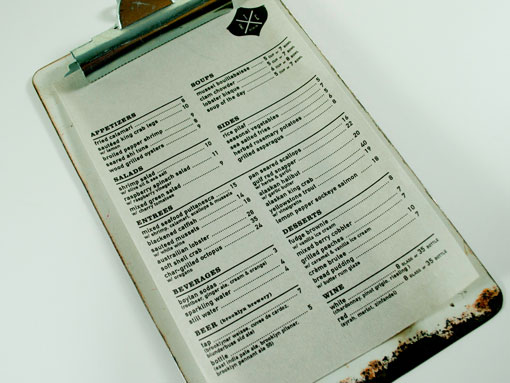
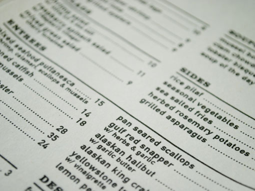
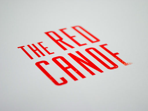
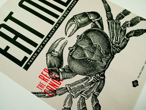
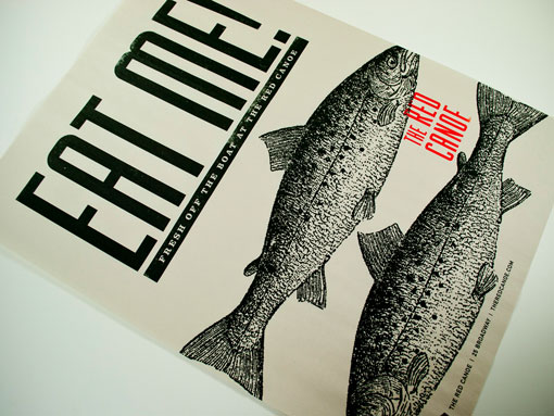
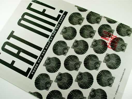
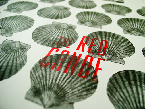
Michael Croxton, an NYC-based designer currently studying in the MFA program at SVA, has one of those enviable portfolios that boasts consistently solid work, from top to bottom. I like his work so much, in fact, that I decided to do two separate posts featuring two completely different projects. First up, The Red Canoe, a restaurant identity that won a Certificate of Typographic Excellence from the Type Directors Club this year.

Get 300+ Fonts for FREE
Enter your email to download our 100% free "Font Lover's Bundle". For commercial & personal use. No royalties. No fees. No attribution. 100% free to use anywhere.
