In this article:
- 25 Most Commanding Military Fonts
- What Makes a Font Feel Military?
- Where Can You Use Military Fonts?
- Where to Avoid Military Fonts
- How to Choose the Perfect Military Font
- Excellent Military Font Alternatives
- Common Military Font Questions
- Conclusion: The Enduring Power of Military Typography
Military fonts bring that perfect combination of strength and readability that can transform ordinary designs into commanding visual statements.
Military-inspired typography has a rich heritage dating back to stenciled equipment markings, official documents, and vehicle identification. Today, these fonts have evolved beyond their utilitarian origins to become powerful design tools across various applications.
Let’s dive into the front lines of military typography!
25 Most Commanding Military Fonts
Not all military fonts deliver the same impact. I’ve carefully selected the most impressive options that truly stand at attention:
Handey Military
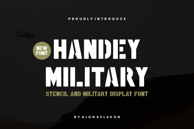
Handey Military is a bold, decorative typeface that exudes strength and authority. Its sturdy letterforms and sharp edges give it a commanding presence, making it ideal for military-themed designs or projects requiring a robust, no-nonsense aesthetic.
Airborne 86
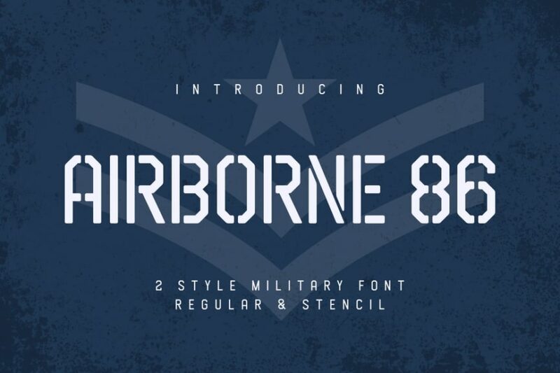
Airborne 86 is a sans-serif font that combines military precision with retro charm. Its clean lines and slightly condensed characters make it perfect for headlines and logos, especially in designs that aim to evoke a sense of nostalgia or vintage military style.
Gin Military Base
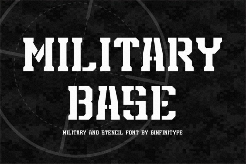
Gin Military Base is a bold serif font with a retro twist. Its strong, blocky serifs and thick strokes give it a powerful presence, ideal for military-inspired branding or vintage-style posters that demand attention.

Get 300+ Fonts for FREE
Enter your email to download our 100% free "Font Lover's Bundle". For commercial & personal use. No royalties. No fees. No attribution. 100% free to use anywhere.
Strong Soldier
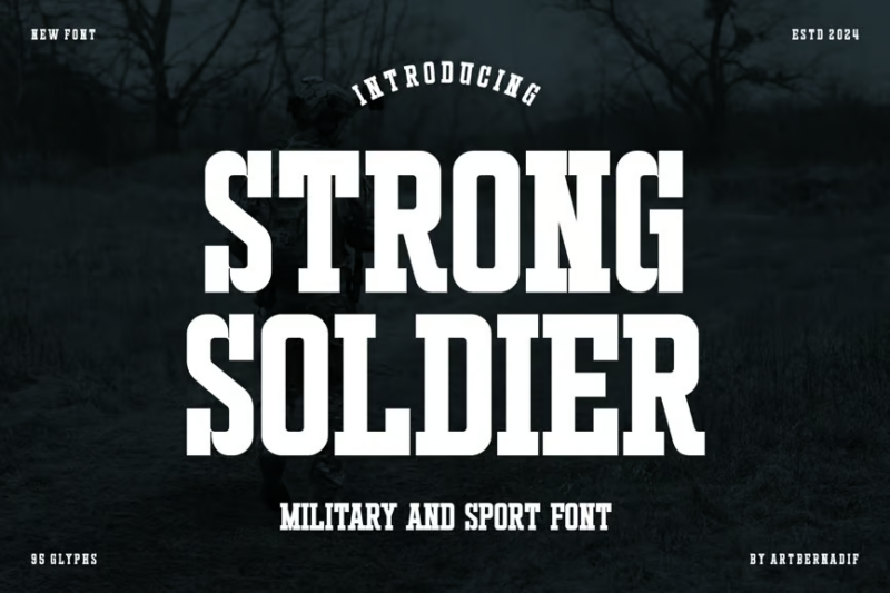
Strong Soldier is a robust serif font that lives up to its name. With its bold characters and athletic feel, it’s perfect for military and sports-themed designs. The font’s strength and clarity make it excellent for headlines and impactful text in various media.
Headcorps
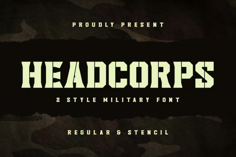
Headcorps is a military-inspired serif font with a vintage touch. Its sharp serifs and structured letterforms evoke a sense of discipline and tradition, making it ideal for historical military designs or projects requiring a classic, authoritative look.
Lordcorps
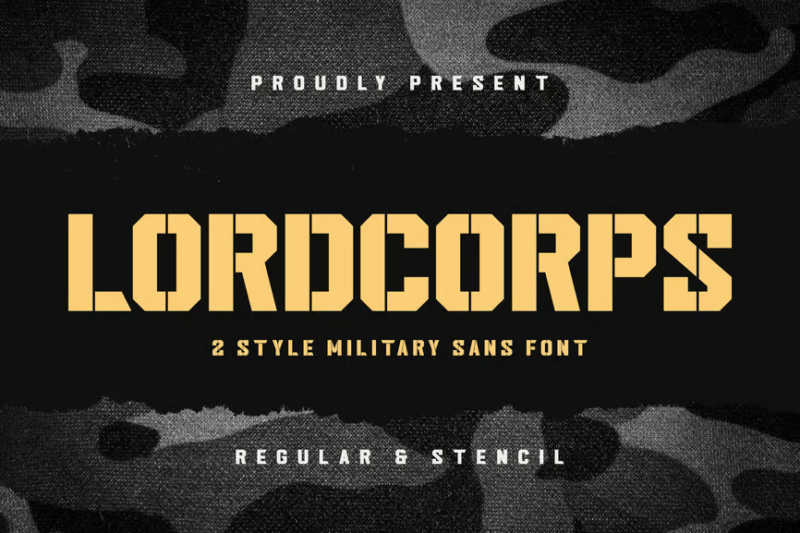
Lordcorps is a sans-serif font that blends military precision with vintage charm. Its clean, geometric shapes and subtle decorative elements make it versatile for both modern and retro-inspired designs, particularly those with a military or institutional theme.
Vinstamp
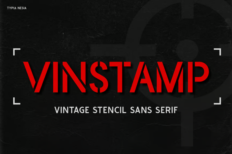
Vinstamp is a stencil-style sans-serif font designed for military and game-themed projects. Its rough edges and bold characters give it a rugged, authentic feel, perfect for creating immersive gaming experiences or military-inspired graphics.
Rouhtem Stencil Display Sans
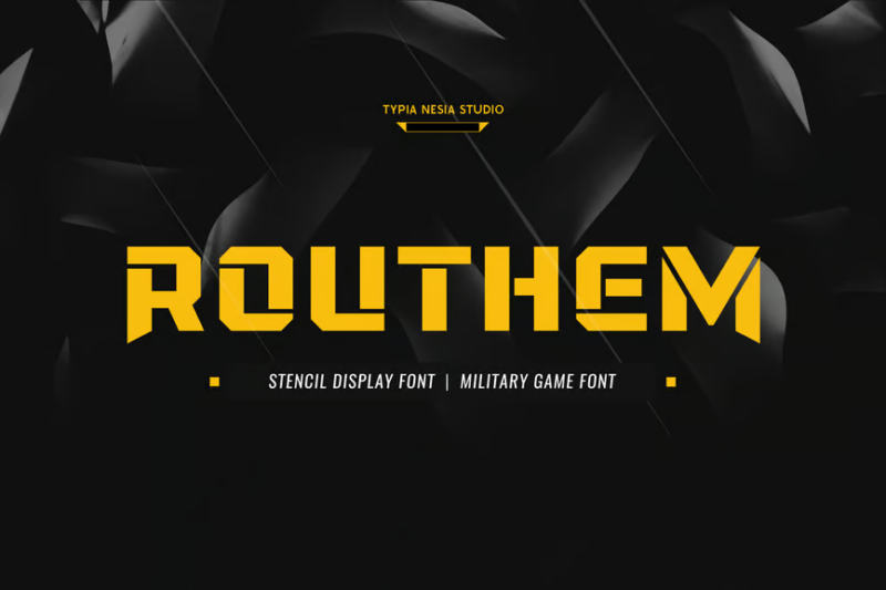
Rouhtem is a bold stencil display font with a military edge. Its clean-cut stencil design and strong geometric shapes make it ideal for game interfaces, military-themed posters, and other designs requiring a powerful, modern stencil aesthetic.
Giodelta
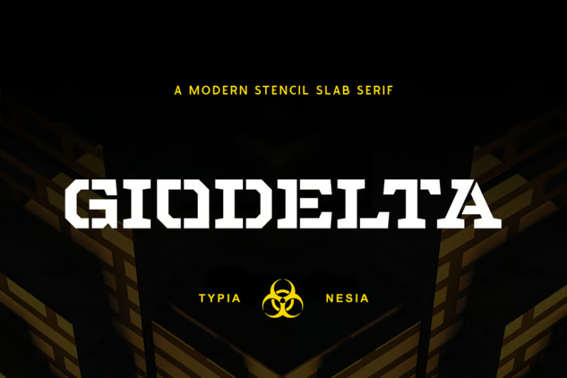
Giodelta is a stencil slab serif font that combines military precision with gaming flair. Its bold, chunky serifs and stencil cuts create a strong visual impact, making it perfect for game logos, military-themed designs, and eye-catching headlines.
Warband Stencil Font
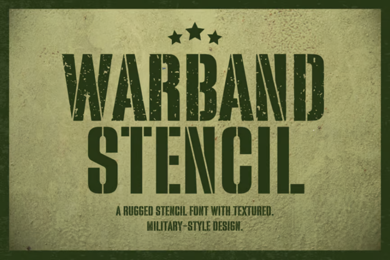
Warband is a powerful stencil font that exudes strength and unity. Its bold, geometric shapes and clean stencil cuts make it ideal for military-themed designs, team logos, and any project that requires a strong, cohesive typographic presence.
Juan Cock Font
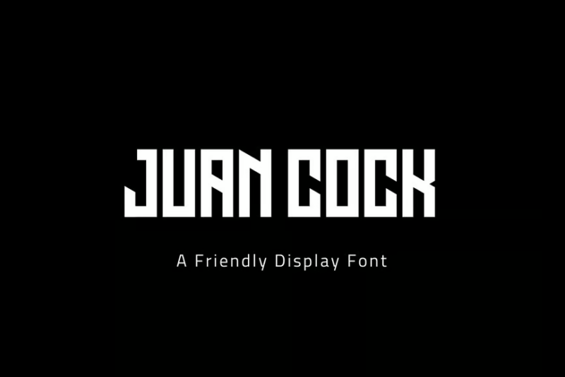
Juan Cock is a versatile font family that includes both serif and sans-serif styles. Its bold characters and esport-inspired design make it perfect for gaming logos, team branding, and modern, high-energy graphics that demand attention.
Markton
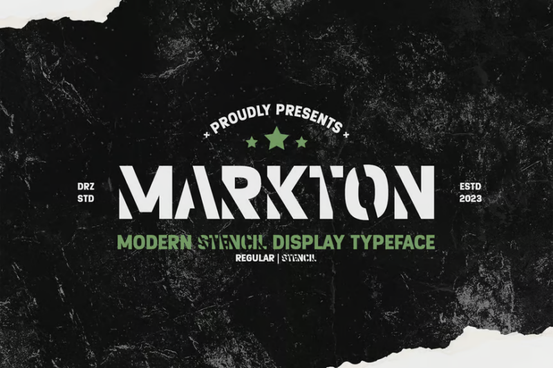
Markton is a modern stencil typeface that balances sharp edges with smooth curves. Its contemporary design makes it suitable for a wide range of applications, from military-inspired graphics to sleek, futuristic layouts in both digital and print media.
Future Soldier
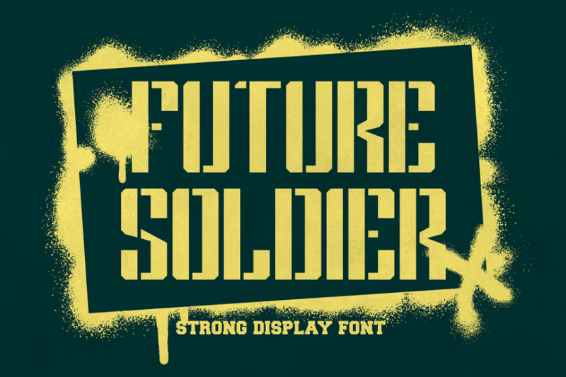
Future Soldier is a futuristic stencil font that combines military precision with sci-fi aesthetics. Its clean lines and unique character shapes make it perfect for forward-looking military designs, game interfaces, and projects that blend traditional military themes with future tech.
Stencil Army Font – SGT. John O
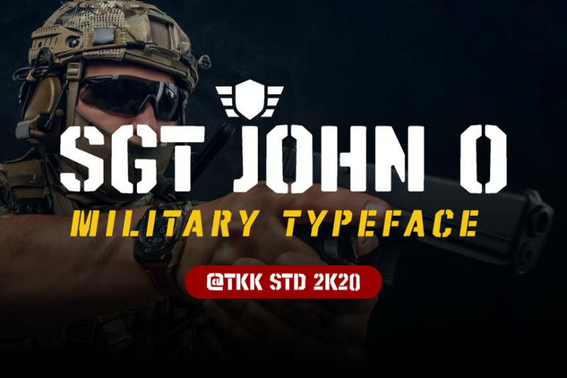
SGT. John O is a bold, no-nonsense stencil font that captures the essence of military typography. Its strong, geometric shapes and clear stencil cuts make it highly legible and perfect for authentic military-style designs, signage, and branding.
Sharpshooter
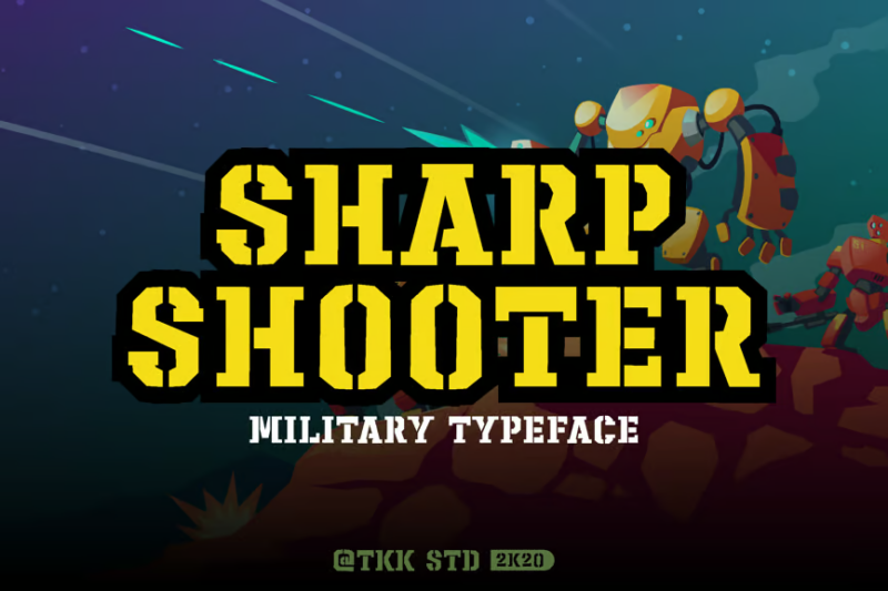
Sharpshooter is a precise and detailed stencil army font. Its serif design adds a touch of sophistication to the military stencil style, making it ideal for projects that require a blend of traditional military aesthetics with a more refined, decorative approach.
Nordik | Future Font
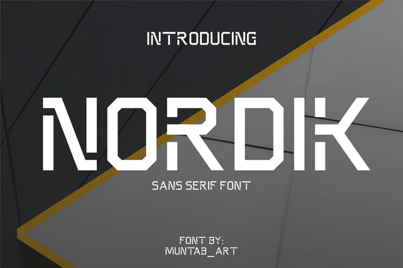
Nordik is a modern, futuristic font family that includes both sans-serif and serif styles. Its clean lines and geometric shapes give it a sleek, contemporary feel, perfect for forward-thinking designs, tech branding, and projects that require a blend of tradition and innovation.
Eaglore
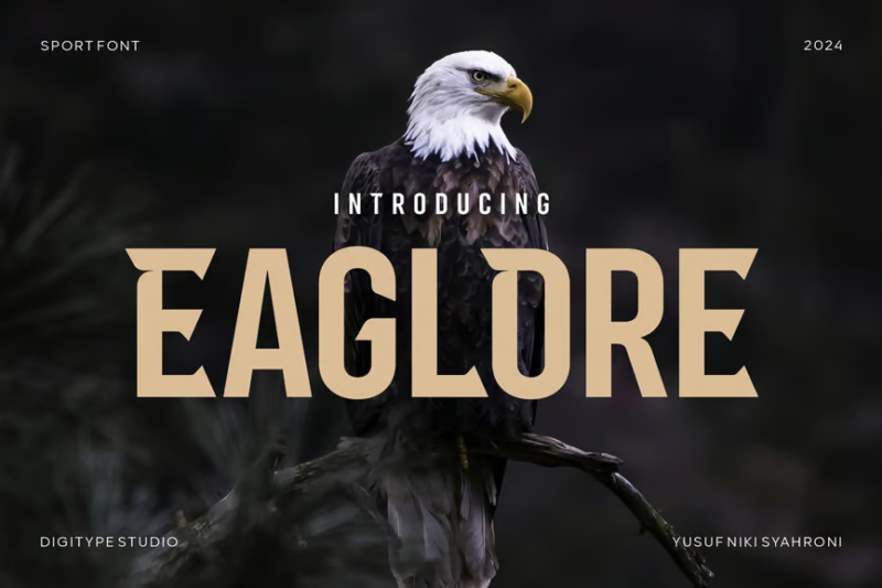
Eaglore is a dynamic sans-serif font designed with esports and futuristic themes in mind. Its bold, angular characters and sharp edges make it perfect for gaming logos, team branding, and designs that need to convey speed, energy, and cutting-edge technology.
Union Force
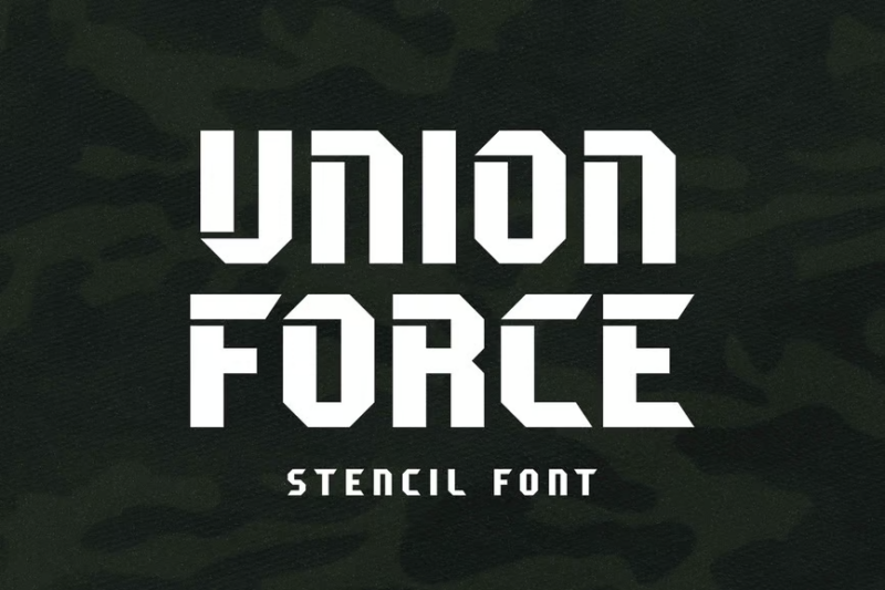
Union Force is a powerful stencil display font that combines military precision with vintage charm. Its bold, blocky characters and clean stencil cuts make it ideal for creating impactful headlines, logos, and designs that require a strong, unified visual presence.
Monback
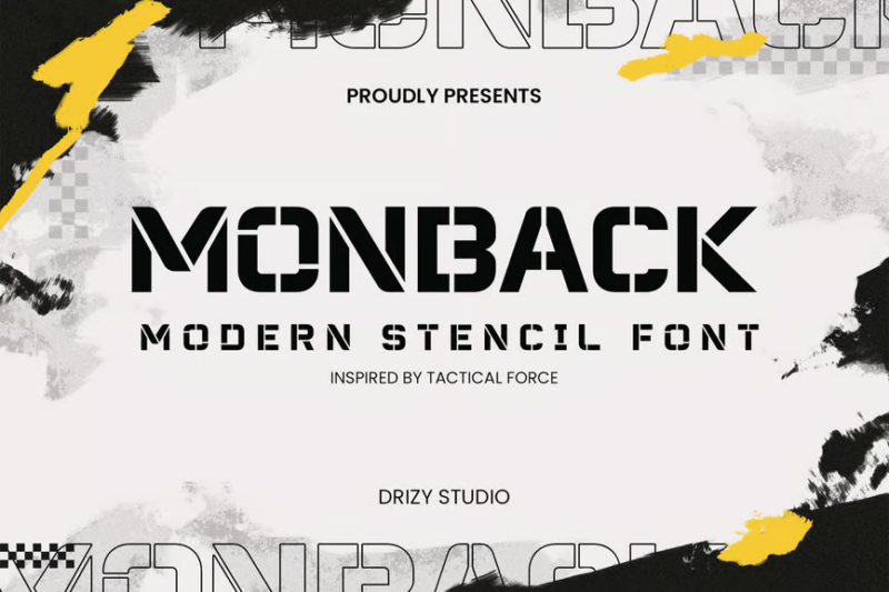
Monback is a modern stencil font that balances sharp edges with elegant curves. Its contemporary design and clear stencil cuts make it versatile for various applications, from military-inspired graphics to sleek, industrial designs in both digital and print media.
Medhorn
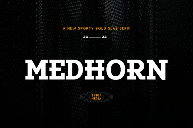
Medhorn is a bold slab serif font designed for modern sports and display purposes. Its strong, geometric shapes and thick serifs give it a powerful presence, making it perfect for sports branding, headlines, and designs that need to make a bold statement.
Aeromono | Modern Sans
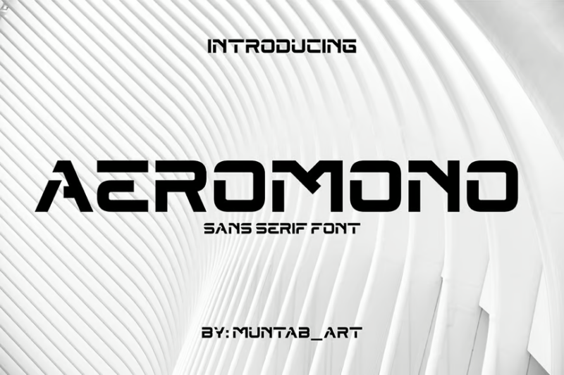
Aeromono is a sleek, modern sans-serif font with a touch of elegance. Its clean lines and balanced proportions make it highly legible and versatile, suitable for a wide range of design applications from corporate branding to contemporary editorial layouts.
Delta
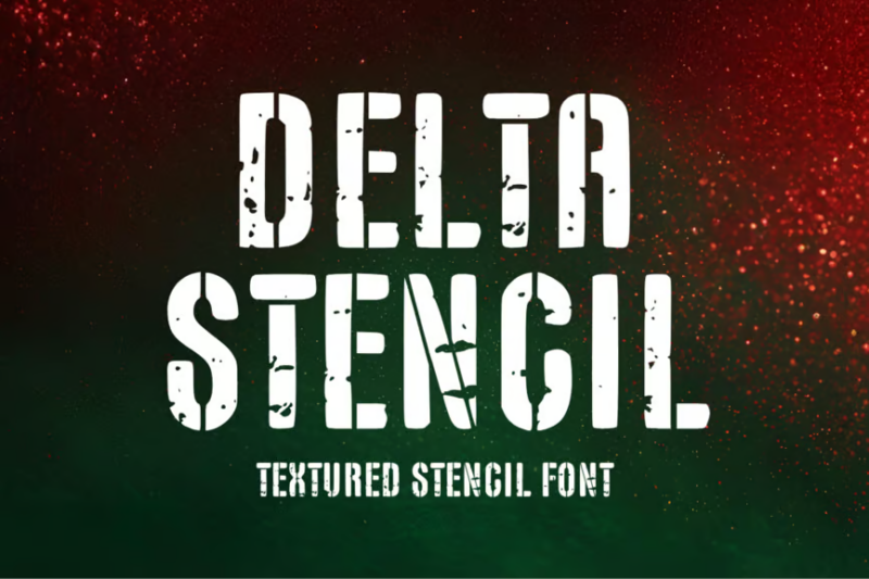
Delta is a textured stencil font that adds a grungy, worn look to the traditional stencil style. Its rough edges and distressed appearance make it perfect for creating authentic, weathered designs, particularly for military, industrial, or vintage-themed projects.
Bandex
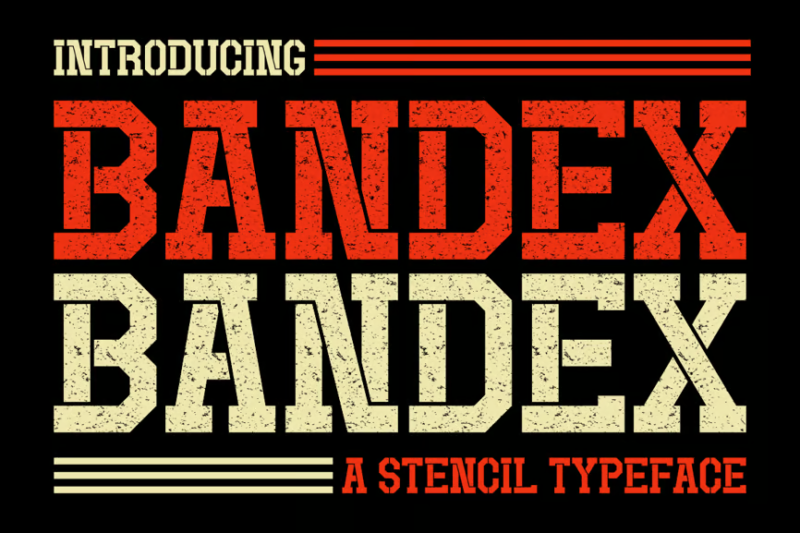
Bandex is a stencil typeface with a strong military influence. Its serif design adds a touch of sophistication to the stencil style, making it ideal for projects that require a blend of authority and precision, such as military insignia or official communications.
United Mech
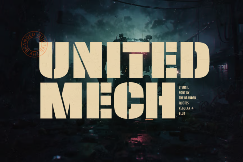
United Mech is a stencil sans font that combines military precision with mechanical aesthetics. Its clean, geometric shapes and uniform stencil cuts make it perfect for tech-oriented military designs, futuristic interfaces, and projects that blend industrial and digital themes.
Team Sequl Brush
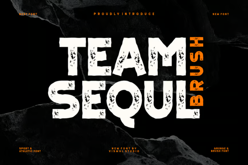
Team Sequl Brush is a dynamic brush font that combines grunge and sports aesthetics with a tropical twist. Its energetic, hand-drawn style and vintage feel make it perfect for creating vibrant, eye-catching designs for sports teams, beach-themed events, or retro-inspired graphics.
What Makes a Font Feel Military?
Military fonts command attention through several distinctive characteristics:
Stencil Elements
The most recognizable feature of military typography is the stencil cut. Originally designed for practical application of text to equipment and supplies, these strategic breaks in letterforms create that unmistakable military aesthetic.
Authentic military stencils feature practical cuts that would allow the physical stencil to maintain structural integrity. This functionality translates into a distinctive visual language that immediately communicates military authority.
Geometric Precision
Military fonts typically feature strong geometric structure with precise angles and consistent proportions. This mathematical precision reflects the disciplined, ordered nature of military operations.
The emphasis on straight lines, right angles, and perfect circles creates typography that feels engineered rather than organic – exactly the impression military design seeks to convey.
Bold Weight and Strong Presence
Military typography rarely whispers – it commands. Bold weights with minimal contrast between strokes create letterforms with substantial visual presence that stand their ground on any background.
This visual strength ensures legibility in challenging conditions while communicating the authority and power associated with military applications.
Simplified Forms
Military fonts prioritize function over decoration. Letters are reduced to their essential forms, eliminating unnecessary flourishes or embellishments that might compromise clarity or efficiency.
This utilitarian approach creates typography that communicates clearly and directly – qualities highly valued in military communications.
Where Can You Use Military Fonts?
Military fonts offer versatility across numerous applications:
Branding
Military fonts provide instant authority and trustworthiness for brands in security, protection, outdoor equipment, tactical gear, and similar industries. Their bold presence creates memorable visual identities with strength and precision.
Organizations seeking to communicate reliability, discipline, and strength often find military typography aligns perfectly with their brand values.
Event Promotions
Adventure races, obstacle courses, survival challenges, and tactical competitions benefit tremendously from military typography. These fonts set appropriate expectations and create excitement around challenging, physically demanding events.
The authoritative presence of military fonts helps communicate that participants should prepare for something demanding and disciplined.
Entertainment
Video games, films, television shows, and books with military themes utilize these fonts to establish authentic atmosphere. Military typography helps transport audiences to the world of strategic operations and tactical engagements.
From first-person shooters to strategic simulations, military fonts help create immersive experiences that feel authentic and compelling.
Apparel and Merchandise
Military-inspired clothing lines, tactical gear, and themed merchandise utilize these fonts to reinforce brand positioning. The typography becomes part of the product’s appeal to consumers seeking that tactical aesthetic.
From t-shirts to patches to promotional materials, military fonts help products connect with audiences interested in tactical and outdoor applications.
Informational Design
Instructional materials, technical documentation, and wayfinding systems benefit from military typography’s clarity and authority. These fonts command attention while maintaining excellent readability, even in challenging viewing conditions.
When information needs to be absorbed quickly and accurately, military fonts deliver exceptional performance.
Where to Avoid Military Fonts
While extremely effective in appropriate contexts, military fonts aren’t universal solutions:
Luxury or Refined Applications
High-end products, premium services, or luxury experiences typically require more elegant, sophisticated typography. Military fonts may undermine the refined impression these applications demand.
Contexts requiring subtlety, delicacy, or traditional elegance are generally poor matches for military typography’s bold, utilitarian approach.
Friendly, Approachable Messaging
Contexts prioritizing warmth, accessibility, and approachability – like children’s products, healthcare services, or community organizations – may find military typography creates an unnecessarily authoritarian impression.
When the goal is to welcome and comfort rather than command and direct, softer typographic choices usually prove more effective.
Extended Reading
While military fonts excel at headlines and short bursts of information, they typically perform poorly for long-form content. Their distinctive characteristics, especially stencil elements, can reduce readability over extended passages.
For books, articles, or other text-heavy applications, military fonts should be reserved for titles and headings, with more readable alternatives handling body text.
How to Choose the Perfect Military Font
Finding the ideal military font for your project requires considering several factors:
Authenticity Level
Consider how authentically military your typography needs to feel. Some projects demand genuine military verisimilitude, while others benefit from a more subtle military influence.
For historical military projects, research the specific typography of the relevant era and branch. For contemporary designs, determine whether you need official-looking typography or just a military-inspired aesthetic.
Application Context
Evaluate where and how your typography will appear. Digital interfaces demand different characteristics than physical products. Large format applications allow for more detailed stencil cuts than small applications.
Consider viewing distance, reproduction method, and background complexity when selecting the appropriate military font weight and style.
Technical Requirements
Assess practical considerations like character set completeness, language support, and available weights. Many military fonts offer limited character sets or single weights, which may impact functionality.
For complex projects requiring extensive typographic flexibility, look for military font families with multiple weights and comprehensive character sets.
Complementary Typography
Few designs rely exclusively on military fonts. Consider how your military typography will interact with other fonts in your design system.
Military fonts typically pair well with clean sans-serifs for body text and technical information. The contrast between commanding display typography and more neutral supporting text creates effective typographic hierarchy.
Excellent Military Font Alternatives
When military fonts aren’t quite right, consider these alternatives that maintain some similar qualities:
Industrial Sans Serifs
Fonts like DIN, Univers, and Eurostile offer the precision and authority of military fonts without the specific military associations. Their technical, engineered appearance provides similar functional aesthetics.
These fonts work perfectly when you need strength and clarity without explicit military references.
Geometric Sans Serifs
Fonts like Futura, Gotham, and Proxima Nova provide the geometric precision of military fonts with a more neutral, versatile character. They command attention while fitting comfortably in diverse applications.
When you need the structural strength without the specific military aesthetic, geometric sans serifs offer an excellent alternative.
Technical Display Fonts
Fonts designed for engineering, architecture, and technical documentation often share military typography’s precision and clarity without the specific military references.
These fonts excel in communicating complex information with authority and accuracy – perfect when military specificity isn’t required.
Common Military Font Questions
Let’s address some frequently asked questions about military typography:
What font do the military use?
Different military branches and countries utilize various typefaces for official documentation, signage, and equipment. In the United States, military documentation often employs standard fonts like Arial, Times New Roman, and similar system fonts for official communications.
For equipment marking and stenciling, specialized typefaces designed for clarity and durability in field conditions are typically used, though these vary across branches and applications.
What is the army stencil font called?
While there’s no single official “Army Stencil” font, several typefaces capture the authentic military stencil aesthetic. Fonts like “Military Stencil,” “Army Stencil,” and “Stencil Std” closely resemble actual stencil typefaces used by armed forces.
These fonts feature the practical breaks and cuts necessary in physical stencils while maintaining the bold, authoritative character of military typography.
What font does the US Army use on uniforms?
The lettering on US Army uniforms typically follows a standardized stencil format rather than a commercially available font. The characters are designed for clarity and durability in field conditions.
Commercial fonts like “Military Stencil” approximate this look but don’t perfectly match the official specifications used in actual uniform production.
What is the most military-looking font?
Fonts like “Army Stencil,” “Military Stencil,” and “Stencil Std” are widely recognized as capturing authentic military aesthetics. Their combination of bold weight, strategic stencil cuts, and geometric precision creates immediately recognizable military typography.
For maximum military authenticity, look for fonts with practical stencil breaks rather than decorative cuts that wouldn’t function in actual stencil applications.
Conclusion: The Enduring Power of Military Typography
Military fonts deliver unmatched authority, precision, and command presence to design projects. From their practical origins in field equipment marking to their contemporary applications across branding, entertainment, and apparel, these typefaces continue to evolve while maintaining their essential strength.
The best military fonts balance authentic military character with practical functionality, providing designers with powerful tools for communicating strength, reliability, and precision. While not appropriate for every application, military typography excels in contexts requiring clear direction, technical accuracy, and commanding presence.
Whether you’re designing for tactical products, military-themed entertainment, or brands seeking to communicate strength and authority, the right military font can transform your project from standard to commanding. Just remember to choose wisely based on your specific application, authenticity requirements, and technical needs.
Which military font stands out to you? Do you have experience using these powerful typefaces in your design work? Share your thoughts in the comments below!