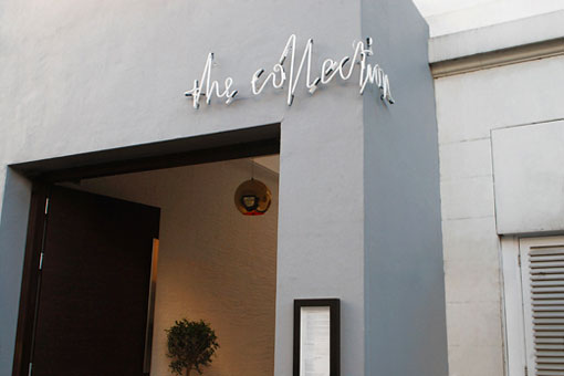
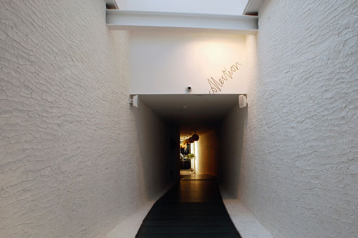
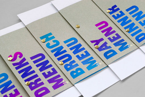
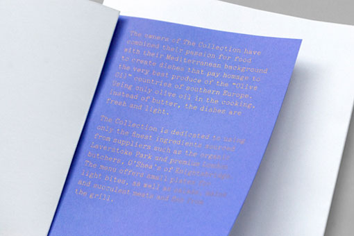
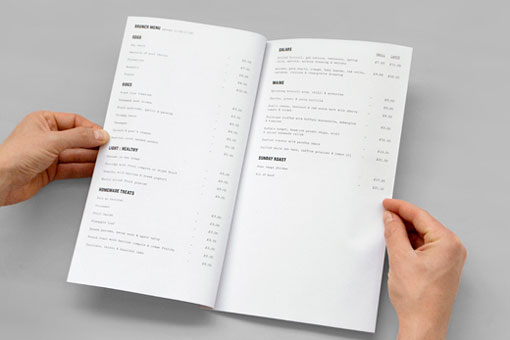
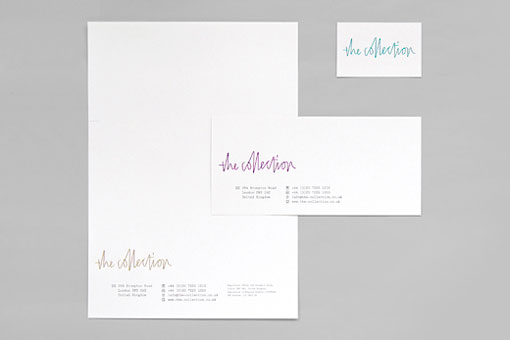
UK-based Mind Design developed the identity and collateral for The Collection, a restaurant, cultural event and retail space. According to the agency:
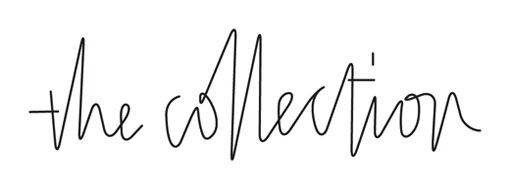
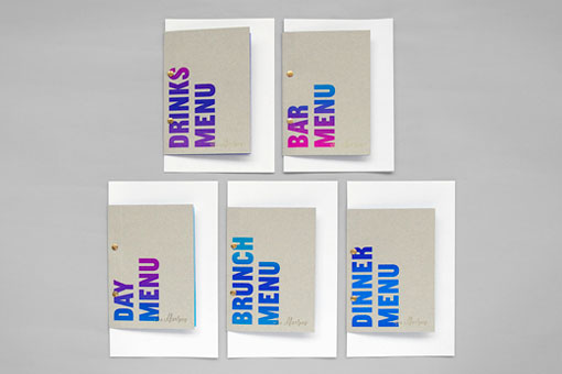
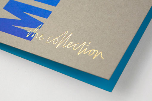
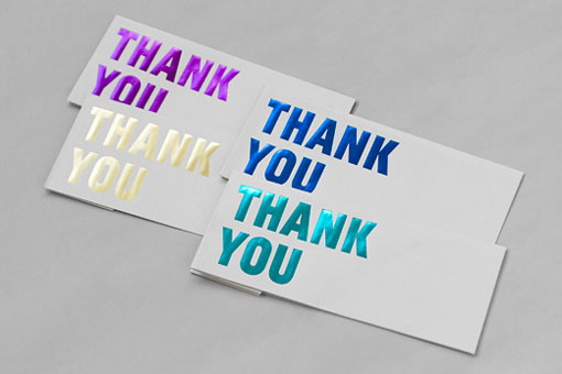
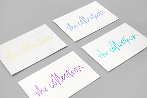
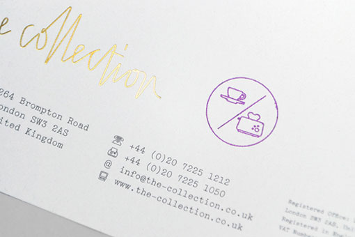
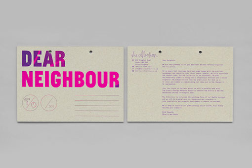
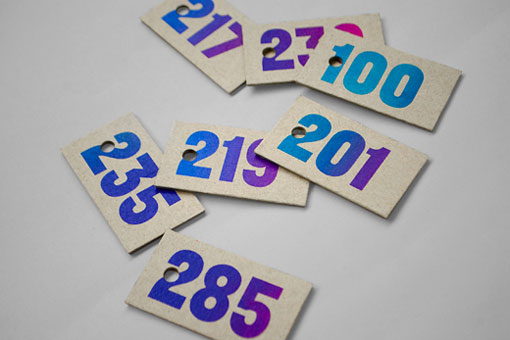
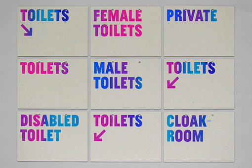
The idea for the identity relates to multiple prints, limited editions and artist signatures. The execution is relatively simple: Everything is based on an A5 format with punched holes. We used screen printing which allowed us to change colours on the printing bed and makes each print unique. Larger signs are made up by several A5 boards and the thickness is achieved by hanging several signs in front of each other. For the logo we asked the client to write the name in their own handwriting connecting two dots equivalent to the punched holes.
Believe it or not, despite the plethora of images below, there is still more to see right here.
