In this article:
- The Best Monoline Fonts of 2026
- What Makes Monoline Fonts So Attractive?
- Where Can You Use Monoline Fonts?
- Where to Avoid Monoline Fonts
- How to Pick the Perfect Monoline Font
- Fantastic Monoline Font Alternatives
- How are monoline fonts actually created?
- Pairing Monoline Fonts With Other Typefaces
- Common Monoline Font Questions
- Conclusion: The Timeless Appeal of Monoline Typography
I’ve noticed monoline fonts taking center stage across branding, web design, and print materials in 2026. There’s something undeniably elegant about that consistent stroke weight that brings a refined, modern touch to any project.
Monoline fonts are exactly what they sound like – typefaces featuring letterforms with uniform line thickness throughout. They have a clean, minimalist quality that feels contemporary yet timeless, making them incredibly versatile for both digital and print applications. Let’s get started…
The Best Monoline Fonts of 2026
Let’s face it, not all monoline fonts are created equally. I’ve compiled a list of my favorite monoline fonts that deliver that perfect consistent stroke weight while offering distinctive character. Here they are:
Manteman Monoline
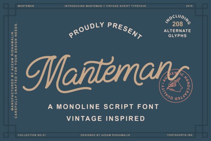
Manteman Monoline is a charming script font with a vintage flair. Its consistent line weight and smooth curves make it perfect for creating elegant, handwritten-style designs. This font would be ideal for logos, invitations, or any project requiring a touch of nostalgic authenticity.
Meraline – Monoline Script
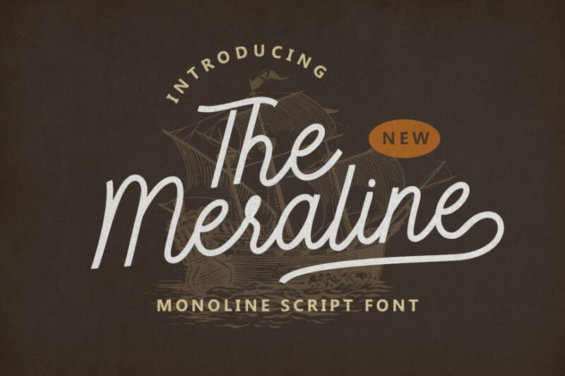
Meraline is a sophisticated monoline script font that exudes elegance and refinement. Its flowing lines and graceful curves make it an excellent choice for high-end branding, wedding stationery, or fashion-related designs. The font’s consistent thickness adds a modern touch to its classic script style.
Monoline Fighter
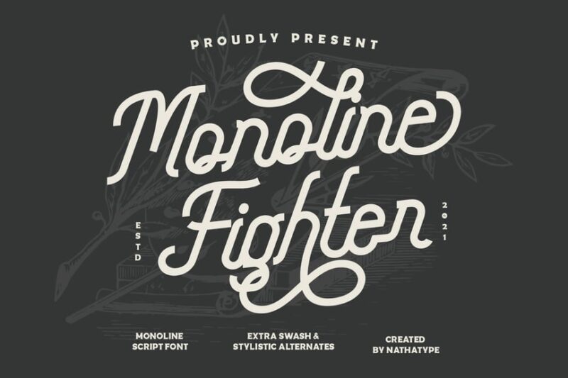
Monoline Fighter is a bold and dynamic script font that combines energy with precision. Its sharp angles and swift strokes give it a sense of movement and strength, making it perfect for sports-related designs, action-packed posters, or branding that needs to convey power and speed.
Saffa Monoline
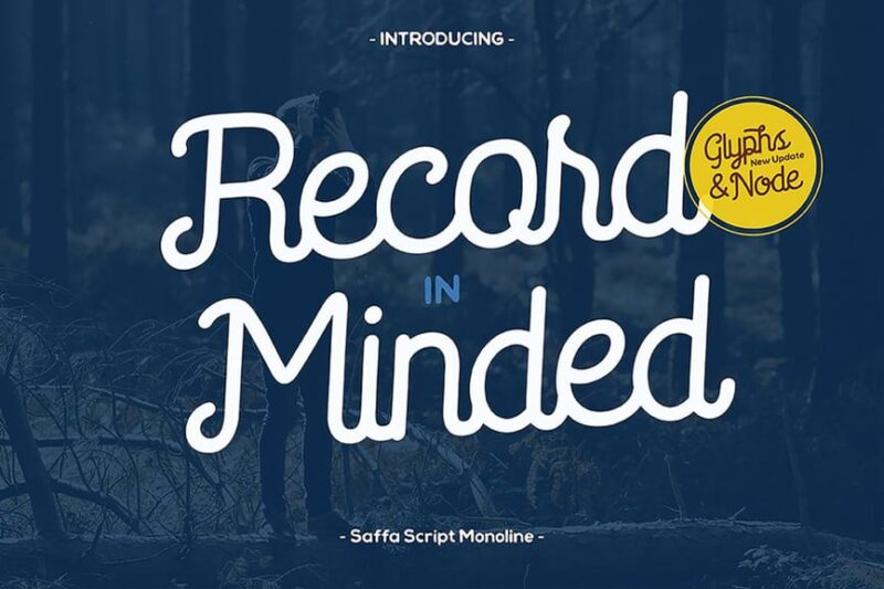
Saffa Monoline is a clean and versatile script font with a modern twist. Its uniform line weight and smooth connections between letters create a seamless flow, ideal for contemporary branding, packaging design, or social media graphics. The font’s simplicity allows for excellent readability while maintaining an elegant aesthetic.

Get 300+ Fonts for FREE
Enter your email to download our 100% free "Font Lover's Bundle". For commercial & personal use. No royalties. No fees. No attribution. 100% free to use anywhere.
Grandmora – Monoline Script
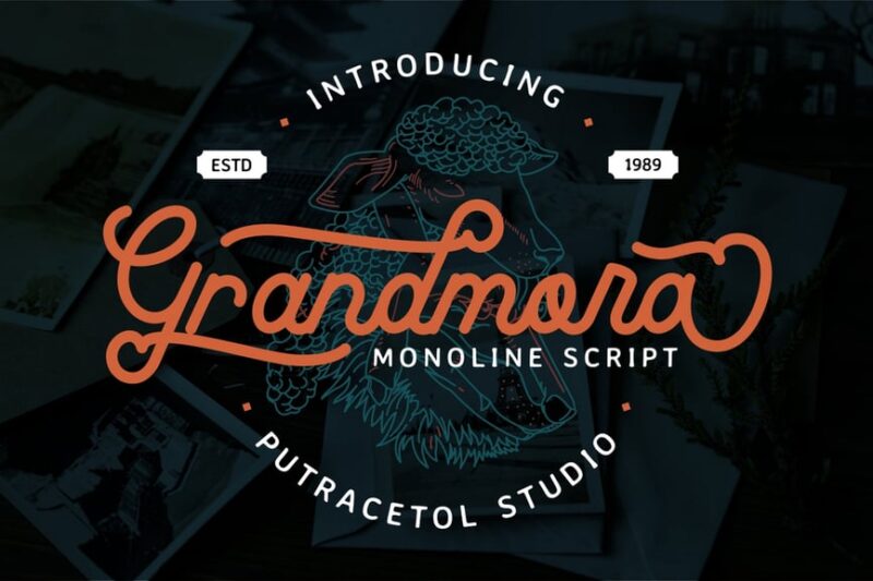
Grandmora is a charming monoline script font that evokes a sense of nostalgia and warmth. Its retro-inspired design features gentle curves and playful flourishes, making it perfect for vintage-themed projects, cozy branding, or designs that aim to create a friendly, approachable atmosphere.
Arkland Monoline + Shadow
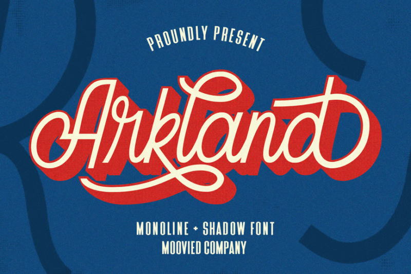
Arkland Monoline is a versatile font that comes with a shadow option for added depth. Its clean lines and subtle hand-drawn feel make it suitable for a wide range of design projects. The shadow variation allows designers to create eye-catching titles and logos with a 3D effect, perfect for posters or digital media.
Borneos – Monoline Handwriting
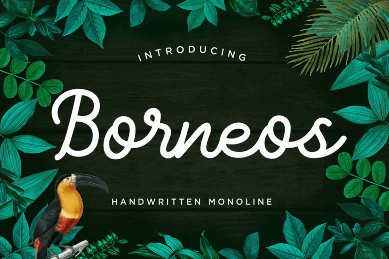
Borneos is a casual and friendly monoline handwriting font that captures the essence of natural penmanship. Its relaxed style and consistent stroke width make it ideal for creating designs with a personal touch. This font would work well for blog headers, informal branding, or any project requiring a genuine, handwritten feel.
Artifact – Monoline Signature
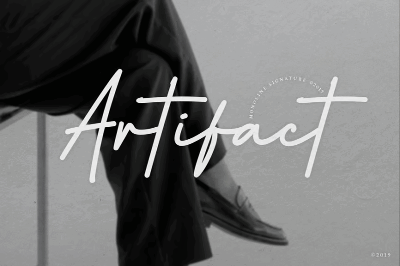
Artifact is an elegant monoline signature font that combines sophistication with authenticity. Its fluid strokes and subtle irregularities mimic the look of a real signature, making it perfect for personal branding, certificate design, or adding a touch of exclusivity to product packaging.
Sublem Monoline Typeface
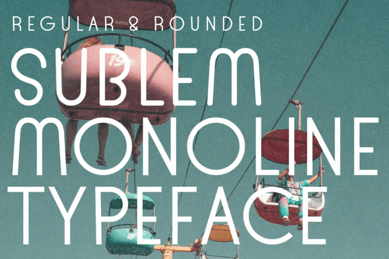
Sublem is a sleek and modern sans-serif typeface with a monoline aesthetic. Its clean, minimalist design makes it highly legible and versatile, suitable for both display purposes and body text. This font would excel in contemporary logo design, editorial layouts, or any project requiring a fresh, uncluttered look.
Twilice Monoline Font
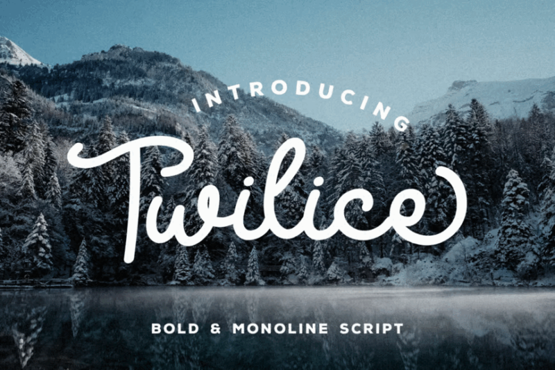
Twilice is a delicate and whimsical monoline font that brings a touch of magic to any design. Its thin, consistent strokes and graceful curves create an airy, dreamlike quality. This font would be perfect for fairy tale-inspired designs, children’s book covers, or any project that requires a light, enchanting touch.
Broadway Vintage Monoline
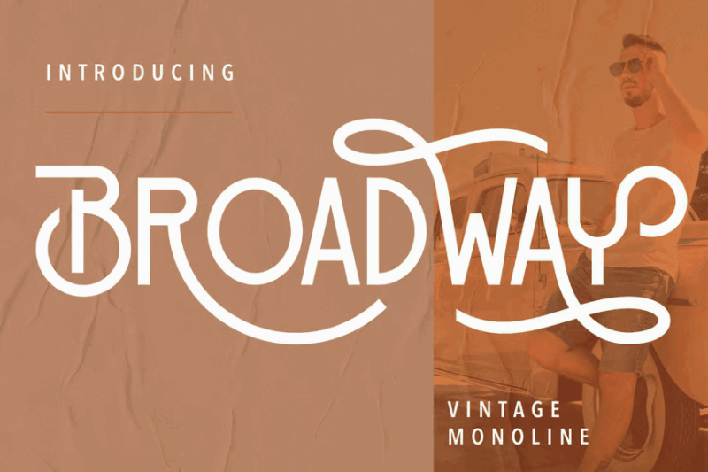
Broadway Vintage Monoline is a bold and charismatic font that captures the essence of classic theater marquees. Its strong, uniform strokes and retro styling make it ideal for creating eye-catching headlines or vintage-inspired logos. This font would shine in poster designs, event promotions, or any project aiming to evoke the glamour of Broadway’s golden age.
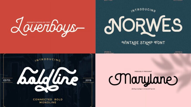
Marylane – Monoline Script Font
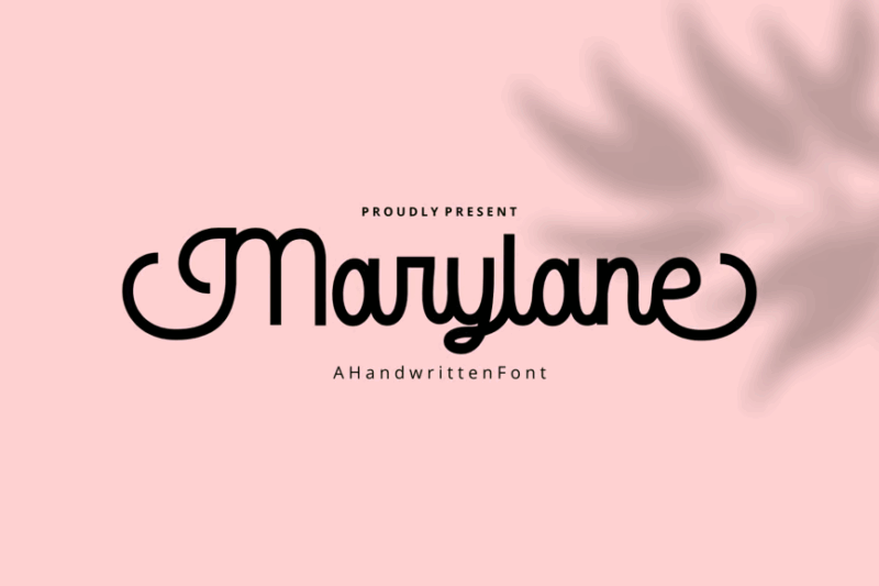
Marylane is an elegant monoline script font with a vintage flair. Its smooth, flowing lines and subtle imperfections give it a handcrafted feel, perfect for creating designs with a touch of nostalgia. This font would be excellent for wedding invitations, artisanal product packaging, or any project requiring a blend of sophistication and vintage charm.
Naiyla Monoline Font
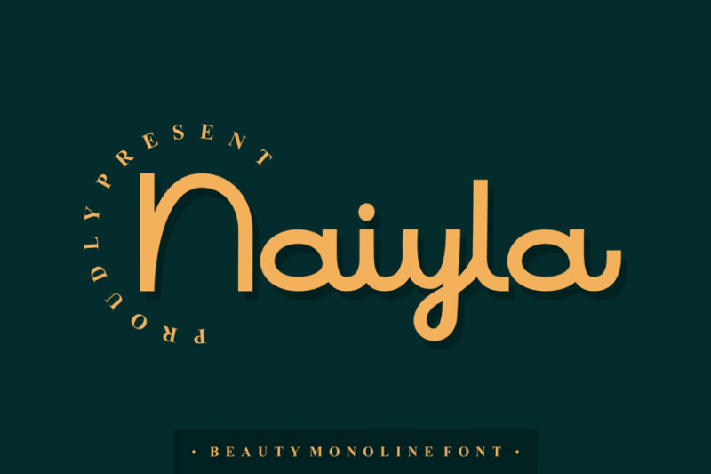
Naiyla is a graceful monoline font that combines elements of modern calligraphy with clean, consistent strokes. Its balanced mix of curves and angles creates a harmonious flow, making it ideal for elegant branding, fashion-related designs, or sophisticated editorial layouts. This font excels in projects that require a contemporary yet timeless aesthetic.
Balitos Monoline Bold
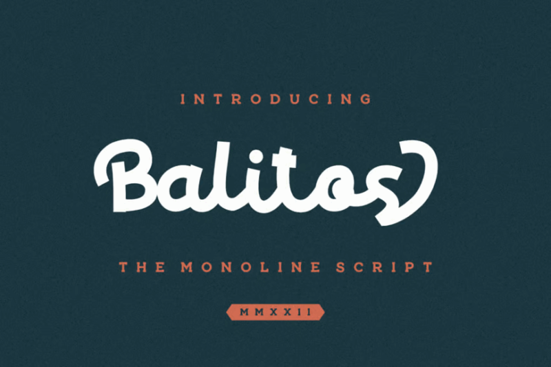
Balitos Monoline Bold is a strong and confident script font with a retro twist. Its thick, uniform strokes and dynamic curves make it perfect for creating impactful headlines or logos. This font would be ideal for vintage-inspired branding, poster designs, or any project that needs to make a bold statement with a touch of nostalgia.
The Rooper | Vintage Monoline Font
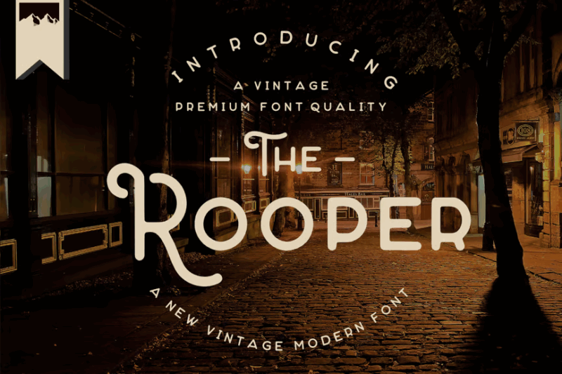
The Rooper is a charming vintage monoline font that evokes the spirit of mid-century design. Its clean lines and subtle irregularities give it an authentic, hand-drawn feel. This sans-serif font is perfect for creating retro-inspired logos, packaging designs, or any project aiming to capture a nostalgic, mid-century modern aesthetic.
Layttona Stylish Monoline
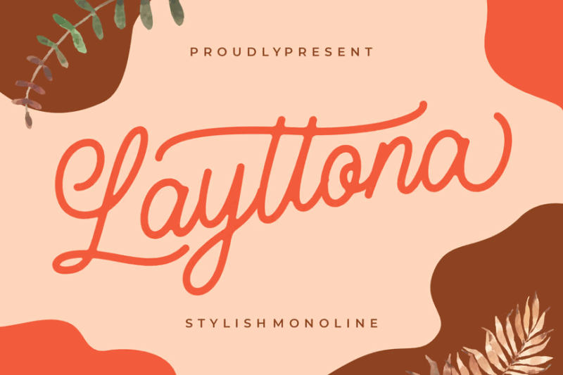
Layttona is an elegant and stylish monoline script font that combines modern simplicity with a touch of classic charm. Its smooth curves and consistent stroke width create a polished, sophisticated look. This font is ideal for fashion branding, luxury product packaging, or any design project that requires a blend of contemporary style and timeless elegance.
Loverboys – Monoline Script Font
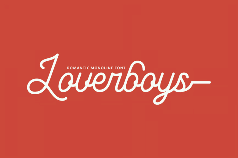
Loverboys is a romantic and playful monoline script font that captures the essence of love and affection. Its swooping curves and heart-shaped details make it perfect for Valentine’s Day designs, wedding stationery, or any project that needs to convey warmth and romance. The font’s consistent stroke width ensures readability while maintaining its charming character.
Abraham Vintage Monoline Font
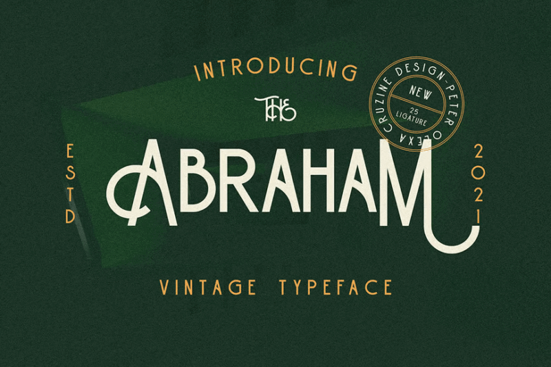
Abraham is a versatile vintage monoline font that combines sans-serif simplicity with subtle decorative elements. Its clean lines and slight imperfections give it an authentic, hand-crafted feel. This font is excellent for creating retro-inspired logos, packaging designs, or any project that aims to blend modern minimalism with a touch of vintage character.
Vignetta – Casual Script Monoline
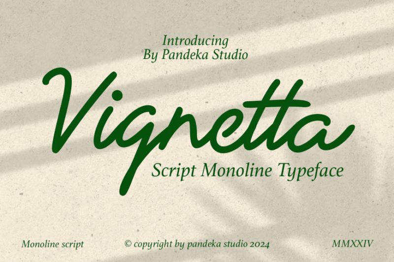
Vignetta is a casual yet refined monoline script font that strikes a perfect balance between elegance and approachability. Its flowing lines and subtle irregularities create a natural, handwritten feel with a touch of luxury. This font is ideal for high-end branding, artisanal product packaging, or any design that requires a blend of sophistication and warmth.
Cholane – Monoline Handwritten Font
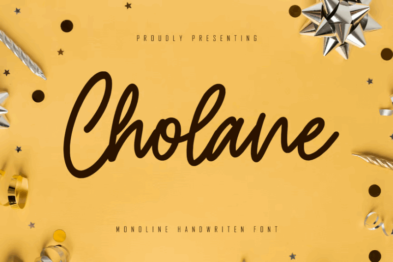
Cholane is a versatile monoline handwritten font that captures the essence of natural penmanship. Its consistent stroke width and subtle imperfections create an authentic, personal feel. This font is perfect for logo design, social media graphics, or any project that requires a genuine handwritten touch while maintaining readability and commercial appeal.
Whitening – A Cute Monoline Font
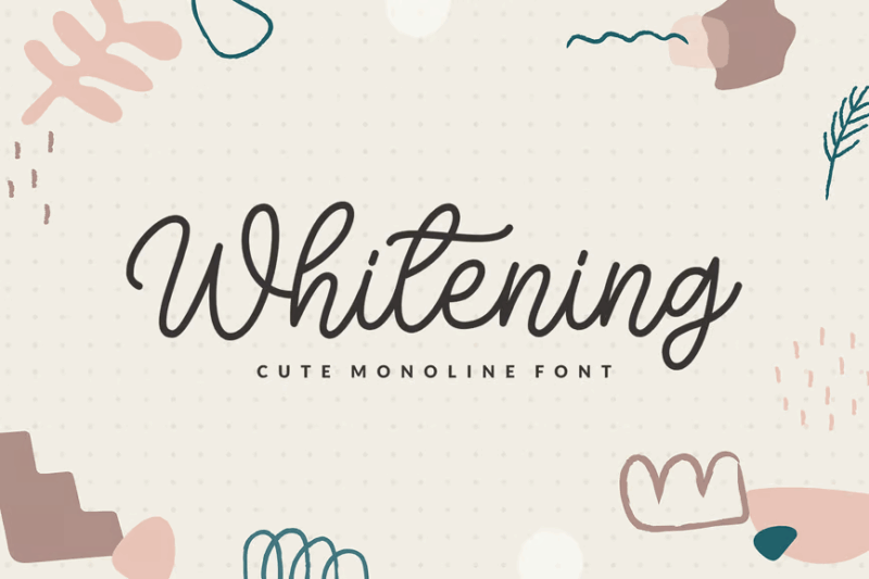
Whitening is a charming and versatile monoline font family that includes serif, sans-serif, and decorative variations. Its cute and sweet aesthetic makes it perfect for children’s book designs, playful branding, or any project that needs to convey a sense of fun and innocence. The font’s consistent stroke width ensures clarity across all its variations.
Eastwood Retro Monoline Script
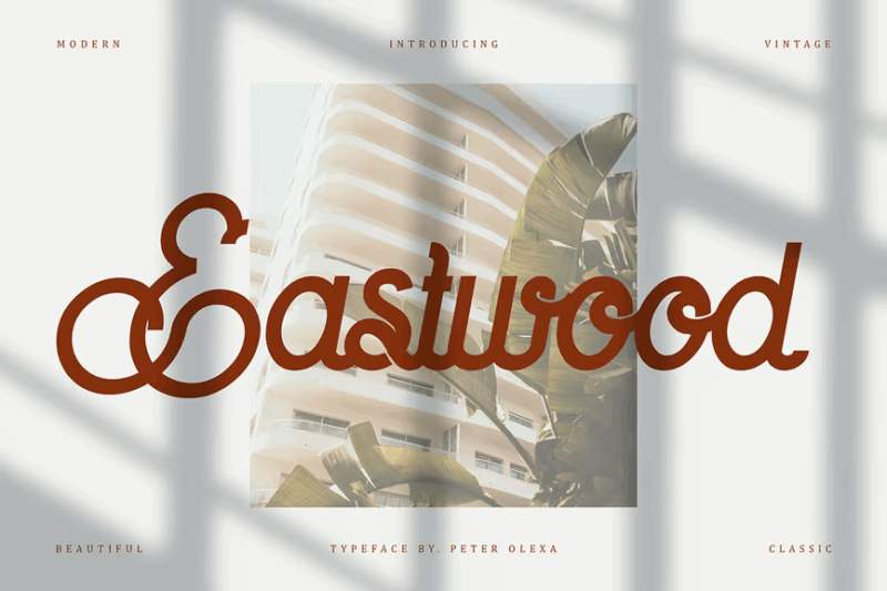
Eastwood is a nostalgic monoline script font that captures the essence of vintage Americana. Its smooth curves and consistent stroke width create a clean, retro look perfect for creating designs with a classic 1950s or 60s feel. This font would excel in vintage-inspired logos, diner menus, or any project aiming to evoke a sense of mid-century nostalgia.
Talyant | Handcrafted Monoline Script Font
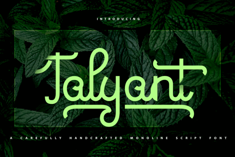
Talyant is an elegant handcrafted monoline script font that combines the beauty of calligraphy with the consistency of digital design. Its flowing lines and subtle texture create an authentic, hand-lettered feel. This font is ideal for wedding invitations, artisanal branding, or any project that requires a touch of handmade elegance with excellent readability.
Fioretta Monoline Signature
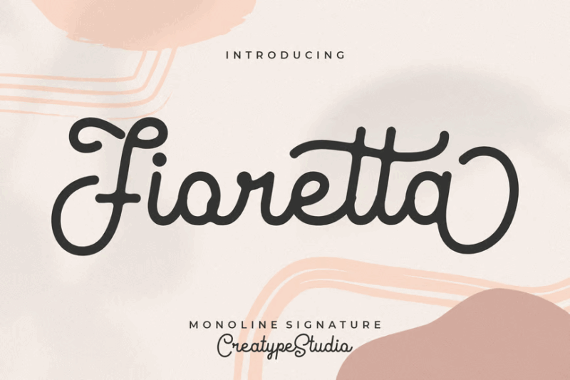
Fioretta is a graceful monoline signature font that captures the essence of a sophisticated handwritten script. Its fluid strokes and natural flow create an authentic signature look, perfect for personal branding, certificate design, or adding a touch of elegance to product packaging. The font’s consistent line weight ensures clarity while maintaining its handcrafted charm.
Hello Radio – Vintage Monoline Script
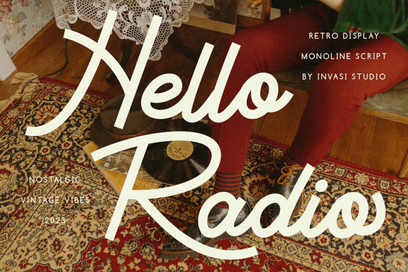
Hello Radio is a playful vintage monoline script font that evokes the spirit of retro radio and advertising. Its bouncy baseline and cheerful curves create a fun, nostalgic atmosphere. This font is perfect for creating designs with a 1950s or 60s vibe, such as retro posters, vintage-inspired packaging, or any project that aims to capture the essence of mid-century optimism.
Boldline -Monoline Bold Typeface
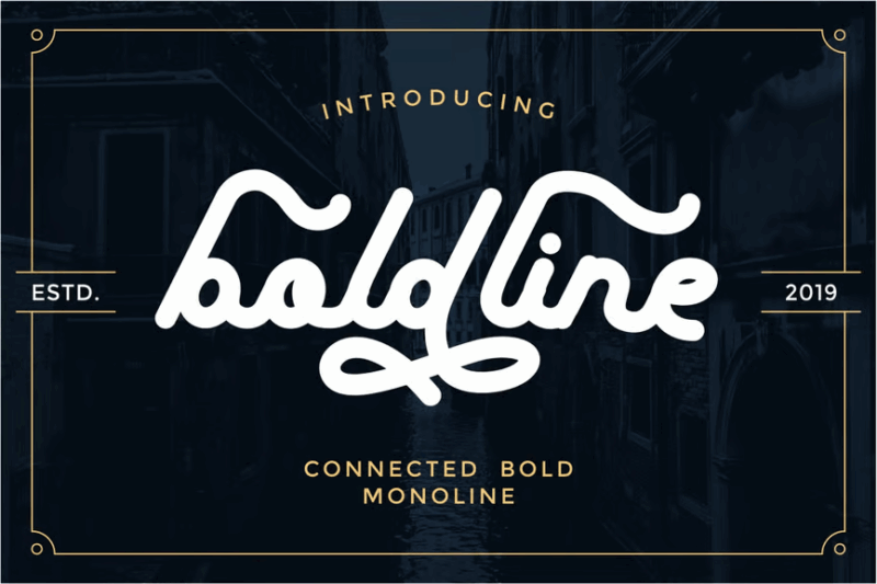
Boldline is a strong and impactful monoline typeface that combines boldness with elegance. Its consistent thick strokes and clean lines make it perfect for creating eye-catching headlines or logos. This font would excel in modern branding projects, poster designs, or any application where a bold, confident statement is required.
Morvino Growing – Retro Monoline font
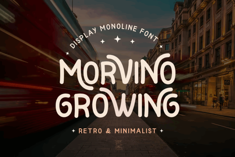
Morvino Growing is a versatile retro monoline font family that includes serif, sans-serif, and decorative variations. Its vintage-inspired design and consistent stroke width create a cohesive look across different styles. This font is ideal for creating retro book covers, nostalgic branding, or any project that requires a comprehensive set of vintage-style typefaces.
Norwes – Vintage Monoline Font
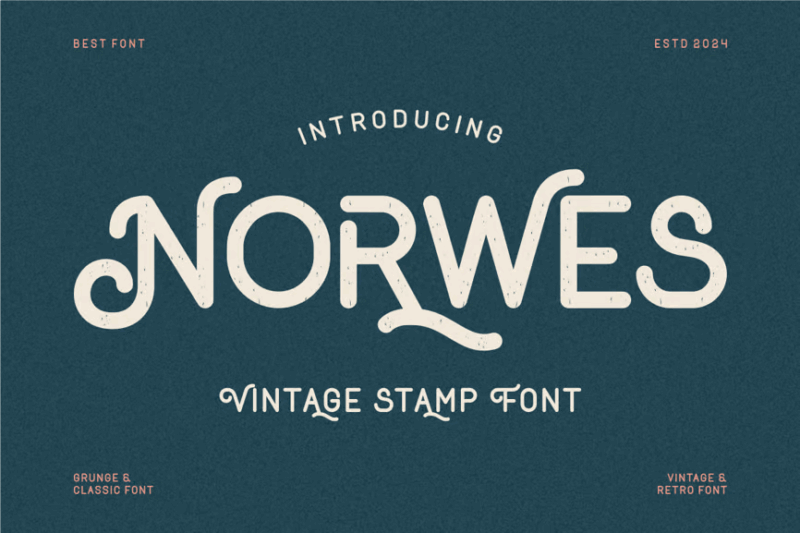
Norwes is a rugged vintage monoline font that combines retro charm with a distressed texture. Its clean lines and weathered appearance create an authentic, time-worn look. This font is perfect for creating designs with a rustic or industrial feel, such as vintage logos, adventure-themed graphics, or any project that requires a blend of nostalgia and grit.
Santiago Vintage Monoline
Santiago is a sophisticated vintage monoline font that exudes a sense of timeless elegance. Its clean lines and subtle vintage details make it perfect for creating classic, professional designs. This font would excel in business branding, upscale packaging, or any project that requires a blend of vintage charm and modern professionalism.
Routen Lightning Monoline
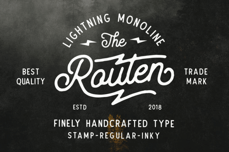
Routen Lightning is a dynamic monoline script font that combines speed and elegance. Its swift strokes and sharp angles create a sense of movement and energy, making it perfect for sports-related designs, action-packed posters, or any project that needs to convey speed and excitement. The font’s consistent line weight ensures readability even in high-energy compositions.
What Makes Monoline Fonts So Attractive?
Monoline fonts get their distinctive appeal from a few key characteristics:
Consistent Stroke Weight
First and foremost, the uniform line thickness. Unlike traditional serif or sans-serif fonts that feature varying thick and thin strokes, monoline fonts maintain the same weight throughout every curve, line, and angle of each character.
This consistency creates a sense of harmony and balance that feels intentionally designed rather than naturally drawn. It gives designs a polished, precise appearance that communicates clarity and confidence.
Clean Minimalism
The simplicity of monoline fonts is another key attraction. Without the visual complexity of stroke variation, these fonts embody the “less is more” philosophy that defines modern minimalist design.
The result is letterforms that feel thoughtful, deliberate, and free from unnecessary embellishment. This restraint allows the actual form and structure of each character to take center stage.
Geometric Precision
Many monoline fonts also incorporate geometric principles – perfect circles, straight lines, and precise angles. This mathematical approach creates letterforms that feel engineered rather than handcrafted.
The combination of uniform stroke weight and geometric precision gives monoline fonts their distinctive contemporary aesthetic. Even decorative monoline scripts maintain this carefully controlled precision despite their flowing forms.
Where Can You Use Monoline Fonts?
Now that we understand what makes monoline fonts tick, where can we actually use them in designs? Their clean, precise vibe makes monoline fonts incredibly versatile:
Branding
Monoline fonts are a fantastic choice for modern brands seeking to communicate clarity, precision, and sophistication. Their clean lines and consistent weight project confidence without visual noise.
For example, tech startups, architectural firms, luxury brands, cosmetics companies, boutique hotels, and minimalist fashion labels all benefit from monoline typography in their visual identity.
Any brand wanting to appear streamlined, contemporary, and meticulously crafted can leverage the refined aesthetic of a well-chosen monoline font.
Logo Design
The consistent stroke weight makes monoline fonts particularly effective for logos and wordmarks. They scale beautifully across different sizes while maintaining legibility and visual impact.
The clean, geometric quality of monoline letterforms also works wonderfully for icon development, creating cohesive visual systems where type and symbols share the same DNA.
Digital Interfaces
In web and app design, monoline fonts shine thanks to their clarity and readability. Their consistent weight ensures they remain legible even at smaller sizes across different screens and devices.
The geometric precision of monoline fonts also aligns beautifully with the grid-based structure of digital layouts, creating harmonious interfaces that feel intentionally designed.
Editorial Design
For magazine layouts, books, and other editorial projects, monoline fonts provide a contemporary sophistication. They work particularly well for headlines, pull quotes, and feature text that needs to make a statement.
The consistent stroke weight creates a pleasing rhythm across a page, helping to establish visual hierarchy while maintaining a cohesive look and feel.
Packaging
On product packaging, monoline fonts deliver clarity and style in equal measure. Their clean lines ensure important information remains readable while contributing to a premium, considered aesthetic.
The geometric precision of monoline fonts also complements the structured nature of packaging design, creating harmony between typography and form.
Where to Avoid Monoline Fonts
While fantastic for many applications, there are certain uses where monoline fonts may not make the best choice. Namely in contexts requiring:
Extended Reading
For long-form body text, traditional serif or sans-serif fonts with stroke variation often provide better readability. The varying thickness in these fonts creates a visual rhythm that helps guide the eye across lines of text.
The uniform stroke weight of monoline fonts, while beautiful, can sometimes create a monotony that becomes tiring for the eyes during extended reading sessions.
Ultra-Traditional Contexts
In designs requiring a very traditional, classical, or historical aesthetic, monoline fonts might feel too contemporary. Their geometric precision and consistent weight are unmistakably modern.
For wedding invitations with a vintage feel, historical society materials, or traditional religious publications, more conventional serif typefaces with varying stroke weights might better convey the desired sense of tradition and heritage.
High-Complexity Information
When dealing with complex data visualization, technical diagrams, or dense information hierarchies, the uniform weight of monoline fonts may not provide enough visual differentiation to establish clear hierarchy.
In these cases, font families with multiple weights and styles offer more tools for creating visual contrast and organizing information effectively.
How to Pick the Perfect Monoline Font
To choose an excellent monoline font matching your needs, first reflect on:
Intended Application
Consider where and how your font will be used. A monoline script might be perfect for a logo or headline but challenging for smaller applications. Conversely, a geometric monoline sans-serif could work beautifully across various contexts.
Test potential fonts at all sizes and applications they’ll be used for before making a final decision.
Character and Personality
While all monoline fonts share consistent stroke weight, they vary dramatically in personality. Some feel strictly geometric and technical, while others incorporate subtle organic qualities or decorative elements.
Identify the specific character you want to convey – sleek and technical? Warm and approachable? Elegant and refined? – then find a monoline font that embodies those qualities.
Versatility and Family Size
For more complex projects, consider monoline font families with multiple weights and styles. While the stroke thickness remains consistent within each weight, having options from light to bold provides valuable flexibility.
Families with matching italic versions, alternate characters, and extended language support offer greater versatility for comprehensive design systems.
Legibility Considerations
Some monoline fonts prioritize distinctive character shapes over optimal readability. Ensure your selection maintains clear distinction between similar characters (like 1, I, and l) and remains legible at your intended sizes.
The geometric precision that makes monoline fonts beautiful can sometimes reduce character differentiation, so scrutinize potential options carefully.
Fantastic Monoline Font Alternatives
If pure monoline fonts don’t quite fit your needs, several alternatives can provide similar aesthetic benefits with different characteristics:
Near-Monoline Fonts
Some typefaces feature very subtle stroke variation – not enough to classify them as traditional serif or sans-serif, but just enough to enhance readability and add visual interest.
These near-monoline fonts maintain the clean, contemporary feel while incorporating minimal modulation for improved legibility in longer text.
Variable Monoline Fonts
The cutting-edge world of variable fonts has introduced interesting hybrids that can shift between monoline consistency and traditional stroke variation depending on your needs.
These adaptable typefaces offer the best of both worlds, allowing you to dial in exactly the right amount of stroke modulation for different applications within a single font family.
Outlined Fonts
For display purposes, outlined versions of traditional typefaces can create a monoline effect while maintaining the character and proportion of classic letterforms.
These hybrid approaches offer another way to capture monoline’s clean aesthetic while preserving some of the character of more traditional typography.
How are monoline fonts actually created?
Ever wondered how font designers actually create those perfectly consistent strokes that define monoline typefaces? The process combines traditional typographic principles with modern digital techniques:
Starting With Basic Shapes
Most monoline designers begin with fundamental geometric forms – circles, squares, and straight lines with consistent thickness. These building blocks establish the DNA of the typeface.
The precise radius of curves, the exact angle of terminals, and the consistent stroke width are carefully calibrated from the outset to ensure harmony across the entire character set.
Optical Adjustments
Despite appearing mathematically perfect, the best monoline fonts incorporate subtle optical adjustments to account for how our eyes perceive different shapes.
For instance, horizontal strokes often need to be slightly thinner than vertical ones to appear equally weighted. Curved segments may require minor adjustments to maintain visual consistency with straight sections.
Digital Precision Tools
Modern font design software allows creators to specify exact stroke widths and maintain them consistently throughout the design process. Tools like “stroke” functions in vector software and specialized font development applications make true monoline creation possible.
These digital tools enable designers to focus on the overall character shapes while ensuring the defining monoline characteristic – that consistent stroke weight – remains perfect.
Pairing Monoline Fonts With Other Typefaces
Creating typographic harmony when using monoline fonts alongside other typefaces requires thoughtful consideration:
Contrast in Structure, Unity in Spirit
The most successful pairings often feature structural contrast balanced by shared conceptual qualities. For example, a geometric monoline sans-serif can pair beautifully with a humanist serif that shares similar proportions despite having variable stroke weight.
Look for typefaces that feel like they belong to the same era or design philosophy even if their construction differs significantly.
Complementary Forms
Pay attention to the specific shapes and proportions that define your monoline font. Does it feature perfectly circular rounds? Sharp, angular terminals? Identify these distinctive characteristics and look for complementary qualities in potential pairing fonts.
The best combinations often echo certain features while providing contrast in others, creating a relationship that feels intentional rather than arbitrary.
Hierarchy Through Contrast
Use the distinctive appearance of monoline fonts to establish clear hierarchy. Their clean, consistent strokes stand out against the texture created by variable-weight typefaces, making them excellent for headlines paired with more traditional body text.
This natural contrast can be leveraged to guide the reader’s eye and create organized, scannable layouts with clear information hierarchy.
Common Monoline Font Questions
Let’s wrap up by answering some common questions about monoline fonts:
What exactly is a monoline font?
A monoline font features letterforms with consistent stroke thickness throughout every character. Unlike traditional typefaces where strokes vary between thick and thin, monoline fonts maintain the same weight across all lines, curves, and angles.
Are monoline fonts good for logos?
Absolutely! Monoline fonts excel in logo design thanks to their clean, consistent appearance and excellent scalability. Their precise, geometric quality projects professionalism while remaining distinctive and memorable.
Can monoline fonts work for body text?
While not ideal for lengthy reading, certain monoline sans-serif fonts can work effectively for short to medium passages of body text, especially in digital contexts. For extended reading, consider near-monoline options with subtle stroke variation to improve readability.
What’s the difference between monoline and geometric fonts?
While there’s significant overlap, they’re not identical. Monoline refers specifically to consistent stroke weight, while geometric describes fonts based on precise mathematical forms. Many fonts are both monoline and geometric, but some monoline fonts incorporate more organic shapes, and some geometric fonts feature varying stroke thickness.
Conclusion: The Timeless Appeal of Monoline Typography
And there you have it, folks – a deep dive into the world of monoline fonts. From their defining consistent stroke weight to their applications across different design contexts, we’ve covered the essentials of working with these elegant, contemporary typefaces.
What makes monoline fonts particularly appealing in 2026 is their ability to balance minimalist restraint with distinctive character. In an era where clarity and authenticity are increasingly valued, the honest simplicity of monoline typography feels especially relevant.
Whether you’re designing a cutting-edge digital interface, crafting a sophisticated brand identity, or creating clean editorial layouts, monoline fonts offer a refined typographic tool that communicates precision and intentionality.
The best monoline designs aren’t just about consistent stroke weight – they’re about finding that perfect balance where technical precision meets thoughtful design. When selected and applied with care, these fonts create designs that feel simultaneously timeless and thoroughly contemporary.
So, which monoline font caught your eye? Are you drawn to the geometric precision of modernist sans-serifs, or do you prefer the fluid elegance of monoline scripts? Let me know in the comments!