In this article:
- 35 Stunning Nature Fonts That Capture the Outdoors
- What Gives a Font That "Natural" Feel?
- Where to Use Nature Fonts Effectively
- Where to Avoid Nature Fonts
- How to Choose the Perfect Nature Font
- Pairing Nature Fonts with Other Typefaces
- Beyond the Obvious: Unexpected Ways to Use Nature Fonts
- Expert Opinions: Typography Designers on Nature Fonts
- Common Questions About Nature Fonts
- Conclusion: Bringing Nature's Beauty to Typography
Nature-inspired fonts bring the outdoors into your designs, capturing organic beauty through typography. From delicate leaf motifs to rugged branch-like letterforms, these typefaces create immediate connections with viewers.
When crafting projects for eco-brands or outdoor companies, the right nature font doesn’t just decorate—it transports people to wild places and grounds digital work in something authentic and tangible.In this comprehensive guide, we’ll explore:
- The most breathtaking nature fonts of 2026
- What makes a font truly “natural” in appearance
- How to effectively pair nature fonts with other typefaces
- Best uses for nature fonts across different projects
- When to avoid nature fonts
- Excellent alternatives when you need something different
Let’s dive into the organic world of typography that brings the outdoors right to your design canvas!
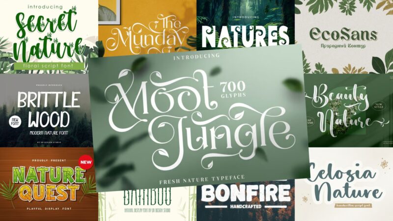
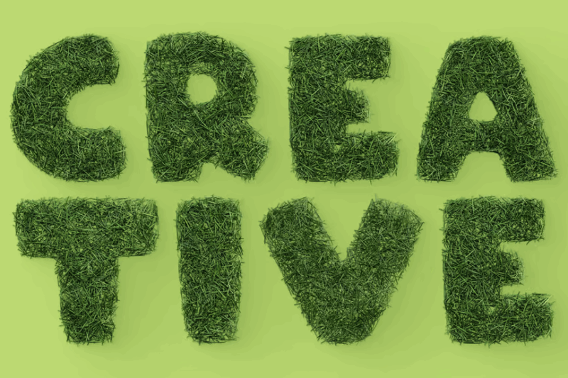
35 Stunning Nature Fonts That Capture the Outdoors
I’ve handpicked these exceptional nature fonts that truly embody the organic, wild beauty of the natural world. Each one brings something unique to your designs – from delicate floral elements to robust, earthy character.
Secret Nature
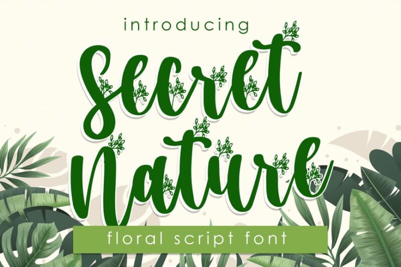
Secret Nature is a handwritten script font with an organic, earthy feel. Its flowing lines and natural imperfections make it perfect for projects that require a touch of rustic elegance and authenticity.
Nature Breath
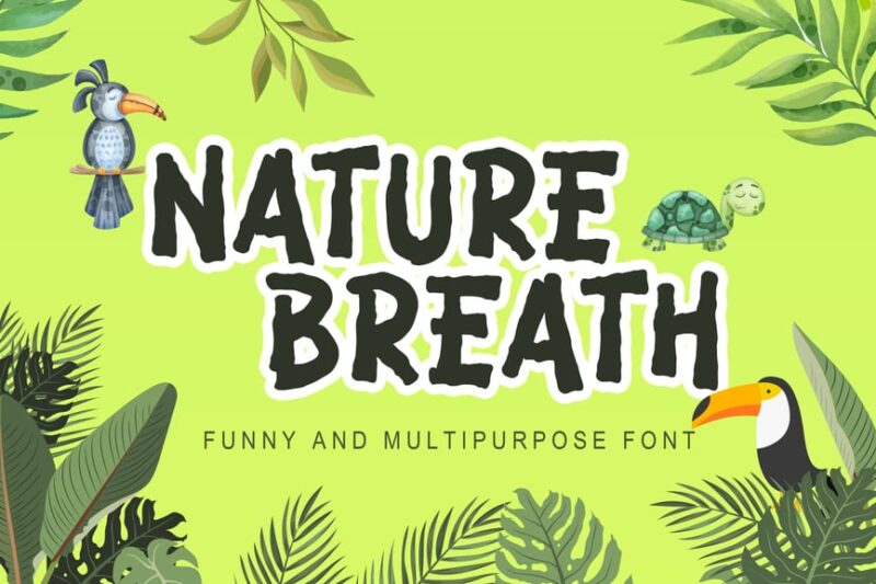
Nature Breath is a decorative font that combines adventure and logo design elements. Its bold, naturalistic strokes evoke a sense of outdoor exploration, making it ideal for branding related to eco-tourism or outdoor activities.
Nature Quest
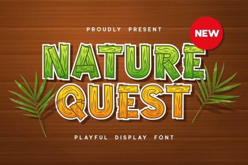
Nature Quest is a decorative display font with a focus on logo design. Its unique letterforms blend organic shapes with a modern aesthetic, perfect for brands looking to convey a connection to nature with a contemporary twist.

Get 300+ Fonts for FREE
Enter your email to download our 100% free "Font Lover's Bundle". For commercial & personal use. No royalties. No fees. No attribution. 100% free to use anywhere.
Mother Nature Font
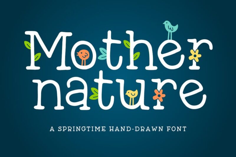
Mother Nature Font is a serif typeface featuring floral and natural elements. Its elegant curves and nature-inspired details make it suitable for projects that require a sophisticated yet organic feel, such as botanical branding or eco-friendly product packaging.
Mollani Nature Script
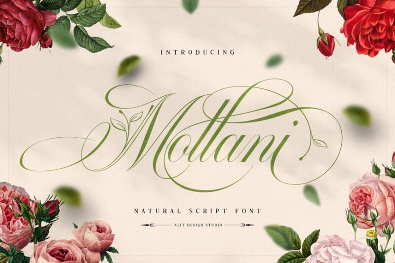
Mollani Nature Script is a flowing handwritten font with leaf and nature-inspired elements. Its graceful curves and organic embellishments make it perfect for creating a sense of natural beauty in designs for wellness brands, eco-friendly products, or nature-themed events.
Natures – Decorative Display Font
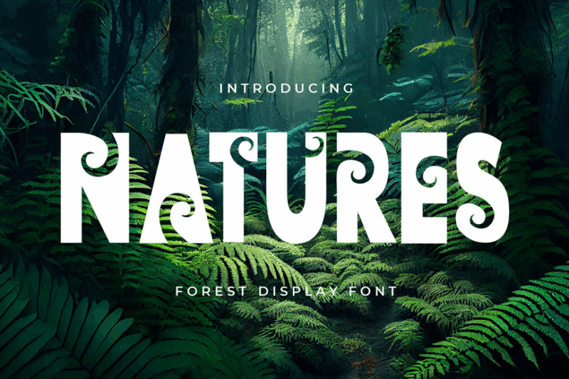
Natures is a decorative display font with floral and ornamental features. Its intricate details and bold presence make it ideal for creating eye-catching headlines or logos for brands that want to emphasize their connection to nature and beauty.
EcoSans — Minimalist Nature Font
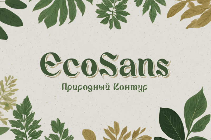
EcoSans is a minimalist font with an eco-friendly and sustainable theme. Its clean lines and subtle organic touches make it perfect for modern, environmentally conscious brands that want to convey simplicity and responsibility in their visual communication.
Beauty Nature Beautiful Script
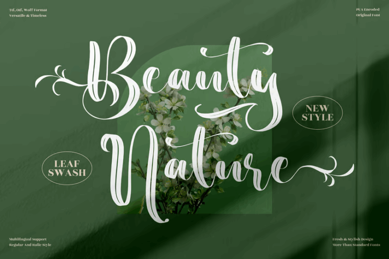
Beauty Nature Beautiful Script is a handwritten font designed for branding projects with a natural theme. Its elegant, flowing lines evoke a sense of grace and organic beauty, making it ideal for cosmetics, spa products, or nature-inspired lifestyle brands.
Celosia Nature – Handwritten Font TT
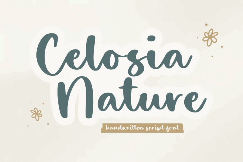
Celosia Nature is a handwritten script font with a decorative flair. Its natural, flowing style combined with unique letterforms makes it perfect for creating a personalized, organic look in designs for boutique brands or artisanal products.
The Moot Jungle Nature Typeface
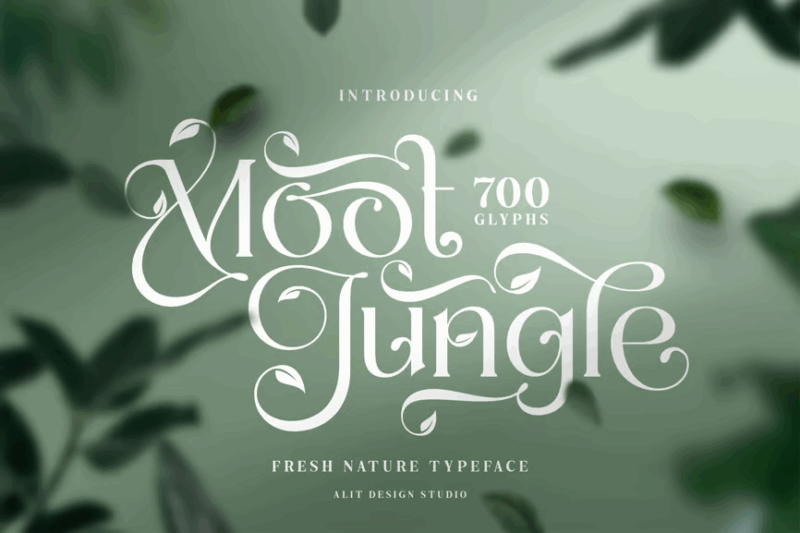
The Moot Jungle Nature Typeface is a serif font featuring leaf and nature-inspired elements. Its bold, playful character with organic details makes it suitable for children’s books, nature documentaries, or eco-adventure branding. Find more jungle fonts here.
Rallomy Nature Beauty Serif
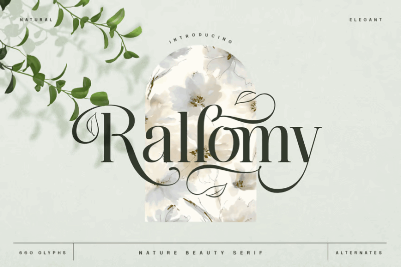
Rallomy Nature Beauty Serif is an elegant typeface with leaf and nature-inspired elements. Its refined serifs combined with organic flourishes make it perfect for luxury eco-resorts, high-end natural cosmetics, or sophisticated nature-themed publications.
Botanic Nature Decorative Font
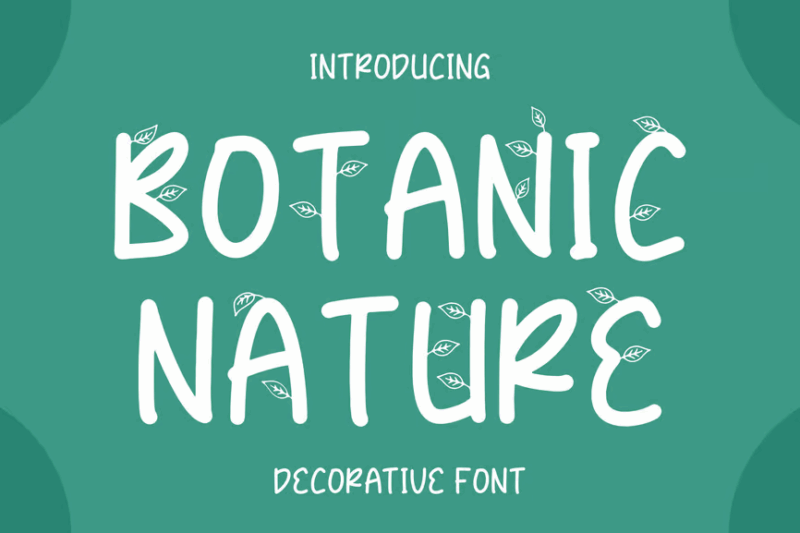
Botanic Nature Decorative Font is a sans-serif typeface with natural elements, designed for branding projects. Its clean lines with subtle organic touches make it versatile for modern eco-friendly brands, botanical products, or nature-inspired tech companies.
Crazy Bamboo – Nature Font
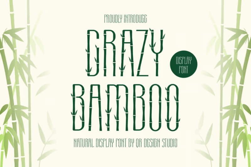
Crazy Bamboo is a decorative nature font with an Art Deco influence. Its tall, elongated characters with bamboo-inspired elements make it perfect for creating a unique, exotic look in designs for tropical resorts, Asian fusion restaurants, or eco-luxury brands.
Brittle Wood – Nature Font
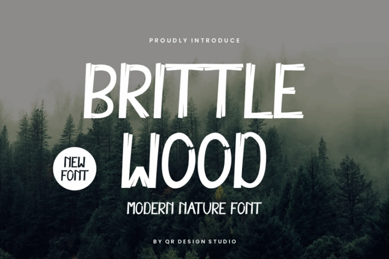
Brittle Wood is a decorative nature font with an autumn-inspired, hand-drawn aesthetic. Its irregular, textured characters evoke a sense of rustic charm, making it ideal for fall-themed designs, artisanal wood products, or cozy cabin retreats.
Wildlife Nature Freestyle Stylish Font
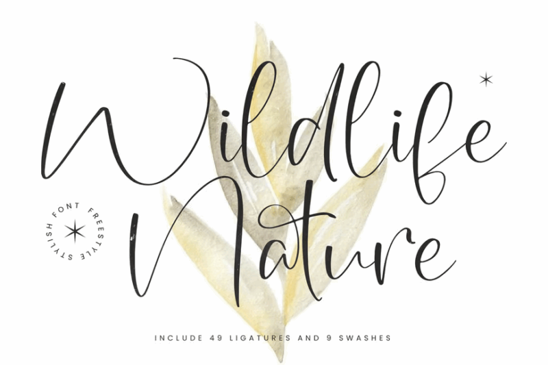
Wildlife Nature Freestyle Stylish Font is a handwritten script designed for nature-themed branding. Its dynamic, energetic strokes capture the spirit of wildlife, making it perfect for outdoor adventure brands, wildlife conservation campaigns, or nature documentaries.
Bonfire Typeface

Bonfire Typeface is a bold block font with a wild, untamed character. Its rough, energetic strokes evoke the spirit of outdoor adventures and campfire stories, making it ideal for wilderness retreats, outdoor gear brands, or rugged lifestyle products.
Branch Font
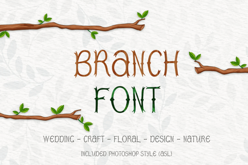
Branch Font is a decorative typeface inspired by wood and pinewood textures. Its unique, organic letterforms mimic the natural patterns found in tree branches, making it perfect for rustic branding, forestry-related projects, or nature-inspired home decor.
Kora
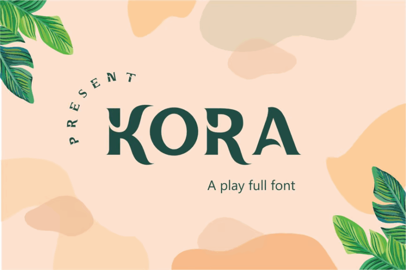
Kora is a sans-serif decorative font with a tropical, aesthetic appeal. Its clean lines with subtle organic breaks make it versatile for modern beach resorts, tropical-themed products, or contemporary nature-inspired fashion brands.
LUPINES – Cute Skinny Handwriting Font
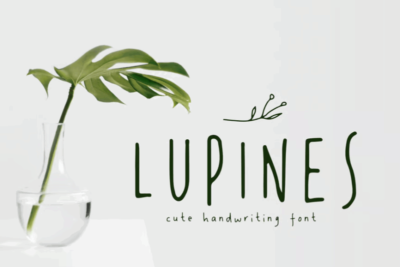
LUPINES is a cute, skinny handwriting font with a delicate and playful character. Its thin, whimsical strokes make it perfect for creating a light-hearted, personal touch in designs for children’s nature books, botanical illustration captions, or quirky eco-friendly products.
Pinefolk – Organic Sans
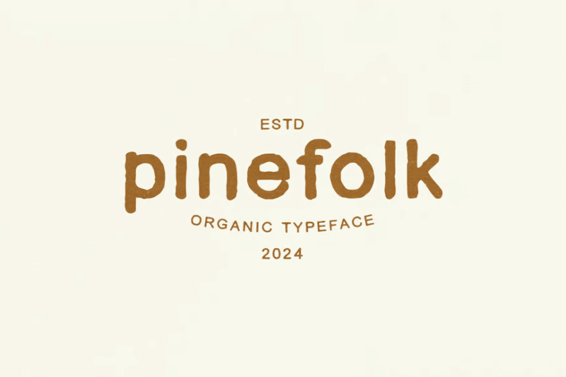
Pinefolk is an organic sans-serif font with a natural, hand-drawn quality. Its imperfect lines and subtle irregularities give it an authentic, artisanal feel, making it ideal for craft breweries, farmers markets, or sustainable lifestyle brands.
Font Pine jungle
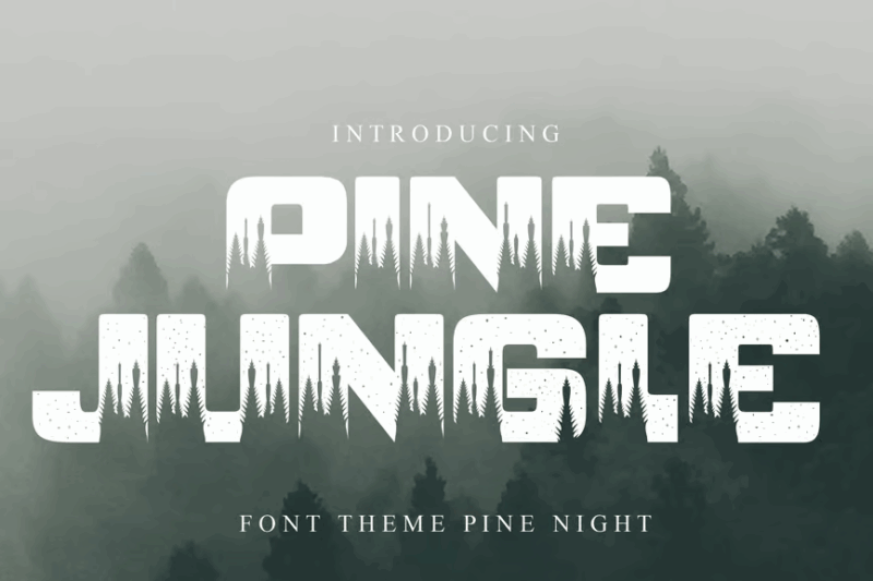
Font Pine jungle is a decorative sans-serif font with jungle-themed symbols. Its playful characters and nature-inspired glyphs make it perfect for children’s educational materials about forests, eco-adventure parks, or tropical-themed events and products.
Botany Festival
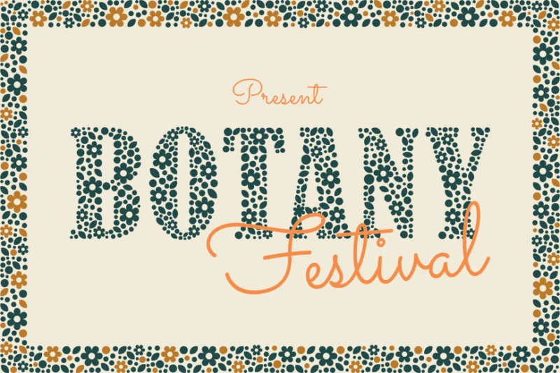
Botany Festival is a serif font with decorative leaf and nature elements. Its elegant letterforms combined with botanical embellishments make it ideal for high-end garden events, luxurious herbal product packaging, or sophisticated nature magazines.
Grow West Nature Typeface
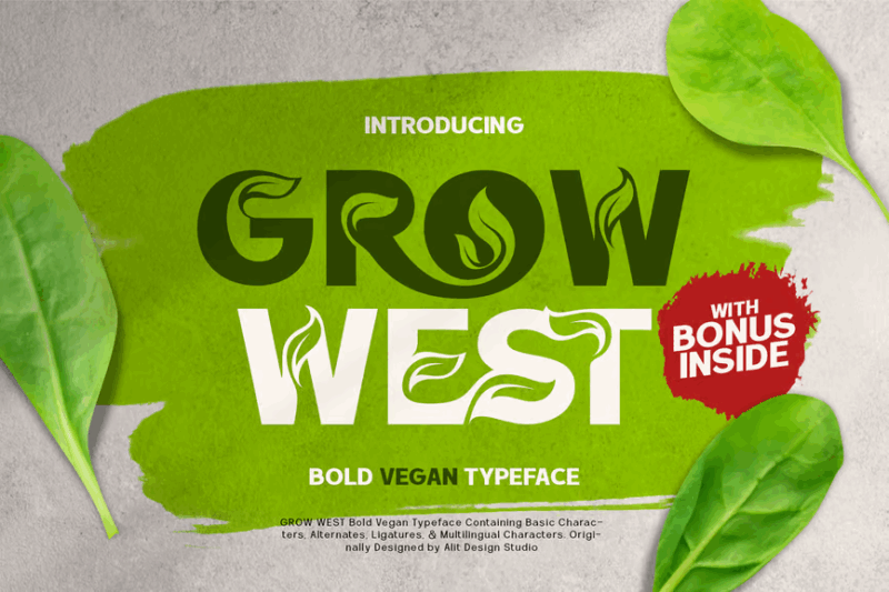
Grow West Nature Typeface is a decorative font featuring leaf and nature-inspired elements. Its bold, organic character with a hint of vintage charm makes it perfect for outdoor gear brands, western-themed nature resorts, or rustic farm-to-table restaurants.
Chirp & Blossom Font
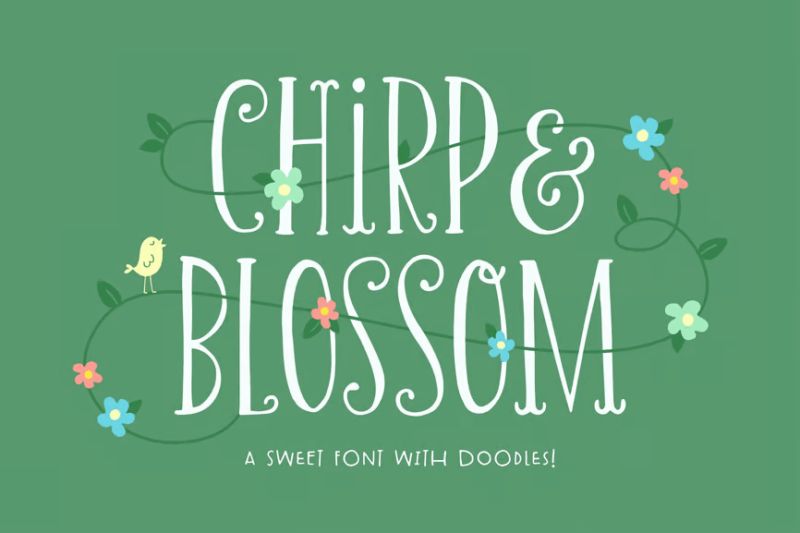
Chirp & Blossom Font is a cute decorative typeface with nature-inspired doodles and symbols. Its playful characters and whimsical illustrations make it ideal for children’s nature books, spring-themed event branding, or cheerful eco-friendly product packaging.
Backwoods Cabin Font
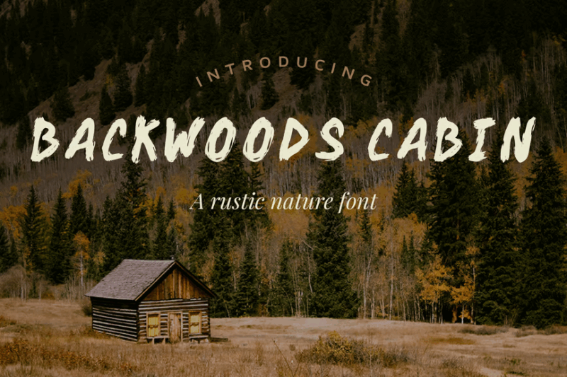
Backwoods Cabin Font is a handmade script with a vintage, textured feel. Its rough, irregular strokes evoke a sense of wilderness and adventure, making it perfect for outdoor gear brands, camping supplies, or rugged lifestyle products.
Monkey Stone – Display Font
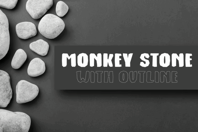
Monkey Stone is a display font combining sans-serif, decorative, and handwritten elements with a primal, aged look. Its unique character makes it suitable for jungle-themed adventure parks, prehistoric nature exhibits, or primitive-inspired fashion brands.
The Munday Typeface
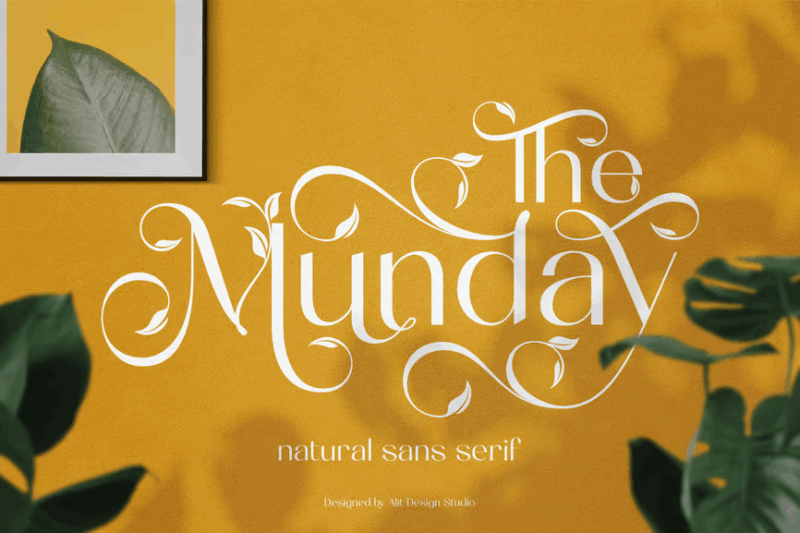
The Munday Typeface is a sans-serif font featuring leaf and nature-inspired elements. Its clean lines with subtle organic touches make it versatile for modern eco-friendly brands, natural wellness products, or contemporary botanical publications.
Mountain Warrior
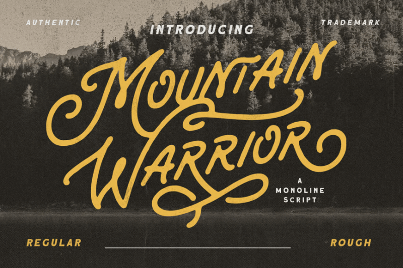
Mountain Warrior is a retro-inspired, rough handwritten monoline script. Its bold, energetic strokes evoke a sense of adventure and ruggedness, making it ideal for outdoor sports brands, mountain resorts, or wilderness-themed clothing lines.
Molga font
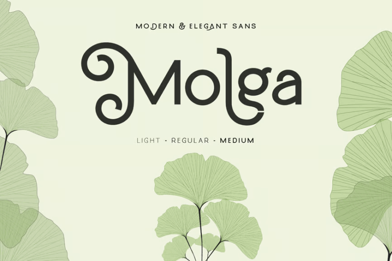
Molga font is a versatile sans-serif typeface with decorative elements and symbols, suitable for logo and beauty-related designs. Its clean lines with subtle organic touches make it perfect for modern skincare brands, natural cosmetics, or eco-friendly spas.
Exploria Font
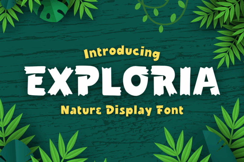
Exploria Font is a fun, cartoon-like sans-serif typeface with a decorative flair. Its playful character makes it ideal for children’s nature camps, animated eco-educational content, or whimsical outdoor adventure branding.
World Madly – Display Font
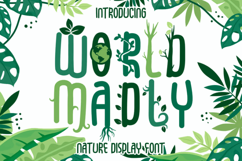
World Madly is a quirky display font with a unique, off-beat character. Its unconventional letterforms make it perfect for creating attention-grabbing headlines in eco-conscious magazines, alternative nature retreats, or avant-garde botanical art exhibitions.
Crown Heaven Font
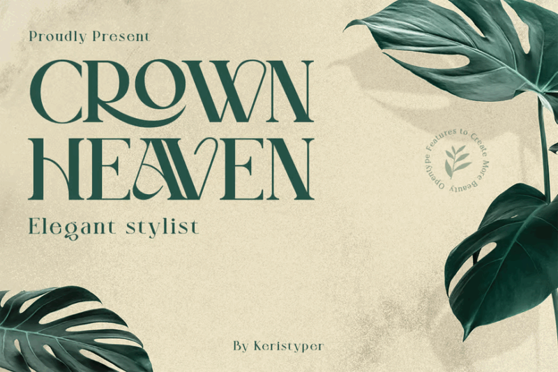
Crown Heaven Font is a classic serif typeface with a touch of glamour. Its elegant, regal character makes it suitable for luxury eco-resorts, high-end organic beauty products, or sophisticated nature-inspired jewelry brands.
Grass Bold – 3D Color SVG Font
Grass Bold is a 3D color SVG font that creates a realistic grass texture effect. Its unique, nature-inspired design makes it perfect for creating eye-catching headlines for lawn care services, golf courses, or eco-friendly outdoor events.
Bahor – Hand Made Floral Typeface
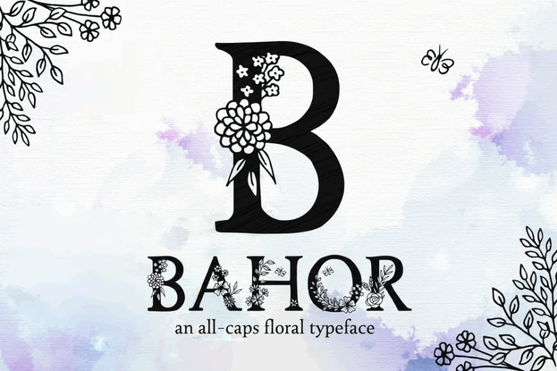
Bahor is a handmade serif typeface with intricate floral elements. Its delicate, ornate design makes it ideal for high-end florists, botanical gardens, or luxury organic skincare brands that want to convey a sense of natural elegance.
Gardener – Garden Font Style
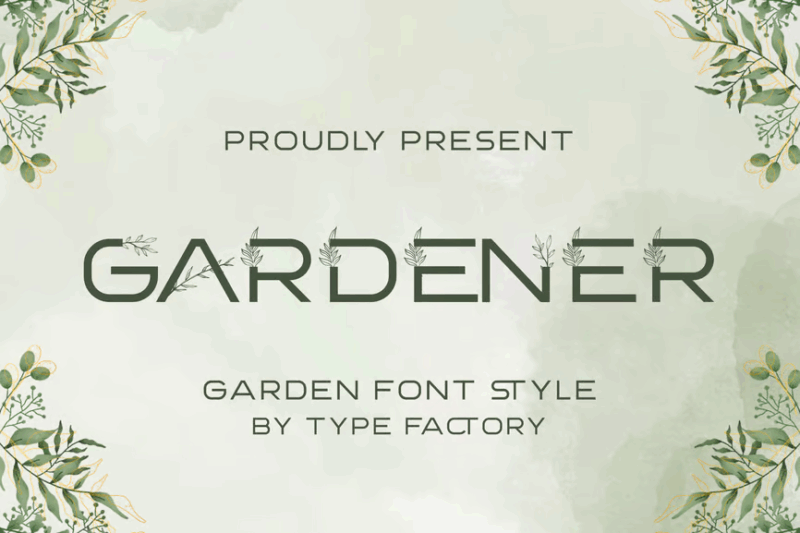
Gardener is an authentic, decorative font style inspired by garden themes. Its organic, hand-crafted look makes it perfect for landscaping businesses, seed packaging, or rustic farm-to-table restaurants looking to emphasize their connection to nature.
Mallong Typeface
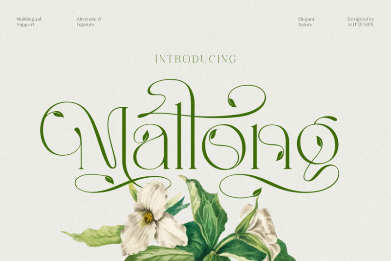
Mallong Typeface is a serif font featuring leaf and nature-inspired elements. Its elegant letterforms with subtle organic touches make it suitable for upscale eco-resorts, premium organic food packaging, or sophisticated nature magazines.
Verdant – Botanical Display Font
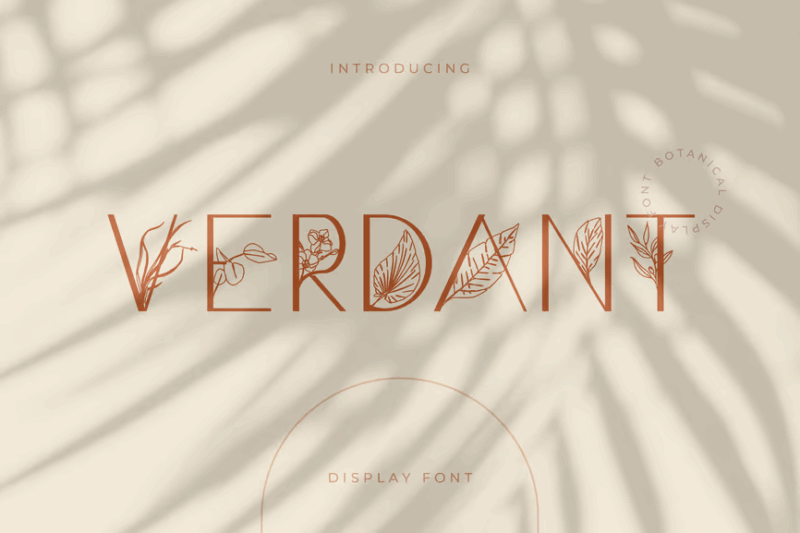
Verdant is a decorative display font with lush, botanical elements. Its intricate floral details and bold presence make it ideal for creating striking headlines for garden shows, herbal product lines, or nature-inspired fashion brands.
Rimba Andalas
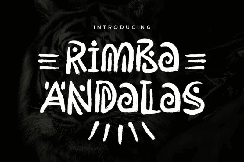
Rimba Andalas is a decorative font with aztec-inspired elements. Its unique blend of symbols and handwritten characters makes it perfect for eco-tourism in indigenous areas, ethnic-inspired nature retreats, or cultural heritage preservation projects.
Camelia Sans – Unique Florist Typeface
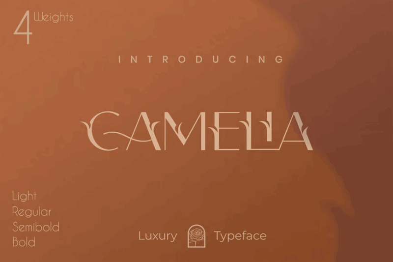
Camelia Sans is a versatile typeface combining sans-serif, serif, and decorative elements with a luxurious, classy feel. Its elegant design with floral touches makes it ideal for high-end florists, botanical cosmetics, or sophisticated garden-themed events.
King Trufle Font
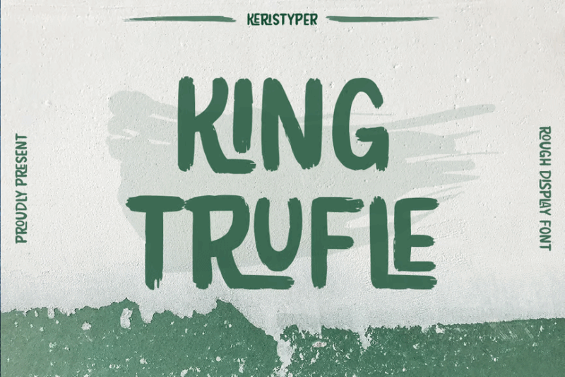
King Trufle Font is a bold, sans-serif decorative typeface with a cinematic quality. Its strong presence and slight organic touch make it suitable for nature documentaries, outdoor film festivals, or adventure-themed entertainment brands.
What Gives a Font That “Natural” Feel?
Nature fonts stand apart from their more mechanical or geometric counterparts through several distinctive characteristics that evoke the organic world:
Organic Irregularity
Just as no two leaves or snowflakes are identical, nature fonts embrace subtle irregularities. Their letterforms often feature varying thicknesses, slightly uneven baselines, and natural inconsistencies that mimic the beautiful imperfections found in nature.
This controlled randomness creates a more authentic, hand-crafted feel that immediately connects to our perception of natural elements.
Flowing, Curved Lines
Nature rarely creates perfect straight lines or sharp angles. Similarly, nature fonts tend to incorporate flowing, curved strokes that echo the gentle bend of a branch, the curve of a petal, or the meandering path of a stream.
These soft, undulating forms feel more organic and less engineered than their geometric counterparts, helping to establish that all-important connection to the natural world.
Textural Elements
Many nature fonts incorporate textural details that mimic natural materials – the rough bark of a tree, the delicate veins of a leaf, or the grainy texture of stone. These tactile qualities add depth and authenticity to the typography.
The textural aspects can be subtle or pronounced depending on the specific natural element being evoked. Wood-inspired fonts might feature visible grain patterns, while plant-based typefaces might incorporate delicate tendrils or leaf-like serifs.
Biomorphic Shapes
Nature fonts often incorporate shapes and forms directly inspired by living organisms. Serifs might resemble tiny leaves or branches, terminals might curve like unfurling ferns, and counters (the enclosed spaces in letters like ‘o’ and ‘p’) might echo seed pods or natural openings.
These biomorphic inspirations create an immediate visual connection to the plant and animal kingdom, grounding the font firmly in the natural world.
Where to Use Nature Fonts Effectively
Nature fonts shine in specific contexts where their organic characteristics enhance the overall design message:
Environmental Branding
For eco-friendly companies, conservation organizations, and sustainability-focused brands, nature fonts provide perfect alignment with their core values. These fonts visually reinforce commitments to environmental stewardship and natural authenticity.
From organic food packaging to renewable energy companies, environmentally conscious businesses benefit immensely from typography that echoes their mission and values.
Outdoor Recreation
Hiking outfitters, national parks, wilderness guides, camping equipment – any brand connected to outdoor adventure and exploration finds natural synergy with these fonts. They evoke the rugged beauty of the wilderness and the excitement of outdoor pursuits.
Nature fonts help establish an immediate connection between the product or service and the great outdoors, creating an aspirational feeling of adventure and exploration.
Wellness and Natural Products
Skincare lines, herbal remedies, spa services, and other wellness brands leverage nature fonts to communicate purity, natural ingredients, and holistic approaches. These fonts visually suggest that the products are derived from or inspired by nature’s healing elements.
The organic quality of the typography helps reinforce messaging around natural ingredients, gentle formulations, and earth-friendly processes.
Botanical and Natural Science
Botanical gardens, herbariums, natural history museums, and educational materials about flora and fauna benefit tremendously from nature-inspired typography. The fonts create visual cohesion with the subject matter.
In these contexts, nature fonts don’t just decorate – they educate by visually reinforcing the organic subject matter being presented.
Where to Avoid Nature Fonts
While versatile and beautiful, nature fonts aren’t appropriate for every design context:
High-Tech and Digital Brands
Companies specializing in cutting-edge technology, software, or digital services often need typography that communicates precision, innovation, and sleek modernity – qualities that most nature fonts don’t prioritize.
The organic irregularities and hand-crafted feel of nature fonts might undermine messages about technological advancement and digital perfection.
Formal Financial Institutions
Banking, investment, and other financial services typically require typography that conveys stability, reliability, and trustworthiness through more conventional, structured forms.
The playful or irregularity of many nature fonts might unintentionally suggest a casual approach to serious financial matters – not the message most banks want to send to customers entrusting them with their money.
Medical and Healthcare (With Exceptions)
Most medical practices, hospitals, and pharmaceutical companies require typography that communicates precision, cleanliness, and scientific rigor rather than organic imperfection.
However, certain healthcare niches like holistic medicine, naturopathy, or herbal remedies can effectively utilize nature fonts to emphasize their natural approaches.
Text-Heavy Documents
Many nature fonts prioritize distinctive character over readability at smaller sizes, making them poor choices for body text in reports, books, or lengthy documents.
Reserve these fonts for headlines, logos, and display purposes where their unique characteristics can shine without compromising reading comfort.
How to Choose the Perfect Nature Font
With so many beautiful options available, selecting the ideal nature font requires consideration of several factors:
Consider Your Specific Natural Reference
Different nature fonts evoke different aspects of the natural world. Are you trying to capture the delicate beauty of wildflowers? The rugged strength of ancient trees? The flowing movement of water?
Identify the specific natural element or feeling most relevant to your project, then select a font that authentically captures that particular aspect of nature.
Balance Character with Readability
The most visually dramatic nature fonts often sacrifice some readability for distinctive character. For logos and short display text, this trade-off might be acceptable, but for longer headlines or subheadings, consider more legible options.
Remember that even the most beautiful font fails if your audience struggles to read your message. Test your chosen font at the sizes you’ll actually be using before committing to it.
Consider the Emotional Response
Different nature fonts evoke different emotional responses:
- Delicate, floral fonts suggest gentleness, beauty, and nurturing energy
- Rough, wood-inspired fonts convey strength, resilience, and rugged authenticity
- Flowing, water-like fonts evoke movement, flexibility, and continuous change
Choose a font whose emotional resonance aligns with your broader brand messaging and the specific feelings you want to evoke in your audience.
Evaluate Technical Requirements
Consider practical aspects like:
- Do you need multiple weights (light, regular, bold) for versatility?
- Will the font need to work across print and digital applications?
- Does the font include all the special characters you might need?
- How does the font perform at very small or very large sizes?
Technical limitations can sometimes override aesthetic preferences when practical functionality is at stake.
Pairing Nature Fonts with Other Typefaces
Most successful designs don’t rely on a single font. Here’s how to effectively pair your nature fonts with complementary typefaces:
Balance with Clean Sans Serifs
The organic irregularity of many nature fonts pairs beautifully with the clean precision of modern sans serifs. This contrast creates a balanced design that’s both fresh and grounded.
Try pairing a distinctive, textural nature font for headings with a clean, legible sans serif for body text. The sans serif provides a neutral canvas that allows the nature font to shine while ensuring readability for longer content.
Create Hierarchy with Contrast
Use the distinctive character of nature fonts to create clear hierarchical relationships in your typography. Reserve your most expressive nature font for the highest-level headings or most important elements.
As you move down the hierarchy to subheadings and body text, transition to progressively more neutral, legible fonts that support rather than compete with your featured nature font.
Consider Contextual Relationships
Look for typefaces that share subtle qualities with your chosen nature font without directly competing with it. For example:
- A nature font with slightly angular shapes might pair well with a geometric sans serif that echoes those angles in a more refined way
- A flowing, script-based nature font might harmonize with a serif that has similar transitional thick-to-thin strokes
These thoughtful relationships create cohesion across your typography system while maintaining appropriate contrast.
Beyond the Obvious: Unexpected Ways to Use Nature Fonts
While nature fonts have obvious applications in environmental and outdoor contexts, creative designers find unexpected ways to leverage their organic appeal:
Digital Contrast
Create compelling juxtaposition by using nature fonts in highly digital contexts – mobile apps, technology websites, or futuristic designs. This unexpected contrast between the organic and the digital can create memorable, distinctive experiences.
The key is to make this contrast intentional and thoughtful rather than accidental or discordant. When done well, this approach suggests a harmonious relationship between technology and nature.
Luxury with a Natural Touch
High-end spas, eco-luxury resorts, and premium organic products benefit from nature fonts that balance organic character with refined elegance. Look for nature fonts with a more subtle, sophisticated interpretation of natural elements.
This approach works particularly well for brands that position themselves at the intersection of luxury and sustainability – offering premium experiences or products with environmental consciousness.
Historical Revival with Natural Elements
Combine nature-inspired details with historical typography styles for projects related to natural history, botanical archives, or heritage outdoor brands. This approach connects the timeless aspects of nature with historical human documentation of the natural world.
Fonts that merge Victorian-era typography conventions with organic details work beautifully for museums, historical societies with environmental focuses, or brands with both heritage and natural positioning.
Expert Opinions: Typography Designers on Nature Fonts
I reached out to several typography experts to get their perspectives on what makes nature fonts effective and how they see them evolving in 2026 and beyond:
Maria Gonzalez, Type Designer at NaturalType Studios, says: “The most successful nature fonts don’t literally mimic leaves or branches – they capture the feeling and movement of natural elements while maintaining functionality as typography. It’s about essence rather than direct imitation.”
James Chen, Environmental Brand Strategist, notes: “We’re seeing a shift toward more subtle nature fonts that suggest rather than shout their organic inspiration. Clients want nature-inspired typography that feels authentic and grounded rather than cartoonish or overly literal.”
Dr. Amelia Parks, Professor of Design History, observes: “There’s a fascinating historical relationship between typography and natural forms, from medieval illuminated manuscripts with their plant motifs to Art Nouveau’s nature-inspired letterforms. Today’s nature fonts are continuing this centuries-old conversation between typography and the organic world.”
These experts agree: the most effective nature fonts strike a balance between distinctive organic character and practical functionality, capturing the essence of natural elements without sacrificing readability or versatility.
Common Questions About Nature Fonts
Let’s address some frequently asked questions about nature fonts:
What makes a font look natural or organic?
Natural-looking fonts typically feature irregular, non-uniform strokes, flowing curves, and organic imperfections that mimic elements found in nature. They often incorporate biomorphic shapes, varying line weights, and textural qualities that reference natural materials like wood, stone, or plant life.
Are nature fonts good for body text?
Most distinctive nature fonts work best for display purposes (headlines, logos, feature text) rather than extended body copy. Their distinctive characteristics often reduce readability at smaller sizes. For body text in nature-themed designs, consider more legible fonts with subtle natural qualities or pair your statement nature font with a neutral, readable companion.
How can I make my design feel natural without using an obviously “nature” font?
Incorporate other design elements that evoke nature – organic color palettes, natural textures, and biomorphic shapes. You can also choose fonts with subtle natural qualities like slight irregularities or gentle flowing forms rather than overtly “tree-like” or “leaf-shaped” typefaces.
Where can I find quality nature fonts?
Beyond the fonts featured in this article, explore type foundries that specialize in organic, handcrafted typefaces. Many independent type designers create beautiful nature-inspired fonts that you won’t find in mainstream collections. Creative marketplaces like Creative Market, MyFonts, and Adobe Fonts also offer excellent selections of nature-inspired typography.
Conclusion: Bringing Nature’s Beauty to Typography
Nature fonts offer designers a powerful tool to connect audiences with the organic world through typography. Whether you’re creating branding for an eco-conscious company, designing materials for outdoor adventures, or simply wanting to infuse your work with the beauty and authenticity of the natural world, the right nature font can transform your design.
The key is choosing nature fonts thoughtfully – considering not just their aesthetic appeal but their functional requirements, emotional resonance, and appropriateness for your specific context. When used with intention and skill, these fonts do more than just look pretty – they tell a story, evoke emotions, and strengthen your design’s core message.
So whether you’re drawn to the delicate intricacy of floral-inspired scripts, the rugged character of wood-textured display fonts, or the flowing movement of water-inspired letterforms, there’s a nature font waiting to bring the outdoors into your next design project.
Which nature font speaks to you? Are you drawn to the bold, texturally rich options or the more delicate, flowing typefaces? Let me know in the comments below – I’d love to hear how you’re using nature fonts in your work!


