Beautiful work by Noise 13 for Reorient, a brand that creates herbal tonics and broths:
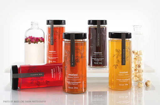
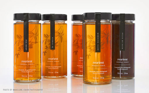
Based in San Francisco, Reorient creates artisanal herbal tonics and broths that deliver a luxurious and nourishing treat for the body. Noise 13 was tasked with overall brand strategy and creative direction, as well as extending the brand’s identity to new packaging and an ecommerce website.
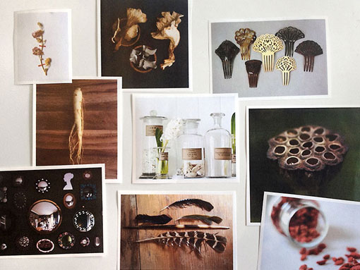
Through early conversations with the client and competitive research, we discovered that the Reorient brand was not necessarily suited to the food and beverage market. Instead, the emphasis on “nourishment for your body from the inside” meant a stronger association with the health and beauty sector. With this in mind, our team gathered inspiration from many different sources, including apothecaries of China and Japan, as well as those in the West. We wanted the visual identity to reflect the brand’s Eastern heritage, but with a more modern and feminine touch. Instinctively, we leaned toward illustration as a key element to communicate the preciousness and delicacy of the product.
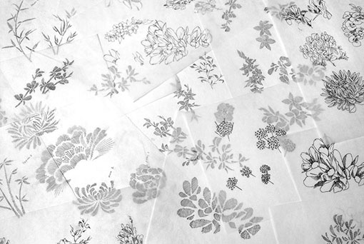
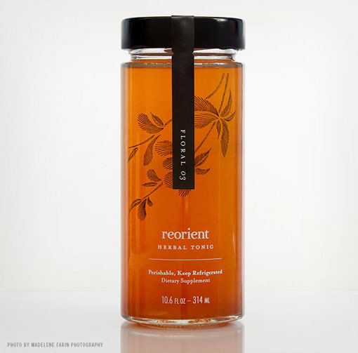
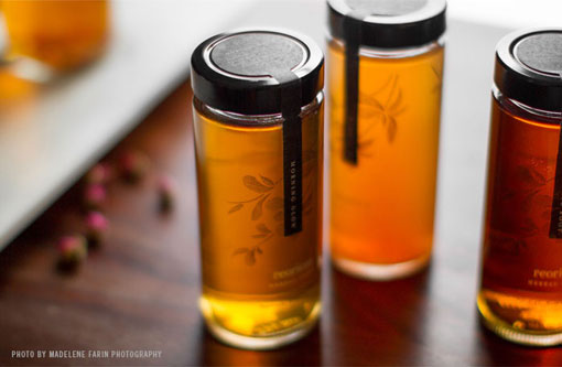
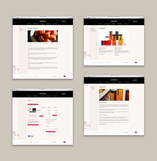
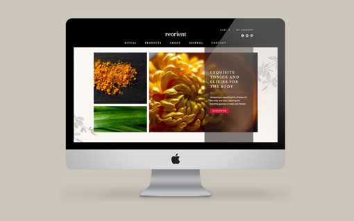
We created a custom illustration to adorn the bottles and the website, inspired by both Chinese Suzhou embroidery and vintage botanical textbook drawings. The restrained black and white color palette of the bottles allows the beautiful colors of the tonics to shine. The website retains the elegant feel of the packaging, accented by stunning product and ingredient photography. Here the client is able to manage her product offerings through an easy-to-use ecommerce platform, as well as share photos and stories with her customers through a Pinterest-style blog.

Get 300+ Fonts for FREE
Enter your email to download our 100% free "Font Lover's Bundle". For commercial & personal use. No royalties. No fees. No attribution. 100% free to use anywhere.

Creative Credits:
Creative Director: Dava Guthmiller
Designer: Christine Lee
Project Managers: Gina Chang/Claire Saccoccini
Photography: Madelene Farin Photography
Logo design: Emily Berry, BerryCreative
Development: Cameron Renfro/Memmadog
