In this article:
What feels new in design is often something you’ve already seen, just framed differently. A layout that suddenly looks fresh again or afont from decades ago , for example. Colors that feel bold now, but were everywhere at some point. And this isn’t random. Certain ideas keep coming back because they solve problems in ways that still make sense, even in a completely different context. So instead of asking what’s new, it’s often more useful to ask: why doesn’t all design evolve forward?
Why do design trends keep cycling instead of disappearing?
Most people think design is driven primarily by creativity. In truth, it’s driven by how people process what they see. And people? They don’t like figuring things out from scratch every time.
This is somewhat corroborated by research on website design that points out users expect things to feel familiar when browsing different websites. When a design element appears completely new or behaves in an unexpected way, it slows them down. That is why web design often features recurring design patterns.
The principles are the same, whether talking about web design or design in general. When a style returns, it brings back something people already understand.
In web design, that’s, for example:
- How layouts are structured
- How navigation works
- Howvisual hierarchy is communicated
But even aesthetics follow this logic.
A bold 80s-inspired layout feels fresh, but the way it uses contrast and hierarchy is still familiar. A minimalist interface feels modern, but it relies on patterns people have seen before.

Get 300+ Fonts for FREE
Enter your email to download our 100% free "Font Lover's Bundle". For commercial & personal use. No royalties. No fees. No attribution. 100% free to use anywhere.
So trends don’t come and go and then come again because designers have run out of ideas. They cycle because familiarity makes design easier to use and, ultimately, easier to trust.
Why does Bauhaus keep coming back in modern design?
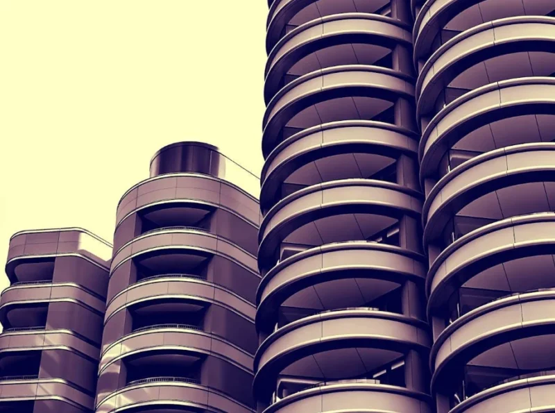
Bauhaus is one of the clearest examples of this. Simple shapes. Functional layouts. No decoration for the sake of decoration. It was built around the idea that design should serve a purpose first.
That mindset still fits perfectly today. When interfaces get cluttered, designers move back toward structure. Grids. Clean typography. Clear hierarchy. You’ll see it in:
- Modern websites
- Product design
- Branding systems
Not because people are copying Bauhaus directly, but because the logic behind it still solves the same problems.
Why are hand-drawn elements still relevant in digital design?
On the opposite end, you’ve got hand-drawn designs. Imperfect lines. Rough edges. Slight inconsistencies. And yet, it keeps showing up. Why?
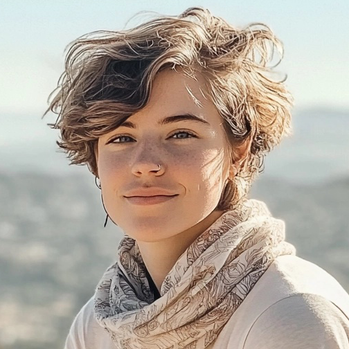
Because not everything benefits from being polished, digital design can feel too precise. Too controlled. Too uniform. Hand-drawn elements break that. They make things feel more personal, approachable, and more human. You’ll see this a lot in branding, in particular, branding for smaller businesses or products that want to feel less corporate.

Why are 80s aesthetics suddenly everywhere again?
Then there’s the 80s. Neon colors. High contrast. Bold gradients. Heavy visual energy.
For a long time, that look felt outdated. Almost excessive. Fast forward to 2026? It’s back! And not in a subtle way. Designers are pulling from the sametrends that shaped the 80s – bright palettes, sharp contrasts, oversized typography – and using them in digital spaces that didn’t even exist back then.
So why now? Because the current design landscape leaned heavily into minimalism for years. Clean. Neutral. Safe.
Eventually, that starts to feel predictable.
The 80s aesthetic does the opposite. It grabs attention. It creates contrast – visually and culturally. And more importantly, it works well on screens. High contrast improves visibility. Bold colors stand out in crowded feeds. Strong visuals perform better when everything competes for attention.
So it’s not just nostalgia. It’s a function meeting timing.
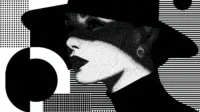
Why do high-contrast and bold visuals keep resurfacing?
This isn’t limited to the 80s. High-contrast design, such asblack and white graphics, shows up again and again across different eras. Strong color clashes. Sharp typography. Because contrast does one thing extremely well: It makes things easy to process. You see it immediately. You understand hierarchy faster. You know where to look.
In digital environments, where attention spans are short and competition is constant, that matters more than ever.
So even when design trends shift toward softer aesthetics, high-contrast elements always find their way back.
Why does minimalism never fully go away?
Minimalism has been ‘’trending’’ for years now. But it’s not really a trend. It’s a fallback.
Whenever design becomes too complex, too layered, too decorative, people reset. They strip things back. They include fewer elements, more space, and clearer structure.
It’s predictable in the best way. Not because designers lack creativity, but because simplicity makes things usable. And usability doesn’t go out of style.
Is design actually evolving or just repeating itself?
Both. New tools change how things are executed. New platforms create new constraints. But the core ideas? They tend to cycle.
Human behavior doesn’t change as fast as technology does, and we still respond toconsistency and standards in:
- Clarity
- Contrast
- Familiarity
- Emotional cues
So when a past style aligns with what people need now, it comes back, not as its carbon copy, of course, but as an adaptation.
Final thoughts
Not all design evolves forward. Some of it circles back, because it works, because it’s familiar, or because the timing is right again. For example, Bauhaus returns when things get cluttered. Hand-drawn elements come back when design feels too polished. 80s aesthetics resurface when everything starts looking the same. It’s not because we’re nostalgic for the olden times. It’s because these styles become relevant yet again.