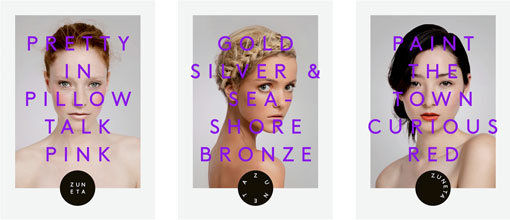
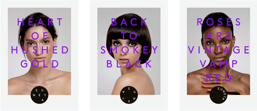
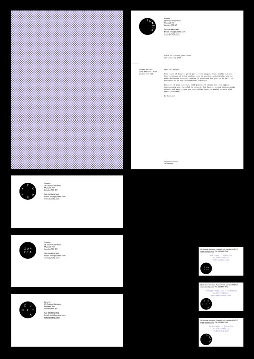
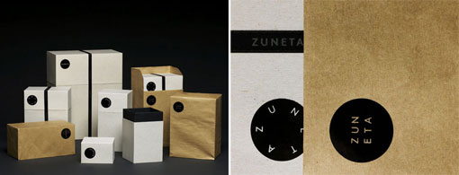
London-based design studio OK-RM recently launched a new portfolio site. One of the projects that stood out to be was the identity for Zuneta, an online beauty boutique. And with so many portfolio sites absent of any commentary, I think it’s a huge plus that they’ve given some insight into the thinking behind the concept:
…Its aim – to bring clarity to the often over complicated field of beauty retailing, a tailor-made service was set up to meet the needs of the specific individual. At the center of the brand lies an interchangeable palette of logos, dynamically reflecting the idea of transition; an analogy to the function of make-up. Alongside this a dynamic textual element is introduced creating intriguing statements in combination with a simple yet sophisticated palette of imagery. The meeting of functional and luxury values are conveyed through the materiality of all printed items.

Get 300+ Fonts for FREE
Enter your email to download our 100% free "Font Lover's Bundle". For commercial & personal use. No royalties. No fees. No attribution. 100% free to use anywhere.
via Collate
