In this article:
- How Dark Mode Changes Typography Considerations
- 4 Steps to Optimize Typography for Dark Mode
- My Dark Mode Typography System
- Applying to Real-World Scenarios
- How I Fixed a Design for Dark Mode
- Typography Optimization Checklist
- Why Typography Matters
The first time I flipped one of my web projects to dark mode, I thought it’d be easy. The same fonts, just inverted colors, right? Within seconds, the type that looked elegant in light mode became blurry and harsh. The serifs became thin, and the white text felt as if it were screaming.
That’s when I realized dark mode typography follows a different set of rules. The human eye, display screens and our perception of weight and contrast all change in low-light environments.
If you design interfaces, you know fonts can make or break a design. In dark mode, they determine whether your eyes feel comfortable or if you’re squinting the entire time. Knowing the rules of thumb that make typography look great in dark mode goes a long way toward keeping designs excellent.
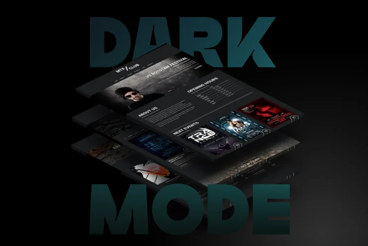
How Dark Mode Changes Typography Considerations
Source: https://unsplash.com/photos/black-and-white-remote-control-psKil0FkS58
Dark mode is a standard feature in many apps, operating systems and websites. Proponents often point to it as a way of easing eye strain. The contrast between dark and light can make reading long blocks of text less stressful.
However, contrast does not always behave consistently. Nielsen Norman Group research shows dark interfaces may reduce glare in some instances. Yet, pure white on black may not be the optimal choice. It becomes tiring to look at.
Type weights can change how well different colors work. A light weight may appear too thin on a dark background, while a regular weight may look more like thin does in dark mode.
Minor adjustments can have a significant impact. Font, color and line height affect legibility. Impactful dark mode design is about finding the right balance. A designer must fine-tune every element of typography.

Get 300+ Fonts for FREE
Enter your email to download our 100% free "Font Lover's Bundle". For commercial & personal use. No royalties. No fees. No attribution. 100% free to use anywhere.
4 Steps to Optimize Typography for Dark Mode
Nearly two-thirds of consumers prefer to purchase from companies that deliver experiences tailored to their needs. Personalization applies to interface design as much as to marketing. Typography that responds to light and dark feels designed with the user in mind, which can make a subtle but meaningful difference in transforming a site user into a customer.
Your attention to type weight, spacing and tone doesn’t just ease readability — it shows you care. Making minuscule adjustments can go a long way toward making someone feel that an interface was designed specifically for them.
Much of perfecting dark mode design is tweaking what you do and running it through contrast checkers. You should also step back from the screen and view the finished product at different distances. Here are the tweaks that garner the best results.
1. Weight, Contrast and Opacity
After a few more build cycles, I realized that what felt right in light mode felt fragile in dark mode, and increasing the weight changed everything. For body text, I had to use regular or medium weight for things to be legible on dark backgrounds. I also found bold or extra-bold worked well for headings. Reading italicized text in dark mode is difficult, so I stopped using it to add stress to words.

Source: https://unsplash.com/photos/black-computer-keyboard-on-brown-wooden-desk-7UzJudQY4oY
Avoid harsh, white text. Instead, go with off-white like #E0E0E0. These hues are light enough to pop but not true white. Similarly, the background can be a dark charcoal rather than pure black, like #121212. Slight variations in brightness can significantly impact the feel of your typography.
2. Line Spacing and Height
Text feels denser in dark mode, so increasing the space is your best friend. When I design dark mode pages, I add:
- +0.02 em of tracking (letter spacing)
- 1.5 times line height for paragraphs
- Slightly more padding around text blocks
Extra space improves readability. On a dark background, letters appear to float, and space provides structure and separation. Spacing is not purely ornamental, as generous line height improves user reading of large text blocks.
3. Font Size
One adjustment I sometimes overlook until digging into the fine details is adjusting the font size slightly. Small fonts can become blurry or distorted in dark mode because low contrast makes it difficult to notice pixel glow. Increasing the base font size by one to two pixels may help with this issue.
If your body copy is 16 pixels, try it at 17 and 18 pixels within dark mode. Experiment with various brightness levels on smartphone devices as well. I like to think of it as “optical scaling.” You are not changing your typography’s proportions — you are helping users perceive it the same way in different lighting conditions.
4. Font Family
Which fonts work best for dark mode? As dark mode became more popular, I found that my default typefaces failed. Thin serifs disappeared, with the font looking uneven and broken. Beautifully drawn letters become ordinary.
To be successful in dark mode design, you must choose typefaces with distinctive characters. The right typeface can increase reading speed by 35% or more. Common typefaces maintain their essential character at low contrast more than unusual ones. Humanist sans serifs like Inter, Roboto or SF Pro are good options. They have open shapes and balanced proportions that are legible in light and dark.
You can still use decorative fonts or serifs, but with more restraint. A designer might want to enlarge a header or bold it. Web Content Accessibility Guidelines (WCAG) 2.0 recommends character contrast of at least 3:1 against the background color. Select fonts with enough structure to stay visible.
My Dark Mode Typography System
When I create dark mode themes, I think of typography within its own design system context.
The dark background (#121212) and the off-white text color (#E0E0E0) should be paired with accent colors. Accent colors highlight links and secondary text. Go with a simple sans-serif font for body text and a contrasting serif or display for headings. Check all items’ accessibility compliance before using them, and test their appearance in dark mode.
Use consistent ratios of body measurements, such as H1 equals two times body size and H2 equals one and a half times. Weight, size and color differences should be noted easily, even in dim light. Slightly loosen tracking and increase line height. Text should not appear in large paragraphs.
Consider how your typography and color choices appear in different settings and devices. It’s best to view the design in bright light. A design that looks perfect on your computer may be a poor experience on your phone screen.
At its best, dark mode is subtle. A well-designed system is more solid and reassuring when it doesn’t attract too much attention.
Applying to Real-World Scenarios
Good design is contextual. Typography must suit light and dark modes if users switch between them. Some ways I create designs that work within different parameters include.
- Slightly heavier weights in dark mode.
- A space adjusted to fractions of an em.
- Two sets of color variables in the style sheet.
Remember longform pages, too. Dark gray backgrounds and increased line spacing can help with readability in blog or article formats. Text should be broken into smaller sections to improve a user’s dark mode experience.
Keep your brand style, even in dark mode. If you have display type or high-contrast logos, test these early in dark mode because some design styles that work well with white backgrounds contrast poorly when reversed.
Heavy display fonts can be used effectively even in dark environments if properly spaced and weighted. Design brand elements intentionally. Create a dark-mode version of your logo or change the stroke weight to ensure it looks good in low-light conditions.
How I Fixed a Design for Dark Mode
One of the best ways to learn design is by hearing what others have done. Last year, I was commissioned to redesign a SaaS dashboard. The client requested that the final design have light and dark themes to suit their users. Starting with the light mode, the whites and grays read clean against a geometric sans-serif — it had perfect balance.
I flipped the colors for dark mode, thinking that would be an easy win. But the entire interface looked wrong. The text felt faint, the icons glowed and everything lost its sense of hierarchy. The regular-weight text I loved in light mode now felt too thin over a dark background.
For the next few hours, I played with the visual design. I lightened the black background to charcoal, muted the white text to a #E0E0E0 gray and changed regular to medium font weight. These changes lent the design new life.
I compared the two versions side by side in a single window to make the two modes look like they belonged to the same family. The light mode seemed bright and airy, while the dark mode seemed sharp and focused. Both were equally legible and consistent.
The first thing the client said when I presented the mockups was, “The dark mode feels calmer on the eyes.” That’s when I realized it’s not just about the color but also about finding comfort and continuity when users switch between modes. The only way to perfect the continuity is to use your experienced designer’s eye or get feedback from someone else.
Typography Optimization Checklist
When optimizing typography, remember that you’re designing for viewers who will access the site in light and dark conditions. Well-designed dark mode typography becomes instantly more accessible. Before finishing a project, review this quick checklist to ensure you meet demand.
- Use sans-serif as body copy, with serif/display for headings.
- Increase regular weights to medium weights, and increase bold weights to extra-bold weights.
- Avoid pure white on pure black.
- Increase line-height to 1.4 to 1.6 times and increase tracking by +0.02 em.
- Test color contrast ratios for 3.1 minimum for text.
- Scale body size slightly larger to about 17 to 18 pixels for the web.
- Test on multiple screens and in different lighting.
- Adjust font weight for better display legibility.
- Test through accessibility checkers.
- Compare light and dark modes side-by-side.
Make changes based on feedback, as your users will tell you what feels right.
Why Typography Matters
Typography for dark mode is about the people who will view it. My dark mode designs from a few years ago look different from my designs now. The best ones make legibility feel effortless. Text doesn’t glow or fade, and users read and scroll comfortably. If your design disappears and site visitors focus on the experience, you’ve done your job as a designer.