-
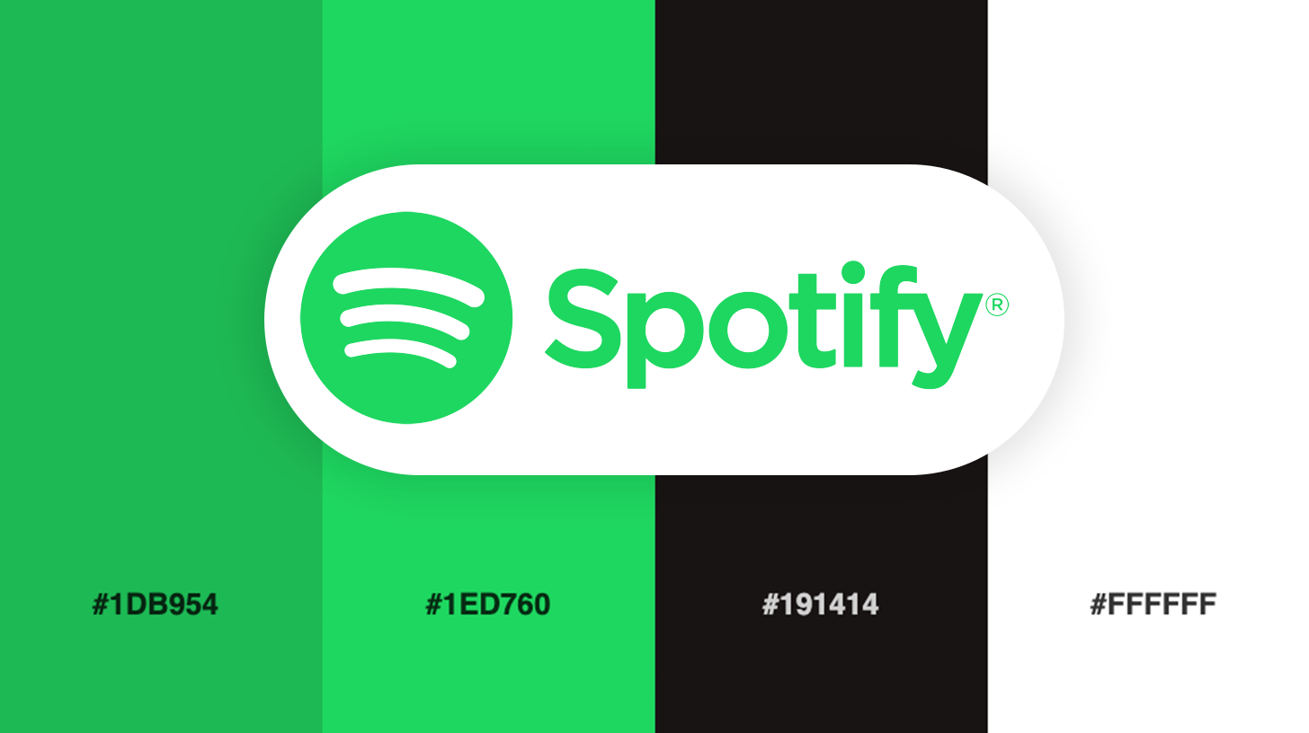
 #1DB954


-
#1ED760
-
#191414
-
#FFFFFF
Download this color palette
 735×1102
Pinterest image

 2160×3840
Vertical wallpaper

 900×900
Square

 3840×2160
4K Wallpaper

In this article:
- The Early Days: Spotify's Initial Color Choices
- The 2013 Redesign: Embracing Minimalism
- The 2015 Brand Refresh: Expanding the Palette
- Symbolism Behind the Colors
- Implementation Across Platforms
- The Evolution Continues
- Lessons for Your Brand
- Conclusion
Color choice can make or break a brand’s visual impact. Few companies illustrate this principle better than Spotify, the streaming giant that has revolutionized how we consume music.
Today, I want to dive deep into Spotify’s color palette—a distinctive visual identity that has helped propel this Swedish startup into a global powerhouse with over 500 million active users. Whether you’re a designer looking for inspiration or a business owner trying to understand the power of color psychology, there’s a lot we can learn from Spotify’s approach.
The Early Days: Spotify’s Initial Color Choices
When Spotify launched in 2006, the digital landscape was cluttered with countless music platforms vying for attention. To stand out, Spotify needed something bold and memorable—and they found it in a vibrant, fluorescent green.
This wasn’t just any green, but an electric, almost neon shade that demanded attention. In those early days, the goal was simple: capture eyeballs in a crowded marketplace. The choice was strategic and deliberate.
“Design is the silent ambassadors of your brand,” famous logo designer Paul Rand once said. And Spotify’s initial ambassador was loud, energetic, and impossible to ignore—much like the disruptive service they were offering to the music industry.
The bright green paired with black created a stark contrast that was not only visually striking but also perfectly captured the youthful, tech-forward spirit of the brand. It was a color palette that said, “We’re not your father’s music service; we’re the future.”
But as with any good brand, evolution was inevitable.
The 2013 Redesign: Embracing Minimalism
By 2013, Spotify had established itself as a serious player in the music streaming world. No longer the scrappy startup, it was time for the brand to mature visually while maintaining its distinctive character.
The 2013 redesign marked a significant shift. The fluorescent green was toned down to a more sophisticated hue (#1DB954)—still distinctively “Spotify green” but with a more refined quality. This change was accompanied by a cleaner, sans-serif typeface and a simplified logo that enhanced scalability and modern appeal.
This evolution wasn’t just about aesthetics. As Spotify expanded to more devices and platforms, they needed a visual identity that would work across all mediums—from tiny mobile screens to large desktop displays. The simplified palette and logo provided the flexibility required for this expansion.
The shift also reflected broader design trends of the time, with many tech companies moving toward minimalism and flat design. But unlike some brands that lost their distinctiveness in this transition, Spotify maintained its unique visual character. The green remained, just in a more sophisticated form.
Think of it this way: Spotify’s brand had grown up. It had traded its loud teenage clothes for a well-tailored suit, while still keeping that signature green pocket square.
The 2015 Brand Refresh: Expanding the Palette
As Spotify continued to grow, they faced a new challenge: how to accommodate an increasingly diverse range of content and marketing needs while maintaining brand consistency.
The answer came in 2015 with a significant brand refresh that expanded their color palette while staying true to their core identity. The classic Spotify green and black remained the heroes, but they were now supported by a broader spectrum of colors to create more dynamic visual experiences.
One of the most notable innovations was the introduction of duotone imagery—a technique that applied two-color filters to photographs, often incorporating that signature Spotify green. This approach allowed for visual variety while ensuring that every image still felt unmistakably “Spotify.”
The expanded palette wasn’t just about looking good; it served a functional purpose. With millions of artists and billions of songs, Spotify needed to create visual distinction between different playlists, genres, and content categories. The broader color palette provided the tools to create these distinctions while maintaining overall brand coherence.
It’s a reminder that the best brand systems aren’t rigid—they’re flexible frameworks that can adapt to different contexts while still being instantly recognizable.
Symbolism Behind the Colors
Every great brand color has meaning beyond mere aesthetics. For Spotify, each core color in their palette carries specific symbolic weight:
Spotify Green
The signature Spotify green represents growth, creativity, and freshness. It’s a color associated with nature and vitality, reflecting the organic way music grows and evolves. There’s also an energetic quality to this particular shade of green that captures the dynamic nature of music itself.
The color stands out in the tech landscape, where blues (Facebook, Twitter, LinkedIn) and reds (YouTube, Netflix) dominate. This differentiation was a deliberate choice—a visual way of saying, “We’re doing something different here.”
As American graphic designer Paula Scher once noted, “It’s through mistakes that you actually can grow. You have to get bad in order to get good.” Spotify’s journey with their green has been one of refinement rather than replacement—they didn’t abandon their signature color, they evolved it.
Black
The deep, rich black that forms the backdrop of the Spotify interface serves multiple purposes. First, it provides incredible contrast for both the green elements and the colorful album artwork that populates the platform. This helps album covers pop and creates an immersive visual experience.
Beyond functional considerations, black conveys sophistication and elegance. It’s timeless and neutral, allowing other elements to shine while providing a cohesive framework. In the context of music, it also evokes the darkness of concert venues and the focus that comes with deep listening.
White
Completing the core triad is white, used primarily for text and user interface elements. White symbolizes simplicity and clarity—critical qualities for a service that needs to present massive amounts of information in an accessible way.
The interplay between these three colors—green, black, and white—creates a visual system that’s both distinctive and highly functional. It’s a palette that works as well on a billboard as it does on a smartphone screen.
Implementation Across Platforms
What’s truly impressive about Spotify’s color palette is its consistent implementation across an ever-expanding ecosystem of platforms and touchpoints. From mobile apps to desktop interfaces, from marketing materials to festival sponsorships, the Spotify visual identity remains cohesive.
This consistency didn’t happen by accident. It required careful planning and a robust brand system that could flex without breaking. The company has clearly invested in developing comprehensive brand guidelines that govern how their colors are used across different contexts.
Yet within this consistency, there’s room for creative expression. Seasonal campaigns might introduce temporary complementary colors. Feature launches might play with different visual treatments. But the core palette remains the anchor that ties everything together.
This balance between consistency and flexibility is something every brand should aspire to. As a designer, I’ve found that the most successful brand systems aren’t those with the most rules—they’re the ones with the right rules, applied intelligently.
For example, Spotify’s outdoor advertising often features their signature green prominently, creating instant brand recognition even from a distance. Their app icons maintain the same green across iOS, Android, and desktop platforms, ensuring users instantly recognize the app regardless of device.
During special events or themed campaigns, Spotify might emphasize different elements of their palette, but the core colors always maintain a presence, keeping the brand consistent even when exploring new visual territory.
The Evolution Continues
Like any forward-thinking brand, Spotify continues to evolve its visual identity. Recent years have seen subtle refinements to their color palette, with slightly different shades of green appearing in different contexts and an expanded set of complementary colors for various playlist categories and moods.
The 2022 updates to their app interface introduced more color customization options, allowing elements of the UI to adapt to album artwork colors—a clever way to maintain brand identity while creating a more personalized visual experience for users.
What’s fascinating about these evolutions is that they’re never revolutionary—they’re evolutionary. Spotify understands that their color palette has built up significant brand equity over the years, and radical changes would squander that advantage. Instead, they refine and expand within a consistent framework.
This approach mirrors how successful musicians evolve their sound—Madonna, David Bowie, Taylor Swift—they all changed their style throughout their careers without losing their core identity. Spotify seems to apply the same philosophy to their visual brand.
Lessons for Your Brand
So what can we learn from Spotify’s color palette journey? Here are a few key takeaways:
- Distinctiveness matters: Choose a signature color that can help you stand out in your industry.
- Evolution, not revolution: Refine your palette over time rather than making jarring changes that might confuse your audience.
- Functional beauty: Your colors should look good, but they also need to work in practical application across all platforms.
- Flexibility within framework: Create a color system with enough variety to meet different needs while maintaining core consistency.
- Emotional connection: Select colors that evoke the right feelings and associations for your brand promise.
Conclusion
Spotify’s color palette has been instrumental in establishing its brand identity in a crowded digital landscape. From its early days of fluorescent green to today’s more sophisticated implementation, the evolution reflects the company’s growth while maintaining its distinctive character.
What makes Spotify’s approach particularly successful is how their colors do more than just look good—they serve the core purpose of the platform by creating an environment where music takes center stage. The dark background recedes, allowing album artwork to pop. The green provides just enough brand presence without overwhelming the content.
In a world where attention is the scarcest resource, Spotify’s color palette helps them cut through the noise, just as their service helps users find the perfect song among millions of options.
If you’re designing your own brand’s color palette, remember that the strongest brands tell simple visual stories. As designer Sagi Haviv puts it, “A logo is the period at the end of a sentence, not the sentence itself.” The same philosophy applies to your color choices—they should punctuate your brand story, not overwhelm it.
The next time you open Spotify, take a moment to appreciate how those familiar greens, blacks, and whites create not just a visual experience, but an emotional one. That’s the power of a well-executed color palette—and it’s something every brand should aspire to achieve.