-
#ffc1cc
-
#ffe0b2
-
#fff8b0
-
#d5fcd6
-
#c2f0ff
-
#c5d9ff
-
#d9c2f0
-
#ffddf4
Download this color palette
In this article:
- What Makes a Color "Pastel"?
- A Colorful Journey Through Time
- The Psychology Behind the Softness
- Real-World Applications
- Design Implementation Strategies
- Avoiding Common Pitfalls
- The Future of Pastel Design
- Final Thoughts
Few palettes are as universally appealing as the pastel rainbow. There’s something magical about these soft, muted versions of vibrant colors that instantly transforms any design from harsh to harmonious.
What Makes a Color “Pastel”?
Let me start with the basics. Pastel colors are simply hues with high lightness and low saturation—think of them as traditional colors mixed generously with white. This creates that signature soft appearance that makes pastels so distinctive and gentle on the eyes.
When I talk about the pastel rainbow palette, I’m referring to a collection of these desaturated colors that spans the entire color spectrum: soft pinks, baby blues, pale yellows, mint greens, and lavender purples. Together, they create a harmonious blend that feels both cohesive and playful.
A Colorful Journey Through Time
The Rococo Era: Where Pastels Got Their Start
The love affair with pastel colors began long before Instagram feeds and millennial aesthetic. During the 18th century Rococo era, artists discovered the power of these lighter tones. French artist Jean-Honoré Fragonard was a master at using pastels to convey romance and whimsy in his paintings.

What I find fascinating is how these artists used pastels not just for their visual appeal, but for their emotional impact. They understood that soft colors could evoke feelings of intimacy and playfulness in ways that bold, saturated colors couldn’t.
Impressionists and Their Soft Touch
Fast forward to the 19th century, and we see Impressionist painters like Claude Monet revolutionizing art with their pastel approach. As someone who appreciates how light plays with color, I’m constantly inspired by how these artists used soft tones to capture fleeting moments—morning mist, sunset reflections, the delicate petals of water lilies.
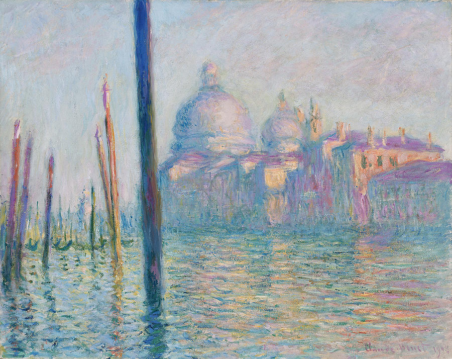
This historical context isn’t just academic knowledge for me. When I’m designing a logo or brand identity, I often draw inspiration from these artistic movements. The Impressionists taught us that pastels can be both sophisticated and accessible—a lesson that’s incredibly valuable in modern design.
The Psychology Behind the Softness
Emotional Responses to Pastel Colors
Here’s what I’ve learned from years of client work: different pastel colors trigger distinct emotional responses. When I’m pitching a brand identity using pastels, I always explain these psychological effects to my clients:
Pastel Blue – This is my go-to for creating a sense of calm and trust. I’ve used it for healthcare brands and financial services where trust is paramount.
Soft Pink – Perfect for conveying warmth and approachability. It’s not just for feminine brands anymore; I’ve successfully used it for coffee shops and tech startups looking to appear more human.
Pale Yellow – This brings joy without being overwhelming. I often incorporate it into designs when I want to add a touch of optimism.
Mint Green – Fresh and creative, it’s ideal for wellness brands or any company wanting to appear innovative yet grounded.
Lavender – This sophisticated hue stimulates creativity while maintaining elegance. I love using it for creative agencies or luxury brands with a playful side.
Cultural Connections
What’s interesting is how universally these soft colors represent similar concepts across cultures. Whether I’m working with clients from Japan, Brazil, or Sweden, pastels consistently evoke ideas of:
- Youth and innocence
- Serenity and peace
- Springtime and renewal
- Gentle beauty and approachability
This universal appeal makes pastels incredibly versatile for global brands—something I always emphasize to my international clients.
Real-World Applications
Interior Design That Soothes the Soul
I’ve collaborated with several interior designers over the years, and pastels are always their secret weapon for creating inviting spaces. Here’s what I’ve observed:
In nurseries, pastels create a cocoon of safety and comfort. I once designed a complete branding package for a high-end nursery furniture company, and we used the full pastel rainbow to represent their “Dreams Come True” collection.
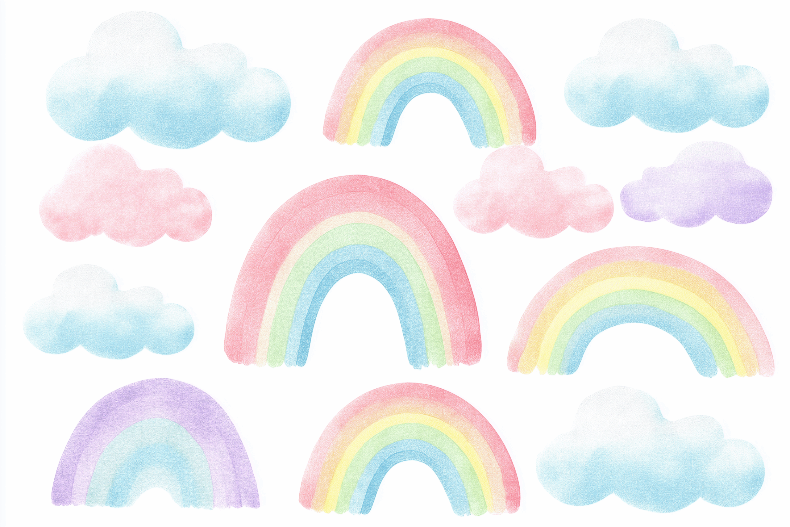
Bedrooms benefit from pastels because these colors naturally promote relaxation. I’ve noticed that hotels using pastel color schemes in their marketing tend to emphasize comfort and luxury.
Fashion’s Love Affair with Soft Colors
Fashion brands know what they’re doing when they embrace pastels. I’ve worked with several clothing companies, and spring collections almost always feature pastel rainbows. Why? Because these colors photograph beautifully on social media and appeal to a wide age range.
One of my most successful projects was rebranding a sustainable fashion startup. We used a pastel rainbow approach to communicate their eco-friendly message—the soft colors perfectly represented their gentle approach to fashion production.
Digital Branding That Whispers Instead of Shouts
In our overstimulated digital world, pastels offer brands a way to stand out by being gentle. I’ve seen this trend explode in:
Wellness apps – Almost every meditation or mindfulness app I’ve designed has incorporated pastels. They signal to users that this is a space for calm, not chaos.
Lifestyle brands – Companies selling everything from organic skincare to artisanal candles use pastels to communicate quality and thoughtfulness.
Tech startups – Contrary to what you might think, many tech companies are moving away from bold blues and reds toward softer palettes. It humanizes their brand and makes technology feel more approachable.
Design Implementation Strategies
Here’s how I typically implement these palettes:
Product Packaging: For a artisanal soap company, I created packaging using alternating pastel colors. Each scent got its own pastel, but they worked together as a cohesive product line.
Web Design: One of my favorite projects was designing a website for a children’s educational platform. We used the full pastel rainbow to code different subject areas—math got soft blue, science got mint green, and so on.
Event Decor: I’ve consulted on several brand activations where pastels created Instagram-worthy backdrops without being overwhelming. The key is balance—using 60% white space with 40% pastel accents.
Avoiding Common Pitfalls
From my experience, here are the mistakes I see designers make with pastels:
- Using too many at once – Even though it’s called a “rainbow,” that doesn’t mean every color needs to appear in every design.
- Forgetting contrast – Pastels can look washed out without proper contrast. I always include at least one deeper tone for text or important elements.
- Ignoring context – Not every brand should use pastels. A law firm or financial institution might find them too casual.
The Future of Pastel Design
Looking ahead, I see pastels continuing to evolve. The rise of digital wellness and mindful technology means these soft colors will likely become even more important in screen-based design.
I’m particularly excited about how pastels work in dark mode interfaces—they pop beautifully against dark backgrounds while maintaining their gentle character.
Final Thoughts
The pastel rainbow palette isn’t just a trend—it’s a timeless approach to color that speaks to our human need for beauty and calm. As someone who’s spent over a decade working with these colors, I can confidently say they offer unmatched versatility and emotional resonance.
Whether you’re designing a logo for a startup, creating packaging for a lifestyle brand, or simply wanting to bring more joy into your personal projects, the pastel rainbow palette provides a foundation that’s both sophisticated and approachable.
Remember, great design isn’t about using the most colors or the boldest statements. Sometimes, the most powerful designs whisper rather than shout. And pastels? They’ve mastered the art of the whisper.
As I always tell my clients: choose colors that reflect your brand’s heart, not just what’s trending. If your brand values gentleness, creativity, and approachability, then the pastel rainbow palette might just be your perfect match.


