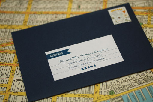
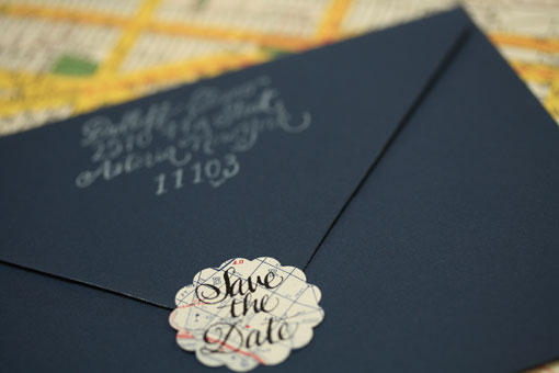
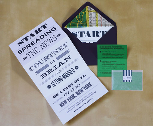
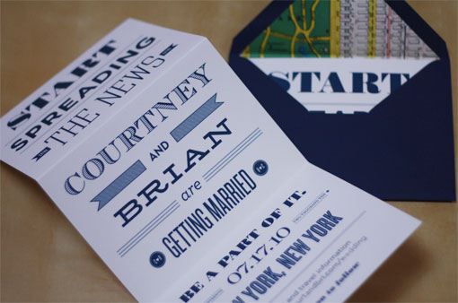
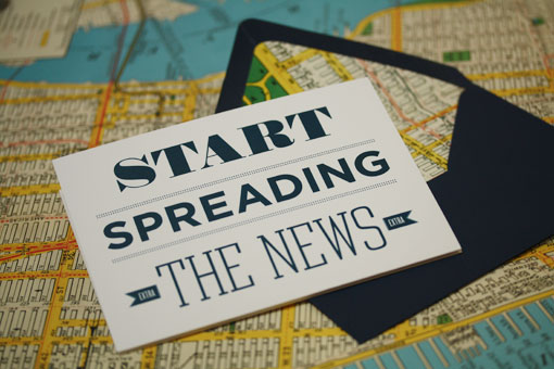
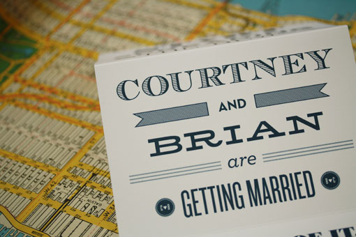
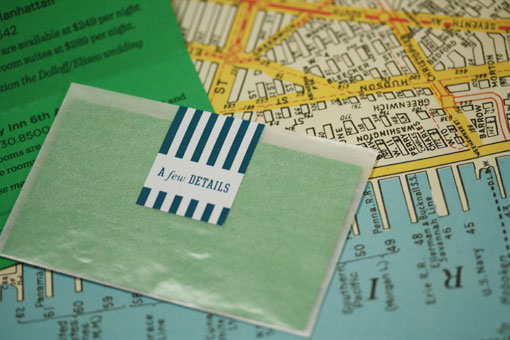
Normally I like to keep anything personal out of this blog. However, although this particular example falls into that category, it is also 100% design-related, so I thought it would be appropriate to share. The last couple of months we have been diligently working on the Save the Dates for our wedding (originally posted here), and our hard work has finally paid off. They are complete and out the door, and we’re really excited about the outcome. Today they are even featured on one of my favorite wedding blogs, The Inspired Bride.
We actually have a site devoted to paper goods and wedding stationery in the works—email subscribers you will be the first to know when we launch. But in the meantime we are accepting custom orders. If you’re interested, don’t hesitate to send an email our way!

Get 300+ Fonts for FREE
Enter your email to download our 100% free "Font Lover's Bundle". For commercial & personal use. No royalties. No fees. No attribution. 100% free to use anywhere.