I recently spotted Poly’s packaging design for Stark Skincare on Dribbble, and knew I had to share it with you. Here’s a bit of background straight from the source:
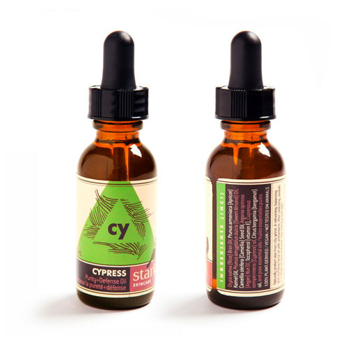
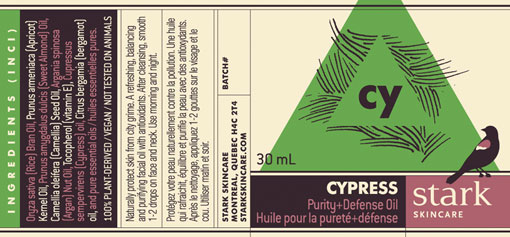
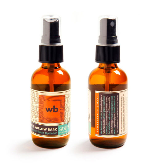
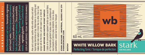
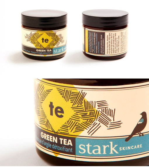
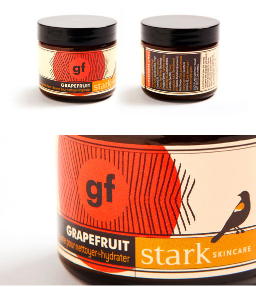
Poly was enlisted to evolve the Stark Skincare brand into labels for their inaugural skincare line. Stark wanted packaging that distinguished itself, which meant boldly displaying ingredients and production details as well as being visually striking. This series was an absolute blast to work on – a great opportunity to create an interesting play between our linework, vivid colours and a quasi-scientific ‘elemental’ layout.
Stark Skincare was created in 2011, as a reaction to greenwashed and conventional skincare products. Stark uses 100% all-natural ingredients to create products made specifically for city life.

Get 300+ Fonts for FREE
Enter your email to download our 100% free "Font Lover's Bundle". For commercial & personal use. No royalties. No fees. No attribution. 100% free to use anywhere.


Creative Credits:
Illustration: Jamie Lawson, Poly
Printing: Pazazz
Photography: Danijela Pruginic
