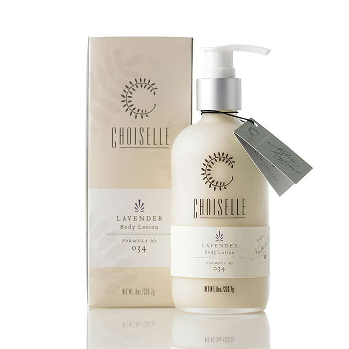
Pennsylvania-based studio Projekt recently created a beautiful new identity and packaging system for Choiselle, a new line of all natural skincare products.
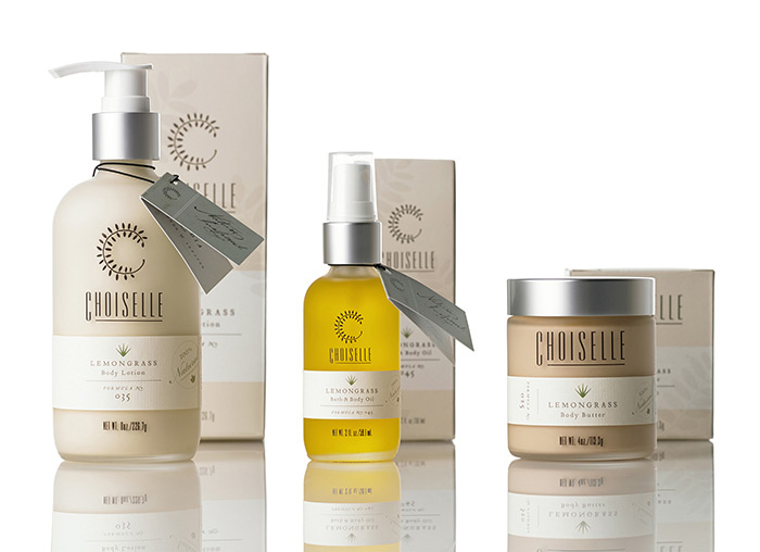
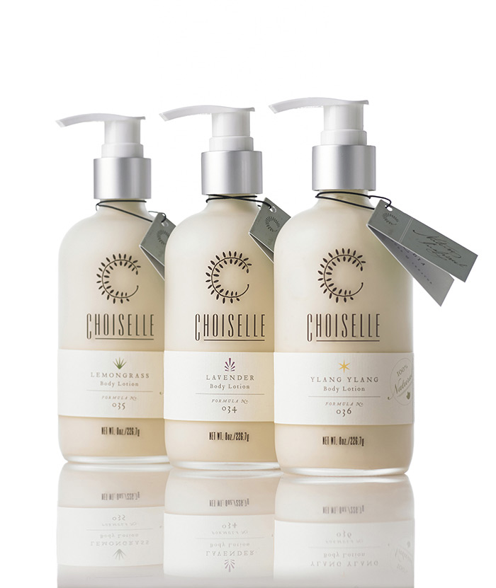
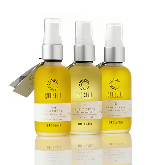
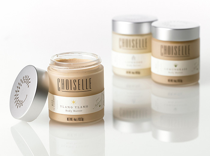
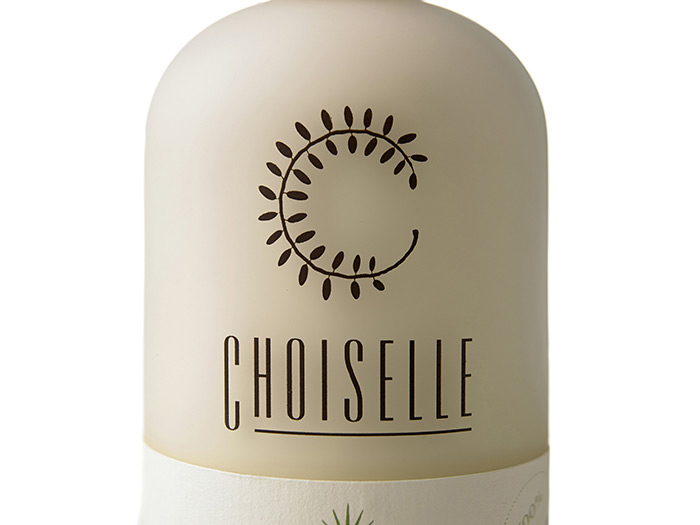
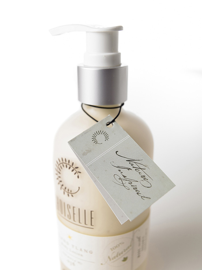
We began with the logo, which hints at Choiselle’s heritage using a nature-inspired “C”. Next we moved on to the bottle graphics which were silk-screened directly to the bottles themselves in one color, before a scent-specific label was printed and hand-applied. Only then did they go in the box. Which we also designed. Finally, the finishing touch was a hangtag that visually detailed the company’s origins, just like the logo.

Get 300+ Fonts for FREE
Enter your email to download our 100% free "Font Lover's Bundle". For commercial & personal use. No royalties. No fees. No attribution. 100% free to use anywhere.
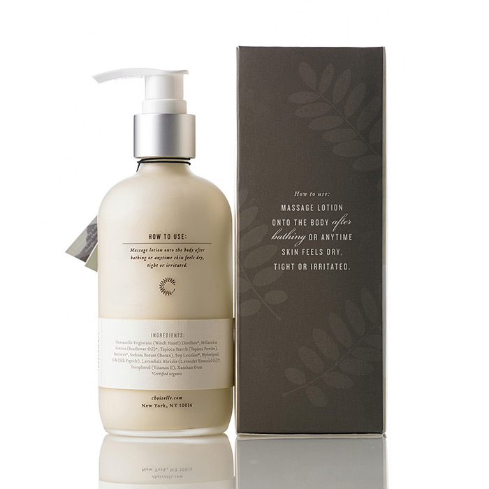
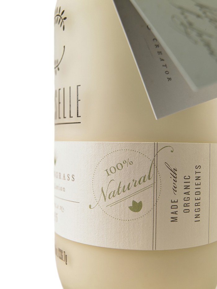
The work Projekt took on began with the brand’s logo and identity and ended with a packaging system for the entire range of products, all of which can now be purchased on the Choiselle site.
