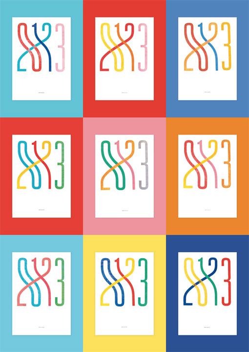
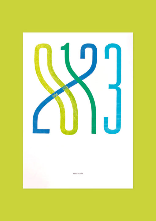
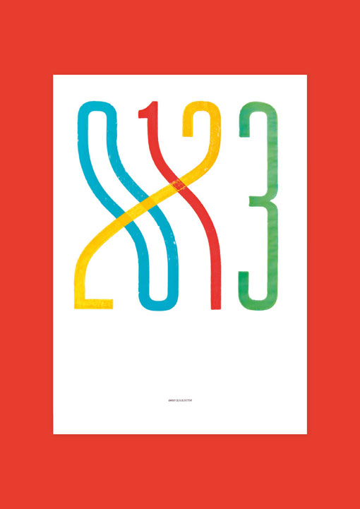
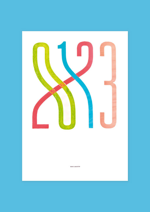
Singapore-based studio Pupilpeople has released a colorful series of typographic 2013 prints, using hand-mixed block printing ink pressed with teak wood on Maple Bright. The series includes single-color prints, which have been released in editions of 50, and four-color prints, which are released in editions of one. Here’s a bit of insight into the thinking behind the design:
As a numeric sequence, 0-1-2-3 is the most common way to arrange the first four numbers we know. Yet, as a marker of time, the same set of numbers can be ordered differently to form a combination that is just as right. Dedicated to the year 2013, our print is built upon this contemplation — the notion that order is subjective, never absolute.

Get 300+ Fonts for FREE
Enter your email to download our 100% free "Font Lover's Bundle". For commercial & personal use. No royalties. No fees. No attribution. 100% free to use anywhere.
