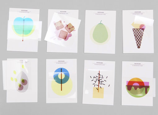
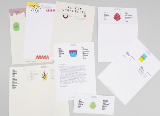
This colorful and playful identity was designed by Netherlands-based studio Raw Color for Keukenconfessies, a food design studio:
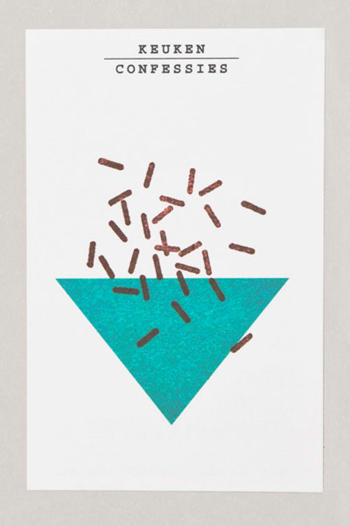
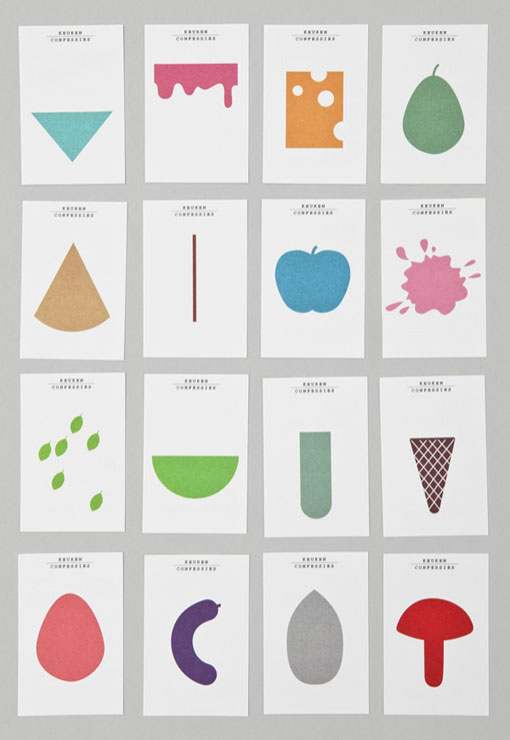
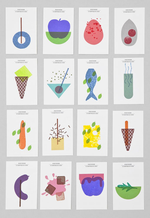
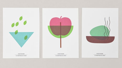
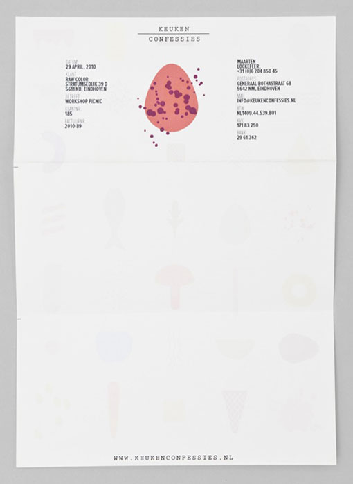
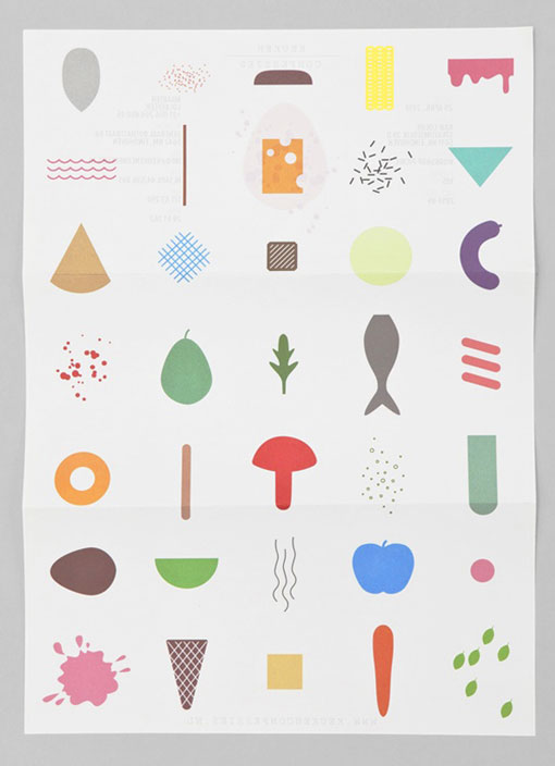
For their identity we searched for a mixture of moods, prints, colours and printing techniques. We were asked to design a ‘logo’ that could change, for this we came up with different, independent shapes coming from food and cooking, some more abstract then others. With these shapes you could mix endless combinations. For the business cards we added a stamp layer, to make the identity a bit more rough and playfull. The identity is based on a simple and strong shape language. For the typography is chosen a black and bold lettertype, it gives a robust feeling next to the colourful shapes. For all the printed matter we used uncoated paper. The stationary paper is only printed on the back site, here the overview from all illustrations are visible, in this case they can use the paper for different occasions.

Get 300+ Fonts for FREE
Enter your email to download our 100% free "Font Lover's Bundle". For commercial & personal use. No royalties. No fees. No attribution. 100% free to use anywhere.
