In this article:
- The Most Realistic Chalkboard Fonts of 2026
- Characteristics of Chalkboard Fonts
- Use Cases for Chalkboard Fonts
- How to Use Chalkboard Fonts Effectively
- Sum Up the Significance of Chalkboard Fonts in Design
Whether you’re crafting a digital masterpiece or a printed invitation, choosing the right chalkboard font can make all the difference. Chalkboard fonts have soared in popularity for their nostalgic and artistic flair, bringing a touch of whimsy to everything from wedding stationery to Instagram graphics.
But with countless styles available, how do you pick the perfect one for your project? This post will guide you through the top chalkboard fonts that combine vintage charm with modern appeal, helping you elevate your designs effortlessly.
The Most Realistic Chalkboard Fonts of 2026
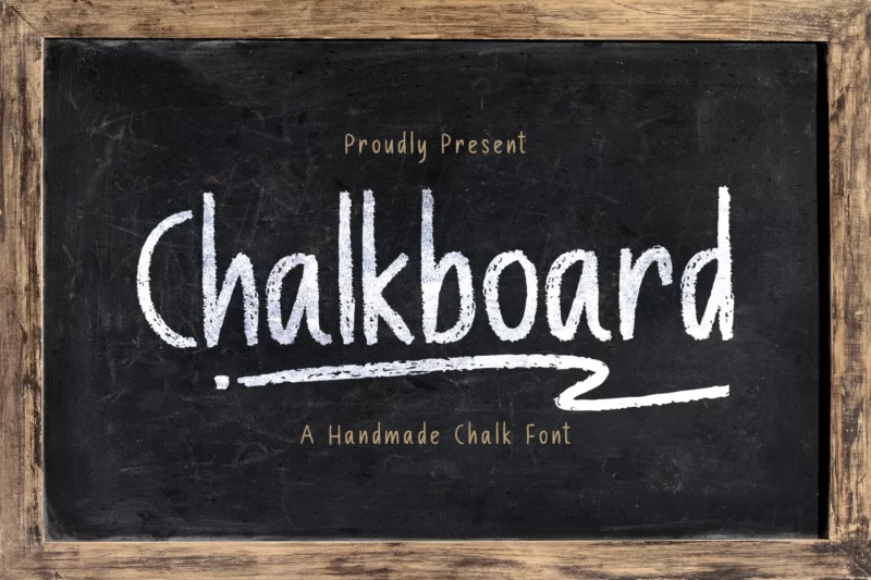
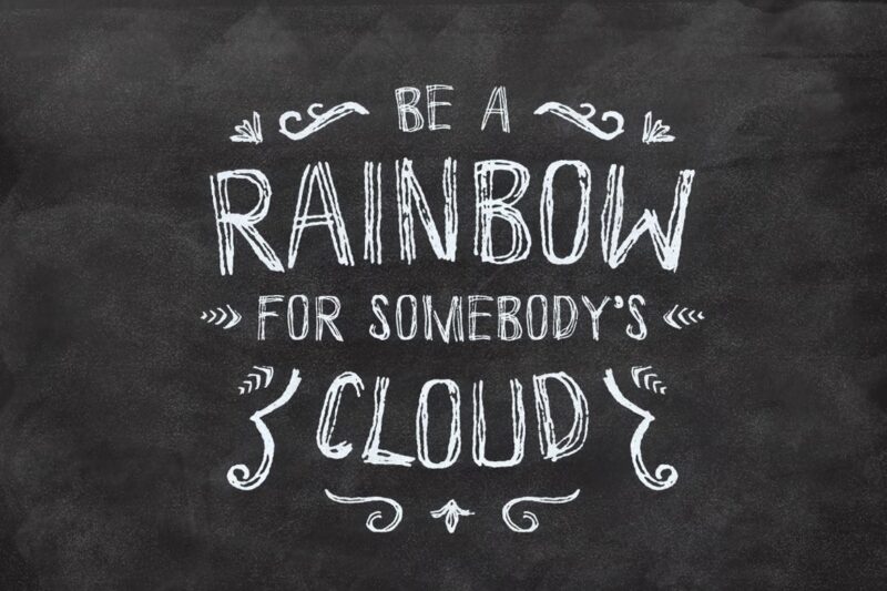
Chalk Board
A handmade decorative chalk font designed for authentic display purposes. Features natural chalk textures.
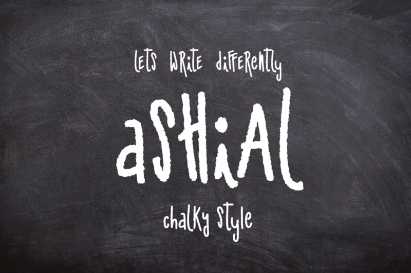
Ashial
A chalky style script font featuring handwritten elements. Combines hand-drawn aesthetics with chalk textures.
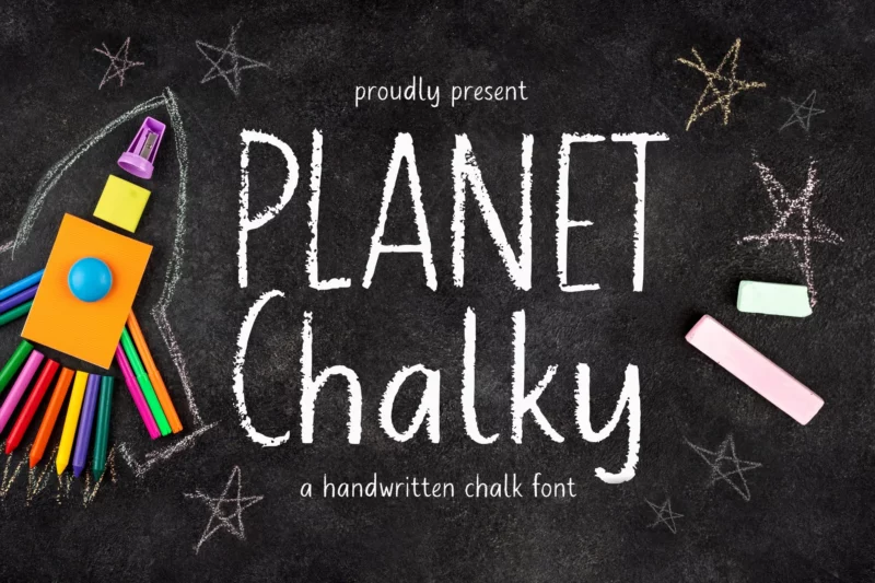
AL Planet Chalky

Get 300+ Fonts for FREE
Enter your email to download our 100% free "Font Lover's Bundle". For commercial & personal use. No royalties. No fees. No attribution. 100% free to use anywhere.
A stylish script font with personal handwritten qualities and chalk textures.
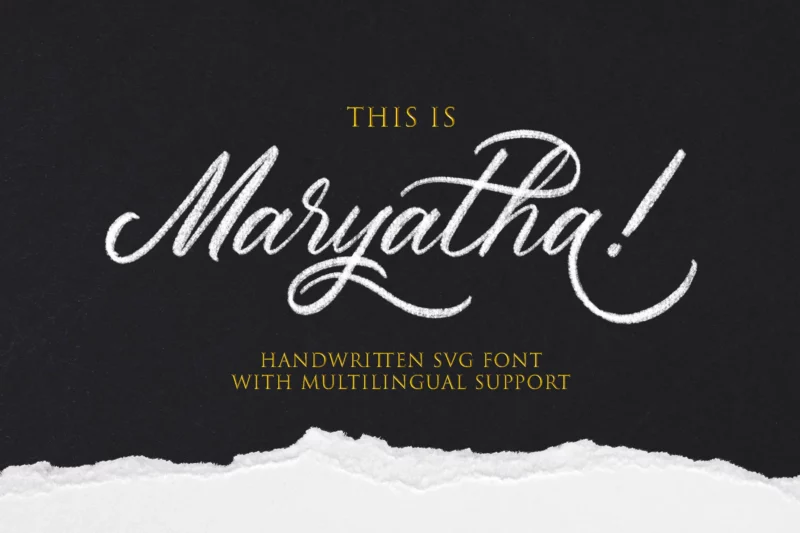
Maryatha SVG
A script and handwritten font available in SVG format. Features flowing script elements.
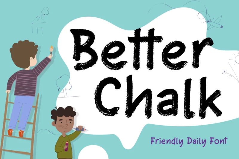
Better Chalk
A script and handwritten font designed for kids and advertising purposes. Features a natural chalk aesthetic.
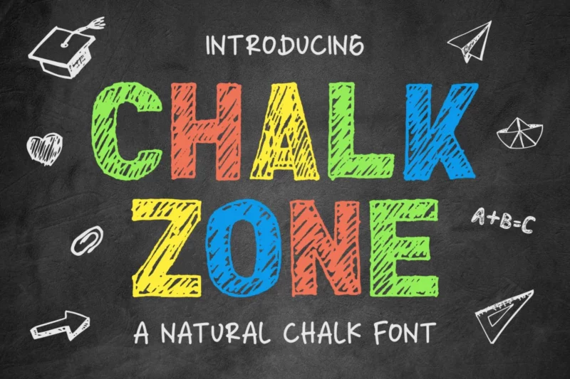
Chalk Zone
A natural chalk-style sans-serif font with decorative elements. Perfect for creating authentic chalkboard designs.
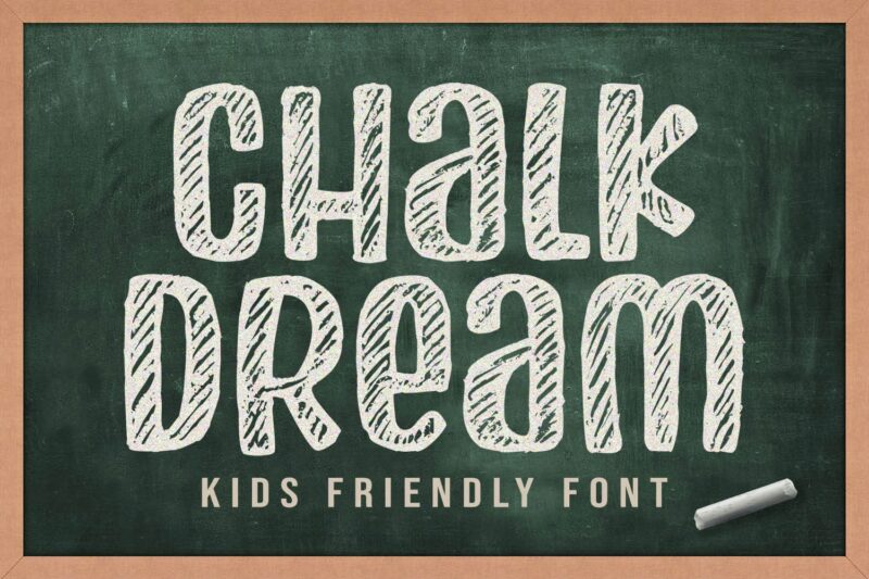
Chalk Dream
A decorative chalk font specifically designed with children and kids in mind. Features playful elements.
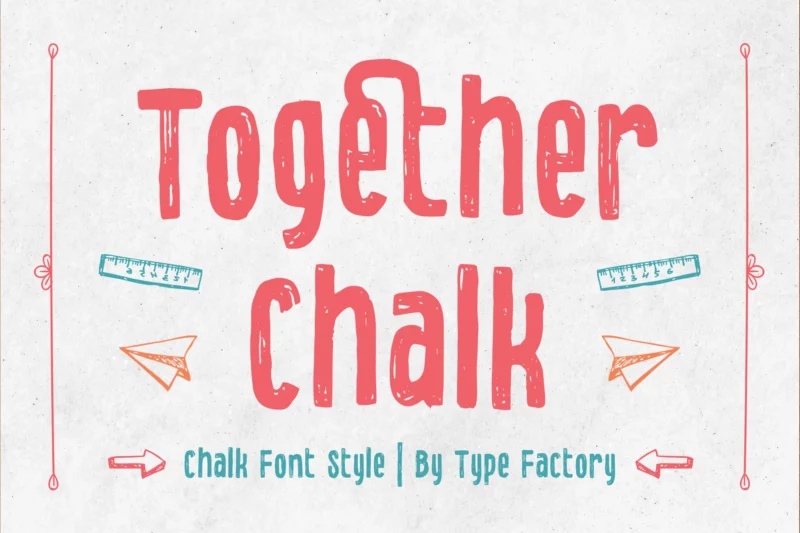
Together Chalk
A decorative chalk font style that combines blackboard aesthetics with cartoon elements.
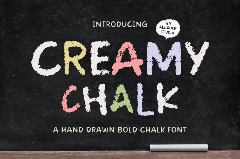
AL – Creamy Chalk
A handdrawn script font with a rough, authentic chalk texture. Features natural handwritten qualities.
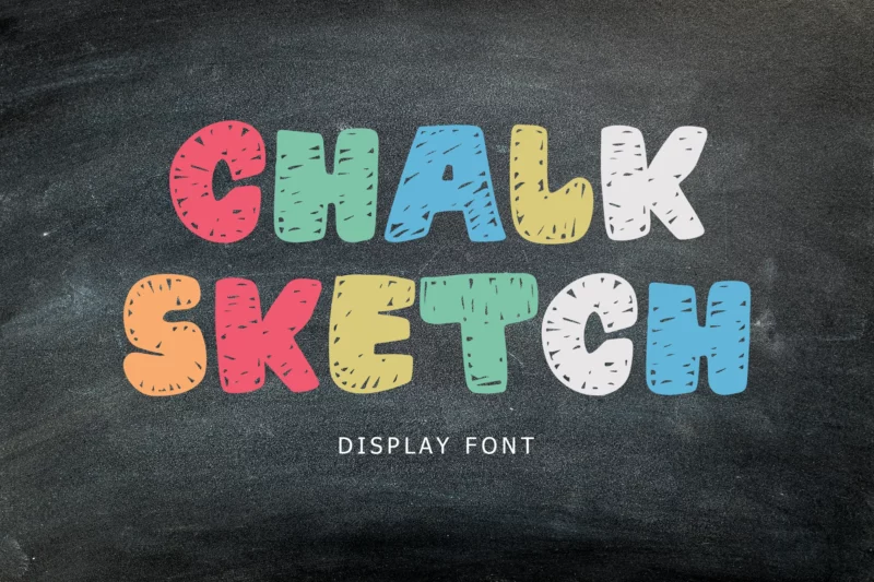
Chalk Sketch
A handwritten monoline display font that mimics natural chalk strokes. Perfect for headlines and titles.
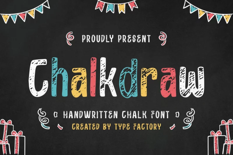
Chalkdraw
A decorative handwritten chalk font suitable for comic-style designs and cover art.
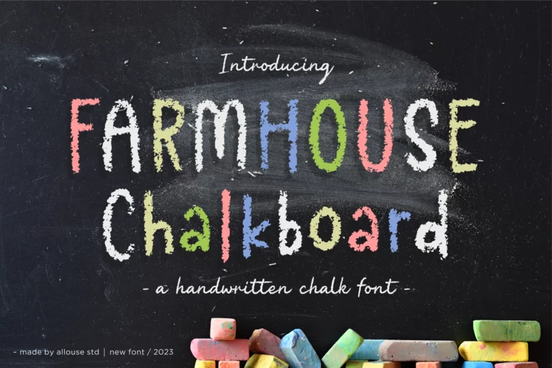
AL – Farmhouse Chalkboard
A rustic, handdrawn script font with authentic chalk textures. Perfect for farmhouse-style designs.
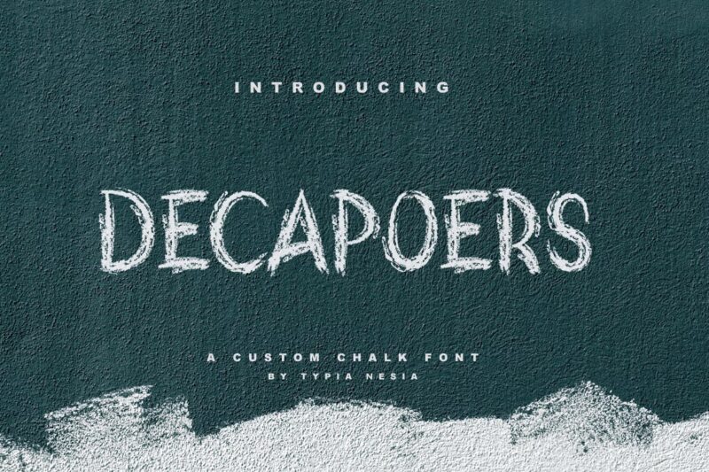
DeCapoers
A versatile font combining sans-serif and script styles with chalk textures. Features black and white contrast.
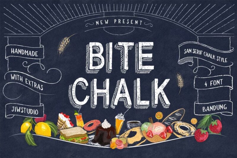
BiteChalk
A comprehensive typeface combining sans-serif and script styles, ideal for menu boards and handdrawn designs.
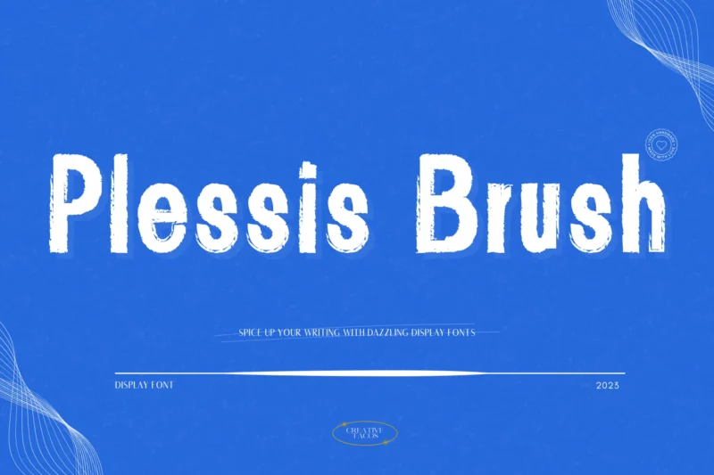
Plessis Brush
A display font combining script and handwritten styles, suitable for Halloween and dramatic displays.
Vanderchalk
A decorative script font featuring chalk-style lettering. Perfect for handwritten typography designs.
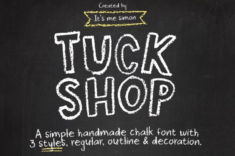
Tuck Shop
A chalk-style sans-serif font designed for casual, shop-style typography. Features authentic chalk texture.
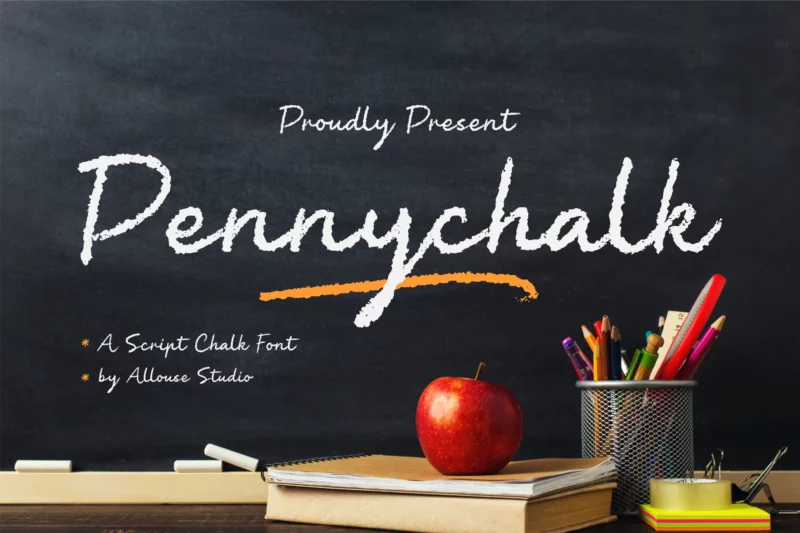
AL – Pennychalk
A handdrawn script font featuring authentic chalk textures and natural handwritten qualities.
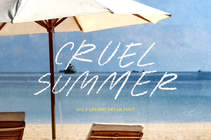
Cruel Summer
A dry brush script font designed for display purposes with handwritten characteristics.
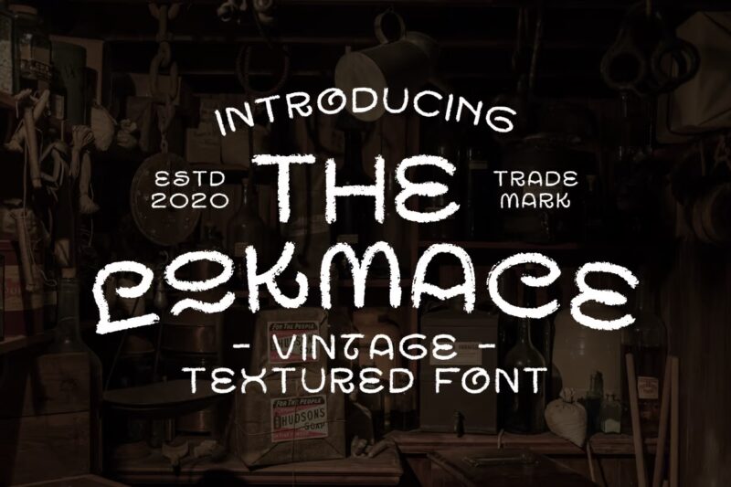
Lokmace
A vintage-style sans-serif decorative font featuring brush textures. Perfect for retro designs.
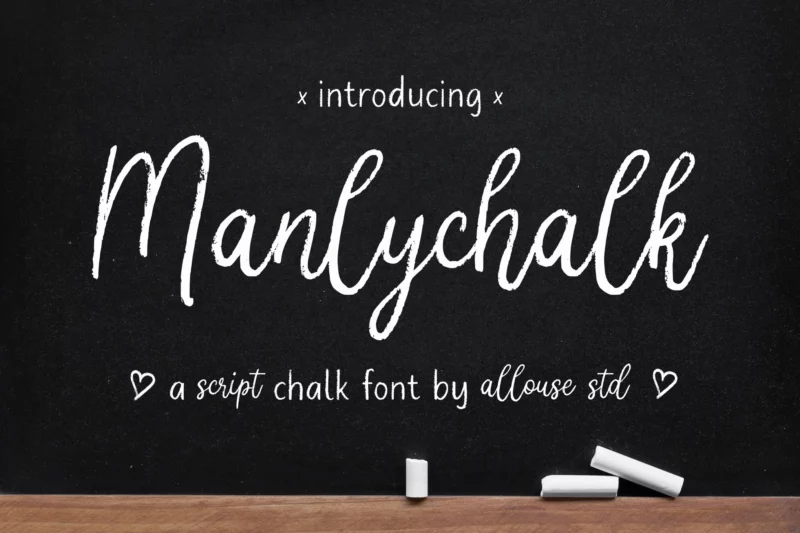
AL Manlychalk
A bold script font combining brush and chalk textures for a masculine appearance.
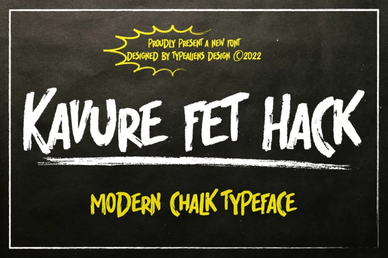
Kavure fet Hack
A decorative font designed for unique text effects and display purposes.
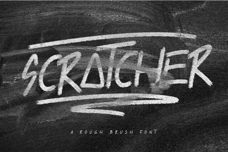
Scratcher
A handwritten brush-style font suitable for display purposes. Features natural brush strokes.
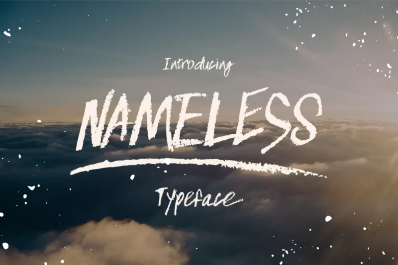
Nameless
A script typeface featuring brush textures and handwritten qualities. Perfect for natural, flowing designs.
Characteristics of Chalkboard Fonts
Chalkboard fonts bring a nostalgic, hand-crafted feel to any design. They’re instantly recognizable by their playful and informal style, reminiscent of the days when chalkboards were the primary teaching tool in classrooms. These fonts are not just about evoking nostalgia; they also offer versatility and creativity in design applications, from cheerful menus to whimsical event invitations. Let’s dive into some of the defining features of chalkboard fonts.
Handwritten Style
One of the standout traits of chalkboard fonts is their handwritten style. This design element captures the imperfection and personality of real chalk writing. Unlike the precise, uniform appearance of standard digital fonts, chalkboard fonts embrace irregularities. This mimics the texture and flow of traditional chalk lettering on a board, where each letter can vary slightly in shape or size. The outcome is a lively, personalized effect that feels spontaneous and genuine. This is why many designers turn to chalkboard fonts to add an authentic, human touch to their projects.
Variety of Weights
A fascinating feature of chalkboard fonts is the range of weights available, from light and airy to bold and sturdy. Different weights can dramatically alter the feel of a design. A lightweight chalkboard font may convey an airy, casual vibe, suitable for informal contexts or subdued background texts. On the other hand, a bold version stands out with authority and prominence, ideal for headings or to grab attention. Designers can choose these variations to match the mood they want to create, playing with emphasis and readability in their compositions.
Decorative Elements
Chalkboard fonts often include unique decorative elements that enhance their visual allure. Flourishes, outlines, and even small doodle-like embellishments can accompany the main lettering, adding layers of interest and intricacy. These decorative touches echo the charming doodles one might find on real chalkboards, adding character and a touch of whimsy. Such features not only make the text more engaging but also allow for creative expression, elevating a simple message into something striking and memorable. Whether it’s elegant swirls or playful accents, these adornments help transform basic content into a compelling visual narrative.
Use Cases for Chalkboard Fonts
When it comes to creative design projects, chalkboard fonts have carved out a niche for themselves, exuding warmth and personality that’s often hard to achieve with traditional fonts. They bring a hand-crafted touch that feels both nostalgic and fresh. From event invitations to digital platforms, let’s explore how these fonts are being used to enhance various forms of communication.
Event Invitations
Chalkboard fonts are perfect for event invitations if you want to add a personal and informal touch. Imagine receiving a wedding invitation that looks like it was handwritten on a vintage chalkboard. It instantly sets a tone that’s both elegant and approachable. Why do they work well?
- Personal Touch: These fonts give the impression of handwritten notes, making the invite feel like it’s crafted specifically for the recipient.
- Versatility: They fit a variety of themes, from rustic barn weddings to chic city celebrations.
- Visual Appeal: The textured appearance draws attention and adds depth to the design.
Menus and Signage
Restaurants and cafes have embraced chalkboard fonts, especially for menus and signage. There’s something about the clean, rustic look that makes comfort food seem even more inviting. This trend isn’t just about aesthetics; it’s about creating an experience.
- Trendy Vibe: Chalkboard fonts complement the cozy, laid-back atmosphere that many eateries aim for.
- Adaptability: Menus change often, and chalkboard fonts make it easy to update offerings without a complete redesign.
- Eye-Catching: Bold lettering and chalk-like textures help menu items stand out, encouraging diners to explore specials and new dishes.
Digital Designs
In the digital space, chalkboard fonts are making waves on websites and social media graphics. They break the monotony of standard fonts and inject a dose of creativity.
- Social Media Posts: Whether it’s an Instagram story or a Facebook post, these fonts make content pop and engage viewers more effectively.
- Website Banners: Add a quirky headline to a homepage or a blog, or emphasize a call to action with a font that feels handmade.
- Graphic Design Projects: From digital brochures to online ads, the adaptable nature of chalkboard fonts means they can fit into almost any digital layout, offering a cohesive yet distinctive look.
Chalkboard fonts, with their handcrafted charm, are not just a passing trend. Their versatility in both traditional and digital applications makes them a powerful tool for designers looking to create memorable, engaging visuals.
How to Use Chalkboard Fonts Effectively
Chalkboard fonts can add a unique and playful charm to any design, giving your projects an artisanal feel that captivates attention. Whether you’re crafting invitations, designing a logo, or creating advertisements, the versatility of these fonts can be a major asset in your creative toolkit. But, like any tool, knowing how to use them effectively is crucial for achieving the best results.
Choosing the Right Font: Tips on Selecting a Font That Fits the Overall Theme and Message
Selecting the perfect chalkboard font is more than just picking what looks good; it’s about choosing a font that aligns with your theme and communicates your message clearly.
- Understand Your Project’s Mood: Is your design fun and whimsical, or elegant and formal? Use this as a guide to choose between playful script fonts or more structured serif styles.
- Consider Legibility: While a quirky, hand-drawn look can be charming, always prioritize readability. Ensure your audience can easily understand your message at a glance.
- Match Font Weight to Usage: Lighter, airy fonts can be great for informal notes or background text, while bold styles are perfect for headings or emphasis.
- Test Your Font Against Your Background: Especially important with chalkboard fonts, ensure that your chosen font doesn’t blend into its background. Contrast is key to making your design pop.
Combining Fonts: Advice on Pairing Chalkboard Fonts with Other Typography Styles
Incorporating more than one font into a design can elevate its appeal, but knowing how to pair fonts effectively is an art.
- Mix with Moderation: Stick to a maximum of two or three fonts to avoid a chaotic appearance. Choose one primary font and one or two accents to complement it.
- Blend Opposites for Balance: Pair a decorative chalkboard font with a clean, sans-serif typeface to create balance and highlight your primary message.
- Sync Font Styles with Themes: Ensure combined fonts share stylistic elements or align thematically with your project. Similar line thickness or complementary curves can help them harmonize.
- Use Hierarchy to Guide the Eye: Decide which parts of your text should stand out and assign fonts accordingly. Something eye-catching will likely draw focus, while a subtler font will support the main narrative.
By choosing fonts that complement your design’s intent and learning how to combine them thoughtfully, you can make your designs not only visually appealing but also effective in delivering their message.
Sum Up the Significance of Chalkboard Fonts in Design
Chalkboard fonts aren’t just about evoking nostalgia; they’re about injecting creativity and charm into your designs. They add a unique touch, making your projects feel warm and personal. Whether you’re designing for print or digital platforms, these fonts provide an opportunity to stand out and create impact.
Unleash Your Creativity
- Expressive Designs: Chalkboard fonts let you convey messages in a creative and engaging way. They’re perfect for adding personality to everything from wedding invitations to restaurant menus.
- Versatile Applications: Use them across different mediums. They adapt wonderfully to both traditional print and modern digital designs, giving you the freedom to experiment.
- Personal Touch: These fonts mimic the imperfections of hand-drawn lettering, offering an authentic and heartfelt look that resonates with audiences.
Why not explore these fonts further in your next project? They open up a world of possibilities for expressing your unique style and vision. Dive in and see how these charming fonts can transform your work into something truly memorable.

