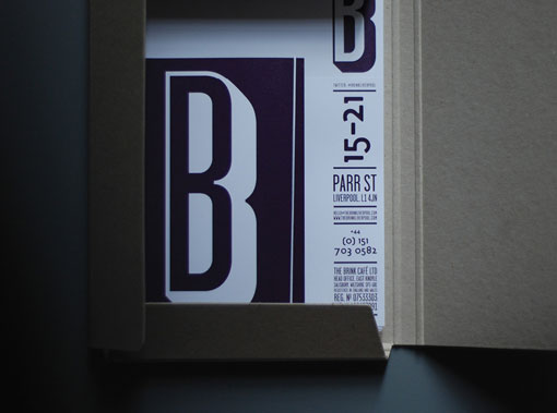
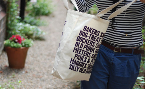
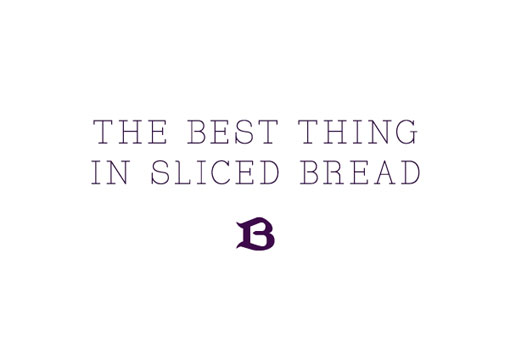
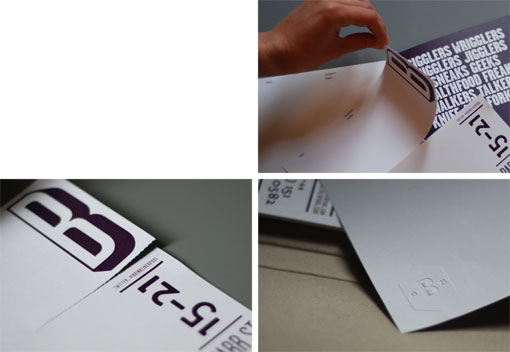
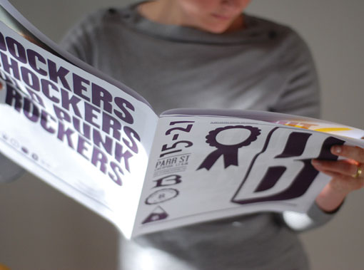
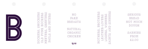
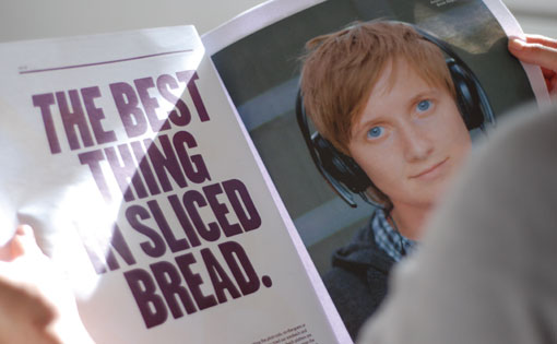
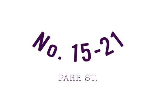
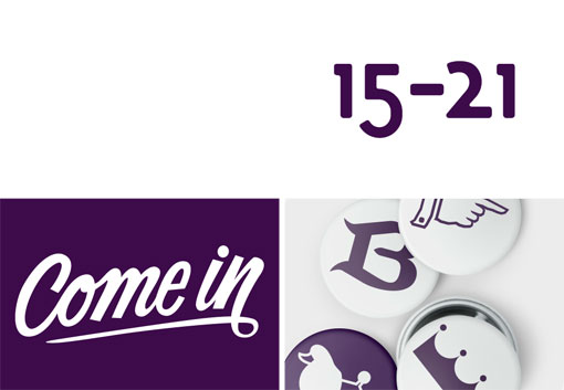
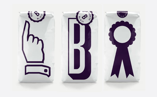
Check out this identity developed by SB Studio for The Brink, which is a dry bar in the UK. I absolutely love the punchy graphics and the degree of interest they’ve established using only two colors.
Inventing a brand that has a voice, one with style, swagger and a wry smile. One that would engage anyone in the city — not just those recovering from addiction. The Brink is Liverpool’s first dry bar. Formed by Action on Addiction, its fundamental aim was to create a place where those recovering from addiction can go and socialise, attend events, or just hang out — without the temptation of anything stronger than coffee.
The brief was to build a lively, celebratory, positive brand. No earnest messaging about the dangers of addiction or the joys of sobriety, instead, a brand with energy. In its visual and verbal identity, it doesn’t dwell on the ‘dry’ aspect, but includes it as an element within a much broader, richer personality.

Get 300+ Fonts for FREE
Enter your email to download our 100% free "Font Lover's Bundle". For commercial & personal use. No royalties. No fees. No attribution. 100% free to use anywhere.
