In this article:
- What Is Skeuomorphism?
- What Is Neumorphism?
- What Is Glassmorphism?
- Skeuomorphism vs Neumorphism vs Glassmorphism: 5 Differences To Help You Choose The Right UI Design Trend
- Conclusion
If you have spent any time exploring UI styles, you already know how intense the neumorphism vs skeuomorphism vs glassmorphism debate gets. Every style has a fan club ready to declare their pick the “future of design,” and honestly, it feels like choosing between 3 completely different personalities.
And here’s the fun part – all 3 styles deliver great results when they are used with purpose. The problem is that designers keep treating them like rival gangs instead of tools. But we are going to change that in this article. You will get a clear sense of how each design approach behaves inside modern interfaces and how you can pick the right one.
What Is Skeuomorphism?
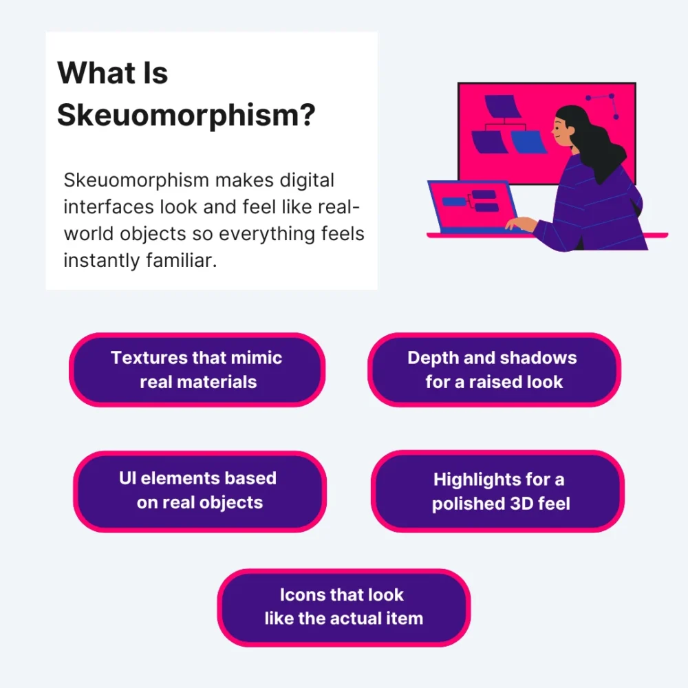
Skeuomorphism is a design style that makes digital interfaces look and feel like real-world objects. It creates textures, shadows, highlights, and tiny details that mimic something you would actually touch in real life. The whole idea is to help you instantly understand how something works because it resembles something familiar.
Key Elements Of Skeuomorphism
- Realistic Textures: Designers use surfaces that look like wood, leather, metal, paper, or plastic. It imitates real-world textures to give the interface a “physical” feel.
- Depth & Shadows: Everything has layers. Buttons stick out. Panels sink in. Shadows direct your eyes so you know what is tappable.
- Familiar and Approachable Design Objects: Digital objects mimic real-life objects – notepads, calculators, switches, dials. If it exists in the physical world, skeuomorphic design elements copy it.
- Highlights & Reflections: Shiny surfaces and light effects make UI elements polished and three-dimensional.
- Literal Icons: Icons look like the thing they represent. A trash icon looks like an actual trash bin. A camera icon looks like a real camera.
3 Real-World Examples Of Skeuomorphism
1. Sewing Parts Online
Sewing Parts Online uses skeuomorphism to make the entire shopping experience feel familiar to anyone who has ever used a physical sewing kit. The product cards look like fabric swatches pinned to a real corkboard, and that visual choice does more than decorate the page.
It helps users understand where to look first, because each “pinned” item sits slightly raised with a soft shadow behind it. The site uses textured backgrounds specifically for high-interaction zones like category filters or thread-color selectors. This creates a visual separation without overwhelming the layout.
Even the product comparison table shows subtle grid lines that resemble tailor’s chalk, giving users a sense of precision and control when comparing stitch lengths or bobbin sizes. Every skeuomorphic decision adds clarity for people who already understand the physical version of these tools, which makes their experience more intuitive.
Get 300+ Fonts for FREE
Enter your email to download our 100% free "Font Lover's Bundle". For commercial & personal use. No royalties. No fees. No attribution. 100% free to use anywhere.
2. EXT Cabinets
EXT Cabinets uses skeuomorphism in a very different way. Their interface leans into materials you would actually find inside a cabinetry shop. Every category panel shifts slightly in tone depending on the cabinet style being viewed.
The shadows under each door sample are calibrated to feel like a real showroom, so the user gets a sense of depth that helps them compare raised panels and inset styles. The color selectors have a mild sheen, which helps customers imagine how light reflects off a finished installation.
The goal is simple and specific – reduce hesitation during the planning stage. The skeuomorphic touchpoints make each step like the early stages of a real remodel, which brings users closer to the final decision because the visuals match what they expect from the physical world.
3. Pergola Kits USA
Pergola Kits USA applies skeuomorphism by using outdoor materials as part of the interface itself. Their configurator is the strongest example. They wrap each control inside elements that seem like real components. The angle selectors mimic brackets with subtle bevels so users can see exactly where structural joints would align.
Even the navigation bar carries a faint stucco texture, which makes the entire experience like planning a real backyard project. This approach works because the skeuomorphic UI reduces uncertainty at every step by turning abstract customization into something practical and easy to follow.
What Is Neumorphism?
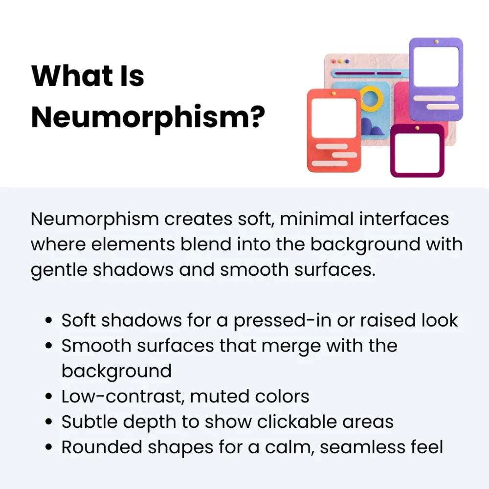
Neumorphism is a soft, modern UI trend built around subtle shadows and smooth surfaces. Rather than making things look real or textured, it keeps everything minimal and gentle.
Elements mix right into the background, almost like they are molded from the same material. It features soft shadows to get a calm and unified look without harsh edges or flashy details.
Key Elements Of Neumorphism
- Soft Shadows: Light and dark shadows on opposite sides create that signature “pushed in” or “popped out” look.
- Smooth, Flat Design Surfaces: Buttons and cards appear to be part of the background. These flat elements keep the interface clean and quiet.
- Low-Contrast Colors: Designers use minimal colour schemes and muted tones so the shadows stand out without making the layout heavy or busy.
- Subtle Depth: Instead of bold layers, you include neumorphic design elements for gentle transitions to show what is clickable.
- Rounded Shapes: Most elements have soft curved designs because sharp corners break the smooth visual flow.
3 Real-World Examples Of Neumorphism
1. CodaPet
CodaPet deals with sensitive, emotional moments, so the UI leans on soft surfaces that are gentle without distracting from the information. The cards sit on a warm background that carries a subtle indentation effect, almost as if each section is gently pressed into a cushion. This creates a clear separation between content blocks without sharp lines or hard contrast.
Their location search bar uses a lightly raised container that guides the eye without aggressive borders. The icons follow the same visual language, so nothing feels abrupt or harsh. CodaPet uses neumorphism the way it was meant to be used: quiet and deeply intentional, especially for situations where emotional comfort matters just as much as clear navigation.
2. MedicalAlertBuyersGuide
MedicalAlertBuyersGuide applies neumorphism more functionally. Instead of focusing on softness for emotional tone, they use it to create a clean and device-centric interface that echoes the look of modern medical tech.
Their comparison dashboard showcases this best. Each tile is in a barely raised container, which instantly builds familiarity for users shopping for alert systems. The ratings module is even more intentional – the score badges are inside soft, concave circles that react subtly when hovered.
For a website built around clarity and trust, neumorphism helps maintain a clinical and polished feel that is approachable and extremely easy on the eyes.
3. Golf Cart Tire Supply
Golf Cart Tire Supply takes neumorphism in a completely different direction by using it to simplify a catalog that could easily feel overwhelming. Product selection involves sizing, load ratings, and compatibility details that confuse beginners, so the site uses neumorphic design to soften the decision-making process.
Their product tiles sit on softly raised canvases that keep each model clearly separated without relying on bold dividers. The size selector uses pill-shaped buttons to help see which option is active without relying on heavy contrast or harsh outlines. Neumorphism here helps turn a technical shopping experience into something smooth and incredibly user-friendly.
What Is Glassmorphism?
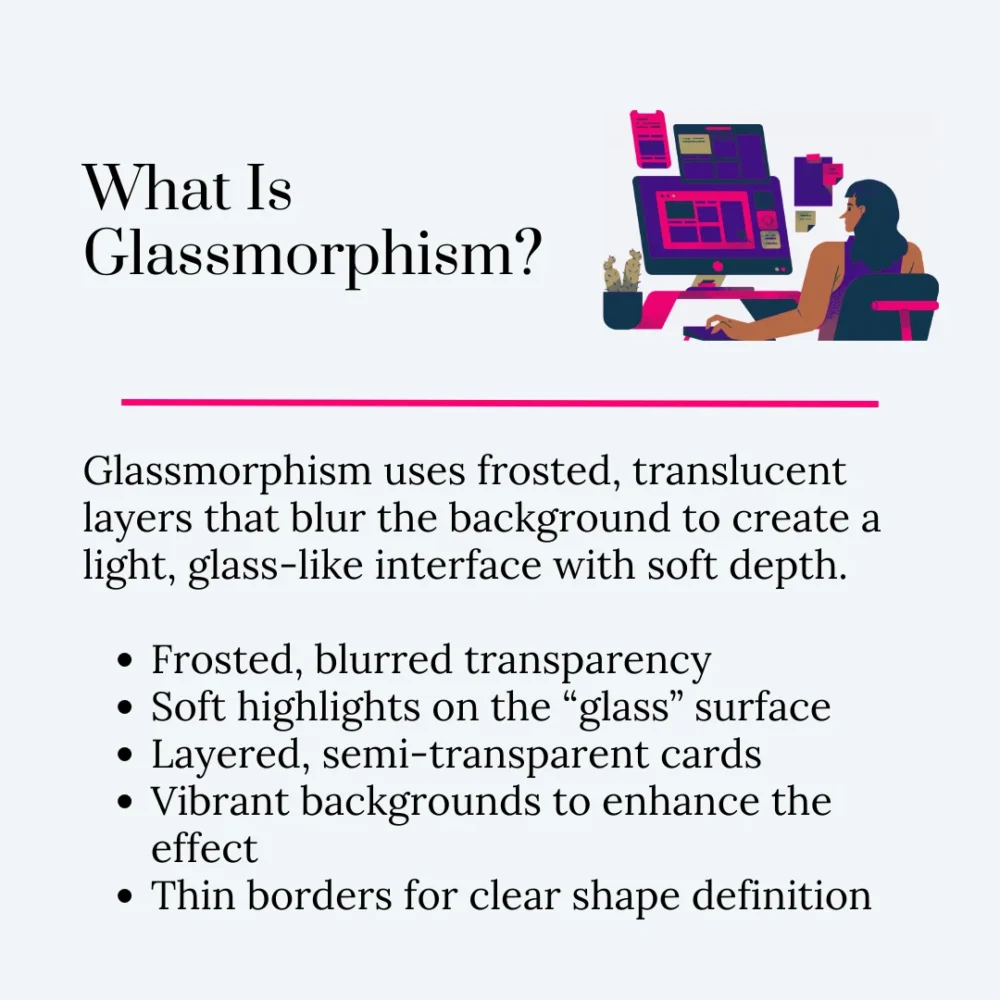
Glassmorphism is a user interface style built around translucent layers that look like frosted glass. You see a hint of whatever is behind the element, but it stays blurred enough to keep things readable. It feels light and airy. The whole design concept creates depth through transparency rather than texture or shadows.
Key Elements Of Glassmorphism
- Frosted Transparency: Elements have a blurred but see-through effect that mimics frosted glass.
- Bright But Subtle Highlights: Soft highlights help the “glass” surface catch light and stand out.
- Layered Depth: Stacked, semi-transparent cards create separation without heavy borders or shadows.
- Vibrant Backgrounds: Colorful gradients or images behind the layers make the glass effect more noticeable.
- Clean, Light Borders: Thin outlines help define the shape so the transparent layer doesn’t blend in too much.
3 Real-World Examples Of Glassmorphism
1. BusinessForSale
BusinessForSale uses glassmorphism to create an open and calm browsing experience, even though the platform handles thousands of listings. Their homepage panels sit on layers that let you see hints of the map or category colors underneath without overwhelming the eyes.
It gives structure to a website that would otherwise feel dense, especially for buyers who want to scan different industries quickly. Their listing cards also help users compare options without losing the sense of space or hierarchy. When you browse on a large screen, the layering becomes even more helpful because it prevents the interface from feeling boxed in.
2. John Campbell Hilton Head Real Estate Agent
John Campbell Hilton Head Real Estate Agent’s website uses glassmorphism to make luxury feel accessible without turning the interface into a glossy distraction. Property detail pages have transparent content blocks that sit over wide-angle living-room or ocean-view shots. This lets visitors stay immersed in the imagery while still reading specs.
The biggest win here is how they create depth on mobile. Instead of stacking boxes and text over each other, the interface is layered and airy, which makes each scroll smoother and more intuitive. For a real estate agent who wants to communicate trust and modern professionalism, this design style fits the brand perfectly.
3. Rosie
Rosie turns glassmorphism into a friendly and approachable experience. Their interface uses soft surfaces with low blur and gentle shadows, so every panel feels softly lifted rather than sharp or high-contrast. This helps guide the user’s attention to essential elements.
Buttons appear as small polished chips that brighten subtly when tapped, which makes each action intentional and reassuring. It is a subtle psychological detail, but it works because the entire design system keeps the focus on clarity and emotional ease. Glassmorphism here isn’t just for aesthetics — it actively supports users who need a gentle, friction-free digital space.
Skeuomorphism vs Neumorphism vs Glassmorphism: 5 Differences To Help You Choose The Right UI Design Trend
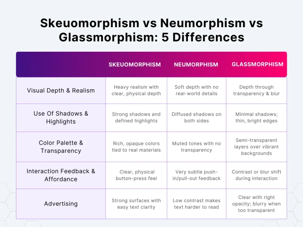
These 3 modern design trends might look like they are doing the same thing, but they behave totally differently. Let’s look at 5 differences that actually matter when you are picking one.
1. Visual Depth & Realism
Skeuomorphism
Skeuomorphism design, also known as the nostalgic design trend, goes all-in on making things look like they belong in your actual hands. Not in a subtle way – it wants you to see the edge, the curve, the shine, the grain.
Every element has a “this object exists by itself” feel because the design treats it like something physical. Depth is obvious. Realism is the priority. It is the only style where details matter more than the shape itself.
Neumorphism
Neumorphism keeps depth but wipes out the realism. It is like everything is sculpted from the same sheet, so nothing seems separate. The depth is so shallow that the UI almost looks quiet. No real-world references. No texture. Just soft shaping that makes elements barely lifted or barely pressed into the surface.
Glassmorphism
Unlike older or traditional designs, glassmorphism creates depth without building anything physical. The entire sense of depth comes from whatever is behind the element. That blurred background shows you the layer order instantly. Nothing is textured. Nothing is sculpted. The transparency and blur do all the work. It feels layered without making the elements heavy.
How To Pick The Correct Design Style
- Check how much visual separation you need between close elements. Some layouts need very obvious depth changes. Others only need light layering.
- Look at how independent each element needs to feel. If your UI has components that must stand out as “physical objects,” you need a depth style that gives each one its own identity.
- Decide how much background you are willing to expose. Transparent layers change how users read the page because they keep showing what is underneath.
- See how much detail your team can consistently maintain. Some styles need constant polishing. Others stay consistent with very little effort. Pick based on maintenance, not just aesthetics.
2. Use Of Shadows & Highlights
Skeuomorphism
Skeuomorphism treats shadows and highlights like real lighting. Shadows are directional. Highlights follow curves. And both are strong enough to shape the object clearly. And no, they are not decorative elements – they are part of the structure. The UI needs them because without them, the realism falls apart.
Neumorphism
Neumorphism uses shadows like soft cushions. They are diffused. They are subtle. And they are on both sides – a light one and a dark one – to gently shape the surface. Highlights are just part of a subtle gradient that smooths the edges. Everything stays controlled, so nothing looks too sharp.
Glassmorphism
Glassmorphism barely uses shadows. The transparency carries the whole thing. Instead, it uses thin and bright edges to suggest that a panel has a surface. Highlights are around the border to give the frosted glass effect. Shadows stay light, so they don’t fight the translucent effect.
How To Pick The Correct Design Style
- Decide how visible your lighting cues need to be in low-contrast environments. Match the style to the lighting reliability you actually need.
- Look at how much shape definition your design components need. Some layouts rely on lighting to define where design features start and end. Others already have structure from spacing and color.
- Test how shadows behave when elements stack. Your UI’s layering pattern will instantly tell you which shadow logic survives.
- Check how much brightness your highlights introduce to the layout. If you are designing for a restrained palette, highlight intensity can make or break the UI.
3. Color Palette & Transparency
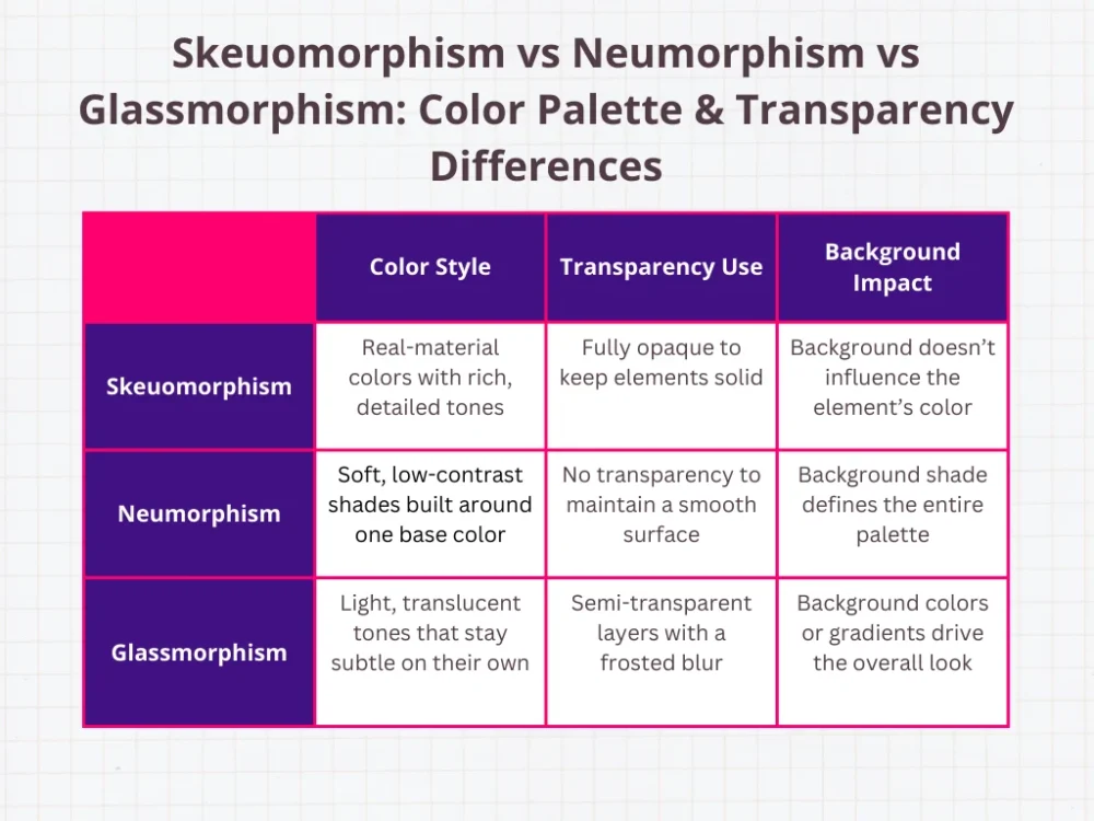
Skeuomorphism
Skeuomorphism depends heavily on color because the style only works when the object looks believable. Leather has a certain range. Metal has a certain shine. You don’t get to choose wildly – the object tells you what the palette must be. The app’s skeuomorphic design elements stay opaque because the whole point is to make the element feel solid.
Neumorphism
Neumorphism only works when the colors stay extremely soft. You are basically building the entire style around one background shade, and the shadows do the rest. That means anything too saturated instantly ruins the effect because the shadows become too obvious.
Designers usually end up with just a handful of workable tones, and most of them are barely different from the background.
Glassmorphism
Glassmorphism changes the logic completely. The color behind the element matters more than the color on the element itself. The “glass” layer usually stays light and semi-transparent, and the background handles the bold or vibrant parts. You are basically designing two color systems – one for the blur layer and one for everything behind it.
How To Pick The Correct Design Style
- Check how often your screens change backgrounds. If your layout regularly switches from dark to light or from calm to busy, note how each style reacts.
- Look at the number of colors your UI system actually needs to function. Some styles work with a narrow palette. Others need a full range for states and components.
- Identify how much of your layout relies on subtle color differences. If your interface uses small color steps to separate zones or states, test whether those steps still read clearly under each style’s color rules.
- Evaluate how predictable your opacity values must stay. If transparency will appear in multiple components, check whether all of them react consistently.
4. Interaction Feedback & Affordance
Skeuomorphism
Skeuomorphism gives you the loudest interaction feedback because every element is built to behave like physical materials. A button actually looks pressed. A switch actually shifts position. A slider physically moves inside a track. The user doesn’t need to assume what is interactive because the element communicates it immediately.
Neumorphism
Neumorphism keeps all interaction feedback extremely low-key. The element still changes shape, but the shift is small – usually just a subtle pull-in or push-out. If you are not paying attention, you can miss it entirely. Affordance becomes a conscious decision – the designer has to put in extra effort to implement interactive elements so they don’t blend in like decoration.
Glassmorphism
Glassmorphism relies on contrast changes to show interaction instead of movement. The element might brighten a bit or tighten the blur during interaction. The user reads the feedback because the element suddenly becomes more defined. It is more noticeable than neumorphism but less literal than skeuomorphism. The feedback is “lighter,” but still present.
How To Pick The Correct Design Style
- Gauge the speed at which your interface needs to confirm an action. Some tasks need instant visual confirmation. Others tolerate slower or softer signals.
- Check the number of design elements that must look interactive even without text labels. When a user has to rely on shape or behavior alone, the style’s clarity becomes obvious fast.
- Test how tap or click states perform when animations are turned off. Your feedback still needs to remain visible without relying on animation curves.
- Place interactive components next to static ones and watch how quickly they blend or stand out. Some styles make everything look too similar. Others differentiate cleanly.
5. Readability & Accessibility
Skeuomorphism
Skeuomorphism makes text easy to read because the element behind the text is a solid, controlled surface. The edges are strong, and the background is stable. The only time readability drops is when designers push textures too far – like using heavy patterns or detailed surfaces that compete with text.
Neumorphism
Neumorphism has the biggest readability challenges. The soft colors, low contrast, and blended surfaces make text easy to lose. If you don’t manually raise contrast or shadows, text simply disappears into the background. Accessibility for visually impaired users becomes a constant push-and-pull because the aesthetic works against clarity at small sizes.
Glassmorphism
Glassmorphism can go either way. When the opacity level is set properly, text looks sharp because the blur neutralizes what is behind it. When the opacity is too low, the background shows through too strongly, and the text loses clarity. You need reliable opacity rules so readability is consistent across backgrounds or images.
How To Pick The Correct Design Style
- Test how your smallest text behaves across different component surfaces. If the smallest labels fail, the style won’t scale.
- Check contrast values using your actual UI backgrounds, not placeholders. A style can pass contrast checks on a blank canvas but fail once your real content is loaded.
- Consider the visual busyness your layout naturally produces. Complex layouts need stable surfaces. Simple layouts can handle more experimentation.
- Look at the consistency of your type hierarchy across screens. When headings and labels fluctuate too much in contrast, the style becomes unstable for your text system.
Conclusion
When it comes to neumorphism vs skeuomorphism vs glassmorphism, the real question isn’t which one looks cooler – it is which one actually works for what you are building.
Don’t pick one just for the sake of it. Pick what fits the interaction and your brand image. That means combining them – a skeuomorphic element to make a key action obvious, a subtle neumorphic panel to calm the eye, and a touch of glassmorphism to give depth and style.
If you want inspiration and a steady stream of ideas to grow your digital design instincts, that is exactly what you will find at DesignWorkLife. We are a crew of designers and creatives building a space for users and design enthusiasts alike. We share everything from engaging user interface tricks to full-blown design stories, all meant to fuel your creativity and sharpen your skills.
Head over – we are here to help with new or modern designs and a little dose of creative joy every time you log in.
