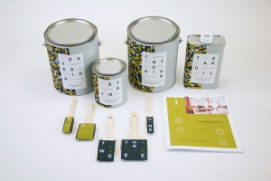
A graphic design student at Fort Hays State University, Josh White recently debuted some impressive concept work. I appreciate how his approach challenges the utilitarian nature of consumer painting products and offers a unique value add to the product in a largely homogeneous market.
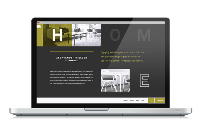
Aleksander Nielsen, having moved from Denmark to the Bay Area, applies knowledge of interior architecture design to plan harmonious spaces, successfully blending Danish functionalism with San Franciscan allure.

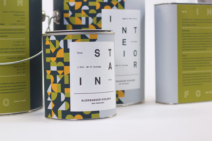
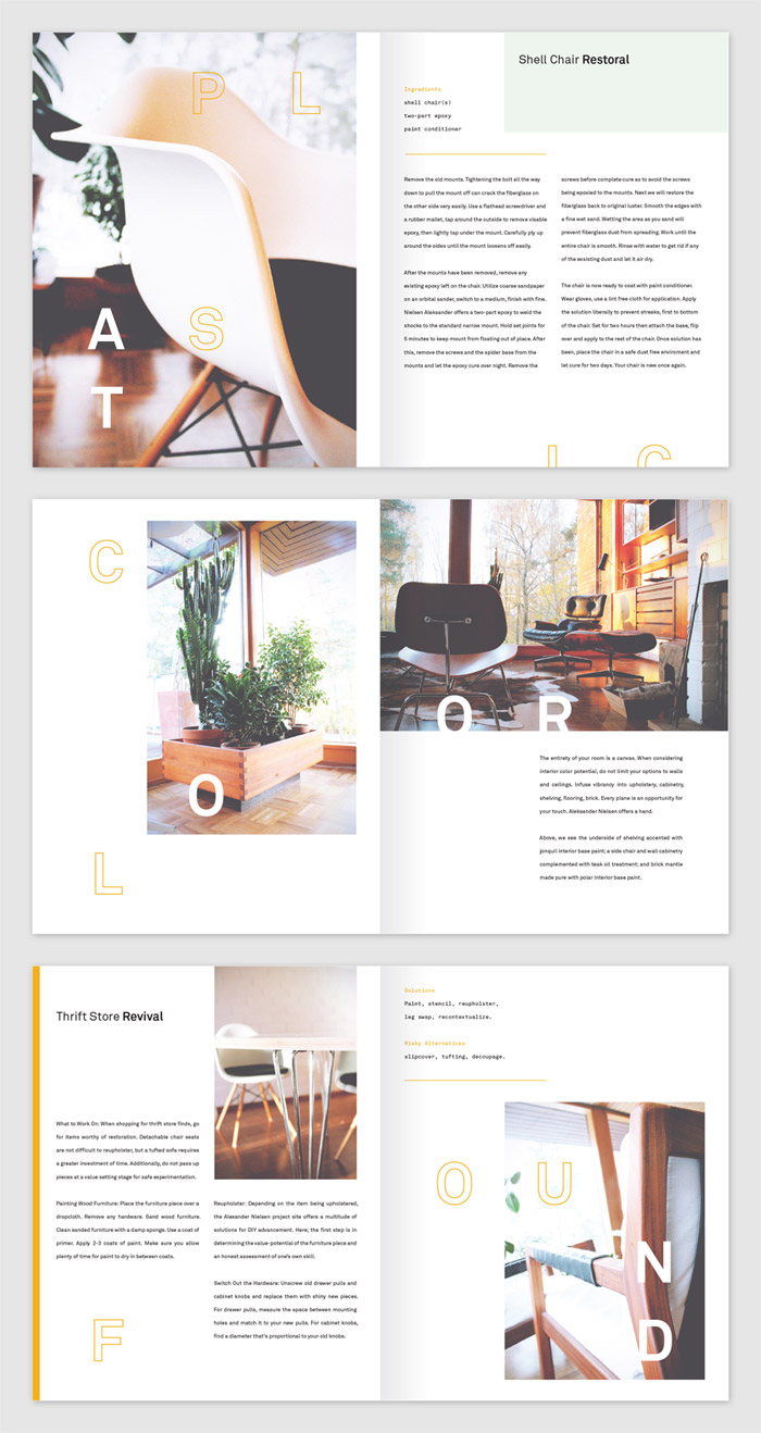
Danish design focuses on modular relationships, space expanded from the square, interrupted by the circle, and complemented by the triangle in way of pattern. We see this as a motif in the work of Nielsen and so such was reflected in the implementation of the studio’s paint collection. Each product operates within the same grid system, allowing for elements to be arranged in unexpected combinations within a cohesive set of constraints. This system was lent across the collection with medium-dependent variation.
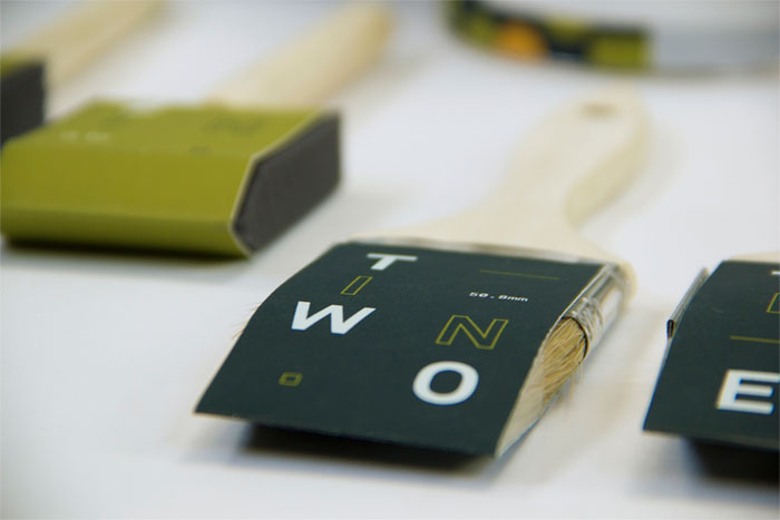
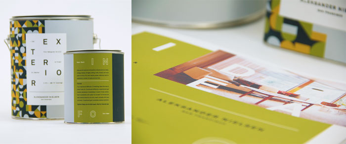
Be sure to explore more of Josh’s work on his portfolio.
Creative Credits
Photography: Pekka and Minna of Olive Green Window

Get 300+ Fonts for FREE
Enter your email to download our 100% free "Font Lover's Bundle". For commercial & personal use. No royalties. No fees. No attribution. 100% free to use anywhere.

