For the month of August (and one day in September!), a series of guest posters will be filling in on DWL with daily posts. Today’s posts come to you from designer Riley Cran. For more from Riley, be sure to check out his blog and follow him on Twitter. Enjoy!
Packaging is one of my favorite disciplines, and this project by Studio H caught my eye recently.
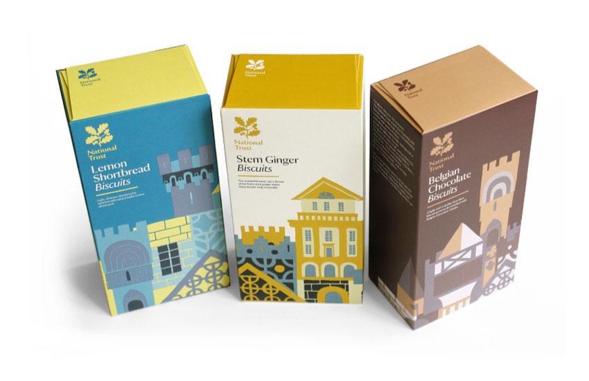
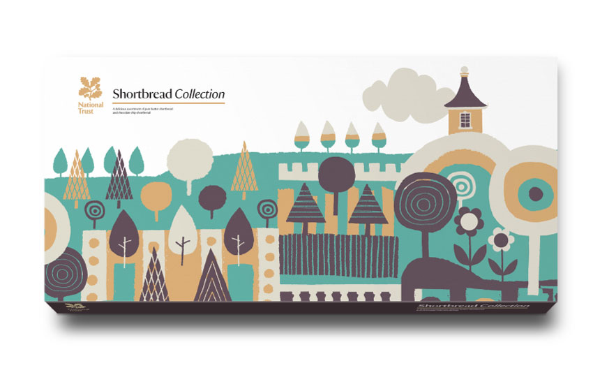
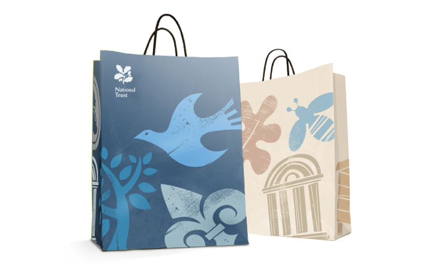
National Trust is an organization that protects historically important architectural specimens, farmland and beaches in the UK. Studio H designed a series of packaging elements for their own line of Biscuits, Chocolate Bars and other products.
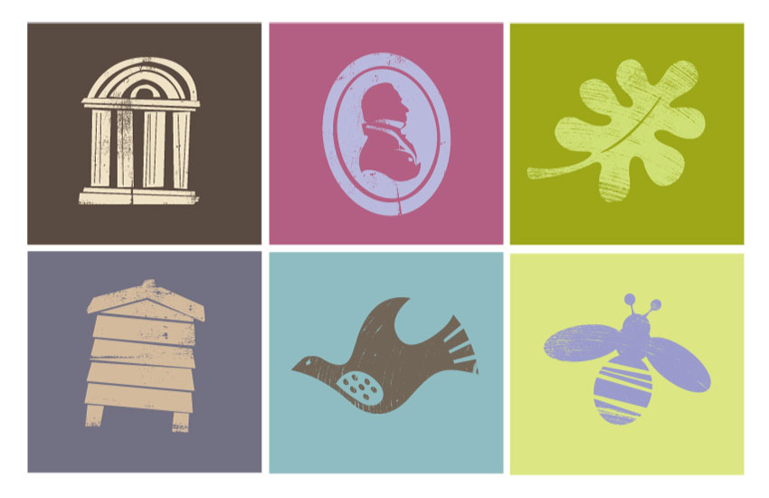
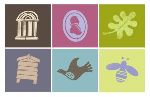
What I particularly like about this design is that all the separate packages work together as a cohesive set, yet each expresses an individual character that is eye catching and functional. As explained by the designer, the use of ‘naive’ illustration lends a friendly, humanistic feeling to these pieces which I think is perfectly in-line with the ethos of the company they represent.
