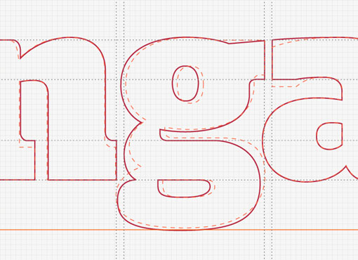
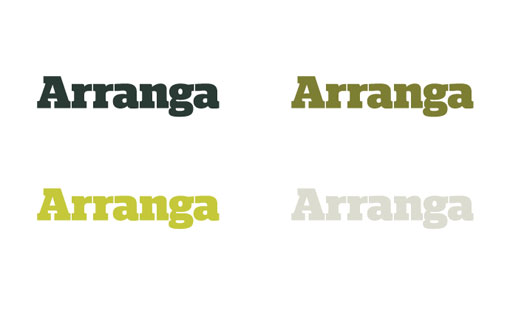
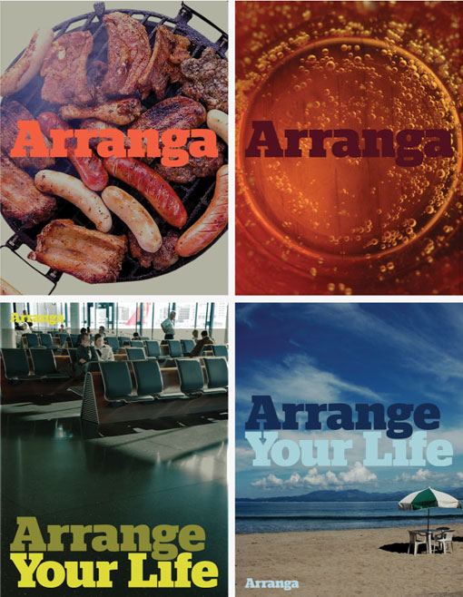
Stylo is a UK-based design firm with a branding specialty, and a knack for clean and informative presentation. I’m particularly interested in the insight they provide into their process, simply by sharing images that document the steps they took along the way, in addition to finished pieces. For each branding case study Stylo presents details of the logo construction, breaks out the individual elements of the brand (typography, color palette etc.) and then application of those elements to one or more finished pieces. It’s a fun experience to be able to essentially scroll through the process in the order that it actually unfolded until you arrive at the final product at the bottom of the page.
Here are a few images from the branding of Arranga—love the use of Stag—to illustrate the idea, but you can see more of the project right here.


Get 300+ Fonts for FREE
Enter your email to download our 100% free "Font Lover's Bundle". For commercial & personal use. No royalties. No fees. No attribution. 100% free to use anywhere.
