In this article:
- 1. Audience-Appropriate Content
- 2. Strategic Organization
- 3. Shareability
- 4. Visual Appeal
- 5. Citations and Additional Information
- Making the Most of Your Infographics
Keeping people interested in content is one of my favorite challenges as a graphic designer. In a world where things constantly compete for the public’s attention, how can I grab and retain the focus of those who see my work?
I’ve learned that infographics can be incredibly effective. They are part of the broader data visualization category, which includes resources that offer graphical representations of information. Charts and graphs are other examples.
Text-only data can be complex to process, but infographics show it in an understandable context and make memorable impressions. What should they include?
1. Audience-Appropriate Content
While sitting in the waiting room at my doctor’s office recently, I noticed an infographic near the receptionist’s desk that gave tips for staying healthy during flu season. I appreciated how the content featured relevant statistics and gave practical tips and reminders anyone could follow. It was a great way to educate people before their appointments.
One of the infographic’s final tips was for people to get annual flu shots. After reading it, I thought about how the designer might also have needed to create a resource giving physicians pointers for engaging with patients who felt fearful or uncertain about following that suggestion.
Doctors know the basics of flu prevention, but they would benefit from infographics that explain the trickier subject of vaccine hesitancy. This experience reminded me of the importance of designing infographics that fit my audience.
An interesting study on this topic involved a team reviewing 79 academic papers about data visualizations and how they defined novice users. The results showed no consistent definition of nonexpert users. Additionally, the sample groups were typically white, college-aged residents of the United States.

Get 300+ Fonts for FREE
Enter your email to download our 100% free "Font Lover's Bundle". For commercial & personal use. No royalties. No fees. No attribution. 100% free to use anywhere.
A person’s current knowledge and what they hope to learn from infographics may not match those groups if they are older or from another country. This is an excellent reminder of how effective infographics must cater to target audiences.
Who will the infographic reach? What do you hope viewers take away from it? Let those questions shape your design work and increase the chances of an audience-appropriate result.
2. Strategic Organization
Identifying your intended audience will help you decide what to include in the infographic. However, determining the best way to present the information is also crucial. That could distinguish between a beneficial, useful infographic and a chaotic, confusing one.
Consider how focal points can draw your audience’s gaze through the content. Use colors, shapes and other visual indicators to help people read the information in the correct order and understand it.
Does your infographic make comparisons, show changes or encourage action? Remembering its purpose can inspire you to organize the content for optimal results.
Strategic Organization in Action
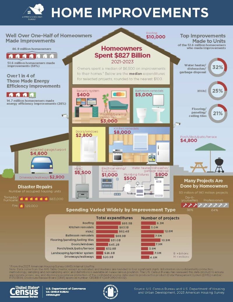
I became a homeowner this year and found the infographic below helpful when considering which upgrades to make to my house. Arranging the information to coincide with different rooms or parts of the residence was smart because it allowed me to quickly find the information that mattered most.
The more familiar I became with the infographic, the more I recognized its information density.
It’s packed with content, yet I never felt overwhelmed when reading it. That’s saying something because home improvements can be daunting by themselves.
However, the color choices, highlighted statistics, room-by-room breakdowns and bar chart at the end made it easier to absorb the information and contextualize it according to my immediate and long-term needs.
Additionally, seeing how more than a third of fellow homeowners had tackled DIY projects gave me the confidence to dive into the work and keep going despite the occasional but momentary hiccups. The infographic designer clearly put themself in the position of people like me and organized the information to keep the content highly educational yet accessible.
This home improvement resource made me more eager to tackle major projects because it showed me what others had done to their houses. It also made me a more capable design professional by providing several organizational best practices for infographics.

Source: https://www.census.gov/library/visualizations/2024/demo/home-improvements.html
3. Shareability
What makes some social media posts go viral while others seem to disappear into the whirlwind of online content only hours after being published? Research shows individuals share posts they view as valuable to themselves or others, and content such as infographics is shown to be more valuable to customers — and thus, also to search engines.
Your infographic could gain momentum as others share it across social media, and as Google sees these social signals as a sign to boost your site in search rankings. Increase the chances of that happening by putting yourself in the position of those who will see your work and ask themselves, “What’s in it for me?”
Marketers do this when they identify users’ problems or concerns and then angle product language to solve them. You can take a similar approach by asking yourself how to maximize relevance for the people who will likely see the content. That is a key strategy that gets businesses to the top of search results.
Consider what individuals wanted to find before they ultimately came across your infographic. Then, broaden your perspective by thinking about common needs.
As a real world example, perhaps you’re creating an infographic for a bank. It’s a good bet that its customers want to manage their money well. You could increase shareability by adding seasonal elements. Give people data about summer vacation plans and destinations, and then provide tips for meeting their getaway goals.
Alternatively, take a business angle by revealing entrepreneurs’ top expenses and how those change by industry. Tie in details about the bank’s services for business owners to emphasize how those can make the financial aspects easier to handle. These example topics offer easily identified value, making them more shareable, potentially over the long term.
4. Visual Appeal
Information presentation is a part of your infographic’s visual appeal, but staying mindful of factors such as the colors, font size and style are also important for getting people’s attention. The human brain handles pictures 60,000 times faster than words. Those images can also evoke feelings.
Have you looked at a picture of a tranquil landscape and instantly felt calmer? Perhaps a picture of the New York City skyline mentally transported you to the year you spent your birthday there with a couple of close friends. Infographics convey information, but they can also alter or incite feelings.
Experiment with different colors, font sizes and other attributes to see how your feelings shift with each attempted choice. Spend time with your client to get feedback on their visual ideals for the infographic. Those conversations may specify some of the hues to include versus leave out of the design.
Colors help 78% of consumers identify specific brands, such as white and red for Coca-Cola, green and white for Starbucks, and yellow and red for McDonald’s. That strong connection between brands and hues may mean ensuring the infographic has a company-appropriate look.
Think about what you want to convey through the font size and style. Using the same font in different sizes is a widely chosen way to create an information hierarchy.
Similarly, the selected style can set the tone for the rest of the information. Whether you take inspiration from a particular decade or let the font inspire a lighthearted mood, how your infographic’s text looks is crucial for its overall effectiveness.
5. Citations and Additional Information
Compelling data on an infographic hooks people, but many want to know its source or how to learn more. Putting a note at the bottom about where you retrieved the information or how people can explore more about the topic can make them see your content as more trustworthy.
An interesting study found people are more likely to fall for misinformation while on their mobile phones. Researchers said that was because individuals scrolling on their smartphones might not bother verifying information if it seems too difficult. However, internet users typically associate their computers with more work-intensive activities.
An easy way around that is to add functional links to your infographic’s citation section or when directing users to additional information. Then, people can just tap the link on their mobile phones to go straight to the source.
Citations and Additional Information in Action
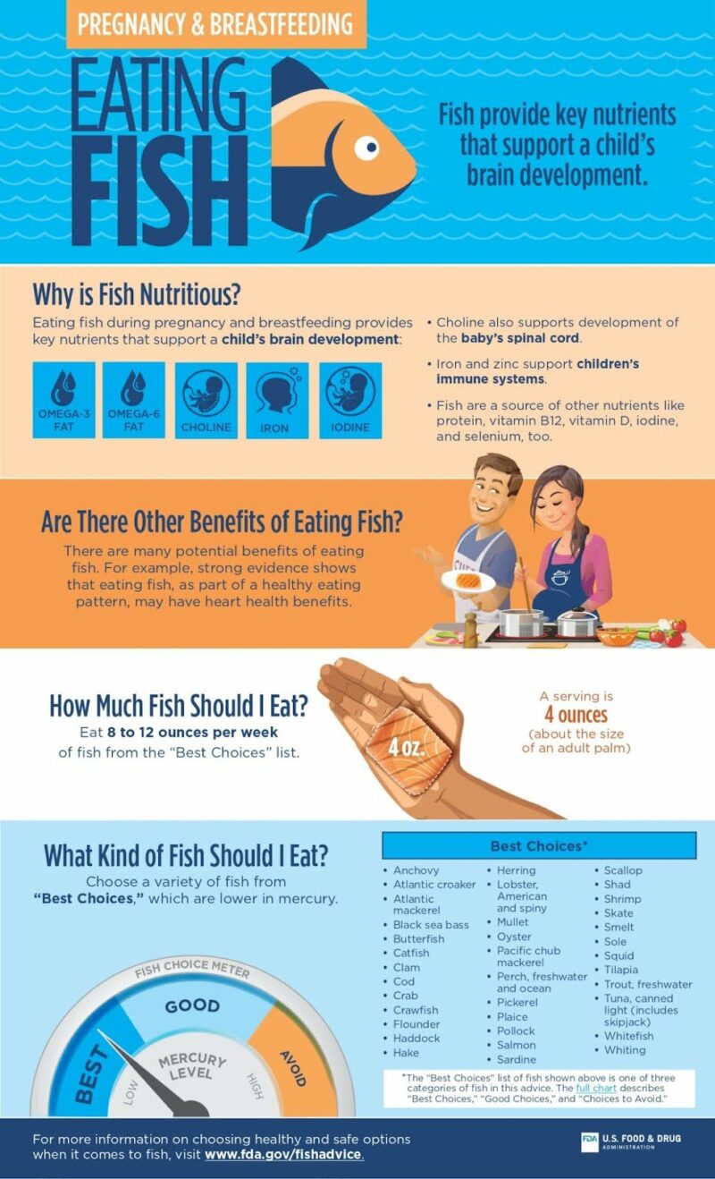
After congratulating a friend on her recent pregnancy news, we started chatting about how she expected her life to change in the coming months. She’d told me her doctor recommended adding more fish to her diet to promote the baby’s healthy development.
My friend admitted she felt a little lost because she’s never cooked fish regularly and didn’t even know which kinds to try. However, she told me of her relief after finding an infographic while scrolling on social media.
After I checked it out in more depth at home after our conversation, I could see why the infographic was so useful to her. It explains how eating fish supports pregnancy and then recommends specific kinds to eat.
I especially liked how the version of the infographic on the FDA’s site has a clickable link near the Best Choices chart that expands upon the topic. The different font color and underlined words helped me quickly recognize I could use the link to go to a complementing page.
Although I would have preferred if the FDA’s main link at the bottom were also clickable, I liked how the designer made it easy to see and included a call to action. This should encourage viewers to learn more from an authoritative source.
Mobile devices comprise 92% of the world’s internet usage. Besides its citation-related advantages, this infographic accounts for that with its easy-to-read fonts that help people retain the information while swiping on small screens.

Source: https://www.fda.gov/food/resources-you-food/infographics-nutrition-and-food-safety-topics
Making the Most of Your Infographics
Follow these best practices, examples and tips to increase your chances of creating infographics that people will see and remember for all the right reasons. This information-distribution method is extremely widely used and well-liked, which requires you to consider these foundational elements at all process stages.


