In this article:
- Quick answer: what's the best font for business cards?
- Understanding Font Categories: The Building Blocks of Business Card Design
- The Psychology Behind Font Choices
- Technical Considerations for Business Card Typography
- Industry-Specific Font Recommendations
- Typography Best Practices
- Modern Trends in Business Card Typography
- Future-Proofing Your Typography Choices
- Conclusion: Making Your Final Font Selection
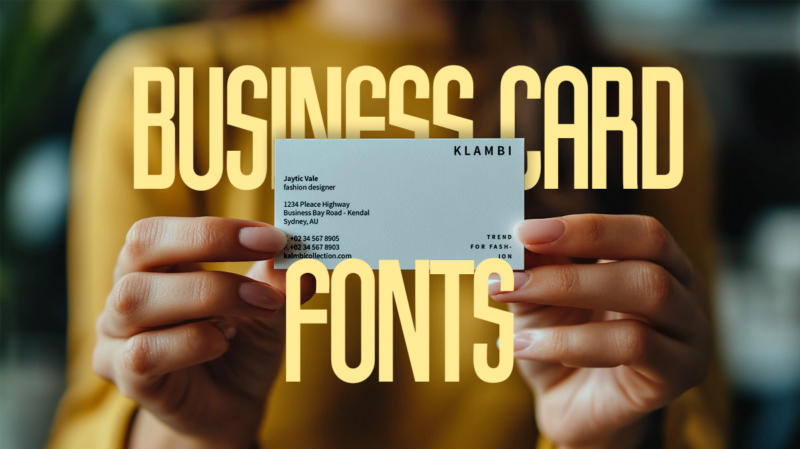
Selecting fonts for your business card might seem like a small detail, but it’s often the difference between a card that gets remembered and one that gets recycled.
Think about it: your business card is often someone’s first tangible interaction with your brand. In those brief seconds when they glance at your card, the fonts you’ve chosen are silently communicating volumes about your professionalism, style, and attention to detail.
But with thousands of fonts available and endless combinations possible, how do you choose the perfect typography for your business card? Should you stick with tried-and-true classics like Helvetica, or venture into more distinctive territory? When is a serif font the right choice, and when might a modern sans-serif better serve your goals?
Quick answer: what’s the best font for business cards?
The best business card font depends on your industry: sans-serifs like Helvetica and Futura convey modern professionalism, ideal for tech and design. Traditional fields like law and finance benefit from serif fonts like Garamond. Choose fonts that maintain readability at 8-10pt size and match your brand identity.
In this comprehensive guide, we’ll dive deep into the world of business card typography. We’ll explore:
- Why font choice matters more than you might think
- The psychology behind different font styles
- Technical considerations for optimal readability
- Smart font combinations that enhance your brand
- Industry-specific recommendations to position yourself effectively
- Common typography mistakes that could be undermining your card’s impact
Whether you’re designing your first business card or looking to refresh your existing one, understanding these typography principles will help you create a card that not only looks professional but effectively communicates your brand’s unique value proposition.
Let’s explore how to make your business card typography work harder for your success…

Get 300+ Fonts for FREE
Enter your email to download our 100% free "Font Lover's Bundle". For commercial & personal use. No royalties. No fees. No attribution. 100% free to use anywhere.
Understanding Font Categories: The Building Blocks of Business Card Design
Before diving into specific recommendations, it’s crucial to understand the main categories of fonts at your disposal. Each type brings its own personality and implications to your business card design.
Sans-Serif Fonts: Modern Minimalism
Sans-serif fonts have become the go-to choice for contemporary business cards, and with good reason. Their clean lines and modern aesthetic make them highly readable even at small sizes. Fonts like Helvetica, Futura, and Proxima Nova convey professionalism while feeling current and fresh.
What makes sans-serifs particularly effective for business cards is their versatility. They work beautifully across different printing methods and maintain their clarity whether embossed, foiled, or printed traditionally. This adaptability, combined with their professional appearance, makes them especially popular in tech, design, and modern corporate environments.

Serif Fonts: Traditional Authority
When your goal is to convey tradition, reliability, or academic authority, serif fonts like Times New Roman, Baskerville, and Garamond shine. These fonts feature small decorative lines (serifs) at the end of each stroke, lending a classic, established feeling to your business card.
Law firms, financial institutions, and traditional consulting practices often gravitate toward serif fonts to reinforce their connection to established practices and long-standing expertise. However, modern interpretations of serif fonts can also bridge the gap between traditional and contemporary design.

Script and Display Fonts: Creative Expression
While they require careful handling, script and display fonts can add a unique touch to your business card. These fun fonts should typically be reserved for your name or business name, while keeping contact details in a more readable style. They’re particularly effective for creative professionals, luxury brands, or any business wanting to convey artistic flair.
The Psychology Behind Font Choices
Your font choice triggers immediate psychological responses in viewers, often before they’ve even read a word. Understanding these responses can help you make more strategic typography decisions.
Building Trust Through Typography
Studies have shown that certain fonts consistently evoke feelings of trustworthiness and reliability. Clean, well-spaced fonts with consistent stroke weights tend to build confidence, while overly decorative or trendy fonts can sometimes undermine credibility. This is why financial institutions often stick to classic, proven typefaces rather than experimental designs.
Conveying Personality
Every font has a personality – from the authoritative boldness of Gotham to the friendly approachability of Museo Sans. The key is matching this personality to your brand identity. A pediatrician’s practice might opt for softer, more welcoming fonts, while an architectural firm might choose stark, geometric typefaces to reflect precision and modern design sensibilities.
Technical Considerations for Business Card Typography
Size and Spacing
The limited real estate of a business card demands careful attention to font sizing. Your name or company name typically appears largest (10-16pt), while contact details should remain legible but smaller (8-10pt). Remember to maintain adequate spacing between lines and elements – crowded text can make your card feel cluttered and unprofessional.
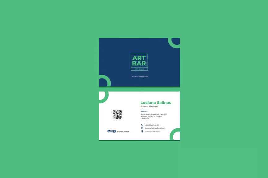
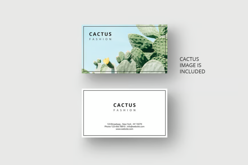
Source: Business Card Template by Envato
Readability at a Glance
Business cards are often read quickly and in less-than-ideal lighting conditions. This makes readability paramount. Avoid fonts that are too light, too condensed, or too decorative for critical information. Consider testing your font choices by viewing them at actual size and in different lighting conditions and by using a quality business card mockup.
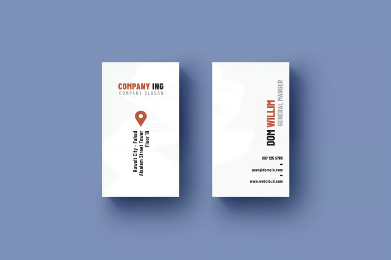
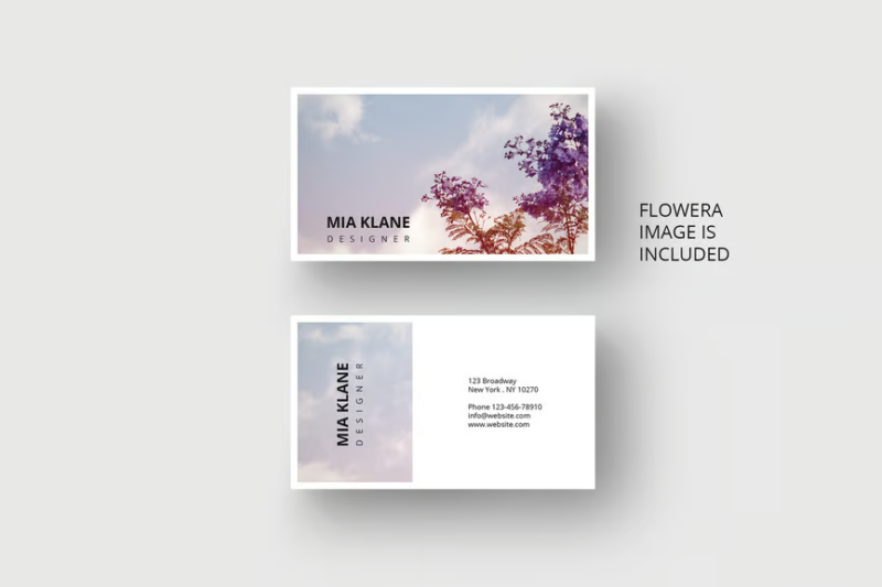
Source: Business Card by Envato
Print Considerations
Not all fonts perform equally well in print. Some delicate fonts may lose detail or become illegible when printed, especially at smaller sizes. Additionally, certain printing techniques like embossing or foil stamping work better with simpler, bold fonts. Always test your chosen fonts with your intended printing method before committing to a final design.
Industry-Specific Font Recommendations
Corporate and Financial Services
In the corporate world, traditional serif fonts and modern sans-serifs reign supreme. Goldman Sachs, JP Morgan, and other financial powerhouses typically stick to classics like Garamond or contemporary options like Helvetica Neue. The goal is to convey stability, professionalism, and trustworthiness through typography.
Creative Industries
Designers, photographers, and other creative professionals have more flexibility with their font choices. Consider pairing a distinctive display font for your name with a clean sans-serif for contact details. Fonts like Futura, Gotham, or even carefully chosen script fonts can help your card stand out while maintaining professionalism.
Technology Sector
Tech companies often gravitate toward modern, geometric sans-serif fonts that convey innovation and forward-thinking. Fonts like Roboto, SF Pro, or Proxima Nova work well here. The emphasis is on clean lines and optimal digital readability, reflecting the industry’s focus on user experience.
Traditional Professions
Law firms, medical practices, and academic institutions often benefit from serif fonts that convey authority and expertise. Times New Roman, Baskerville, or Garamond are tried-and-true choices. However, modern interpretations of these classics can provide a fresh take while maintaining gravitas.
Typography Best Practices
Creating Visual Hierarchy
Your business card should guide the reader’s eye through information in order of importance. Use font size, weight, and style to create clear distinction between elements. Your name or company name might be 14pt bold, while contact details could be 9pt regular weight. This hierarchy ensures quick comprehension of key information.
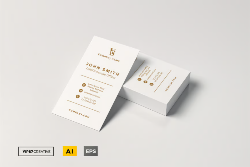
Source: Simple Business Card by Envato
White Space and Layout
Don’t let the small size of a business card tempt you into overcrowding. Proper use of white space is crucial for readability and professional appearance. Give your fonts room to breathe – generous margins and spacing between elements can make even simple typography look sophisticated.
Font Pairing Strategies
When combining multiple fonts, aim for contrast with compatibility. A bold sans-serif heading can work beautifully with a lighter serif for body text. However, limit yourself to two or three fonts maximum – anything more risks looking chaotic. Popular combinations include Helvetica with Garamond, or Futura with Bodoni.
Modern Trends in Business Card Typography
Minimalist Approaches
The “less is more” philosophy continues to dominate business card design. Single-weight sans-serif fonts used thoughtfully with ample white space create a contemporary, sophisticated look. This approach works particularly well with premium printing techniques like letterpress or foil stamping.

Digital Integration Considerations
With the rise of digital business cards and scannable QR codes, choosing fonts that work well both in print and on screen is increasingly important. Sans-serif fonts like Inter or Roboto were specifically designed for cross-platform legibility and make excellent choices for modern business cards.
Future-Proofing Your Typography Choices
Balancing Trends with Timelessness
While it’s tempting to choose the latest trending font, remember that your business cards should remain relevant for years to come. Consider whether your chosen typography will still look appropriate and professional in five years. Classic fonts with modern applications often provide the best longevity.
Adaptation for Digital Platforms
Your business card typography should translate seamlessly to your digital presence. Choose fonts that are widely available for web use or have close digital alternatives. This ensures consistency across all your brand touchpoints, from physical cards to your website and social media profiles.
Conclusion: Making Your Final Font Selection
Choosing the right fonts for your business card is a balancing act between creativity and practicality. The most successful designs combine thoughtful typography choices with careful attention to hierarchy, spacing, and printing considerations. Remember that your business card is often your brand’s first impression – make it count with typography that truly represents your professional identity.
Quick Selection Checklist
- Consider your industry standards and expectations
- Ensure readability at business card size
- Test print quality with your chosen printing method
- Verify digital compatibility if needed
- Create clear information hierarchy
- Maintain consistent branding with other materials
By following these guidelines and considering your specific needs, you’ll be well-equipped to choose typography that elevates your business card from a simple contact sharing tool to a powerful piece of brand communication.


